deepstrasz
Map Reviewer
- Joined
- Jun 4, 2009
- Messages
- 22,326
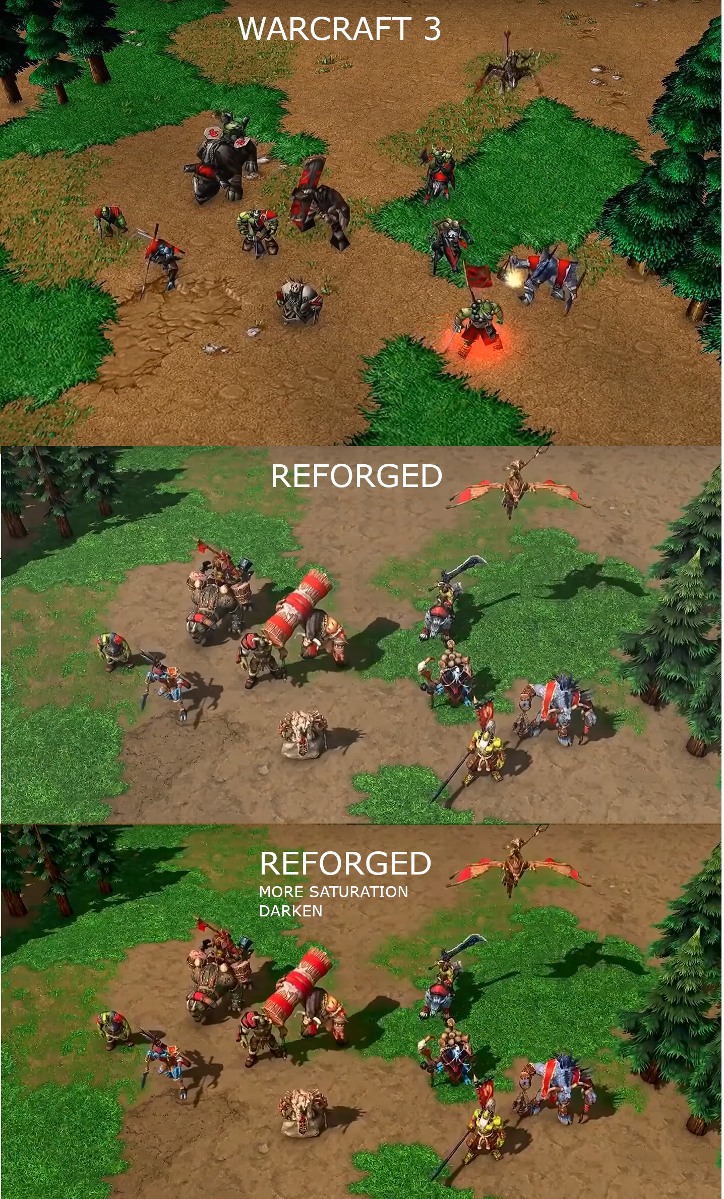
I prefer clearness though so things could be distinguished.The game needs to look more saturated. I repeat, the realism comes from the models, not from the textures/colors.
Also, @Augustus and @Blackcat enough with the double-multiposting. Write everything in one post. You can copy from one post to another and delete the surplus.
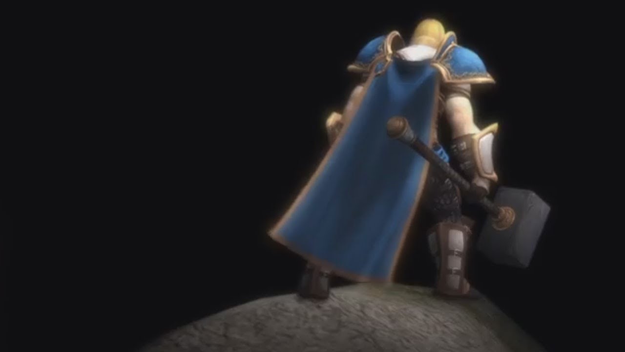
Those images aren't how the actual HD looks like. They're bad quality.Also, is it just me or does the remaster have a slight fog effect? Not entirely sure I like that.
Saturation like that might make things blurry. I wouldn't want that because honestly Warcraft III didn't have that on highest video options and resolution.Maybe we should also take into consideration that Blizzard was afraid people would accusing them of making it too much like WoW, so they made the colors darker.
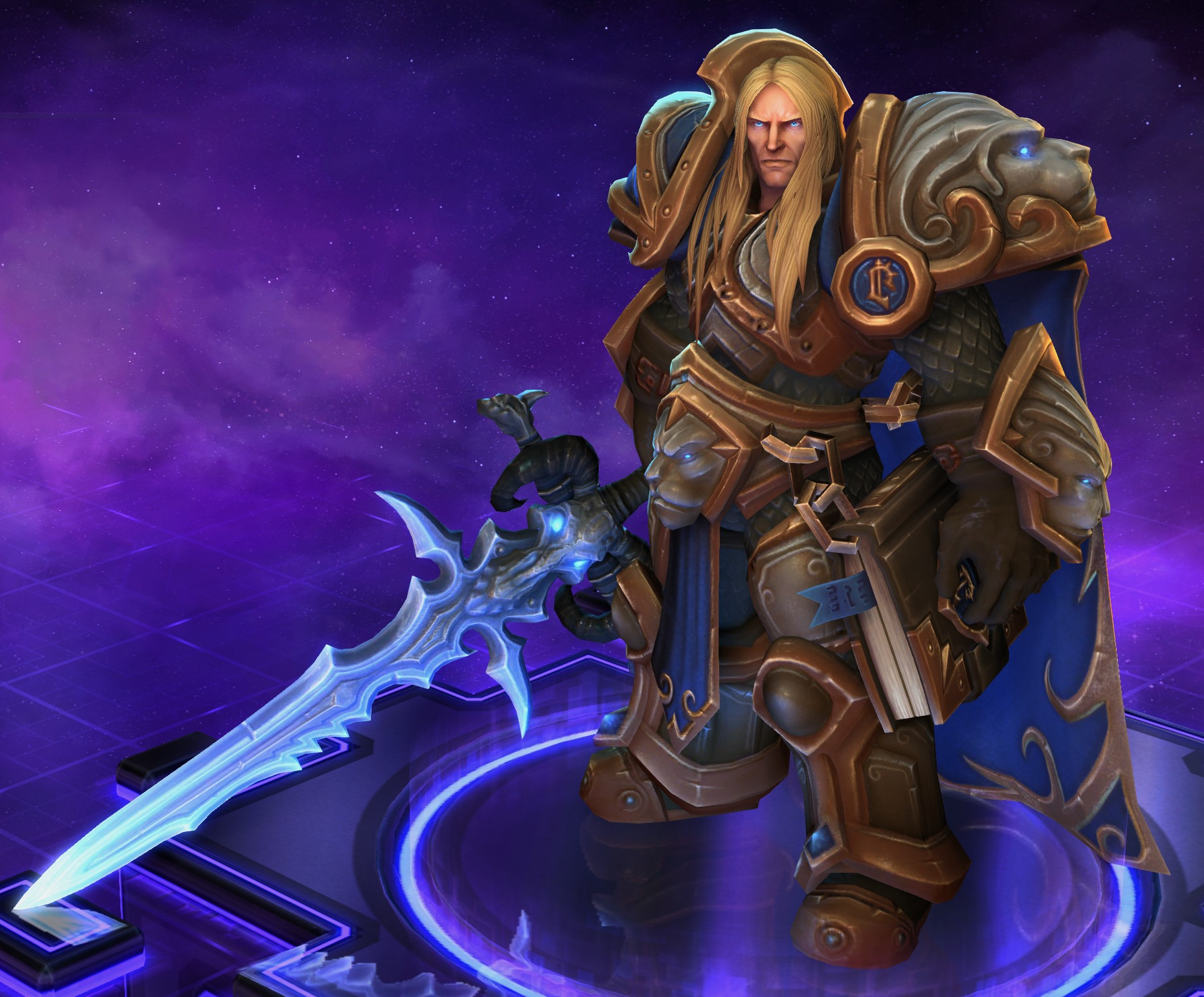


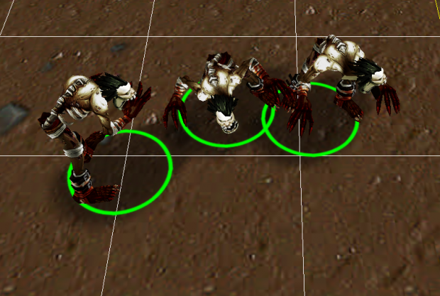
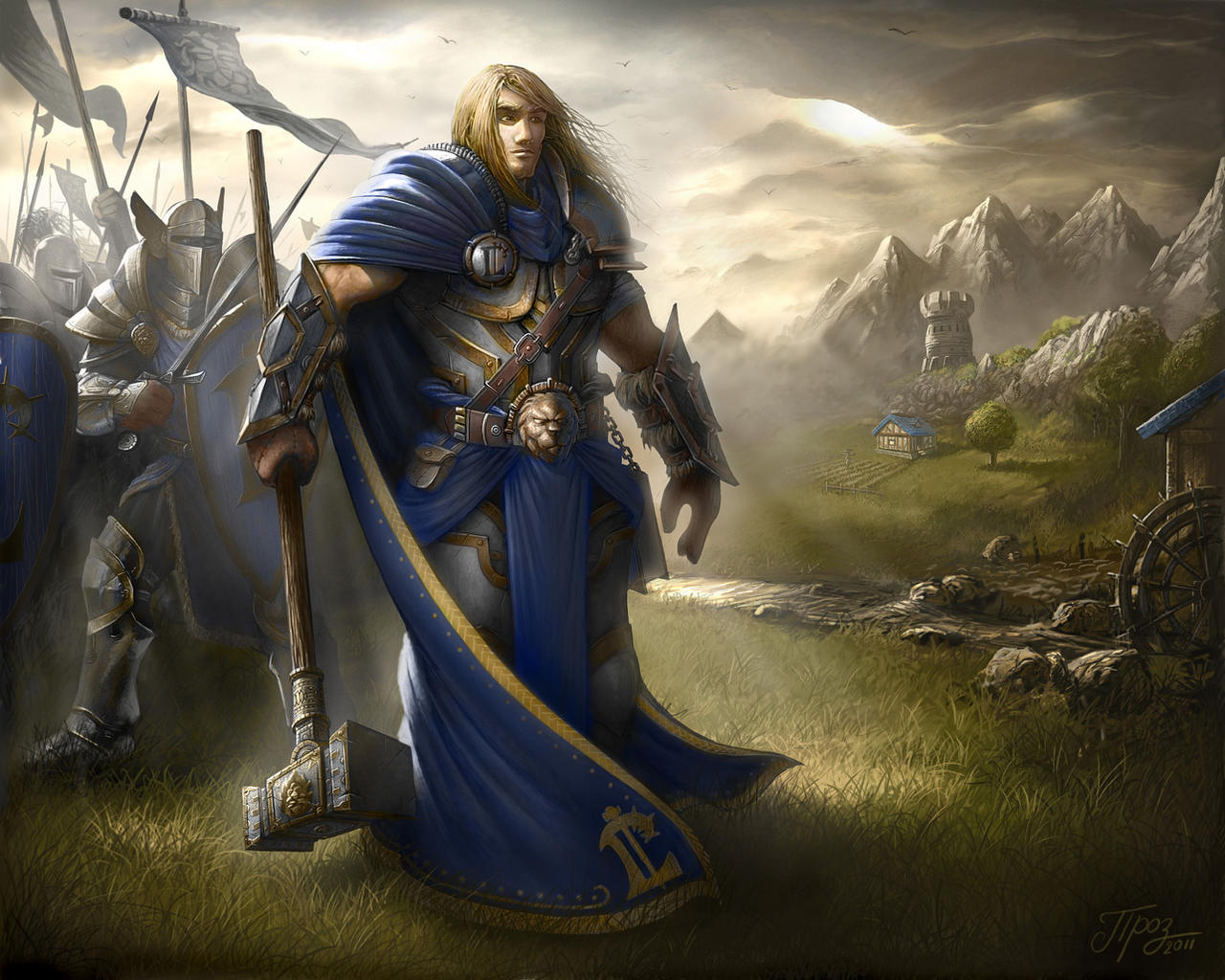
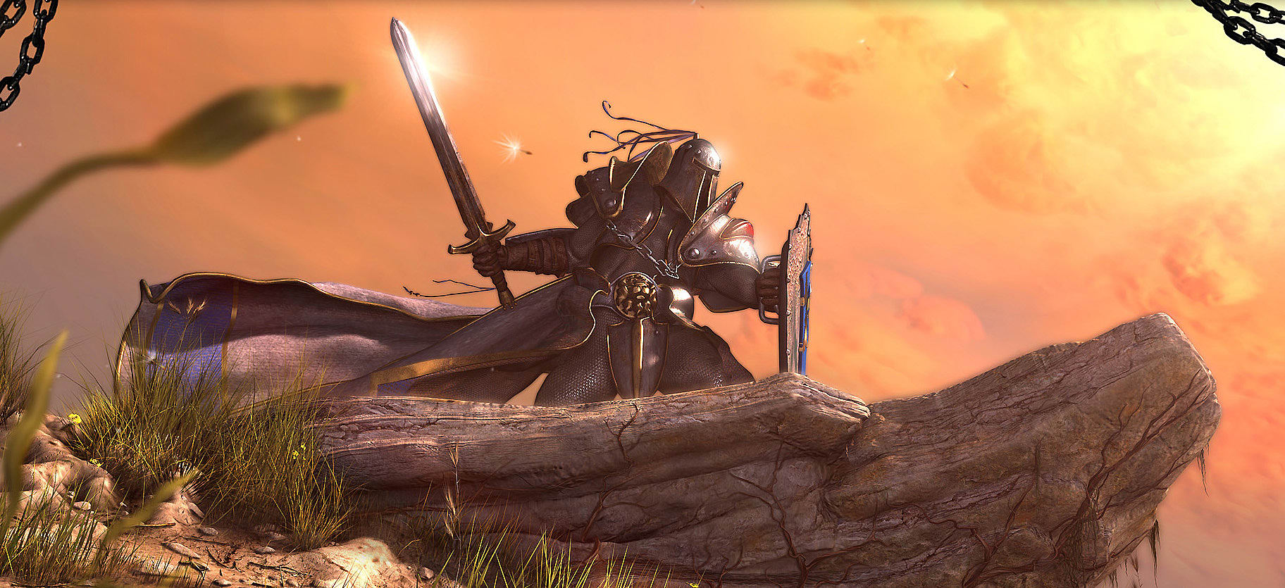
 ), and units having absurd proportions (tiny head, huge weapons and shoulderplates), which are not pleasant to look at.
")
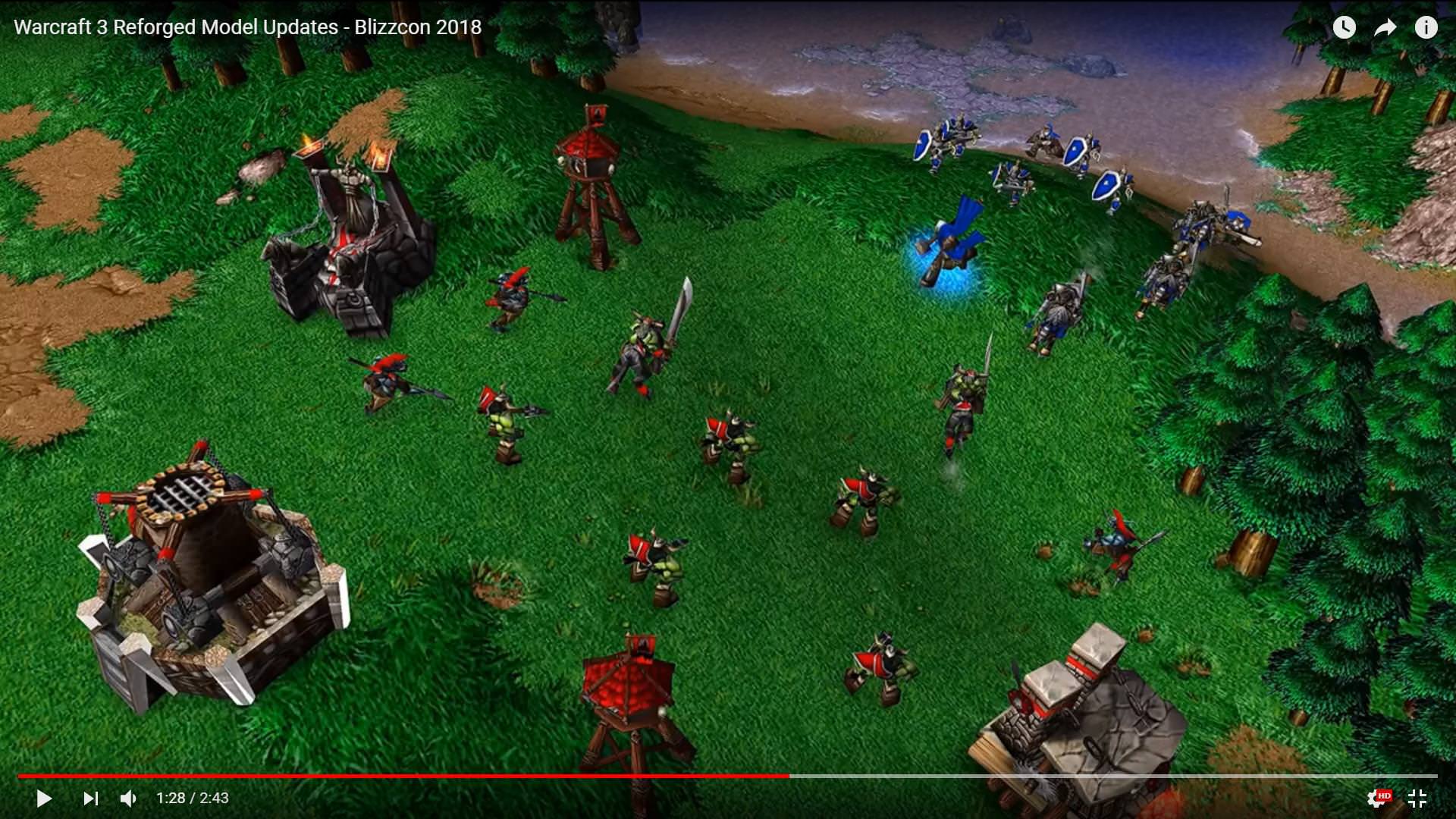
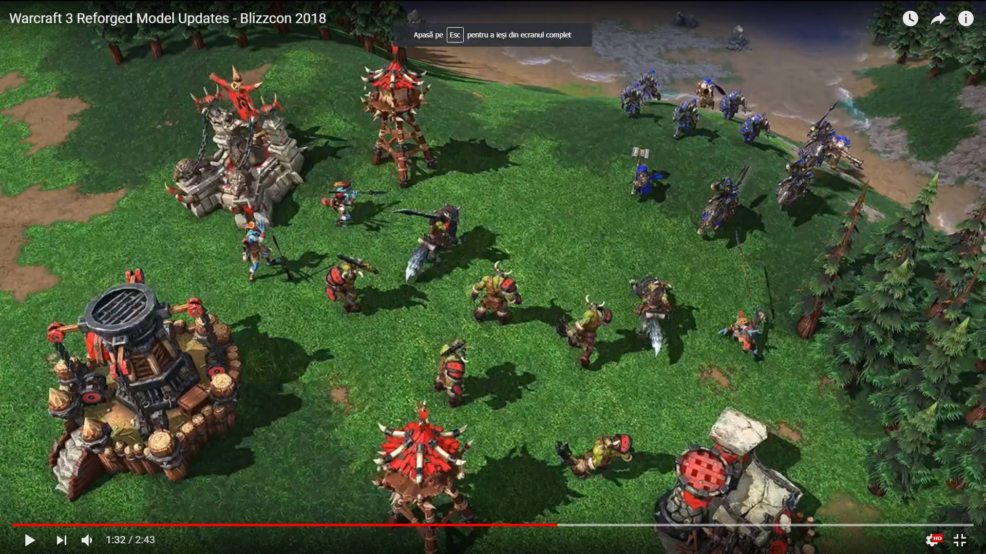
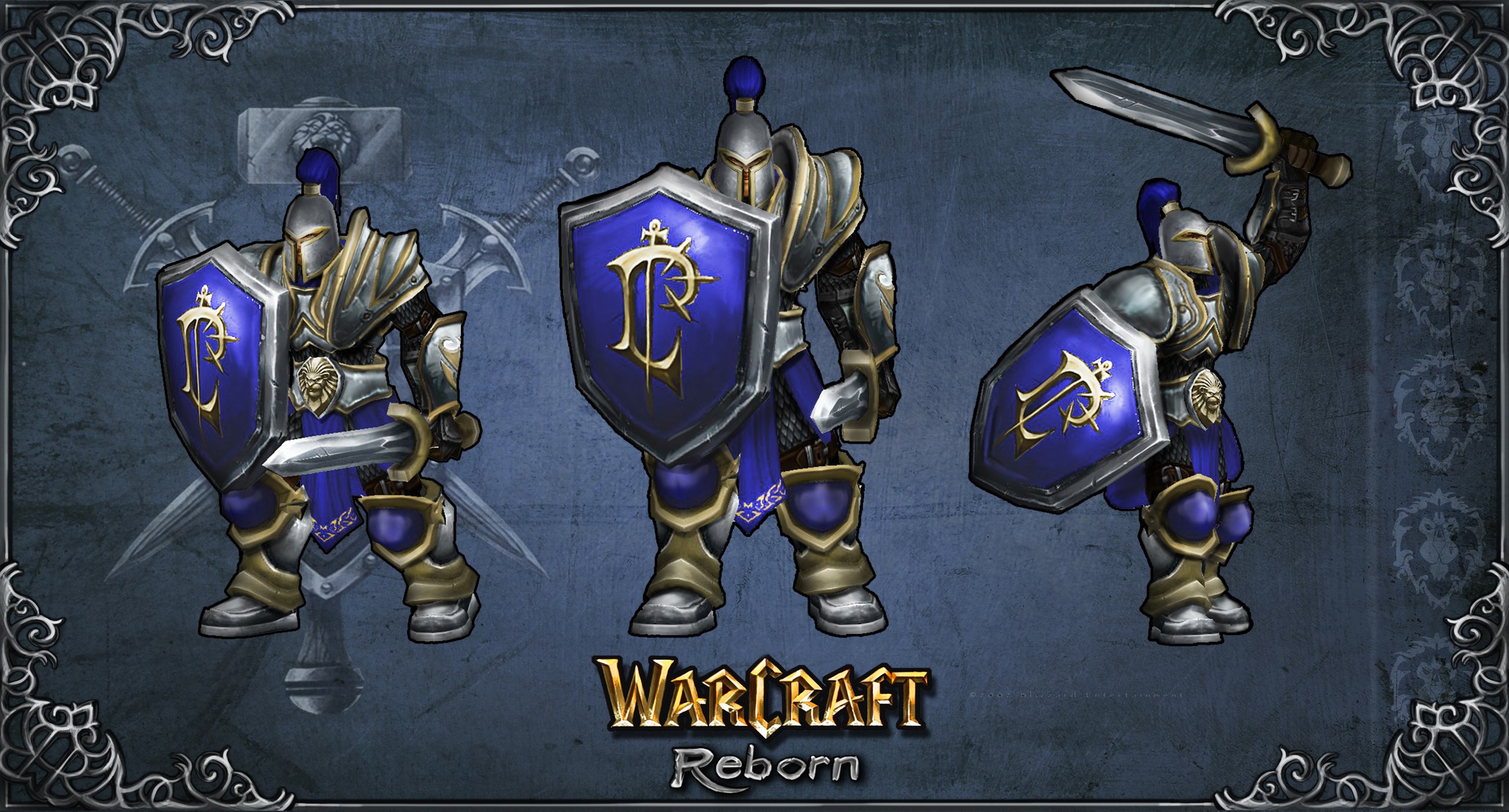
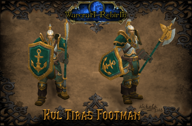
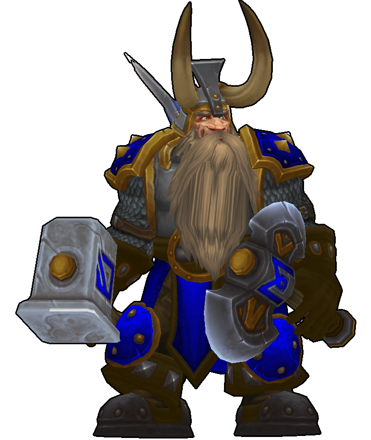
 They could all have their respectable faction crest on their shields or armor.