• 🏆 Texturing Contest #33 is OPEN! Contestants must re-texture a SD unit model found in-game (Warcraft 3 Classic), recreating the unit into a peaceful NPC version. 🔗Click here to enter!
  • It's time for the first HD Modeling Contest of 2024. Join the theme discussion for Hive's HD Modeling Contest #6! Click here to post your idea!

Warcraft III Reforged - Artistic/Textures/UI Feedback

Status
Not open for further replies.

ISL

ISL

Level 13
Joined
Nov 7, 2014
Messages
238
Someone please tell me im dumb and need to calm down lol
You're dumb and need to calm down

But I too, hope that they will make some changes to the current design :D
The devs might have already taken our feedback into consideration, and are making new changes and various adjustments right now
 
Level 32
Joined
Oct 26, 2014
Messages
369
Maybe we could collectively write a single big general piece of critique on game's general art direction? General feedback is quite contradictory, there even are people on reforged's forum who ask devs to not change anything about the new design an̶d̶ ̶I̶ ̶h̶a̶v̶e̶ ̶n̶o̶ ̶i̶d̶e̶a̶ ̶h̶o̶w̶ ̶t̶h̶o̶s̶e̶ ̶p̶e̶o̶p̶l̶e̶ ̶f̶u̶n̶c̶t̶i̶o̶n̶
 
Level 11
Joined
Nov 23, 2013
Messages
665
@Gluma , @Archian is already planning to send a document with compiled feedback from us to Blizzard, he mentioned it somewhere. :) I don't know if he's already started to do it or if it's still a work in progress.

I've watched the reforged gameplay video and the new unit proportion looks just fine to me, not so much difference from the old one. I imagine adjusting HD models with the old proportion (i.e. shorter belly) will only make them look stretched, out of shape, weird, creepy, etc etc.
If you take a look at the pictures Deepstrasz provided, you'll see it's possible to keep the original Warcraft III style without giving units a weird look. :) Cartoony proportions, but not too much!

I think the Grunts are perfect, I don't think they're too big either, Orcs have changed a lot since War2, they're definitely depicted as significantly larger and stronger than almost all humans(Even most leadership position humans). Grunts themselves are about twice the strength and durability of a footman, so they should look the part.
I agree that orcs should definitely be larger and stronger than humans. In Warcraft III, this is why grunts cost more food and gold than human footmen! ;)
On the other hand, it doesn't mean that orcs must have weird bulky proportions, like in the movie, in the MoP trailer or in Reforged. It's just an artistic choice Blizzard made a while ago for some reason, but it differs from what the design of Warcraft used to be. In the original Warcraft III, orcs are larger than humans, but their proportions are more harmonious and balanced most of the time.
I would just feel disappointed if the game changed too much while it could have kept the original spirit and having better graphics. Once again, it's a matter of taste!

Honestly I disagree with a lot of people here thinking that it needs to be done over or drastically changed. I think most of the proportionto bes look much better than before, and if you listened to people and went with more cartoony proportions it would actually look MORE like heroes of the storm.(Which I don't find it does at all, despite some seeing a resemblance.)
Look at a HoTs footman, big head, big hands/feet, simple armor. This game's art-style looks nothing like WoW or HoTs imo. (In fact I'd say the SC2 Warcraft 3 remake has more of a WoW look than this.)
I wouldn't say that graphics and style have to be redone entirely! From what I've seen so far, there is a lot of good stuff, even though it's still a work in progress - which mean it will be improved even more. I just think that many things need to be tweaked, but I'm sure the final result will be great. I just hope very hard that the game will not look to different, because I would like to use the new fancy graphics and not keep the old ones! :)
Also, about WoW and HotS: the similarities between WoW/HotS and Reforged are not about proportions, but the general style. I would say it applies mostly on buildings and environment, and some other details such as the size of some weapons and armours.
WoW, HotS and current Reforged styles are not bad per say; they just don't look like Warcraft III, that's all I'm saying. :p
 
Level 39
Joined
Jul 26, 2004
Messages
1,481
Maybe we could collectively write a single big general piece of critique on game's general art direction? General feedback is quite contradictory, there even are people on reforged's forum who ask devs to not change anything about the new design an̶d̶ ̶I̶ ̶h̶a̶v̶e̶ ̶n̶o̶ ̶i̶d̶e̶a̶ ̶h̶o̶w̶ ̶t̶h̶o̶s̶e̶ ̶p̶e̶o̶p̶l̶e̶ ̶f̶u̶n̶c̶t̶i̶o̶n̶

Not everybody shares your view. I think the new art direction is fantastic. There is room for some improvement in some areas like proportions and such. But if you think that they're gonna drastically change the entire art direction because a few people here are too nostalgic too let go of the old one, I think you're gonna be sorely disappointed. No way they throw out that much progress. Which is why, and I think I've repeated this a million times already, we will have the option to switch to the old art style. So even if the art style doesn't end up changing that much people still have the opportunity to play with the old art style that they love so much. Not that I dislike the old art style, I adore it, but just because something is new doesn't mean that it's worse. It's supposed to look different. If it looked the same what would even be the reason to make the game to begin with?
 
Level 14
Joined
Jan 16, 2009
Messages
716
I just don't understand all the complaints about the art style "changing" when you can literally switch to the old one with the click of a button.

Saying you can go back to old models is a non argument - nobody is talking about the old models here. If people are "complaining", it's about the new models. There are many angles you can critique the models today (as we are seeing alpha footage). Even if you are only talking about the complaints concerning the art style, you can easily understand how people wanted to see more faithful HD models, can't you?

The visuals has been the #1 topic of discussion since the announcement. Feedback on them has been mixed to say the least.
Many interesting points have been raised and I hope the team will take them into account and make a very visually pleasing game that stays true to the values that made the original good enough to be remastered and played after 16 years.
 
Level 32
Joined
Oct 26, 2014
Messages
369
To each his own I guess. I just don't understand all the complaints about the art style "changing" when you can literally switch to the old one with the click of a button.

I mean we are allowed to not like the new style and and try and explain why, right? I mean some might be annoying about it like I am, but that's ok to not like things

Yeah true, I'll probably play with old graphics anyway. I hope the original gets some new visual stuff too, like the skins. Wouldnt iit be cool if we could see peoples skin even in the old game, all in the good old style? This would add for custom map consistency too
 
Level 3
Joined
Feb 14, 2018
Messages
33
Will reforged support directx shader?

Saying you can go back to old models is a non argument - nobody is talking about the old models here. If people are "complaining", it's about the new models. There are many angles you can critique the models today (as we are seeing alpha footage). Even if you are only talking about the complaints concerning the art style, you can easily understand how people wanted to see more faithful HD models, can't you?

The visuals has been the #1 topic of discussion since the announcement. Feedback on them has been mixed to say the least.
Many interesting points have been raised and I hope the team will take them into account and make a very visually pleasing game that stays true to the values that made the original good enough to be remastered and played after 16 years.
Blizz said it can be turn back to the old version anyway
 
Last edited by a moderator:
Level 39
Joined
Jul 26, 2004
Messages
1,481
Saying you can go back to old models is a non argument - nobody is talking about the old models here. If people are "complaining", it's about the new models. There are many angles you can critique the models today (as we are seeing alpha footage). Even if you are only talking about the complaints concerning the art style, you can easily understand how people wanted to see more faithful HD models, can't you?

The visuals has been the #1 topic of discussion since the announcement. Feedback on them has been mixed to say the least.
Many interesting points have been raised and I hope the team will take them into account and make a very visually pleasing game that stays true to the values that made the original good enough to be remastered and played after 16 years.

Of course. Criticism should always be encouraged (and Blizzard has actually done so), but the criticism should at the very least be constructive. Saying "I dislike the art style" is useless criticism. Blizzard can't use this. Saying stuff like "maybe the proportions should be like so and so" or "this unit's silhouette should be a bit more recognizable" on the other hand is constructive, as it's something Blizzard can actually implement. Saying it should be more "faithful", while I can appreciate the sentiment, is probably not that useful either, because doing so would require a total rehaul of everything that they've made so far. That's not just textures and models, it's their entire shader library (faithful would mean no more PBR) out the window. Basically wasting all the man hours put into it so far. It's not happening. That's really my gripe here. Complaining about the art style doesn't really help anyone. Critiquing the models does.

Then there are of course people who are totally toxic and are accusing Blizzard of destroying the old game, or being too "revisionistic", to which I say: you can still use the old art style! So that sentiment isn't so much in regards to the valid criticism that we're hearing, but more in regards to the absolute hate that some people have been spouting.
 

Triceron

Hosted Project: W3CSW
Level 11
Joined
May 13, 2010
Messages
99
So looks like Blizzard is outsourcing art to Lemon Sky, a Malaysian outsource company. They actively replied on reddit in a thread pointing this out, and they even say they are not hiding this information.

Warcraft III Reforged - Outro Screen, ken wong

Lemon Sky

44263683_2049867458368501_8442325830280937472_n.jpg
 
  • Like
Reactions: pyf
So looks like Blizzard is outsourcing art to Lemon Sky, a Malaysian outsource company. They actively replied on reddit in a thread pointing this out, and they even say they are not hiding this information.

Warcraft III Reforged - Outro Screen, ken wong

Lemon Sky

44263683_2049867458368501_8442325830280937472_n.jpg

Yeah I realized this screen was posted 1 week before blizzcon, to be honest I'm abit unhappy that Blizzard gave designing job to them but sadly when you make an agreement it lasts long and you can't change the company without paying a penalty fee (considering this studio remade sc1 means they already made agreement for atleast 5 years)
 

Triceron

Hosted Project: W3CSW
Level 11
Joined
May 13, 2010
Messages
99
Blizzard is happy with the work, and tbh I don't blame them considering the quality of models they're getting at the speed and quantity needed to get WC3R out by next year. The cost it would be if they made this internally would easily double the cost and time taken.

I can see this style being a compromise of what the Artists are used to (PBR-centric pipeline) and the lore is taking a dump simply because they are using whatever most relevant concept there is to base the units off of.

Honestly I don't mind because whatever they're doing gets us all closer to what we want to see. If something needs tweaking, that's where we can step in. If I want a bigger shield or different decals on footmen, I'll just go in and model edit or completely replace it and just use their animations; that's exactly what I did for their WoW and WC3 models. Whatever they provide will be useful tools for us.

I'm already planning on revamping my WC2 Death Knight design and their new Archmage skeleton would be perfect to support a higher res model.
 
Level 6
Joined
Apr 7, 2012
Messages
184
Hmm, I think remasters have lower budgets so that is probably why they are oursourcing. Their A team is probably very expensive. I think they are also not expecting to make a boatload of money out of it too. Remasters usually have less interest and the cinematic only has 1 million views so far. Might explain why they are also only remaking the opening cinematic. Still, Blizzard are swimming in cash and the fact that they are not going full steam ahead on this is dissapointing but I kinda get it why.

I am still disappointed, seeing that remade cinematic was like seeing the original for the first time again. I was hoping I could have the same experience for all of them. I hope they are remaking the Illidan vs Arthas cinematic at least...

Still, that cinematic was the oldest of the bunch and it shows. Compare it to the Human campaign finale and you will see quite a big difference in quality.
 
Level 14
Joined
Jan 16, 2009
Messages
716
The first thing everyone wanted to do was make Warcraft III more realistic,” says Didier. “So everything was smaller. Then we saw it in game, and we were like ‘Everything looks dumb.’ So we started making the colors simpler, decreasing the shading, adding flat colors. We scaled the characters back up and made them bigger and bulkier so they read from that top-down camera. That’s one of the reasons we started doing that style, because it read better, but also because everything felt huge. Everything felt heroic and mightier.

Interesting quote from Samwise Didier.
 

deepstrasz

Map Reviewer
Level 69
Joined
Jun 4, 2009
Messages
18,845
Because it's two different types of RTS. In Starcraft you control anonymous masses where a single unit taken by itself has little importance, in Warcraft 3 you control units and hero units - each of them having its own individual importance.
No. Brood War's camera can't get that many units in and even if StarCraft is more macro based, many units actually have their role so, I don't buy it.
 
Level 14
Joined
Jan 16, 2009
Messages
716
Well in Brood War, the units are much bigger than in Starcarft 2 (since the camera is much more zoomed in). I don't see how that contradicts the Samwise quote.
His quote is pretty clear and explains the issues with Reforged quite well, or at least how it fails compared to Warcraft 3.
The devs have heard that complaint and I believe we will see a lot of improvements next iteration.
 

Rui

Rui

Level 41
Joined
Jan 7, 2005
Messages
7,550
The first thing everyone wanted to do was make Warcraft III more realistic,” says Didier. “So everything was smaller. Then we saw it in game, and we were like ‘Everything looks dumb.’ So we started making the colors simpler, decreasing the shading, adding flat colors. We scaled the characters back up and made them bigger and bulkier so they read from that top-down camera. That’s one of the reasons we started doing that style, because it read better, but also because everything felt huge. Everything felt heroic and mightier.
Interesting quote from Samwise Didier.
Well, if Samwise himself says that, I guess there's no turnaround from the oversized shoulderpads and hammers. To me, they're what's dumb about those models.
 

deepstrasz

Map Reviewer
Level 69
Joined
Jun 4, 2009
Messages
18,845
Well in Brood War, the units are much bigger than in Starcarft 2
That or the resolution is just small. The thing is, the proportions are OK there in what unit design is concerned. They didn't have to make huge unrealistic armour to identify units. StarCraft II has more bulky stuff than Brood War but not as much as WoW and its spread to Reforged. So, unit overall size=/=parts of them being way bigger than normal, especially when you want to aim for realism.
 
Level 14
Joined
Jan 16, 2009
Messages
716
It's much more about silhouette than oversized parts. Warcraft 3 used oversized and bulky proportions, but the purpose was to built an interesting and remarkable silhouette for a RTS game.
In Reforged, the oversized parts are more about fitting the Warcraft visuals. So much that it looks like a parody - the shoulder-pads and the hammers with those small heads are laughable.
Let's take the paladin, they used the blademaster skeleton for it, which result in a very lean silhouette that make him unremarkable when seen from a RTS view.

comparisonuther.PNG

W3R_side_by_side_comparison.png
 

deepstrasz

Map Reviewer
Level 69
Joined
Jun 4, 2009
Messages
18,845
The point is that the paladin has less presence that a footman. His hammer is almost as big as his body.
So, how does the paladin have a less presence than the footman? I don't get it. If anything, the paladin is more visible because of the huge hammer which should be changed by the way. The hero will be noticed by the hero glow instead among others.
 

deepstrasz

Map Reviewer
Level 69
Joined
Jun 4, 2009
Messages
18,845
And I didn't even interlude the knights that outclass the paladin in presence by a lot in Reforged.
You meant that it's smaller. That does not mean its presence is not noticeable, hence the big hammer...
Anyways, they'll probably tweak heroes as in the Reforged Culling of Stratholme...
The picture you're showing is surely a pre-alpha or an early alpha. I don't think they'll leave the paladin like that. Can you see the Riflemen, which are supposed to be dwarves, almost bigger than the Footmen? (sure, in classic Warcraft III too but we're talking about Reforged and namely that picture you keep shoving in my face).
While we're at it, look at the Grunts, way bigger than the orcs on the wolves as in Warcraft III. In case I'm not clear here, they will not leave a small paladin while weird things like what I wrote about the orcs still stand.
Realistically proportionate, being tall doesn't mean having a small head. That's disproportionate.
All in all, they still have work to do.
 
Last edited:

Triceron

Hosted Project: W3CSW
Level 11
Joined
May 13, 2010
Messages
99
Honestly, once you play for a week, your brain will adapt to every unit and recognize what is what.

Play some Total War Warhammer. There are so many units and the camera is so far out that its all visual noise to a newcomer. But if you actually play and get into it, you begin to recognize what is what.

Your brain abstracts the white border of the footmans shield in WC3, to the point where you only recognize that shield silhouette. That expectation is being carried over to Reforged. your brain has had YEARS to recognize he shape and look of a footman out of a mish ash if low polygons from a screenshot.

Once you get used to it, the Reforged footmans will be easily seen the same way. Maybe the sharp shoulder angles and dark metallic coloration might be the thing your brain identifies as ''footman". Its a matter of perspective. Remember that we were once used to seeing a very rounded Footman without a shield from Warcraft 2.

There are two things that need to be worked on to identify units more clearly. Team color and Hero Glows. As soon as this is sorted out more clearly, the Paladin issue would go away because now he has a hero glow under his feet or now ghouls can be clearly identified as Purple Team instead of Red Team. Silhouttes dont really matter, because your brain will abstract nee visual connections to any unit. If I imported the Total War models into WC3 and replaced them all, it would take you 10 minutes to get used to which is which no problem.
 
Last edited:

deepstrasz

Map Reviewer
Level 69
Joined
Jun 4, 2009
Messages
18,845
Its a matter of perspective. Remember that we all had to get used to janky polygons when we were used to seeing a very rounded Footman without a shield from Warcraft 2.
Yeah, nifty concept they did back then. In Orcs and Humans the Footman had a shield while the Grunt used both hands to wield the axe. I guess those yellow gauntlets stretching on the forearms were a sort of shield.
29490.png

They did it quite right with human armours in the movie though:
 
Level 3
Joined
Jun 16, 2018
Messages
21
In the pictures of loading screens and such were no graphical limitation, right? so they would represent the real apearence of the units, i mean the way the original artist meat them to be. Now with the power of new computers that figures are easily archivable so... why they dont look like them? Its loosing the escence of the game, a medieval enviromet, coarse and simple. I would like to see more in other fields just like the animation modifiers i found in the new triggers are awesome as the legendary size map is.
 
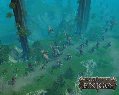
If they could improve cliff design, it would be great. For example Armies of exigo had good looking cliffs

Couldn't find many good pictures tho

315095-armies-of-exigo-windows-screenshot-finding-one-of-the-most.jpg

51WXWGSCBRL.jpg

Pakin_30-08-2004-11-51-07_2.jpg

Inside warcraft 3 mpq there are MDX files for cliffs . It can be seen how they are sculpted,and those sculpts arent tiled very well . So they need to resculpt cliffs in order to look more smooth

Anyway Pete said in 1 interview that they will go new tileset and cliff system for reforged , cause the old wc3 system of tiles and cliffs will never let the game look good as modern games.

It means all of the work of modders who created custom cliffs and tiles wil not work. But guess what ?

It will be way more better and easier both blizz and modders ! I hope it will look at least complex like you have shown in screens,and i believe its gonna be super great !
 
Level 2
Joined
Jul 24, 2004
Messages
17
Call me a heretic, but TBH, I love almost all of the art so far in WC3 Reforged. It's the UI that I'm not too sure about. Needs to have a classic variant, as well.

In the case of the art, my only real ick is maybe the Ghoul (hard to recognize as a Ghoul...Perhaps give us one that looks more like the original, with the current one being an alternate, sort of like the Dark Templar has 2 variants in SC2?), Footman's shield (rest of the Footman looks great, though) and the Scout Tower (It's too small). Maybe the walls on the Human Town Hall could also be straight and angled, instead of round. But that's really a minor thing.
 
Level 7
Joined
May 26, 2017
Messages
127
I've watching the 40 minute video gameplay of WC3:R again and there's something I don't like at all... It's about the attack animation of the Troll Headhunter.

I don't know how to explain it well in English but... Don't you find strange that when he attacks, he steps forward and "gets inside" the unit in front of him?

TH1.gif

I know it's a more natural movement to throw the javelin but it feels weird and it's not the only animation I've seen of this style.

TH2.gif


For example in the Warcraft III the feet of the Troll remain static in the ground.

TH3.gif

For example in the Heroes of the Storm the feet of the Troll also remain static on the ground (although the animation seems cheaper but still ...)
 
Last edited:
watching the 40 minute video gameplay of WC3:R again and there's something I don't like at all... It's about the attack animation of the Troll Headhunter.

I don't know how to explain it well in English but... Don't you find strange that when he attacks, he steps forward and "gets inside" the unit in front of him?


I know it's a more natural movement to throw the javelin but it feels weird and it's not the only animation I've seen of this style.


For example in the Warcraft III the feet of the Troll remain static in the ground.


For example in the Heroes of the Storm the feet of the Troll also remain static on the ground (although the animation seems cheaper but still ...)

Nothng wrong with you(maybe headhunter is not best example,but i understand what you wanna say totally), if they go completly different or nonsense animations it will not be wc3 anymore at all . It will be MOBA game , or wow alike anim on RTS game, so unnatural. Wc3 Reforged by Blizz may then give you a feeling its not only wc3 anymore, but its some FAN MODd based with mass wow or moba anims and style , which would be a shame for the firm

They can not do mesh transplant , cause it doesnt work on high polly models - it breaks and destroy their parts totally.

Modders perfectly understand that mesh trasplant isnt possible for a blizzard standard ,even though they sucesfully did it on many models, but on some its not possible.

What makes this game kinda to remember it and to leave a scar in your brain forever is : Combination of Portrait (And its following awesome sounds) and anims.

With a specific bakcground story and environment in custom maps , those principles make wc3 popular.

SO : only possible solution is they hire animators to carefully watch wc3 model anims and animate models from begining totaly to be wc3 alike-friendly.
Ofc they can go a bit different , but some are unique . But in the sea of animations (which i highly doubt they will devote such a time to keep very specific one and do other in their way,its hard) - so most easiest way is to do similar like everything it is.

P.S It will never happen cause they hire a studio that doesnt have a bright history of games, and cause blizz decided its the most cheap way . And once for all i dont hate that studio , and i am not a racist = i can proove it by shooting a selfie on my skin color...I just wish both blizz lemonade a good luck in future work!
 
Last edited:
Level 6
Joined
Apr 5, 2015
Messages
166
In my opinion the direction of the new art style is great. Yeah it's different but I'm fine with it and I will be even more fine with it when I get into it.
Other than that, I totally agree with most what Tauer said in his posts. If we want to make good changes we need to be as constructive as possible with our critics as we can be.
While it is important that a company should listen to their community to make them happy it should be equally important that the community gives reasonable and constructive feedback in order to earn the right to be listened.
Here comes my view on some of the points I have with the work in progress that was presented.

Footman - In my opinion he is slightly too big and looks too heroic. When I played the campaign, Footmen were more like villagers/peasents that help armies in war times. That is exactly what happens twice in the first campaign aswell where Arthas recruits villagers twice. Also they felt more rough and not so seriously in their job. I would prefer them to be less heroic as they are more troops to send into death and who would sacrifice such an epic armor as a king. Does not feel right for me. TL;DR I would prefer them slightly smaller and a less heroic armor.

Rifleman - A bit too big but other then that an amazing model. Well done!

Ghouls - I do actually like them, but they need more team colors they are hard to spot in some parts of the trailer.

Knights - I have a weird feeling about them, the riders feel so small compared to Footman and other human units. Proportion feels a bit weird but other than that I like the new model. Could also use a bit more team color. But those things could just be me.

Dreadlord - Awesome!

Abomination - Great one, nothing to do here in my opinion.

Tauren - Weapon is like 25% too big, otherwise good.

Raider - Good model.

Grunt - Really good, but I do not like the walking animations. They look to hastened and he is moving his arms too much. Don't think a brute like that would walk with such moving arms. Would prefer a stronger walk.

Paladin - Dunno, I didn't like the original one either so this is atleast a small upgrade. He is slightly too small in my opinion.

Batrider and Wyvern Rider - Both are good in my opinion, not much to add.

Orc Buildings - Awesome, especially the towers were really really good for me. I love them, good work!

Human Buildings - Good, but not as good as the orc buildings. Not really sure why though.

Ground Textures & Doodads - Really good for me. Many people say that they look worse than in the original game but I can't agree on that at all. They are much better than the old ones. But surely there is still room for improvements.

Hero Glows - I think this is what more people should consider when saying that heroes don't look noticeable anymore compared to normal units. The glow made a lot of the magic in that I guess. I would want it back. This would be one of the things I think could create the "classic" feeling a bit more for many players.

Saturation - I would also like a bit more saturation as mentioned and shown on pictures in this thread. I think this would add the "classic" feeling very quickly as well and would make it a better feeling.

Interface - This might be one of the most important parts and I actually like it. They managed to keep the old feeling while giving you much more vision. I want this right now.
 
Level 5
Joined
Jul 15, 2015
Messages
118
Guess we all agree on the footman issue.
Honestly who would put in the insane amount of effort and work into mass-producing such awesome armor for basic infantry fodder. :D
They need something more humble. :}
 

Deleted member 238589

D

Deleted member 238589

Riflemen have always been bigger than footmen. I guess it just looks even more weird with these new graphics. They should and probably will stay that way because of the hitboxes.

Footmen are really over engineered. Too much detail. They look muddy and plain bad from the distance imo.
But I think that Uther's model embodies what's wrong with these new inconsistent graphics, I just can't put my finger on what it is specifically.
 
Status
Not open for further replies.
Top