- Joined
- Jan 1, 2009
- Messages
- 874
looks more a "die bitch!!" icon
I second that... Mind if I use this icon on my Ex-Girlfriend?
looks more a "die bitch!!" icon


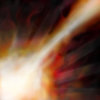
Ima blowing your fuckin' head off!!Slight update on my Far Sight, as well as a Bash WIP.

Frost amour
And a very messy carrion beetle wip
The_Silent, your Earthquake look more appropriate for Breath of Fire, to me, at least. I think we should be able to see some ground/rocks.


It's called finalizing.You guys are so pro, how do you start that bad and make it so excellent at the end?


Are you honestly considering letting people post as many icons as they want (even only judging 4)? That's insanely imbalanced. That gives people with more time or better skills a much larger chance at winning, by crowding out everyone else. Seriously, 4 entries per person.
All in all, I'm seeing loads of really amazing artwork here for icons, but only very few of them (and none recently) look like they would fit into Warcraft 3, to me. :<
I dont understand how you make soo cool logos, this is the best i can make:
The first one i used some textures, the second i followed a pro tut..
(I get the background tho)
No, actually, it's quite unfair and a very poor contest mechanic. Just thought I'd chime in and let you know.Dentothor said:if you were paying attention, the judges only pick the best 4 and judge them. its completly fair.
No, actually, it's quite unfair and a very poor contest mechanic. Just thought I'd chime in and let you know.
@second icon: According to the name, BTNBuildLogo. It's supposed to be a Hero ability.I dont understand how you make soo cool logos, this is the best i can make:
View attachment 54801
View attachment 54802
The first one i used some textures, the second i followed a pro tut..
(I get the background tho)


Denthotor, some of your icons are hardly approved even in the Icon section... They lack a good shape, and when it's not that, you should make outlines to the objects and improve the contrast. Just my opinion...


I agree that each contestant should only submit 4 icons. Having more gives them an unfair advantage because they have more of a chance at getting votes and winning.
If you only have four, than those are the four that are judged.
If you have more than four, than that gives backup icons, which are unfair.
So you want them to pick your worst instead or something?


Bash is as said before an WIP, and Far Sight, well, it's an orc eye. The Far Seer is an orc. And the iris is what he is actually seeing, and that part is inspired by the original.@Terradont
Your bash icon doesn't fit into <acronym title="Warcraft 3">wc3</acronym> theme.
What's with that green eye got to do with far sight?


 comments?
