
- Joined
- Jun 23, 2009
- Messages
- 4,763


Ehmm... No not really joker. ")
Take a look at this sig:
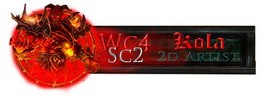
It is one of the first i made, and quality wise i could've made it alot better today.
Mainly 'cause i made it in Photoshop Elements and it was two years ago. ^^
Now, this sig still has some coolness about it.
This is because the design pretty much just works.
It has set borders consisting of a square and a circle, some neat and clear textures and colors that fit in with each other.
And that's all good 'n stuff, but if you just leave it at that it looks BAWRING.
So, an easy and usually pretty good-looking way to make a very defined sig into something that goes KAPOW is to have an image that pops out of these borders.
In this case, we have an awesome image of Kil'Jaeden that 'pops out' of the circle.
By using this technique, you get two very important qualities in your sig:
1: You have a clear and defined border.
Blurry borders can be usefull, but you gotta use them really well and you REALLY gotta know what you're doing or you'l make something that doesnt work.
2: You have something that goes KAPOW. Something that jumps right onto the face of someone that looks at the sig.
This is VERY important as a sig that you have to look at for a few seconds before you realise that is going on has kinda already lost half the battle.
That doesnt mean that the sig cant be blurry at all, and that all the images have to be fully recognizable from eachother and whatnot, but people gotta have a general feeling of what's going on the moment they put their eyes on the sig.
Soeh, that's really all i gotta say for now.

If you got further questions or dont understand something, speak up!
Helping others is basically what i do here.
Take a look at this sig:
It is one of the first i made, and quality wise i could've made it alot better today.
Mainly 'cause i made it in Photoshop Elements and it was two years ago. ^^
Now, this sig still has some coolness about it.
This is because the design pretty much just works.
It has set borders consisting of a square and a circle, some neat and clear textures and colors that fit in with each other.
And that's all good 'n stuff, but if you just leave it at that it looks BAWRING.
So, an easy and usually pretty good-looking way to make a very defined sig into something that goes KAPOW is to have an image that pops out of these borders.
In this case, we have an awesome image of Kil'Jaeden that 'pops out' of the circle.
By using this technique, you get two very important qualities in your sig:
1: You have a clear and defined border.
Blurry borders can be usefull, but you gotta use them really well and you REALLY gotta know what you're doing or you'l make something that doesnt work.
2: You have something that goes KAPOW. Something that jumps right onto the face of someone that looks at the sig.
This is VERY important as a sig that you have to look at for a few seconds before you realise that is going on has kinda already lost half the battle.
That doesnt mean that the sig cant be blurry at all, and that all the images have to be fully recognizable from eachother and whatnot, but people gotta have a general feeling of what's going on the moment they put their eyes on the sig.
Soeh, that's really all i gotta say for now.
If you got further questions or dont understand something, speak up!
Helping others is basically what i do here.
") (without PScs5)
(without PScs5)


 little image

 its nice lol


