Community
Maps
Tutorials
Gallery
Support Us
Install the app
-
Listen to a special audio message from Bill Roper to the Hive Workshop community (Bill is a former Vice President of Blizzard Entertainment, Producer, Designer, Musician, Voice Actor) 🔗Click here to hear his message!
-
Read Evilhog's interview with Gregory Alper, the original composer of the music for WarCraft: Orcs & Humans 🔗Click here to read the full interview.
-
Create a faction for Warcraft 3 and enter Hive's 19th Techtree Contest: Co-Op Commanders! Click here to enter!
-
Create a void inspired texture for Warcraft 3 and enter Hive's 34th Texturing Contest: Void! Click here to enter!
-
The Hive's 21st Texturing Contest: Upgrade is now concluded, time to vote for your favourite set of icons! Click here to vote!
You are using an out of date browser. It may not display this or other websites correctly.
You should upgrade or use an alternative browser.
You should upgrade or use an alternative browser.
Phoenix Trial #5 - Hero Ability Icon Replacements
- Status
- Not open for further replies.
- Joined
- Sep 20, 2008
- Messages
- 445
But blink is real hard to make, anything teleport will look like semi-evade
- Joined
- Dec 1, 2006
- Messages
- 342
- Joined
- Apr 13, 2006
- Messages
- 722
- Joined
- Sep 2, 2007
- Messages
- 3,723
I can't see the mass nor the teleport in your icon =/
- Joined
- Jan 21, 2007
- Messages
- 2,014
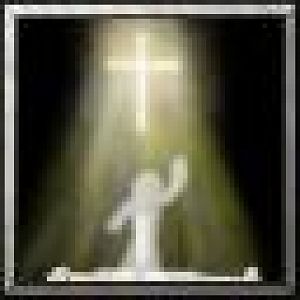
So now it's ressurection and...?
Looks awesome btw.
Looks awesome btw.
- Joined
- Jan 21, 2007
- Messages
- 2,014
Aha, phoenix. 
I just thought it was another holy spell, seeing how they both have about the same color scheme.
I just thought it was another holy spell, seeing how they both have about the same color scheme.
- Joined
- Jan 1, 2009
- Messages
- 874
Niiiiiice
Mr.Goblin
Art & Graphics Design Moderator
- Joined
- May 26, 2008
- Messages
- 4,467
CnP?! perhaps..
- Joined
- Jul 1, 2007
- Messages
- 6,677
Teh CNP is srs bsns, one duz not simpely joke about such mattress.
Mr.Goblin
Art & Graphics Design Moderator
- Joined
- May 26, 2008
- Messages
- 4,467
- Joined
- Apr 27, 2008
- Messages
- 1,050

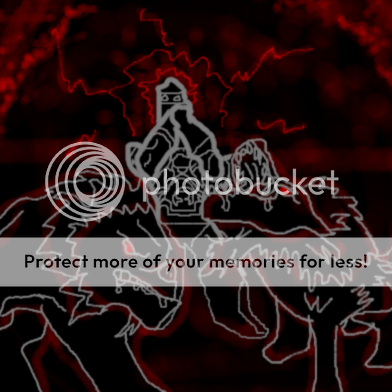
Spirit wolf.
Crap, you took my idea.
Here's my version of it (ITS JUST AN OUTLINE, DON'T FREAK OUT)
- Joined
- May 16, 2007
- Messages
- 7,285
i'd like to try this.
- Joined
- Dec 6, 2007
- Messages
- 2,228
snap, you definitely improved it.
Caeyra, you are using quite generic symbols and represented situations used in nearly any game. That's why we're saying "CnP perhaps"?
Since i haven't seen quite a lot from you before, i'd be glad if you could send me the .psd file. I might be able to give more detailed feedback then.
shaman, just coninue it. The fact that someone else took the same icon to replace doesnt mean that you aren't allowed to make a replacement for the icon as well.
- Joined
- Nov 3, 2006
- Messages
- 8,102
Just put it into a zip archive, then while writing a post,
"Go Advanced", then manage attachments, and just add it there.
"Go Advanced", then manage attachments, and just add it there.
- Joined
- Dec 6, 2007
- Messages
- 2,228
He already sent the psd files to me.
- Joined
- Dec 18, 2007
- Messages
- 1,098
- Joined
- Dec 6, 2007
- Messages
- 2,228
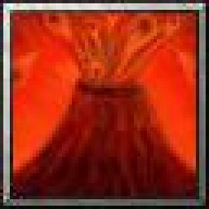
Okay, i added two infernal eyes to my infernal meteor, i thought about adding a mouth as well, but then it doesn't look like a meteor anymore.
Please tell me, which version looks better?


Please tell me, which version looks better?


- Joined
- Jan 21, 2007
- Messages
- 2,014
The eye one looks better, but i wouldn't have seen the eyes if i didn't know it were supposed to have them. I'd recommend making them more noticable.
@Zack. The Incinerate one is far too monotone IMO.
@Zack. The Incinerate one is far too monotone IMO.
- Joined
- Dec 6, 2007
- Messages
- 2,228
Bigger or brighter?
Or another effect?
Or another effect?
- Joined
- Jan 21, 2007
- Messages
- 2,014
I don't know what would look good actually. My guess would be brighter.
Last edited:
- Joined
- Sep 20, 2008
- Messages
- 445
I would make it bigger, the rock itself
see it only is about 25% of your icon atm
i would make it like 75% so you have more room for detailing for infernal
see it only is about 25% of your icon atm
i would make it like 75% so you have more room for detailing for infernal
- Joined
- Dec 6, 2007
- Messages
- 2,228
You can't see that it's a falling rock then 
It would be just the infernal head again and that's pretty unoriginal (nearly no difference between the original icon).
It would be just the infernal head again and that's pretty unoriginal (nearly no difference between the original icon).
- Joined
- Jan 30, 2009
- Messages
- 2,273
Im hopefully going to join this to see what i can do and how far i can go!
Here is My First one for the Pit Lord's: Howl of Terror

Here is My First one for the Pit Lord's: Howl of Terror
- Joined
- Jul 29, 2008
- Messages
- 9,909
Wow... Just wow. I can't believe I missed this for so long, after I was paying attention to the idea thread... Dang. Must be almost over. 
Well anyway, I must say, AMAZING ICONS. Especially Mr.Goblin and bananaHUNT, for how well they fit into Wc3 (and, oh yeah, how AWEXOME they are). bananaHUNT, if you don't release or use that Troll tiki-mask icon soon, I will come to your house and gut you.
Keep on keepin' on, all.
Well anyway, I must say, AMAZING ICONS. Especially Mr.Goblin and bananaHUNT, for how well they fit into Wc3 (and, oh yeah, how AWEXOME they are). bananaHUNT, if you don't release or use that Troll tiki-mask icon soon, I will come to your house and gut you.
Keep on keepin' on, all.
- Joined
- Jan 21, 2007
- Messages
- 2,014

Far sight, not keen on this one, hopefully I can replace it. The bg was supposed to be like the maps on the loading screens, but I don't think that comes across at all.
To be honest, that looks like an icon for a windows 95 education game. (no offence)
I also think it's more fitting for the goblin observe version of the spell, since far sight have a more shamanistic theme.
- Joined
- Apr 30, 2009
- Messages
- 66
None taken. xD
I don't like it that much, I'm not gonna be too upset if others feel the same way.
I really hate the original Far Sight icon, but coming up with an improvement has not proved easy.
Edit:

Maybe more mystical, if not shamanistic. I wanted to add an orcish hand to it, but it's too busy as it is. =/
I think I'ma just pick another icon to remake.
I don't like it that much, I'm not gonna be too upset if others feel the same way.
I really hate the original Far Sight icon, but coming up with an improvement has not proved easy.
Edit:

Maybe more mystical, if not shamanistic. I wanted to add an orcish hand to it, but it's too busy as it is. =/
I think I'ma just pick another icon to remake.
Last edited:
Mr.Goblin
Art & Graphics Design Moderator
- Joined
- May 26, 2008
- Messages
- 4,467
wow dude.. that looks alot like Elenai's style  , wich looks nice btw
- Joined
- Apr 27, 2008
- Messages
- 1,050
Bigger or brighter?
Or another effect?
I suggest making the thing in front of the infernal (the green fire stuff) more glowy and round. Right now it looks to dark to be demonic fire, it kind of looks like as the infernal was falling it hit a disgusting oozeling, which exploded upon impact. And its kind of flat, like the rock is a blade, not a round stone thing. Kind of have the fire overlap the rock a bit more, and it should be fine.
- Joined
- Jan 30, 2009
- Messages
- 2,273
- Joined
- Sep 2, 2007
- Messages
- 3,723
- Joined
- Dec 18, 2007
- Messages
- 1,098
@Dentothor
It looks as if you ripped the icon off Obsidian Destroyer's Devour Magic somehow :S
@DevineArmy
Looks good. Could be more goblin XD. Put lots of buttons and explosive-looking stuff
Anyway, I will work on my icons but I don't seem to be getting much feedback
EDIT: Holy... I just realised that my icon layers got merged when I saved as .tga... Foolish of me
- Joined
- Apr 27, 2008
- Messages
- 2,512
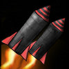
make it a white Missile
- Joined
- Sep 2, 2007
- Messages
- 3,723
kay
In the meantime, I started a new icon
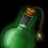
Goblin alchemist chemical bomb spell.
comments on this and on the rockets please.
Ima take a close look at the old rocket icon ...
It wasn't gray ... I remember now.
also ... this kinda is my first bottle thingy ever ... so hints would be very welcome.
In the meantime, I started a new icon
Goblin alchemist chemical bomb spell.
comments on this and on the rockets please.
Ima take a close look at the old rocket icon ...
It wasn't gray ... I remember now.
also ... this kinda is my first bottle thingy ever ... so hints would be very welcome.
Attachments
- Joined
- Apr 27, 2008
- Messages
- 2,512
just fix the glow 
- Joined
- Sep 2, 2007
- Messages
- 3,723
What's wrong with the glow?just fix the glow
I hate the bottle ... I did it wrong =/
- Joined
- Aug 23, 2008
- Messages
- 2,319
The glow is too solid. It doesn't fade away from the bottle, it just suddenly goes from full to 0 opacity. As a glow, it should fade more.
- Status
- Not open for further replies.
Similar threads
- Replies
- 305
- Views
- 36K
- Replies
- 307
- Views
- 34K


