- Joined
- Jan 30, 2009
- Messages
- 2,248

@Dentothor
It looks as if you ripped the icon off Obsidian Destroyer's Devour Magic somehow :S
i based it off of the Obsidian Destroyer's Devour Magic
Follow along with the video below to see how to install our site as a web app on your home screen.
Note: This feature may not be available in some browsers.
@Dentothor
It looks as if you ripped the icon off Obsidian Destroyer's Devour Magic somehow :S


I can understand Holy Light, but the rest doesn't look like their abilities at all. Resurrection and Divine Shield are just the same, except for the border (One is hard, the other sort of fades). The hand was in my opinion not making me think of the ability and its fingers are way too tall to be real. Check your own hand and try to match it with that.


The missile looks too flat.Wipy
rocket launch spell ... the goblin dude has that.


EDITED - I am NOT out.
Probably (Definately) won't win, but I'll give it hell.
Heres second icon for the contest. (Storm Bolt)
https://www.hiveworkshop.com/forums/resource.php?t=126915
Cold... soooo cold,... D:
FROST NOVA!! pew! pew!
War Stomp?! MK!!
Looks like fun. This is what I have so far.

Could this be a replacement for the "Sleep" ability icon?

Opinions please.

Endure Aura
Uhm. What is it? ><
Yeah i will see what i do with endurance, but movement endurance is difficult to make on a small size like this.
Anyhow WIP for Big Bad Voodoo:

Now i have one for quality, one for creativity and one for blizzard style
Okay, i think this are going to be my entries, but i will work on remakes and the other versions.
For now, this is what i got:
BTNRainOfFire

BTNInferno

BTNHolyLight

BTNSilence

The quality will be even better, since his are .jpg images.
I've already lost (my icons suck Dbut here they are.

From left to right,
Hurl Boulder
Storm Bolt
Monsoon
Critical Strike
hum.. vampiric aura?
EDIT = DEAD AND DECAY!
Here's a WIP from me, guess the spell and win a hug.
Hopefully it will retain some detail when reduced to 64x64")
V1:
V2:
Is it too similar to the blizzard icon? =/


Aww, you forgot mine.
Anywho and anyways, here's my version of Death Coil and Searing Arrows!


No green wolves? ;]
And if Bliz can have purple, I can have green, no? ;]
In all seriousness though, thanks a lot for the crits, Hawkwing. Of the two spirit wolf icons, I do prefer the first I made, but it was mentioned it was generic looking, so I tried to approach from a different angle. I really had trouble with showing the teeth, as you can see. I'll work on them a little, and see if I can improve on them.
For resurrection I changed from the hammer and crown symbol to a dude rising up
It looks bad. The problem is the drawing itself. The demon hunter looks too weird there. His pose doesn't suggest evasion...evade wip.
i think ima replace the weird looking sword with an arrow.
I know it's very bright ... was just playing with exposure shit.
It looks bad. The problem is the drawing itself. The demon hunter looks too weird there. His pose doesn't suggest evasion...
also his shape is pretty deformed, like horn-shaped ears and straight lines in the abs outline
@Denthotor, looks interesting, but will hardly fit <acronym title="Warcraft 3">wc3</acronym>
I didn't mean the effects, but the drawing. The shape is messed up. Avoid using lines, the visible side in his belly looks weird. The ears are weirdly upwards looking like horns, if weren't by the purple color.The contrast shit did fuck up the shadings ...
I don't see what you mean with the hornshaped ears ... I made em like samwise does.
deng, thats reallly good.
id like to see the full pic.
Hawkwing? I wan't sum damn'd reviews too.
edit: evade wip.
i think ima replace the weird looking sword with an arrow.
I know it's very bright ... was just playing with exposure shit.
So here is My Icons So Far
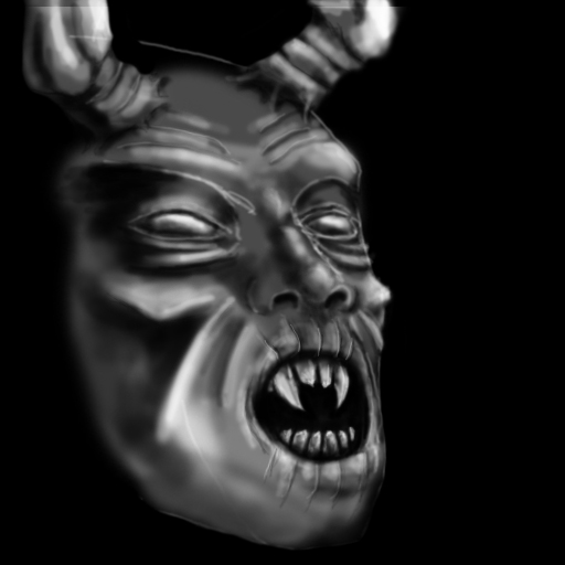
Howl Of Terror:

Mana Drain:

I think the problem with the second one is that it doesn't look feral enough. Look at the cheek hair on the original one for example.


thanks! im just sad that i still have little to show at the moment lolzI like your style
This is the full pic.
I've been working in 64x64 because in my experience, when I shrink something down, I'm always horribly disappointed by how it looks. >_<
Evasion kind of looks like he's been surprised by someone tapping him on the shoulder with a sword than him evading anything. =/
I also agree that the lines defining his muscles are too...defined, for lack of a better word. >_< You want to show the shape of his form with light and shadow, not hard lines.
Howl of Terror is my favourite of yours, it looks awesomely gruesome, and I like how wet and shiny the tongue looks.
Mana drain looks pretty good, they way you rendered the mana looks awesome, but maybe you could show it actually entering/being absorbed by the hand? Just a suggestion.
Old:
New:
Any improvement? I think it looks a little meaner, at least. Still prefer the one with the moon though.
Thanks again to everyone offering help/suggestions.
The mouth on the new one is better at least. The cheek hair looks a little messy now though.
Hawkwing, could you critique my Death and Decay WIP?
~Snap


