• 🏆 Texturing Contest #33 is OPEN! Contestants must re-texture a SD unit model found in-game (Warcraft 3 Classic), recreating the unit into a peaceful NPC version. 🔗Click here to enter!
  • 🏆 Hive's 6th HD Modeling Contest: Mechanical is now open! Design and model a mechanical creature, mechanized animal, a futuristic robotic being, or anything else your imagination can tinker with! 📅 Submissions close on June 30, 2024. Don't miss this opportunity to let your creativity shine! Enter now and show us your mechanical masterpiece! 🔗 Click here to enter!

Joining the Texturing Contests - A decade too late!

Level 25
Joined
Dec 30, 2007
Messages
1,549
In the name of the Light, I boop you!
135529-447e6f464f7f9f41d1ab32fca8c09b83.png
 
Last edited:
Level 25
Joined
Dec 30, 2007
Messages
1,549
I can’t figure out what to do next. I don’t want to do the #4 Chaos Warrior, as the model doesn’t inspire me at all the UVs are weird. I’m not doing any festive stuff, as I really don’t like that either, so #5 Halloween is out of the question as well.

And I did something horrible just now, I opened up an old hard drive with a lot of old stuff on it and I might consider “stealing” some of my old ideas and remake them for this "event". And yes, this is for my own suffering and yours as well! <3

#7 Holy/Angelic
A gender-bent Dragonhawk Rider or whatever it’s called, into a Priestess of Elune. The UV is horrible however. This is rather recent - 2016 - but as you can see, I didn't do much with it.
Showcase_PristessOfElune.png


#8 Fiery Demonic/Fire
A very old texture with remarkable quality compared to some of the stuff posted here, Magma Gnoll! This is from 2010 and probably the only thing I can look back upon without feeling dizzy.
Showcase_MagmaGnoll.png


#10 Opposite
Look away, this might hurt your eyes! But the idea is solid for this one, “Land and Air”. But instead of making them pure opposites, such as warm and cold, they’d be combined for some sort of “morph-friendly" bonus. This is from 2009 with additions apparently appearing around 2010 and 2014. Changes not posted here, I've no memory of ever returning to this, but the changes are substantial.
Showcase_Shapeshifter_Land.png

Showcase_Shapeshifter_Air.png


#12 Naga
I’ve always loved when people convert standard units into nagas, for some reason. Over the years, I’ve tried it myself but never finished. From top to bottom; 2011, 2012, 2013. I actually like the face for the gnoll in 2D format, way better than I remember.
Showcase_NagaFlying.png

Showcase_NagaPristess.png

Showcase_NagaGnoll.png


#0 Extra
The younger me loved demon ladies with boobies flapping about, so I'll post one of them here as an extra. The others are even worse than this one, dates range from 2008 to 2012. I've no idea if I could "force" one of these into one of the contests and I've already made the Harpy Demon. But hell, this is fun!
Showcase_DemonTracker.png


That's enough for now. If you think I should remake anyone of these, make yourself heard. I can't make up my mind on what to do anyway. Though, another Harpy seems rough.
 
Last edited:
  • Like
Reactions: San
Level 25
Joined
Dec 30, 2007
Messages
1,549
Boop!

Those are all pretty great. I particularly love the idea of a gender-/race-swapped Dragonhawk Rider, and the current WIP looks great.

Don't feel bad about using old stuff; it's not like you didn't draw it in the first place. : )
Most of my old works scare the crap out of me x'D

And yes, I like the idea of the gender swapped Dragonhawk Rider as well, but I took a look at the UV layout and it's a horrid mess. Not that a good UV map is something we have in WC3 anyway, but this is real bad. Here's a first attempt at the humanoid:
PristessOfElune.png

Added the skin color change as I'm not sure if I should go for the goofy pink a la World of Warcraft or the paler blue-purple more often found in WC3. As for the armor... Yes, boob plates, deal with it. And it drains me to work with this one, there's so much stuff sharing UV space in weird ways that drives me insane.

And please, don't mind the ugly face, I'll try to brush it up in a later state. Oh, and the upper lip and underside of the nose share like 1 pixel on the UV map...
#12 - Tyrandae FOR sure!
Really? I guess I could give it a quick overhaul as well. I really dislike the lack of detail of her face however. Hard to work with and always end up looking weird :p
 
Last edited:
I kinda like it. Would love if there's 1 more color and some more details like other materials (armor, bracelet, amulet etc.) I would like to see how this will turnout. Good luck!

Oh btw can't find a theme that's interesting for me. XD
yep, kinda on it.. TC is going to be cloth, we'll have some wood, lill ivory, skin.. but the majority of the boar is black, as far as i can see on google

lemme know where a new color could be added, but to not change the boar pelt

also.. need ideas? demonize Apheraz :xxd: aka RoC sorceress texture
 
Level 34
Joined
Sep 17, 2010
Messages
2,744
yep, kinda on it.. TC is going to be cloth, we'll have some wood, lill ivory, skin.. but the majority of the boar is black, as far as i can see on google

lemme know where a new color could be added, but to not change the boar pelt

also.. need ideas? demonize Apheraz :xxd: aka RoC sorceress texture
:eek: It's a boar? i thought it was a wolf u_u
 
lmao you got me there. I forgot about the footman wrap, well it is much easier than Mountain Giant's wrap (disaster, if you don't have a direct paint tool like 3dcoat) :p
i guess.. some wraps are tripping even harder

Alright, I'm going with Footman. Here is a WIP.
that is looking cool..
 
Level 25
Joined
Dec 30, 2007
Messages
1,549
View attachment 295258 View attachment 295259
alright @Arowanna , what do you think so far? ( shaman has some very derpy shoulders.. )
My main concern in the last WIP was the lack of highlights, but its already a lot better. And instead of taking sole inspiration from reality, I'd take a look at Quilboars and Boars in WC3 and WOW equally.

My main concern would be the colors. While real boars are indeed monotone, Warcraft in general features a lot more vivid colors. I'll add a quick dump here and try to explain what I'm after.

upload_2018-4-4_23-51-31.png


1. This model is composed of three main colors; pink, brown and blue. The blue and pink parts is there to break up the monotony and the brown parts varies from bright beige to red. I'd suggest doing something like this, add more colors into the large chunks of fur/leather. Begin with picking two - max four - base colors to use.

2. This might not be a problem when you've added muscles, but your current base colors, purple and desaturated brown does not contrast each other that well. I've a hard time with this myself, but I'd strongly suggest either changing the base leather or skin color.

3. Don't mind this too much, it's a quick color overlay and let me first note that I don't like this idea, but it proves a point; it increases the contrast between the skin and fur. And I just really love the "naked snout" of the WOW Boars and Quilboars, but that's personal opinion.

4. I just don't buy the folds here, they're very deep and reminds me more of how silk would fold than leather. While we can work leather into a rather soft material that allows for frills and folds, it just doesn't sit well with me in WC3. That is of course personal taste sneaking into it again, but I'd try to straighten or give the whole lower body a more "fur feel".

Beyond that, I really like where its heading, keep up the good work!

PS It's late here and I haven't slept in forever, so there might be some snark here. Sorry in advance.
 
Level 25
Joined
Dec 30, 2007
Messages
1,549
@PrinceYaser you've asked me before and I've answered. Here's the general gist of the matter: Alpha Skinning

Download ~Nightmares Dragon Slayer for a good example. Look at the shield in the Alpha layer, it should answer your question in combination with the 'Alpha Skinning' tutorial.

@Misha you don't have to listen to anything I say unless you think it helps.
 
Level 25
Joined
Dec 30, 2007
Messages
1,549
You've converted it to a .JPG, always use .TGA for WC3 textures. The Alpha Layer should look like this:
upload_2018-4-5_13-45-37.png

On the left side you've the raw data, on the right side you've the alpha and color layers visible. All models have predetermined polygons - or rather triangles - that supports TC. The Footman has a quite a few: shoulders, shield and greaves (boots).

I.e. you can't add TC wherever you want, you still have to adhere to where the modeler made it possible. It's further explained here:
Team Color in 3DsMax 5
Adding Team color to your model using mdl - Wc3C.net
 
Last edited:
You've converted it to a .JPG, always use .TGA for WC3 textures. The Alpha Layer should look like this:
View attachment 295685
On the left side you've the raw data, on the right side you've the alpha and color layers visible. All models have predetermined polygons - or rather triangles - that supports TC. The Footman has a quite a few: shoulders, shield and greaves (boots).

I.e. you can't add TC wherever you want, you still have to adhere to where the modeler made it possible. It's further explained here:
Team Color in 3DsMax 5
Adding Team color to your model using mdl - Wc3C.net
Understood. Thanks, m8! :)

Alright, here is my final entry.
Forsaken Lieutenant | HIVE
 

Kyrbi0

Arena Moderator
Level 45
Joined
Jul 29, 2008
Messages
9,514
All models have predetermined polygons - or rather triangles - that supports TC. The Footman has a quite a few: shoulders, shield and greaves (boots).

I.e. you can't add TC wherever you want, you still have to adhere to where the modeler made it possible. It's further explained here:
Team Color in 3DsMax 5
Adding Team color to your model using mdl - Wc3C.net
Thanks for the tips; I've had some trouble recently trying to get to the Alpha layer.

Also, just a note that you can add TC wherever you want, as changing the model to support it in (almost) any given geoset is extremely simple. .... Though, I realize that for a Texturing-only challenge, yeah, you're stuck. ; )
 
Level 25
Joined
Dec 30, 2007
Messages
1,549
Looking a lot better, keep at it!

Understood. Thanks, m8! :)

Alright, here is my final entry.
Forsaken Lieutenant | HIVE
Added to the list!

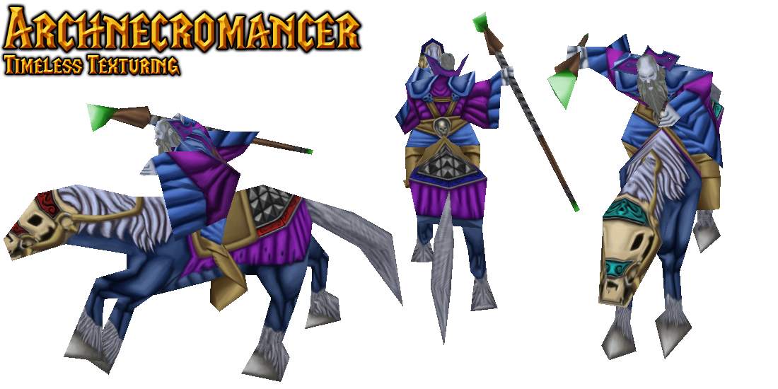
This has little to nothing to do with the texture, but presentation is important in art; I'd strongly suggest changing the preview picture. It's impossible to read what's going on with blur effect, framing and the massive Arthas(?) picture at the top. Whilst the trading card gimmick is a fun idea, it's way to cluttered for a good presentation at the moment. Remember, your art is also judged by its presentation.

Very quick analysis (yes, I'm taking this way to serious...)

upload_2018-4-5_20-25-54.png


Your current focal point - where the viewers eyes are lead - is on Arthas chin, instead of your actual work. The trading card framing also creates two parallel artworks. In this case Arthas and your work, but you're once again lead away from your work due to the blur effect creating too much distraction and little to rest the eyes upon.

Then I'd consider the text as well. You've two different framings for the two different texts presented. Your username uses the frame of the artwork as a frame. This gives the idea that you're taking credit for the art in the top frame. I guess you want to create the idea that Arthas is you and you're presenting yourself, but this is not the effect it creates.

The "Timeless Texturing" has its own distinct banner as a frame. This vastly different presentation creates inconsistencies and I'd strongly recommend moving your username a) outside the art itself b) take another queue from trading cards and move it to the top-left c) drop it all together.

Anyway, this is far from on-topic. Moving on.
 
Last edited:

Moy

Moy

Level 49
Joined
Jan 25, 2011
Messages
2,382
@PrinceYaser It looks very rushed, to be honest. And again, please use more colors - right now it looks very monotonous. The metal materials looks great however I really feel that there's so much metal which has random design. I suggest to search for armor designs (like concept arts or 3d models) on google. There were little added TC which couldn't be seen in game. The shield design was very random tho and looks familiar :p Would like to see a unique concept. Try to combine themes you like the most like nature + fire, ice + fire, egyptian + any other team etc

@Misha That's what I like - Bruno Mars :xxd: The texture is very not Misha is that even you? Joking aside, I like it very much than the old one. Loving the nose

@Arowanna you showed how messy I am with alpha layers :xxd:
 
Level 25
Joined
Dec 30, 2007
Messages
1,549

Moy

Moy

Level 49
Joined
Jan 25, 2011
Messages
2,382
@~Nightmare so, i get comfy with drawing on a tablet, and suddenly i'm not myself? :xxd:

silliness aside, i'm gonna take a look later if i can cover that boar nose/lips lower area with a few bristles.. they kinda feel too clean Ouo
also, did i do a good job on the TC cloth..?
TC was put in good use, meaning it is splendid. But it looks naga-ish because TEAL, wonder how it looks with other colors tho.
 
@PrinceYaser It looks very rushed, to be honest. And again, please use more colors - right now it looks very monotonous. The metal materials looks great however I really feel that there's so much metal which has random design. I suggest to search for armor designs (like concept arts or 3d models) on google. There were little added TC which couldn't be seen in game. The shield design was very random tho and looks familiar :p Would like to see a unique concept. Try to combine themes you like the most like nature + fire, ice + fire, egyptian + any other team etc
Thanks for the review! I'm working on that. Here is a progress on the shield:

fl-01-png.295910


Does anyone know why the sword and eyes got black? :/
 
Last edited:

Moy

Moy

Level 49
Joined
Jan 25, 2011
Messages
2,382
@PrinceYaser Oh it looks good. But I suggest working on the gold trim as it blends with the wood. Another option is to make the wood less shiny as it tends to look metallic. Another one is to decrease the size of the trim it takes so much attention. Also remember that the shield has tc also :)

Does anyone know why the sword and eyes got black? :/
Save it in tga format when saving i think choose the last one with 32 in it. I don't know if it is 32 pixels but it should have 32 in it, just tick the checkbox :xxd:
 
Last edited:
Top