• 🏆 Texturing Contest #33 is OPEN! Contestants must re-texture a SD unit model found in-game (Warcraft 3 Classic), recreating the unit into a peaceful NPC version. 🔗Click here to enter!
  • It's time for the first HD Modeling Contest of 2024. Join the theme discussion for Hive's HD Modeling Contest #6! Click here to post your idea!

Joining the Texturing Contests - A decade too late!

But I suggest working on the gold trim as it blends with the wood. Another option is to make the wood less shiny as it tends to look metallic. Another one is to decrease the size of the trim it takes so much attention. Also remember that the shield has tc also :)
Thanks! :)
Save it in tga format when saving i think choose the last one with 32 in it. I don't know if it is 32 pixels but it should have 32 in it, just tick the checkbox :xxd:
Yes, fixed. It was in 24 pixels.

A progress on the armor:

fl-02-png.295909
 
Last edited:

Moy

Moy

Level 49
Joined
Jan 25, 2011
Messages
2,382
Warcraft 3 Footman - Terrible Wrap :xxd:

I am really suggesting to at least take inspirations from different armors and combine them to make a unique one. It looks very random and mushy at the moment. I'm liking the shield btw, the highlights could be reiterated - Remember that lights come from above. Also loved that helm.
 
I am really suggesting to at least take inspirations from different armors and combine them to make a unique one. It looks very random and mushy at the moment.
Really? I took some references this time but seems it is still random. Could it be cause of wrap? Lol

TELL ME AT LEAST IT'S FAR MORE BETTER THAN THE OLD ONE XD

forsaken-lieutenant-jpg.295958
 
Level 25
Joined
Dec 30, 2007
Messages
1,549
@Arowanna are you tracking my wips?
In the main post? No, the main post massive and it's a pain to edit. I've settled with referring people to the first WIP posted; main reason why I do this. If people object to this, I could take the time and add the latest WIP to the main post. However, it would be far less time consuming for me personally if people could update their first WIP post, treating it like a "internal WIP thread" or whatever for further reference. I'll add a side note in the main post regarding this.

As for following your updates? Yes, I usually check this thread daily. But I don't speak unless I'm addressed :p

Edit 1
@Archian is it possible to rename this thread? The current title really doesn't fit anymore. Or would a renaming break links referring to this thread?

Edit 2
Added the 27th contest to the table. I'll start the documentation of judges as well, it'll take some time however.
 
Last edited:
Level 25
Joined
Dec 30, 2007
Messages
1,549
@Arowanna naa, as long as you add the finished thing to the main thread, as you're doing currently, ( i think..?) I'm all fine ^^
Ye, I try to keep the latest, finished product up to date in the main post. I don't always notice when people update their preview images however, and the "main image" disappears. But I try to update it as fast as I notice it.
 
@PrinceYaser fixed! And the new WIP looks interesting, what previous contest is it being made for?
Thanks! Texturing contest #7.

Edit:

It's done. My hands are just fucked up finishing this texture using a shitty mouse! Here is it anyway.

dw-previewtransparent-png.296282
 
Last edited:
Level 25
Joined
Dec 30, 2007
Messages
1,549
Sorry for the delay, found ethanol. @Wildfire entry added to the list, keep at it! :)

And I might as well post this here, as I still haven't come up with a good idea for the current Texturing Contest:
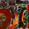
ShapeshifterLand.png

My attempt at a remake of this, #10 Opposite. Have I whined about how bad the Succubus UV is? No? It's shit. And I covered the face with black because I can't draw feminine faces. And I've made a tutorial on how to utilize 3D Coat for WC3 retextures. Read utilize, not how to get good at 3D Coat, merely how to utilize it for WC3. Preferably without archaic software.

I'll upload the tutorial to the Tutorial Section once this textures is done. And once I've cleaned up the drunk rambles.
 
Level 25
Joined
Dec 30, 2007
Messages
1,549
The *.JPG works just fine.

If you're working with the *.JPG format, I strongly advice against it! Work with either *.TIFF, *.TGA or *.PSD depending on what software you're using. *.JPG basically degrades each time you save it, you won't be able to use the Alpha channel for team colors and this. Plus, the *.PSD format allows you to save your layers.

I'll add my feedback as soon as I've time!
 
Level 17
Joined
Sep 6, 2017
Messages
185
@Wildfire sorry for the massive delay, I've had a lot to do and participated in the Texturing Contests, so I didn't really have time to construct my feedback. Just wondering, before I start, is the skin of the Keeper of the Grove suppose to be stone? Or is it skin, fur or something similar?
The body is skin, the parts of limbs are stone.
 
Level 25
Joined
Dec 30, 2007
Messages
1,549
Added to the list!

Sorry for my, again, late response. I have had a lot to do lately, I think I'll have to skip my "in depth" critique of this one or at least wait until I have more time on my hands.

Anyway, I can throw some of my thoughts out there:
1. I guess that you use pure white and black for highlights and shadows? I would strongly advice against this, as it only dulls the the color, but barely brings in any contrast. Learning how to use a triad of colors or simply complementary colors will help a great deal to increase the contrast of your work.

This tool can help a great deal to help with the process. Sinix Design usually tries to cover this in his series 'Paintover Pals' as well, here is the most recent example. I strongly recommend his channel in general, as it covers a whole lot of basics that most people seemingly ignore or miss.

2. The metal for the Fire Demon sticks out like a sore thumb. I would guess that you're trying to capture the metal textures of WC3 Humans in general? I would recommend bringing in some reds and oranges to the mix. The strong yellow/gold rim and blank metal doesn't meld with the rest of the texture. It just looks to "smooth" and "pristine" compared to the rest of the texture work.

Beyond that, I really like the results!
 
Last edited:
Top