Its nice explanation, i agree with that. I would expand it a bit.
I mean if Reforging models different from original alot with style + imagine how skins would look alike + if they go different icons (not talking about unit icons right now) ,and anims different than wc3,then i am afraid we wont be able to recognize game anymore ?
We will need to play alot of time to get used to it (always remembering how old one looked...).
This can produce a psihologicaleffect that can can cause a great dissatisfaction .
I passed many stages in my purist ego, i must say that i realised that sc2-wc3 assets that look almost 100% same as old wc3 will make you bored after a while....
Still going totally different style than old wc3 can lead to rage. We need some middle, like hd mods tried to do, using different platform art but trying to reach original...
and they can do it x15time better than us.
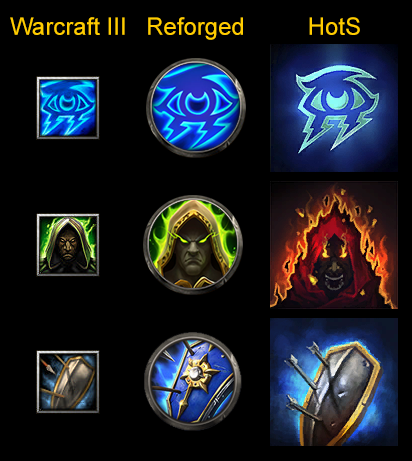
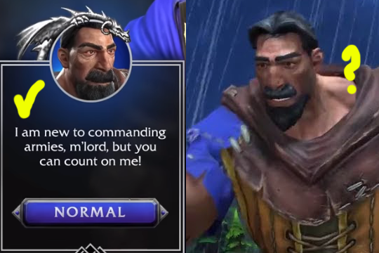
We need them to hit that old charm, like reforged did with human peasant ICON ?
I saw Reforged icon and model probably use same base,but i cant surely tell is it 1 single same model with
a)different angle shoot camera of real model and icon
b)with different processing of real model and icon
c)different anims of wc3 animations on real model...
Cause i want human peasant look same as his icon of Reforged (lets assume his icon is shoot of real model with wc3 anims????)
Anyway, we are fine, i accepted new "pegasus pony casting rainbowspell" philosophy, and i will stick to it alot, trying to stay positive hoping my bolt of positive energy will be shoot in universe and then strike back to dev minds.
We are good, we are fine, we are strong, we are safe, we work with passion, we work hard, we discuss models in caffe bar after shift ends, when we go to town and drink beer together we make lore jokes! And we love this game and we will do it the best we can, and we will listen community voice!
We will bring you the best product you will enjoy in next few years - Your lovely Lemonsky studios.