• 🏆 Texturing Contest #33 is OPEN! Contestants must re-texture a SD unit model found in-game (Warcraft 3 Classic), recreating the unit into a peaceful NPC version. 🔗Click here to enter!
  • It's time for the first HD Modeling Contest of 2024. Join the theme discussion for Hive's HD Modeling Contest #6! Click here to post your idea!

Warcraft III Reforged - Artistic/Textures/UI Feedback

Status
Not open for further replies.
Damn, those icons really suck :/ They're just hard to "read", it's not obvious at first glance what they represent, especially the building icons.
Unlike the original icons where you can see instantly what the icons are for.

The blue blackground makes this even worse, it makes the icons look like a blurry mess.
They're cramming way too much detail into what looks like tiny 32x32px (or 48x48?) buttons.
 
Level 7
Joined
May 26, 2017
Messages
127
I added one more example with Blacksmith upgrades.

Damn, those icons really suck :/ They're just hard to "read", it's not obvious at first glance what they represent, especially the building icons.
Unlike the original icons where you can see instantly what the icons are for. But yes, maybe they have too much detail, what bothers me is that some icons have brightness in the background and others don't.

The blue blackground makes this even worse, it makes the icons look like a blurry mess.
They're cramming way too much detail into what looks like tiny 32x32px (or 48x48?) buttons.

It is very important that you keep in mind that the icons that I add of the Reforged are screenshots from the Youtube gameplay... so the image quality and its size is not the real one.

Long rifles had a bayonet? At least, does the new model have one?

Yes, the model has a bayonet.
 
Level 7
Joined
May 26, 2017
Messages
127
Did they even change the icon placements?

Then, the icon change is OK. They could add a bayonet attack animation for custom game making.

No, they don't.
I mean, on Reforged the icons are 1x4 not 2x2.

7.png
 
I agree with you, we need a style that does not stray too far from the original Warcraft. At the moment with the little information we have about the game I'm afraid we can only think that we won't able to recognize the game, I mean: new artistic style, new voices, new dialogs, "new" campaign maps (Culling of Stratholme)... too many drastic changes that do not respect the original game (it's still too soon to say but...).

In my opinion the assets of the Stracraft II were the natural evolution of the classic models of Warcraft III (especially the Heroes, which are more worked than the normal units) and look great...
If everything goes wrong we can import them into the new lighting system of the Reforged, right? :grin:

For example, the Energy Pendant icon was easily recognizable but now it does not respect the original icon and it is also very boring and generic.


Another example, I think the icons of the Human buildings capture the essence of the originals although I am not a fan of the blue background brightness (the Blacksmith does not have it, the rest of the buildings yes... wtf?)


The point is that there are things that they respect, others that they adapt (with more or less fidelity) and others that are totally separate from the original concept... That's when we have the problem, the conglomeration of good and bad ideas is something that we can not afford.

PD: Another example.


Oh dear god now i am rly pissed off, all who played wc3 grew up with wc3 icons. Ye i must use those ridicilous words, cause they are small size and they MUST be recognizable. Theres absolutely no need to spam some superman art with super details.
We saw some of icons from hots are faitfull to original wc3. its how they were upscaled and repaint over it...

Icons must be 100% purist done in HD manner and recognizable.

And the biggest reason is not only recognision : ITS THERES HUNDRED OF ICONS IN WC3. WHERE YOU EVEN DONT KNOW THEIR NAMES OR FUNCSTION!
BUT YOU RECOGNISE THEM VERY FAST CAUSE OF VISUAL MEMORISING!

If reforged goes those new icons, bloody hell, i wont be able to use visual element of recognising cause its totaly different art, also i wont be able to even examine and guess whats inside icon iause they are super detail spam - its another recognision element...
 
Last edited:
Level 7
Joined
May 26, 2017
Messages
127
Oh dear god now i am rly pissed off, all who played wc3 grew up with wc3 icons. Ye i must use those ridicilous words, cause they are small size and they MUST be recognizable. Theres absolutely no need to spam some superman art with super details.
We saw some of icons from hots are faitfull to original wc3. its how they were upscaled and repaint over it...

Icons must be 100% purist done in HD manner and recognizable.

And the biggest reason is not only recognision : ITS THERES HUNDRED OF ICONS IN WC3. WHERE YOU EVEN DONT KNOW THEIR NAMES OR FUNCSTION!
BUT YOU RECOGNISE THEM VERY FAST CAUSE OF VISUALITY!!!!!!!

I'm sorry, I made you angry :oops:
 
It is very important that you keep in mind that the icons that I add of the Reforged are screenshots from the Youtube gameplay... so the image quality and its size is not the real one.

Oh, I didn't realize that. I guess they will look better at full size/quality. But it still seems like they're less recognizable and distinct than the originals, making the game less intuitive to play. They should definitely get rid of the colored backgrounds, and be careful not to add too many details into them.
But I'll reserve judgement until I see a full-sized ingame screenshot or something.
 
I'm sorry, I made you angry :oops:
You slap me in the face, with the truth...But its fine, we discuss about it provide feedback, i am shocked - my new philisophy didnt work on this...

Well if we speak about buildings and units, we can justify it like this : They shoot the portrait screenshot and then make icon out of it. Probably unit icons paint a bit..
I mean lets say we forgive them, cause when you pick a unit by clicking an icon, you will kinda know its Archmage for example..Visualy you will be able to remember old one (new one wont look like santa claus for sure) , using mind you will know that unit is in human altar, and you will easy compare with other units icons...
Buildings kinda slightly harder but you will be on the track...

But icons for items,spells etc...Can not be tolerated...Must be purist.
And when we come to custom game part if they go this style for icon of items,spells = its over -.-

Massive majority of people do not even read spell names,item names, they just cast spell see what it does and visually remember how icon look.
Similar with items, they check stats and remember visualy how icon of it looks...

With those kind of icons i will have to read what that item or spell deos jsut because i visualy dont any bloody idea what it is and cant visually connect with old one cause of new art, and be afk ingame destroying it , learning all over again ...
Comon...
 
Last edited:
Level 7
Joined
May 26, 2017
Messages
127
You slap me in the face, with the truth...But its fine, we discuss about it provide feedback, i am shocked - my new philisophy didnt work on this...

Well if we speak about buildings and units, we can justify it like this : They shoot the portrait screenshot and then make icon out of it. Probably unit icons paint a bit..
I mean lets say we forgive them, cause when you pick a unit by clicking an icon, you will kinda know its Archmage for example..Visualy you will be able to remember old one (new one wont look like santa claus for sure) , using mind you will know that unit is in human altar, and you will easy compare with other units icons...
Buildings kinda slightly harder but you will be on the track...

But icons for items,spells etc...Can not be tolerated...Must be purist.
And when we come to custom game part if they go this style for icon of items,spells = its over -.-

Massive majority of people do not even read spell names,item names, they just cast spell see what it does and visually remember how icon look.
Similar with items, they check stats and remember visualy how icon of it looks...

With those kind of icons i will have to read what that item or spell deos jsut because i visualy dont any bloody idea what it is and cant visually connect with old one cause of new art, and be afk ingame destroying it , learning all over again ...
Comon...

Obviously if we were able to see the icons of the buildings in their real resolution maybe we would not have so many doubts about them. Still, surely without that background with color and brightness will be much better even drawn from another angle.

I have good news for you, there are icons of items that respect 100% the original ones...


11.jpg

I know that the new icons look very low in the image (I remind you that I capture them from the gameplay), but I think we agree that except the health potions, the others are very loyal.

Now we know that they CAN DO IT, they can REFORGE the old icons with more resolution...

Why do not they treat all the icons the same?

Why do some icons change and others not?

What the hell is going on?
 
Last edited:
If they recreate all icons in that style (the health potions redesign is fine too IMO), I'm fine with it.
However, they suffer from the same problem (imo) that the entire game has so far: the color saturation is very low. They look drab and unattractive. One of the things that made WC3 visually appealing is the almost cartoonish color schemes.

Why do not they treat all the icons the same?

Why do some icons change and others not?

What the hell is going on=

100% agreed. Mixing and matching visual styles and differing approaches to redesigns will result in a messy and incoherent feeling while playing the game.
But we do have to assume that the game is still in its early stages, hopefully they have a decent art director that will make sure this doesn't happen.

I also agree with kantarion. If they change the icons too much, existing custom games will have a lot of icons that no longer fit their function.
 
Last edited:
Level 7
Joined
May 26, 2017
Messages
127
But the number is too big making some icons barely visible...

Of course, but you can not deny that (even with the low quality of the image, the small size of the icon and the large size of the number) the Rod of Necromancy, the Ring of Protection and the Robe of the Magi, are almost equal to the originals...

You're right that the number is too big but that's because the Reforged UI is also smaller. They said that the UI had a lot to change to its final state so this probably has already changed.

999.png

If they recreate all icons in that style (the health potions redesign is fine too IMO), I'm fine with it.
However, they suffer from the same problem (imo) that the entire game has so far: the color saturation is very low. They look drab and unattractive. One of the things that made WC3 visually appealing is the almost cartoonish color schemes.


100% agreed. Mixing and matching visual styles and differing approaches to redesigns will result in a messy and incoherent feeling while playing the game.
But we do have to assume that the game is still in its early stages, hopefully they have a decent art director that will make sure this doesn't happen.

I also agree with kantarion. If they change the icons too much, existing custom games will have a lot of icons that no longer fit their function.

I also like the potion icons.

About the saturation: a month ago I uploaded a photo comparing the different doodads (WC3RExamples | HIVE) and if you look, all the screenshots I made of the gameplay seems like bleached ... I do not know if it's something from the YouTube video itself, something from the game or what, but it always happens... Probably the game does not look like this
 
Last edited:
I really think that the art director would be able to stop this mixing of styles like shown here they have done very nice new icons exact same like original while others are looking like something from another game, I think that whole 'new artsyle' thing must be reduced to the point of what they have done with buildings, they are still looking like Warcraft III and not looking like overdosed realisim they have done to armor while adding anime faces to heroes/units
 

deepstrasz

Map Reviewer
Level 69
Joined
Jun 4, 2009
Messages
18,836
You're right that the number is too big but that's because the Reforged UI is also smaller. They said that the UI had a lot to change to its final state so this probably has already changed.
I think the issue is they are doing this instead of putting the camera a bit up so you'd see more. Now, they are cluttering icons in the lower side of the screen cutting parts of the UI to increase game visibility keeping the original camera view.

overdosed realisim they have done to armor while adding anime faces to heroes/units
The details maybe because no sane human wore such an armour reducing visibility and putting weight on shoulders. They're medieval warriors, not tanks.
 
Obviously if we were able to see the icons of the buildings in their real resolution maybe we would not have so many doubts about them. Still, surely without that background with color and brightness will be much better even drawn from another angle.

I have good news for you, there are icons of items that respect 100% the original ones...


I know that the new icons look very low in the image (I remind you that I capture them from the gameplkay), but I think we agree that except the health potions, the others are very loyal.

Now we know that they CAN DO IT, they can REFORGE the old icons with more resolution...

Why do not they treat all the icons the same?

Why do some icons change and others not?

What the hell is going on?

Ya its close its going in 100% direction for sure, anyway we can easy figure out what it is.

I would agree that on smaller icons with those numbers (cause of ui) can additionaly destroy visibility and recognision...
Maybe for alternate UI they expand,enlarge "item tab" and delete those brick borders...
If do so would that leave a possibility item icons could be Larger ???

Honestly lol, more and more when i compare those icons i start believing old wc3 is ancient art or arhitecture (lets say " gisa pyramids") that couldnt be replicated ever by anyone even in this modern age xD...
And i always want HD wc3 lol..

Shuting down my purist ego,before its too late
3..
2...
1....

Goodnight
 
Last edited:
Level 14
Joined
Jan 16, 2009
Messages
716
cloack.PNG

They don't know how a cloak works so they thought it was horns...

consistency.PNG
At least there is a consistency between 2D and 3D in making thing less readable and more cluttered.

cheap.PNG
The famous peasant lost all his charm and silliness for this.


A good idea would be to be able to pick and choose what elements you want to keep from the original. Like you could play with the new models and the new musics but with the old icons and voices.
 
View attachment 318442
They don't know how a cloak works so they thought it was horns...

View attachment 318443
At least there is a consistency between 2D and 3D in making thing less readable and more cluttered.

View attachment 318444
The famous peasant lost all his charm and silliness for this.

Yeah, imo it's obvious Reforged art is being made by people who don't understand what made WC3 (or any RTS) visuals good in the first place. It's not even being done by Blizzard, but by 3rd party digital sweatshops...
At least the programming is being done by the Blizzard "classic" team...
 
View attachment 318442
They don't know how a cloak works so they thought it was horns...

View attachment 318443
At least there is a consistency between 2D and 3D in making thing less readable and more cluttered.

View attachment 318444
The famous peasant lost all his charm and silliness for this.


A good idea would be to be able to pick and choose what elements you want to keep from the original. Like you could play with the new models and the new musics but with the old icons and voices.

I totally agree with you 100%, even for peasant.
This was my biggest concern...
But theres 1 thing, they went realistic textures and all those sketchy charm wc3 had IS GONE.( i will not use word cartoonie cause ppl mix those stuff with toy shapes etc)
Its not wc3 anymore ;(

BUT THAT PEASANT IN ICON IS THE CLOSEST CHARM THEY COULD GO WITH THIS NEW ART.

If they try give it comic look like old wc3 it may end up very ugly for undeads etc, and very idiotic for human models,cause of texture art they picked...

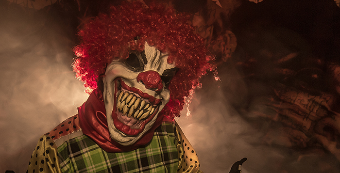
Example clowns are funny, clowny xD, lets give him a bit smile (ok this example is a bit satyr, but its to blow mind to ppl so they try understand what i am talking about trough pictures)

cLilQq2.jpg


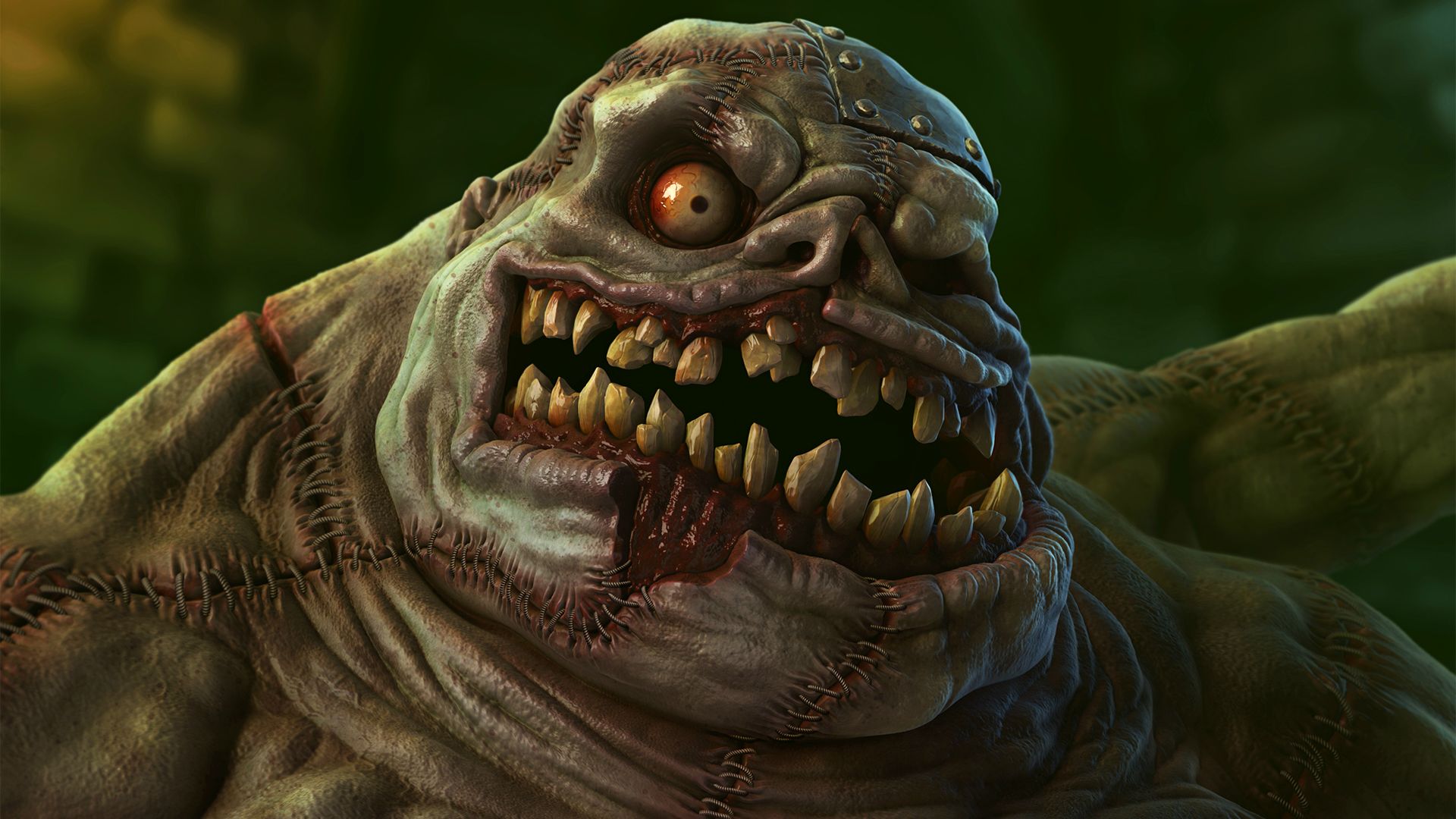
Now lets do abomination funny guy from wc3

nDrMBrz.jpg


Different texture art may preserve old charm

https://i.imgur.com/MtW88OY.mp4
 
I don't agree that a silly/cartoony style looks bad with higher quality art. In WoW it works...

I didnt say that.. I say different art of Reforged using realistic textures may not give us old wc3 sharm.
Last model is actually wow, and it saved something from wc3,cause textures are handpainted.
This new art will go generic things for al comic-sketchy wc3 sharm models, simply cause if they try it on this art that use realistic textures instead of (handpainted realism-very stylyzed )it may end up with "scary clowns smile"...
 
Level 7
Joined
May 26, 2017
Messages
127
I didnt say that.. I say different art of Reforged using realistic textures may not give us old wc3 sharm.
Last model is actually wow, and it saved something from wc3,cause textures are handpainted.
This new art will go generic things for al comic-sketchy wc3 sharm models, simply cause if they try it on this art that use realistic textures instead of (handpainted realism-very stylyzed )it may end up with "scary clowns smile"...

There is one thing that pisses me off... Since Warcraft III, all the models that they have created of abominations are taller and less wide. I know that now the model of Arthas, Uther, footmen, peasants are taller and thinner but... why does an abomination follow that style?

It is supposed to be a creature created from several corpses, it should be wide and disproportionate as it is in Warcraft 3.

I do not know if any of these models reminds me of Warcraft III abomination to be honest...

88.png
 
There is one thing that pisses me off... Since Warcraft III, all the models that they have created of abominations are taller and less wide. I know that now the model of Arthas, Uther, footmen, peasants are taller and thinner but... why does an abomination follow that style?

It is supposed to be a creature created from several corpses, it should be wide and disproportionate as it is in Warcraft 3.

I do not know if any of these models reminds me of Warcraft III abomination to be honest...

View attachment 318486

This is one of the last models of Reforged to discuss , trust me its very good compare to some humans we saw in demo...
Reforged may not go sketchy look for faces like old wc3, and even if they did it would be a big question how it would be compatibile with a new texture style they choosed..
My personal guess if they did so,for certain models like abomination it would end up as "scary clowns"....And who wants "scary clowns" ???

I dont know, maybe i am just guessing, and i bet they didnt even try and dont know what i am talking about.
I would really like to see they try hit old abom face charm,using wc3 animations for portrait.
So that i know is my theory true or not,otherwise its just my guessing -.-
 
Level 11
Joined
Nov 23, 2013
Messages
665
I don't agree that a silly/cartoony style looks bad with higher quality art. In WoW it works...
WoW is a bit cartoony, but much less than Warcraft 3 (at least in Wow's early years - and in-game, not in concept art or fan arts)

Here are Footmen / Stormwind Guards from Warcraft 3 and WoW:
footmencomparison-png.318720
I set them at the same size so proportions can be compared:
  • Classic Warcraft 3 proportions are exaggerated a lot
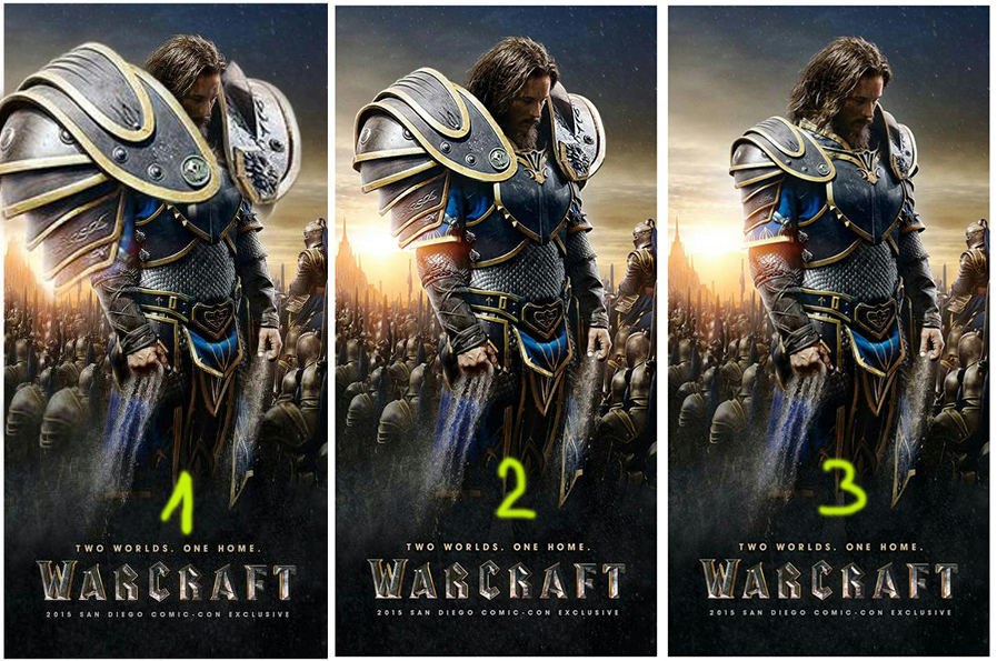
  • Reforged proportions are exaggerated a bit but not so much, except some armour parts, which are utterly ridicuously big (not to mention the fact that the Footman's head can't even be seen behind his gigantic shoulderpad when he's seen from the side)
  • Compared to the first two, WoW proportions are almost realistic.
As for textures, they are very cartoonish with Warcraft 3, and not so much with the other two.

Grunts / Orgrimmar Guards:
gruntscomparison-png.318724
Classic: huge arms, big boots
Reforged: gigantic chest and shoulders, very big hands, tiny legs and head
WoW: the Orc is very big, but proportions are quite balanced (although it's hard to tell how an Orc is realistic)

WoW is also way less cartoony than HotS, but I didn't take the time to find pictures :p HotS's style is not bad per say, but I don't think it fits the Warcraft universe imho.

If it were up to me, I'd go for 100% realistic, like Metzen's Warcraft 2 artwork. But the best compromise seems to be WoW's style, which isn't so cartoonish and not 100% realistic either.
 
Last edited:
WoW is a bit cartoony, but much less than Warcraft 3 (at least in Wow's early years at least - and in-game, not in concept art or fan arts)

Here are Footmen / Stormwind Guards from Warcraft 3 and WoW:
footmencomparison-png.318720
I set them at the same size so proportions can be compared:
  • Classic Warcraft 3 proportions are exaggerated a lot
  • Reforged proportions are exaggerated a bit but not so much, except some armour parts, which are utterly ridicuously big (not to mention the fact that the Footman's head can't even be seen behind his gigantic shoulderpad when he's seen from the side)
  • Compared to the first two, WoW proportions are almost realistic.
As for textures, they are very cartoonish with Warcraft 3, and not so much with the other two.

Grunts / Orgrimmar Guards:
gruntscomparison-png.318724
Classic: huge arms, big boots
Reforged: gigantic chest and shoulders, very big hands, tiny legs and head
WoW: the Orc is very big, but proportions are quite balanced (although it's hard to tell how an Orc is realistic)

WoW is also way less cartoony than HotS, but I didn't take the time to find pictures :p HotS's style is not bad per say, but I don't think it fits the Warcraft universe imho.

If it were up to me, I'd go for 100% realistic, like Metzen's Warcraft 2 artwork. But the best compromise seems to be WoW's style, which isn't so cartoonish and not 100% realistic either.

A quick history of a grunt development

Warcraft 3 Grunt History
 
WoW is a bit cartoony, but much less than Warcraft 3 (at least in Wow's early years at least - and in-game, not in concept art or fan arts)

If it were up to me, I'd go for 100% realistic, like Metzen's Warcraft 2 artwork. But the best compromise seems to be WoW's style, which isn't so cartoonish and not 100% realistic either.

Well yeah, WoW especially nowadays with new epic model updates is the Warcraft look to me, WoW's art style to recrate Warcraft III models to be the exact same but HD has always been the goal to me and it fits alot better with Reforged's doodads,enviroments etc they have shown in demo mission too, cause that demo is just like: a nice Warcraft map + real life armor for hulk's + faces ripped from anime games added on top of them (actually under them because hulking armors are x5 bigger than their faces)
 
WoW is a bit cartoony, but much less than Warcraft 3
Well yeah, but it wouldn't work if it was like WC3, because it is much more detailed and you see everything up close instead of from 50 meters in the air.
Considering this, IMO WoW strikes a good balance between "realistic" and cartoony style. I think the same approach would work well for Reforged if they exaggerate proportions just a bit more, much more than the current Reforged style.

Aside from not really "feeling" like Warcraft all that much, I think it will be hard to see any details in Reforged when viewed from an RTS perspective, if you know what I mean. This is not only because of proportions which are emphasized in all the wrong places (like the shoulderpads and the ridiculous extravagance of the footman's armor), but also because of the texture style, which is just completely lost when viewed from RTS camera.

kantarion said:
All of those look 100% more fitting than the Reforged grunt IMO. There would be almost no criticism from the fans if Reforged looked more like that I think.


The link between WC3 and WoW is clearly visible. It feels like you're in the same universe, despite the huge difference in detail and perspective. There is continuity in art and style.
I think Blizzard made a huge mistake hiring an external company from the other side of the world to do the art, they should have given this task to their own existing Warcraft art department.
 
Last edited:
Well yeah, but it wouldn't work if it was like WC3, because it is much more detailed and you see everything up close instead of from 50 meters in the air.
Considering this, IMO WoW strikes a good balance between "realistic" and cartoony style. I think the same approach would work well for Reforged if they exaggerate proportions just a bit more, much more than the current Reforged style.

Aside from not really "feeling" like Warcraft all that much, I think it will be hard to see any details in Reforged when viewed from an RTS perspective, if you know what I mean. This is not only because of proportions which are emphasized in all the wrong places (like the shoulderpads and the ridiculous extravagance of the footman's armor), but also because of the texture style, which is just completely lost when viewed from RTS camera.


All of those look 100% more fitting than the Reforged grunt IMO. There would be almost no criticism from the fans if Reforged looked more like that I think.


The link between WC3 and WoW is clearly visible. It feels like you're in the same universe, despite the huge difference in detail and perspective. There is continuity in art and style.
I think Blizzard made a huge mistake hiring an external company from the other side of the world to do the art, they should have given this task to their own existing Warcraft art department.

Well if we speak about proportions, what Reforged did for armored units is next : They went thin base body and super-large armor...

Instead of going stronger bodys with regular increased armor.
A bit smaller armor on second picture would be Warcraft style (but larger than 3)
But again i will repeat what Samwise said, the end result was a game with heroic poses and armors...
Which means wc3 epic animations, and a bit larger armors and stronger bodys (not thin and real life alike, and surely not reforged footman xD..)


b7jsjr6.png


But if we talk about footman he actualy could have epic look and be thin like cinematic one,compared to dwarfy wc3 one.
Its just they made model so so wrong -.-
I explained it in my footman post,alot.
 
Last edited:
Level 11
Joined
Nov 23, 2013
Messages
665
Well yeah, but it wouldn't work if it was like WC3, because it is much more detailed and you see everything up close instead of from 50 meters in the air.
Considering this, IMO WoW strikes a good balance between "realistic" and cartoony style. I think the same approach would work well for Reforged if they exaggerate proportions just a bit more, much more than the current Reforged style.
Yep it works pretty well in WoW, the balance between cartoon and realism is quite nice (it was when I played it, mostly in vanilla and BC), except some weapons and armour parts that were weird (it was already pauldrons even then!!). It would be nice to see how WoW style would look with a RTS camera height. Would units be recognisable while having a nice style?

Aside from not really "feeling" like Warcraft all that much, I think it will be hard to see any details in Reforged when viewed from an RTS perspective, if you know what I mean. This is not only because of proportions which are emphasized in all the wrong places (like the shoulderpads and the ridiculous extravagance of the footman's armor), but also because of the texture style, which is just completely lost when viewed from RTS camera.
Agreed! The right balance must be found, between having nice details for close-up views, and having units that can be immediately recognisable at first glance. I think shiny armours don't help, even if they look nice.

The link between WC3 and WoW is clearly visible. It feels like you're in the same universe, despite the huge difference in detail and perspective. There is continuity in art and style.
I think Blizzard made a huge mistake hiring an external company from the other side of the world to do the art, they should have given this task to their own existing Warcraft art department.
Exactly. It seems like I already said that a thousand times, but I feel the same: Reforged doesn't look bad in itself, but it doesn't look like Warcraft.


Well this picture shows that normally-sized pauldrons are epic too, and how dumb oversized armour parts look (at least in my opinion)
 
Level 7
Joined
May 26, 2017
Messages
127
Well if we speak about proportions, what Reforged did for armored units is next : They went thin base body and super-large armor...

Instead of going stronger bodys with regular increased armor.
A bit smaller armor on second picture would be Warcraft style (but larger than 3)
But again i will repeat what Samwise said, the end result was a game with heroic poses and armors...
Which means wc3 epic animations, and a bit larger armors and stronger bodys (not thin and real life alike, and surely not reforged footman xD..)


b7jsjr6.png


But if we talk about footman he actualy could have epic look and be thin like cinematic one,compared to dwarfy wc3 one.
Its just they made model so so wrong -.-
I explained it in my footman post,alot.

Why don't they copy the Footman of the intro cinematic?...
Why is the design of Reforged's sword so ugly compared to the Footman of cinematics?...
Why do the other models (Mortar Team and Spellbreaker) respect the size of the shoulder pads and the Footman don't?...
Why I want to die?

999.png

Is this shit practical?

retardedswords.png
 
Last edited:
Yes! They already have great examples of HQ versions in the WC3 cinematics, even the 3D backgrounds of the campaigns.
They did a good job on the updated intro cinematic (although it looks like it was done by a different team?), why not follow that style.
I mean, that first picture of the cinematic already has pauldrons that look super impractical if you think about it, but it's still nothing compared to the footman.
They could make a 1:1 copy of the Human symbol in the middle there and people would be very happy.

They will probably adjust the footman though, in this thread alone there's a huge amount of complaining about it. But that won't fix the overall problem we're seeing. That mortar team and spellbreaker look really cool and are very well done (even the footman if we're being honest, aside from the obvious problems), but simply not for a Warcraft-style RTS.

This discussion is probably pretty pointless though, they've already sunk a lot of time and money into the existing assets, they're not going to be replaced anymore. Maybe some adjustments and tweaks, but I don't think we can expect anything more.
 
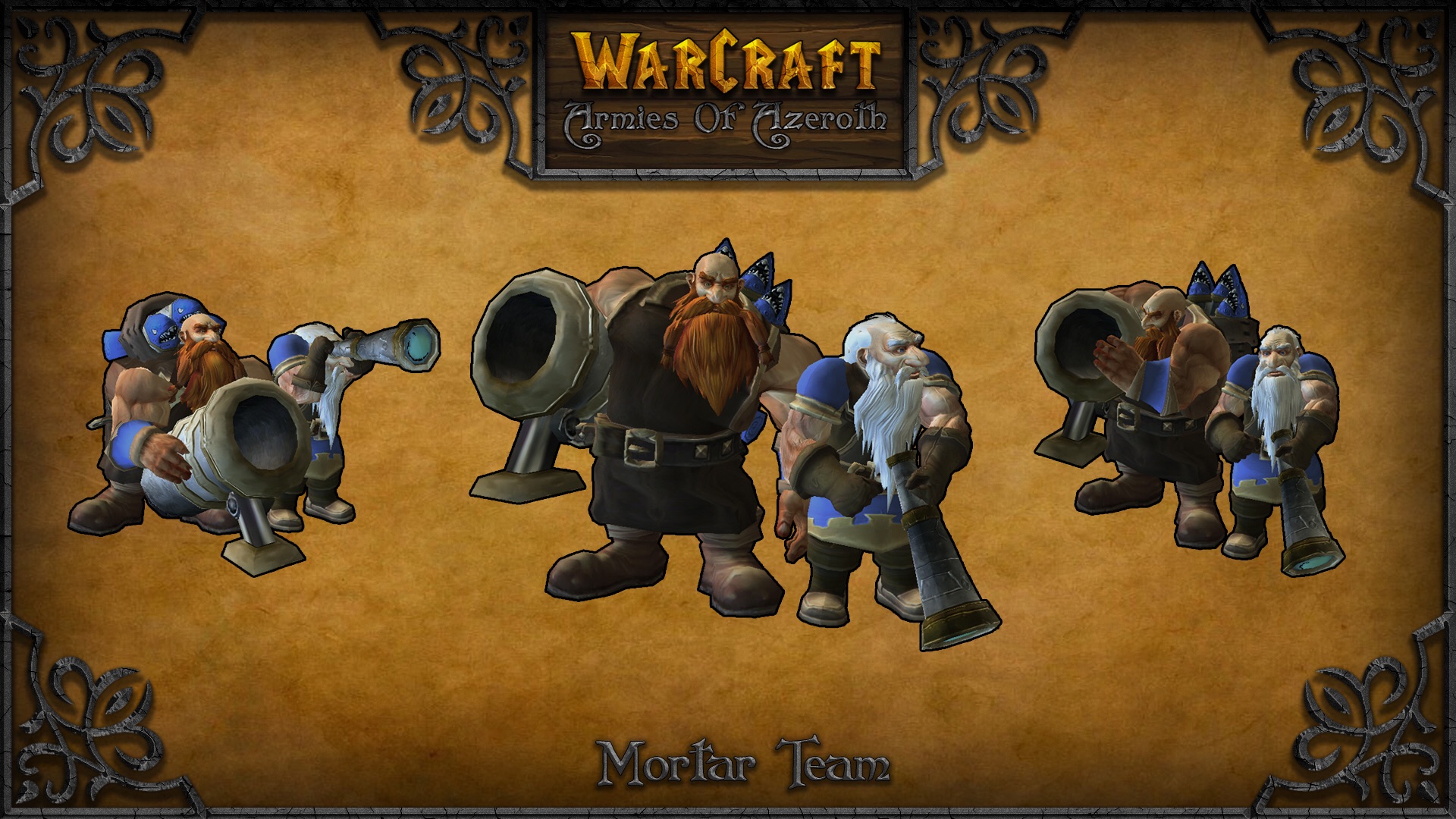
Mortar team is so alive like real persons,i like detail faces. You dont have to read this : (I will skip the thing that white beard guy is having a haricut similar to a helicopter pilot, or if you want metrosexual asian anime haircut on the top of the head and they both wear glasses like they are engeneers.
White beard guy having a teleskope and glasses doesnt go together...)

But i repeat, model is super awesome, and if Reforged goes this quality of mortar team for all models of Reforged be sure that the project is 100% safe and good quality...

About spellbreaker, i believe he need different helm,i am 100% sure in that. They should check old wc3 or community waa model...
 
All I can say is Blizzard(actually Lemon Sky) might have forgotten less is more, even simple units are designed like they were the Royal Guards, and Spellbreakers helmet is really a question mark to me I just want to ask why? And another thing is he has green eyes, and even the current lore states that Blood Elves' eyes turned to green after the events of TFT....
 
Level 7
Joined
May 26, 2017
Messages
127
For now we have focused on the Footman model because it requires special attention since it is one of the most iconic units of the Humans (and Warcraft III), I think what bothers us all in general is the enormous size of their shoulder pads and his full and golden plate armor as if he were a nobleman.

Now, if you want to discuss the model of the Mortar Team or the Spellbreaker...

Personally, I like the model of the Mortar Team a lot. I like the shape of the cannon, the clothes of the two dwarfs (especially the bottom part which respects its original version), the boots and also that they have added a "backpack" with buckles to the one that carries the ammunition... but of course there are things that I would change:

1.png


3.png

First, I would add a pigtail to the redhead dwarf, for example, like the one Falstad has in Heroes of the Storm but obviously shorter, like the original version.
2.png

I like the detail of the smoking pipe, it gives a funny touch, I do not care if they remove it or keep it, but it does not respect the original version.

I would remove Naruto's hair from the white-haired dwarf and add a bald spot, like the original version. Armies of Azeroth did it very well.

image.8.jpg

I like pilot goggles even if they are not Gyrocopter pilots, again I do not care if they remove or keep it, but it does not respect the original version. Although this type of goggles is usually used in aviation, I think it was also used by some soldiers in the tank machine guns (in real life). These glasses do not have the function of correcting vision, they have the function of protecting, so I think they can go together with the telescope.
 
Personally I really don't care about details like that. If we imagine that these are people/soldiers, it's not like all of them would look identical, they would have different hair styles etc., so it's not like it breaks continuity or canon or anything. As long as it looks cool I'm fine, it can only add some personality to the units, which is always nice.
 
Level 11
Joined
Nov 23, 2013
Messages
665
I like the detail of the smoking pipe, it gives a funny touch, I do not care if they remove it or keep it, but it does not respect the original version.
The smoking pipe is a nice detail indeed; however, who would smoke around explosives? :p Of course, 100% realism shouldn't be aimed for, but it has to be at least believable - imho.

I would remove Naruto's hair from the white-haired dwarf and add a bald spot, like the original version. Armies of Azeroth did it very well.
While I like the Mortar Team model overall, there are a couple of details I do not like, and Naruto's hair is one of them. It doesn't fit the Warcraft universe at all.

I like pilot goggles even if they are not Gyrocopter pilots, again I do not care if they remove or keep it, but it does not respect the original version. Although this type of goggles is usually used in aviation, I think it was also used by some soldiers in the tank machine guns (in real life). These glasses do not have the function of correcting vision, they have the function of protecting, so I think they can go together with the telescope.
Yes, pilot goggles are not bad in themselves, but why did they want to add them? They seem unnecessary. But now they are there, it's not a big deal.

Personally I really don't care about details like that. If we imagine that these are people/soldiers, it's not like all of them would look identical, they would have different hair styles etc., so it's not like it breaks continuity or canon or anything. As long as it looks cool I'm fine, it can only add some personality to the units, which is always nice.
I partially agree on that. In real life, those units wouldn't be completely identical. However, I think a bald Dwarf is more neutral than a Naruto Dwarf. What I mean is, in the universe of Warcraft, it is more likely to come across a bald Dwarf, or a Dwarf with a ponytail, than a Dwarf with manga-style hair. Thus it would be weird to see an army full of Naruto Dwarves.
Therefore, maybe we shouldn't be too nitpicky on some details, but I think some details are worth being criticised. :)
 
Last edited:
Well we all agree in many parts, but i dont want my general feeling about mortar team been understood wronlgy cause of some details...
I love it,its quality model and i hope Reforged use that model as an example.
Cause i saw some very bad bad models in Reforged, so my intention was not to criticize mortar team at all,and btw i love pipe part alot.
When blizz provide me such a quality model like mortar, i forget my purist ego.

But that Jaina with wrong cape,plastic-static hood,wrong haircut style,roller-skates kneepads and Arthas with anime girl face,giraffe neck and lichking alike armor marshmellow oversized pfff, also generally uther base thin proportions boosted with marshmellow armor and his dress like a ballerine unti the ground...
Footman we all agree, i would mention also tuaren with stump looking more like native-american shamanic cow than strong one, what else i saw something too,i cant remember right now xD
I cant peace with it, ever.
 
Holy s&%, is this stuff from the same project? Storm is Coming - Warcraft III mod , most of the models looks perfect

Well yes and no, those work except the first custom made one is all gathered from our works in mods in various years so Storm is Coming mod is now kinda the 'latest' versions of our models, Storm is Coming Grunt is not shown in that link because Commedia(leader of storm is coming) likes his version more it is kinda same as those are shown though.

:O I wish that was what Reforged looked like.

Thanks, we always worked to do it and tried to make Blizz see those stuff and Remaster the game with this style but sadly... We will work on, Reforged is a great base for us atleast...
 
Level 7
Joined
May 26, 2017
Messages
127
Regarding the Spellbreaker model, in my opinion it is almost perfect. There are details that I love: the phoenix shaped shoulder pads that in the model of the original version are impossible to appreciate, the elven runes of the shield (100% respected), the tunic under some pieces of the armor, the shape of the part superior of the shield that resembles a phoenix, the sword and its gem in the hilt...

123.png


latest

This model only has one problem, but it is a VERY noticeable problem... the helmet.

It is strange because it seems that they have been inspired by the concept art and the Spellbreaker of the menu to create all the parts of the model EXCEPT the helmet...

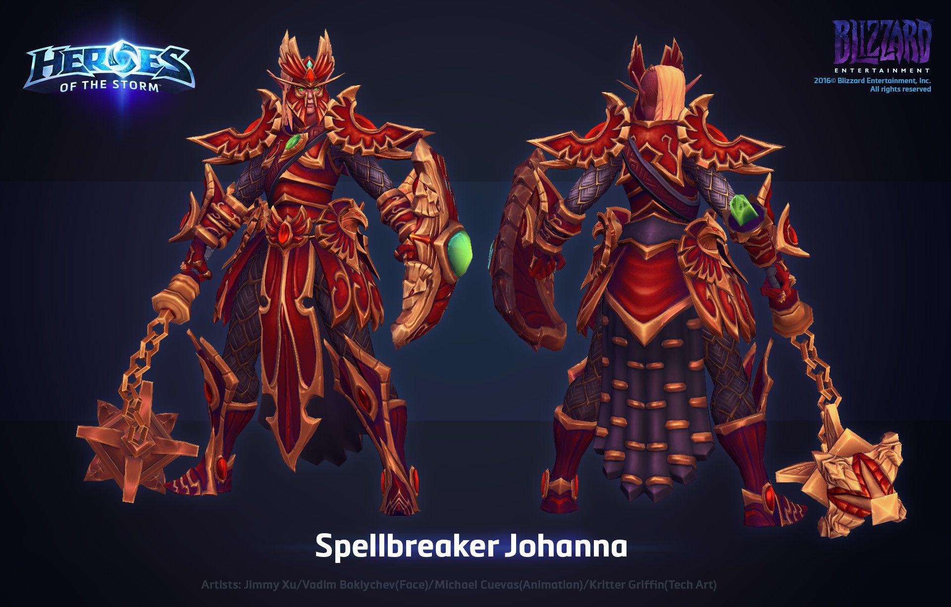
The helmet reminds me a lot of a skin of Johanna in Heroes of the Storm, look carefully at those rounded shapes of the helmet:

f97a9beca0dabf195074b8faf2d89d65.jpg
I would change the helmet, similar to its original version; I would make his hair longer and let it fall down the chest and sides of the helmet (and maybe make the shield bigger since it seems that it will not cover him completely).

Well we all agree in many parts, but i dont want my general feeling about mortar team been understood wronlgy cause of some details...
I love it,its quality model and i hope Reforged use that model as an example.
Cause i saw some very bad bad models in Reforged, so my intention was not to criticize mortar team at all,and btw i love pipe part alot.
When blizz provide me such a quality model like mortar, i forget my purist ego.

But that Jaina with wrong cape,plastic-static hood,wrong haircut style,roller-skates kneepads and Arthas with anime girl face,giraffe neck and lichking alike armor marshmellow oversized pfff, also generally uther base thin proportions boosted with marshmellow armor and his dress like a ballerine unti the ground...
Footman we all agree, i would mention also tuaren with stump looking more like native-american shamanic cow than strong one, what else i saw something too,i cant remember right now xD
I cant peace with it, ever.

Jaina MUST be changed... that's for sure.
IMO. Taurens look very bad, they look too much like WoW, they look like happy Swiss cows.

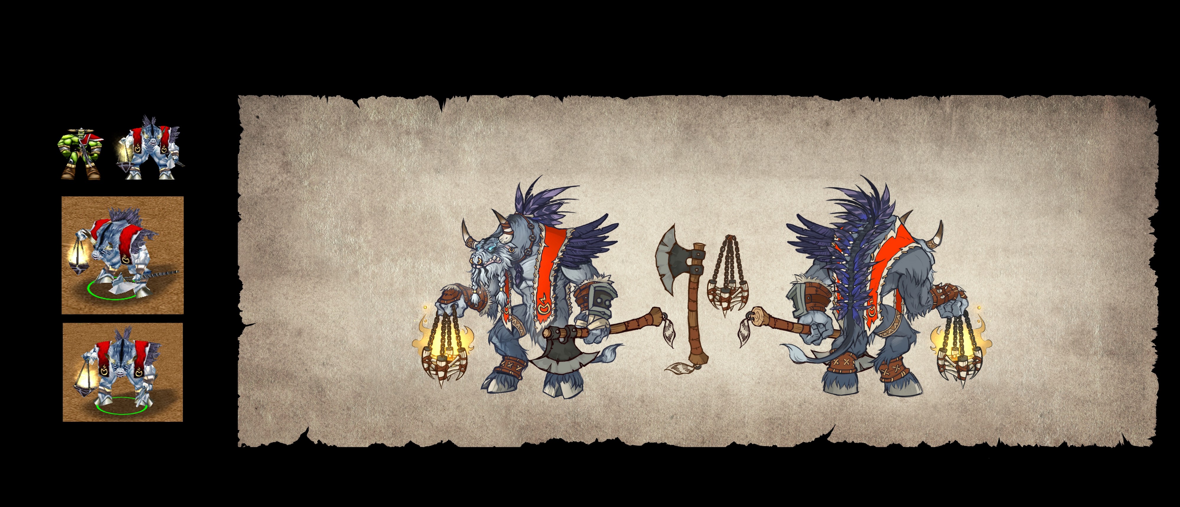
Probably noone noticed but do not forget the Spirit Walker with his STICK

What the fuck... it's true... why have not they use the axe? It is in the Reforged concept art.

Warcraft_III_Reforged_-_Spirit_Walker_concept_art.jpeg
 
Last edited:
Regarding the Spellbreaker model, in my opinion it is almost perfect. There are details that I love: the phoenix shaped shoulder pads that in the model of the original version are impossible to appreciate, the elven runes of the shield (100% respected), the tunic under some pieces of the armor, the shape of the part superior of the shield that resembles a phoenix, the sword and its gem in the hilt...


latest

This model only has one problem, but it is a VERY noticeable problem... the helmet.

It is strange because it seems that they have been inspired by the concept art and the Spellbreaker of the menu to create all the parts of the model EXCEPT the helmet...

The helmet reminds me a lot of a skin of Johanna in Heroes of the Storm, look carefully at those rounded shapes of the helmet:

f97a9beca0dabf195074b8faf2d89d65.jpg
I would change the helmet, similar to its original version; I would make his hair longer and let it fall down the chest and sides of the helmet (and maybe make the shield bigger since it seems that it will not cover him completely).


Jaina MUST be changed... that's for sure.
IMO. Taurens look very bad, they look too much like WoW, they look like happy Swiss cows.


What the fuck... it's true... why have not they use the axe? It is in the Reforged concept art.

Warcraft_III_Reforged_-_Spirit_Walker_concept_art.jpeg

All highelf/bloodelf workers, spealbreaker ,including prince Arthas must have longer hair(well he does in reforged) that is clearly sawn from air perspective on their backs.
It must not go inside the clothes or inside armor (like some community models xD)...
 
Last edited:
Level 7
Joined
May 26, 2017
Messages
127
Just a few minutes ago someone has uploaded an image of SUPPOSED Maiev's new model in Reforged to the official forum but he has already deleted the link to the image, luckily I managed to save it.

This is the post: The new Maiev model

This is the image of the new model:

iDYawdB.png


This is the concept art of Reforged:

$.jpg


This is a comparison I made:

Maiev.png


It could be fanmade... but... fuck, they're exactly the same... could anyone really be so meticulous with the details if it were not official?
 
Just a few minutes ago someone has uploaded an image of SUPPOSED Maiev's new model in Reforged to the official forum but he has already deleted the link to the image, luckily I managed to save it.

This is the post: The new Maiev model

This is the image of the new model:

View attachment 319014

This is the concept art of Reforged:

View attachment 319015

This is a comparison I made:

View attachment 319016

It could be fanmade... but... fuck, they're exactly the same... could anyone really be so meticulous with the details if it were not official?
Art style is not even close to any Blizzard game, not even close to Reforged's mess too don't worry it is pure fan made
 
Status
Not open for further replies.
Top