frostwhisper
Media Manager
- Joined
- May 25, 2007
- Messages
- 4,251


Progress on the rider

Follow along with the video below to see how to install our site as a web app on your home screen.
Note: This feature may not be available in some browsers.


Is it just two layers on "Normal" mode with the alpha sum of them both being one? Or do they need "Blend" mode or something else?Glad to see people using the blending trick more.


One Normal layer as a base, and then Blend layer(s) to add to it. Material alpha doesn't affect Normal and Transparent layers; only the Blends and Alphas. The Blend value will have to depend on your desired visual, but it would usually be in the mid range to keep it from fully overtaking the Normal layer.Is it just two layers on "Normal" mode with the alpha sum of them both being one? Or do they need "Blend" mode or something else?


holy frick that's looking sick. Especially the grey, I didn't think that was possible.More progress. Blending different Thunder Lizard textures yields nice results.
View attachment 407153
i did the material blending trick on my recent nerubian bundle. only difference is that i used an additive filter instead of a blend one to make the model's texture shinier.holy frick that's looking sick. Especially the grey, I didn't think that was possible.
This 'blending' thing... why have I basically never heard of it before? It seems really potent.


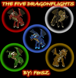
@FerSZ used it for his 5 dragonflight models some years ago with an excelent result iirc.holy frick that's looking sick. Especially the grey, I didn't think that was possible.
This 'blending' thing... why have I basically never heard of it before? It seems really potent.
 www.hiveworkshop.com
Maybe the WiP deadline is the 15th of October past which you can't simply upload a complete model? Some might be able to work on a model in less than a day. Who am I to judgeYou mean the 24th, right?

Yeah, like that time I got drunk on christmas eve and made the 'paint goblin' part of my old contest entry from scratch in about... I think it was five hours?Maybe the WiP deadline is the 15th of October past which you can't simply upload a complete model? Some might be able to work on a model in less than a day. Who am I to judge
Just checked. You have it. But you need to add it to your award showcase: https://www.hiveworkshop.com/account/manage-medals...speaking of which, didn't we win? Shouldn't I have a medal for that?


 I hope this doesn't apply the other participans.
")
"Djembe mon and de spear, voodoo has come ta dis land!"The 3rd WIP. Concept overlook

You are utterly ridiculous, man. xDThat's the geometry pretty much done. One thing I will probably change is the ballista's spears to a more simplistic model. Using the default headhunter spear at the moment makes it look a bit busy. Next step - animation.
View attachment 410866
Be blessed the judges!Is two weeks enough?
Thank you very much for coming along!Deadline has been extended to Nov 7.
 Really excited about this news, also hope more WIPs will appear and contestants will use the time boost.


You should update Stefan K.'s entry too, since he already uploaded his result to the modelling sectionLooks awesome! Loving the armor! Great wip!
Updated first post!
This thing is looking utterly fantastic. I particularly love the details on the armor & the feather arrangements.In the last concept I decided to use the follwing texture of feathers from Harpies because it had an alternate purple-blue version which I was about to use in the hero's Alternate animation:
View attachment 412118
I also adjusted some of the TC shapes and points, but I was not satisfied with the result: the textures looked somewhat sloppy, and the lines of the golden helmet did not visually blend with the patterns of the TC mesh, since the latter had no contours. So, I gave up on this idea.
From that moment on, I went back to my original idea of "shabby" gold textures with tribal patterns and re-shaped the mesh:
View attachment 412119View attachment 412121
There I got the helmet with some ancient tribal aesthetics containing the desired colors, shapes and even a nose guard, a nice little detail that can enhance the portrait look. At that point, looking at the references with one eye and my work with the other, I decided to finalize the concept.
A "few" moments later I got my set of armor ready:
View attachment 412123View attachment 412125
Some other references hinted me at the items I can add to the final look of the hero, such as a chest plate, claw rings, hair tubes and, of course, feathers. As for the feathers, I got back to the previous texture with sharp, thin and minimalistic look with a TC layer that can compliment more complex carved-looking parts perfectly and become an original piece of the whole picture. I gave the feathers a symmetrical look because rich jewelry for high-ranking wearers require fine craftsmanship, and we find order in symmetry.
There is always room for the temptation to overload one's character with details. Thus, I took some samples and looked at how the mesh worked in some sequences and imagined how it would work in the Alternate animations.
View attachment 412126View attachment 412127View attachment 412128
After that I got to a point that I need a simpler and higher chest, a bare stomach (which is subject to transformation in the Alternate) and a "heavier" belt/waist part. The bottom detail should help the character stand out in the Alternate, when he looses the staff, and compliment with the main magic gem of the staff.
As for the shapes, their thickness and positions match the standard esthetics of Warcraft well by the eye. Also, by the eye, the textures are detailed enough and their "stretchiness" fits most in-game models.
View attachment 412130View attachment 412131
The amount of details also seem fine: the helmet/crown has "rich" shapes so I decided to leave the ears and tusks without jewelry. In meantime I found that it would be creative to add some jewelry to the hair. There can be many and many variations.
The staff of the hero is on the way: it will include feathers, gold parts, a big TC gem and some other fitting things. I'm also planning to change some feathers and make them look more bushy on the head. At the moment I have this WIP:
View attachment 412132
Your feedback and criticism are appreciated!
I'm happy that the Troll expert likes this oneThis thing is looking utterly fantastic. I particularly love the details on the armor & the feather arrangements.
 Thank you!
I will say that it's starting to move into "RPG hero/WoW character" territory for me; at least, lined up next to the Shadow Hunter it's looking a fair bit more detailed than some of the OG stuff.
Your words from someone with great visual experience made me look for additional options, but I feel like I exausted all means to make it more SD. What I think is that there's some "freshness" difference between the mesh and textures of TFT and ROC units. The newly introduced, such as Lady Vashj, Firelord, Spellbreaker, Cryptlord, Bloodmage ect., have more rich-looking mesh with a set of details that are paid more attention in terms of textures, mesh and animation. For instance, Spellbreaker's animation and texturing is far better looking than regular Alliance units for the units of its size; Firelord has almost all his mesh parts moving and some unique sequences with animated mesh like his fire at the bottom; the Bloodmage model has roaming spheres, vibrant mesh details, and a well-detailed head that has facial expressions outside of his portrait, which makes him a good choice for an RPG character. The addition of some TFT models has definitely expanded the range.) have 3 well animated fingers and Lady Vashj even 4.
Here's a WIP. Unsure if I will manage to finish...
I think 2 or 4 are the way to go. Maybe even a combination of sorts.Creation of staff concepts with different levels of detail:
I like #2 best, personally!Creation of staff concepts with different levels of detail:
1.View attachment 4129882.View attachment 412985
3.View attachment 4129874.View attachment 412989
As for me, the style requires angularity, squareness and patterning to match with armor. The staff also should demonstrate the Troll's rank and status.
What I like here is a plain TC spot on the bottom that echoes well with the TC gem at the other end. What I don't like is a level of detail compared to SD models with staffs that look quite poorly. Some things can still be simplified to provide a better SD feel to a certain extent. What are your thoughts?