Community
Projects
Maps
Tutorials
Gallery
Support Us
Install the app
How to install the app on iOS
Follow along with the video below to see how to install our site as a web app on your home screen.
Note: This feature may not be available in some browsers.
-
Listen to a special audio message from Bill Roper to the Hive Workshop community (Bill is a former Vice President of Blizzard Entertainment, Producer, Designer, Musician, Voice Actor) 🔗Click here to hear his message!
-
Read Evilhog's interview with Gregory Alper, the original composer of the music for WarCraft: Orcs & Humans 🔗Click here to read the full interview.
-
The Hive's 22nd Icon Contest: Creep Abilities is now concluded, time to vote for your favourite set of icons! Click here to vote!
-
✅ The POLL for Hive's Texturing Contest #34 is OPEN! Vote for the TOP 3 SKINS! 🔗Click here to cast your vote!
-
✅ The POLL for Hive's Techtree Contest #20 is OPEN! Vote for the TOP 3 FACTIONS! 🔗Click here to cast your vote!
You are using an out of date browser. It may not display this or other websites correctly.
You should upgrade or use an alternative browser.
You should upgrade or use an alternative browser.
Texturing Contest #17 - Poll
- Status
- Not open for further replies.


- Joined
- Apr 18, 2008
- Messages
- 8,454


The title should be "Texturing Competition #17 - Poll". And there should be a global notification for all users that the poll is up.
I voted for Stanakin Skywalker's hut. I would have voted for Red Shift, but those huge, ship-like, round windows really bother me.
(Edit by Pyritie: Fixed!)
I voted for Stanakin Skywalker's hut. I would have voted for Red Shift, but those huge, ship-like, round windows really bother me.
(Edit by Pyritie: Fixed!)
Last edited by a moderator:
- Joined
- Dec 29, 2008
- Messages
- 3,351
I like Just_spectating's entry, very awesome idea.
- Joined
- May 16, 2007
- Messages
- 7,272


thanks
my vote goes to...
l0w_kwaliti
brilliant church
creativity gave him my vote
my vote goes to...
l0w_kwaliti
brilliant church
creativity gave him my vote
- Joined
- May 31, 2009
- Messages
- 974
Go go Red Shift!
- Joined
- Jul 3, 2010
- Messages
- 537

I voted for the Church of Light. Very creative.
- Joined
- Mar 6, 2009
- Messages
- 193
Can l0w_kwaliti's submission really be the crypt model...? That's an incredible transformation I must say!
I would certainly use it as a church model with the other human buildings. It fits in rather well in the theme.
It gets my vote!
I would certainly use it as a church model with the other human buildings. It fits in rather well in the theme.
It gets my vote!
- Joined
- Dec 22, 2008
- Messages
- 488
I vote for l0w_kwaliti's Church of the Holy Light. It's really awesome, amazing how an undead building can be transformed.
- Joined
- Dec 8, 2008
- Messages
- 4,380


Voted for Red Shift  He has got the most usefull of all of the entries. One texture -> much buildings what can be better? it's also a plus in file size
 ")
All the other entries are also really good") Good job you've done here
Good job you've done here
If Red Shift wouldn't be there, I would have voted for Dan, because I love the concept, only reason I voted not for him is, that they don't fit too much to other wc3 buildings...
He has got the most usefull of all of the entries. One texture -> much buildings what can be better? it's also a plus in file size All the other entries are also really good
Good job you've done here If Red Shift wouldn't be there, I would have voted for Dan, because I love the concept, only reason I voted not for him is, that they don't fit too much to other wc3 buildings...
- Joined
- Dec 30, 2007
- Messages
- 1,558


I love most of these... I don't really know what to pick :>
Red Shift's Baradin Bay Slums are awesome thanks to their usefulness and awesomeness, yet the other skins are awesome, but not as useful.
So RS, you're my choice today D:
Red Shift's Baradin Bay Slums are awesome thanks to their usefulness and awesomeness, yet the other skins are awesome, but not as useful.
So RS, you're my choice today D:
- Joined
- Jun 16, 2009
- Messages
- 244
AWESOMENESS for RedShift ~~ you got my vote dude. very useful
- Joined
- Aug 20, 2009
- Messages
- 649
My vote shurely goes for Dentothor because it awesome and creative
- Joined
- Jan 22, 2010
- Messages
- 60
Red Shift's buildings look like outhouses ;\
- Joined
- May 26, 2009
- Messages
- 760
Red Shift's buildings look like outhouses ;\
They kind of look like indoor to me - but still they look really good, but not enough.
My vote went to Stanakin's hut because it's simple yet awesome and, the way I see it, very useful.
Yours,
Chizume
- Joined
- Dec 29, 2008
- Messages
- 1,351

I cannot decide... The throne of beasts is awsome and very original... But the bay slums also looc fantastic... From the other way the abandoned assylum is jus great... Ah fuck i won't vote. :/
- Joined
- Jan 30, 2009
- Messages
- 2,248
J_S for sure. Absolutely brilliant idea.
- Joined
- Feb 23, 2010
- Messages
- 227
Went with Red Shift's Baradin Bay Slums. They were just so full of awesomeness and quality. But l0w_kwaliti's Church of the Holy Light was a close second for me as well.
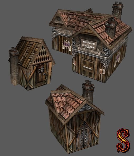
Dan van Ohllus's Houses with Weird Chimneys
POS: I actually really like them. The creative use of the chimneys almost makes me think of Dr. Suess. I could see myself using these skins.
NEG: The overall skin doesn't seem have a general theme, making it not blend together as well.
Dentothor's Abandoned Asylum
POS: This is a very creative skin. The detail in the wood looks very well done.
NEG: Sadly, the rest of the model isn't as high quality as the base. The towers look off and the door and terrace doesnt match.
Just_Spectating's Throne Of The Beasts
POS: Seems to be very WC3-esque which I like in models.
NEG: The throne seems to be more of a Magnatuar trophy display than an altar or throne.
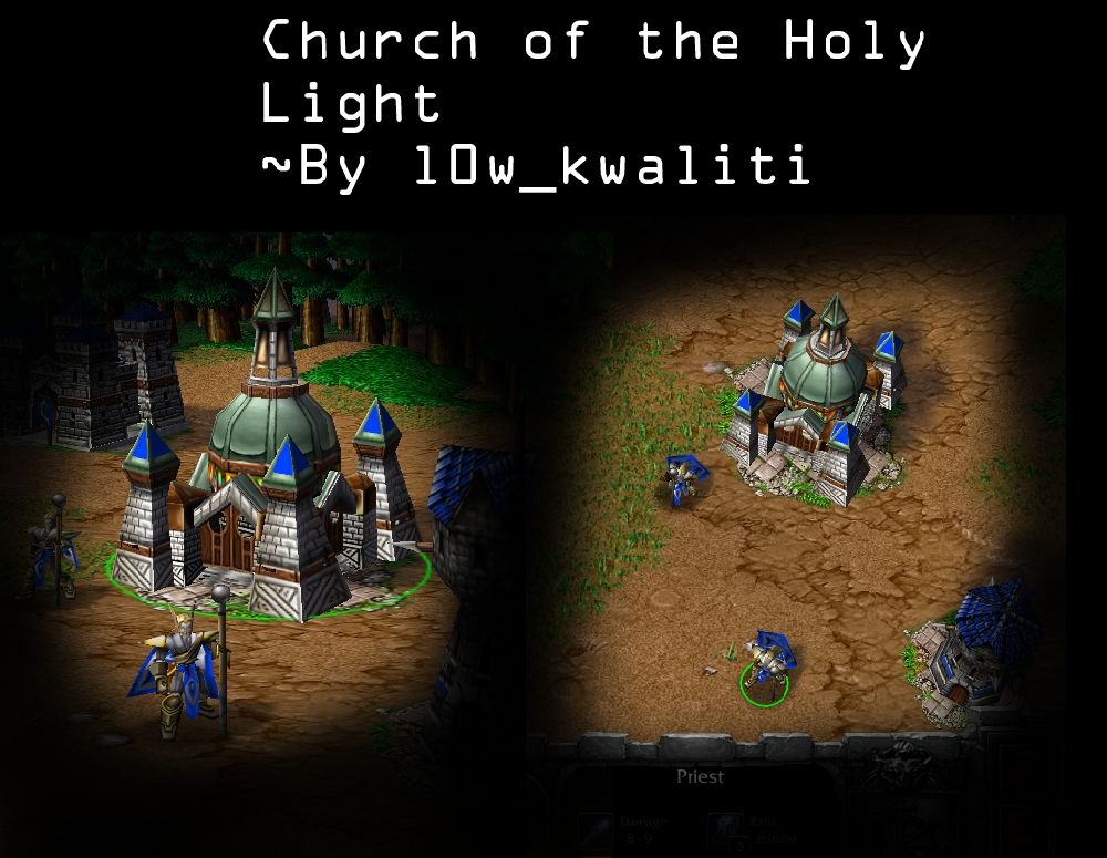
l0w_kwaliti's Church of the Holy Light
POS: Another very creative skin. A nifty idea I thought of is... How cool would it be to have the church corrupted and turned into the crypt in a game for some reason? Anyway love the concept and the thorough looking job.
NEG: The walls don't seem to match the brick patterns of the barracks or the castle. It has a style of its own, albeit a good thing, not something that should have been done this time.
M0rbid's Futuristic Towers
POS: One of my favorite models, good quality and creative.
NEG: Although well done, they don't seem that appealing.
Red Shift's Baradin Bay Slums
POS: The textures are clearly the best quality work in this contest. The detail, the theme- awesome! I might even use them sometime. I love the variation and appreciate the fact that you still managed to maintain a similar look through the texturing.
NEG: I think the grungey feel is a little overplayed and on some of the buildings the overall textures seemed out of place- not aligning with the rest of it.
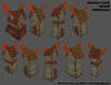
Stanakin Skywalker's Hut
POS: Appealing, unique and simple. Just what I like in a model. LOL, just when you think a peasant's house couldn't look more poor.
NEG: If you only included a doorless model the 'stacking' idea would make the models a lot more useful. After all a door to a drop is kinda- @_@.
thisruoy's Arcane Vault
POS: Clearly the cutest model in this contest. Was a good laugh.
NEG: Although funny, I don't see it being that useful. And if you had something like- hearts floating around it instead of runes, that would be much more win.
Dan van Ohllus's Houses with Weird Chimneys
POS: I actually really like them. The creative use of the chimneys almost makes me think of Dr. Suess. I could see myself using these skins.
NEG: The overall skin doesn't seem have a general theme, making it not blend together as well.
Dentothor's Abandoned Asylum
POS: This is a very creative skin. The detail in the wood looks very well done.
NEG: Sadly, the rest of the model isn't as high quality as the base. The towers look off and the door and terrace doesnt match.
Just_Spectating's Throne Of The Beasts
POS: Seems to be very WC3-esque which I like in models.
NEG: The throne seems to be more of a Magnatuar trophy display than an altar or throne.
l0w_kwaliti's Church of the Holy Light
POS: Another very creative skin. A nifty idea I thought of is... How cool would it be to have the church corrupted and turned into the crypt in a game for some reason?
Anyway love the concept and the thorough looking job.NEG: The walls don't seem to match the brick patterns of the barracks or the castle. It has a style of its own, albeit a good thing, not something that should have been done this time.
M0rbid's Futuristic Towers
POS: One of my favorite models, good quality and creative.
NEG: Although well done, they don't seem that appealing.
Red Shift's Baradin Bay Slums
POS: The textures are clearly the best quality work in this contest. The detail, the theme- awesome! I might even use them sometime. I love the variation and appreciate the fact that you still managed to maintain a similar look through the texturing.
NEG: I think the grungey feel is a little overplayed and on some of the buildings the overall textures seemed out of place- not aligning with the rest of it.
Stanakin Skywalker's Hut
POS: Appealing, unique and simple. Just what I like in a model. LOL, just when you think a peasant's house couldn't look more poor.
NEG: If you only included a doorless model the 'stacking' idea would make the models a lot more useful. After all a door to a drop is kinda- @_@.
thisruoy's Arcane Vault
POS: Clearly the cutest model in this contest. Was a good laugh.
NEG: Although funny, I don't see it being that useful. And if you had something like- hearts floating around it instead of runes, that would be much more win.
Last edited:
- Joined
- Dec 29, 2009
- Messages
- 88
Red Shift's Baradin Bay Slums - the best texture for sure.
But I hesitated about the second place, bexause Houses with Weird Chimneys by Dan van Ohllus and Hut by Stanakin are very good, and I also liked M0rbid's Futuristic Towers, so the second place is split for me at least...
But I hesitated about the second place, bexause Houses with Weird Chimneys by Dan van Ohllus and Hut by Stanakin are very good, and I also liked M0rbid's Futuristic Towers, so the second place is split for me at least...
- Joined
- Dec 20, 2009
- Messages
- 1,894


I did go for DvO's Houses with Red Chimneys.
What actually made me do this is soemthing, that has nothing to do with the quality of the skin. Because many entrys where so damn good in terms of quality that I could not decide which is the best. So I decided to go with the most creative one.
To be honest, Shift's is damn awesome. But it's not tooo creative for me. Stanakin, J_S, l0w, and DvO were very creative, same goes for Dent, (btw. same goes for thisruoy, but his model choice and technique aren't good enough compared to the rest), but what really putted my vote towards DvO were the idea of the chimneys. Great idea and great execution in them! They look pretty weird. --
..
And I like it!
- Joined
- Jun 10, 2008
- Messages
- 1,397
The companion cube had least votes, even though it wasn't the best skin, it was the most creative. lol.
- Joined
- Jun 15, 2006
- Messages
- 2,641


voted for DvO's wierd houses


- Joined
- Jan 30, 2009
- Messages
- 2,248
The companion cube had least votes, even though it wasn't the best skin, it was the most creative. lol.
he has done the same thing for two contests... theres not really anything creative about it anymore...
- Joined
- Jul 27, 2004
- Messages
- 3,685


Dan van Ohllus's entry is very good. I'll vote for him.
/end of cereal biznuz
I had a hard time choosing between Just_Spectating's, M0rbid's, Red Shift's and Stanakin's entries. These are the ones that I liked most.
But I finally came to a conclusion that Stanakin will get my vote.
/end of cereal biznuz
I had a hard time choosing between Just_Spectating's, M0rbid's, Red Shift's and Stanakin's entries. These are the ones that I liked most.
But I finally came to a conclusion that Stanakin will get my vote.
- Joined
- Apr 18, 2009
- Messages
- 224
well i voted for m0rbid because i like the idea, and the result is pretty good...even though I know Red Shift is gonna win.
- Joined
- Jun 17, 2010
- Messages
- 2,275
i could not decide between slums and church. I flipped a coin, church won.
- Joined
- Aug 4, 2007
- Messages
- 640
My vote is for the church
- Joined
- Feb 23, 2010
- Messages
- 227
My vote is for the church
you should implement the dancing guy into a texture somehow
- Joined
- Nov 8, 2007
- Messages
- 2,252


umm right. can someone get the links with the actual blp files? just looking at screenshots doesnt really do justice.
- Joined
- Dec 20, 2009
- Messages
- 1,894
l0w quality: https://www.hiveworkshop.com/forums/1628377-post200.html
Stanakin: https://www.hiveworkshop.com/forums/1628174-post197.html
Red Shift: https://www.hiveworkshop.com/forums/1622324-post173.html
thisruoy: https://www.hiveworkshop.com/forums/1620141-post151.html
M0rbid: https://www.hiveworkshop.com/forums/1620179-post152.html
DvO: https://www.hiveworkshop.com/forums/1620618-post155.html
J_S: https://www.hiveworkshop.com/forums/1614361-post137.html
Dentothor: https://www.hiveworkshop.com/forums/1619320-post150.html

- Joined
- Jan 7, 2005
- Messages
- 7,551
Dentothor's reskin for the High Elven Barracks was very tempting. However, my vote goes for l0w_kwaliti's "Church of the Holy Light". First, because it's probably the most useful. Second, because I had never seen someone re-texture a Crypt. It was pretty smart.
- Joined
- Dec 11, 2008
- Messages
- 128

my vote goes to Red Shift, but Stanakin and l0w quality did a great job too. nice contest.
Deleted member 157129
D
Deleted member 157129
1. Red Shift
Absolutely stunning.
2. Stanakin Skywalker
Awesome.
3. Just_Spectating
Very interesting.
Absolutely stunning.
2. Stanakin Skywalker
Awesome.
3. Just_Spectating
Very interesting.
- Joined
- Jul 30, 2007
- Messages
- 887
Like so many other, my vote goes to RedShift. I would, however, like to congratulate all the contestants on a job well done.
I alsmot couldn't decide between M0rbid's Futuristic Towers and Red Shift's Baradin Bay Slums. Red shift made a better texture work, but M0rbid's idea was more creative, and with some fog work that tower could be damn usefull for Star Wars map. And would look very great too.
- Joined
- Mar 2, 2008
- Messages
- 180
So many amazing entries... 
Ultimately, I voted for M0rbid's, though. I'd never have thought of those tower models for a futuristic building, but he pulled it off masterfully.
Ultimately, I voted for M0rbid's, though. I'd never have thought of those tower models for a futuristic building, but he pulled it off masterfully.
- Joined
- Jan 30, 2009
- Messages
- 2,248
I am out of the contest. The symbol on My Building was a trace of another picture.
And seemingly enough I did not know that this would cause a disqualification, As it is under the 25%.
Sorry Everybody.
And seemingly enough I did not know that this would cause a disqualification, As it is under the 25%.
Sorry Everybody.
- Joined
- Nov 26, 2006
- Messages
- 11,133


I am out of the contest. The symbol on My Building was a trace of another picture.
And seemingly enough I did not know that this would cause a disqualification, As it is under the 25%.
Sorry Everybody.
I'll remove you from the poll.
If anyone voted for dent, you can revote for someone else.
- Status
- Not open for further replies.
Similar threads
- Replies
- 70
- Views
- 9K
- Replies
- 100
- Views
- 19K