- Joined
- Sep 20, 2008
- Messages
- 445


actually i agree with him ") i just cannot say it with good words like that
i just cannot say it with good words like that
i just cannot say it with good words like that
i just cannot say it with good words like that


Better != More Accurate.@Kyrbi0
Sure you don't have to make the icon represent the spell "mythologically correct", but the point of this contest is to make a new icon for a spell, hopefully better or more accurate than the Blizzard one
Bah, you think I would post without having read the previous posts? Nonsense.Avator said:Kyrbi0, I'm not even going to bother typing it out again. Read the previous posts before talking about something. Both the submission limit and the old Phoenix icon have been widely discussed and you're only bringing up old arguments that have been proven senseless long ago. So read the previous posts and if you don't feel like reading it: Don't post about those subjects at all.


Yes, yes that's exctly what I am. Green with intense jealousy. xDKyrbi0 is just jealous
Ah, that's an entirely different story. I fully support the entrants physically creating as many icons (or what-have-you). It's just a matter of how many the entrant in question actually submits as their entry.Just_Spectating said:and hes not submitting 5...... hes submitting his 4 best ones.
...
...
...
only the people in this thread would know about the other ones he made, so the public poll can still vary by a lot.
). Just keep your submission down to the regulated-Maximum.better or more accurate than the Blizzard one.
@Kyrbi0
[facepalm]Since when is or equal to and? I never said that more accurate means better. [/facepalm]
lolwut?
Stop thrusting your e-penis into everything and let the guy be nice.


Run a sharpen on those icons


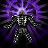
Heres anouther submission: Howl of Terror

Does not really look like the Pit Lord.
Edit: Well, it may be the spell's victim.
No, he's definitely the howling person. It's indeed not fitting to the Pit Lord. He should either change the icon to the victim or make a completely new icon, showing the Pit Lord, which is probably too much effort.
No, were not making alternates, we're making hero icon replacements. Replacements of icons of the existing Wc3 heroes.
The submissions should fit the hero.
However, you can stilll adjust it in the suggested way (guy->victim).
That would be fitting then.
He may hold his hands on the ears.
why?
Sharpen always helps things when you're resizing down.
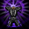
Heres anouther submission: Howl of Terror


good >.<i still think i have the best howl of terror here!


good >.<
which one is the best?
Paladon, I made this icon in like 4 layers in 64² (resized to 58² and put a border on it). But nothing prooves I made the face myself ... and I guess nothing prooves I made the fire myself too =/ Do I have a problem now?


both are, sorry to say that, kinda ugly.
I wouldn't have seen it as Avatar if you hadn't said it. I was going towards Soul Burn :O
The first one looks better, the glow just gives the icon a strange color.
My suggested changes:
I think you need to fix the shape of the eye, it's rather... odd...
I also think you should make the flame blue. At least i connect blue to Avatar.
Maybe add some beard at the very bottom of the icon, the MK has alot of beard.
Damn, i need to start working on my bash icon and another icon :S
lol? he just gave his opinion, what does this have to do the fact that he didn't make any icons?If you comment on a resource, be sure to say why you don't like whatever someone posted. That sure would help a lot. Now people would think you're some kind of asshole because you never even made an icon.
lol? he just gave his opinion, what does this have to do the fact that he didn't make any icons?
and I say the same, it looks ugly.
The body shape is the same one you had before. Bad shaped body overall. Warcraft blur effects are usually 2 or 3 pictures with transparency, put one aside the other, until barely nothing can be seen in the last one, it looks more blizzard-ish and better as well.
The shape of the eye ... I'm not sure since most wc3 icons, skins etc ... have very simplistic eyes.
I was more concerned that the eye isn't shaped as an eye, but a pile. Keep it simple.
Oh, I didn't see the new icon, I was talking about the Evasion... oh, your newer icon...you're talking about a body? That kinda confuses me because I thought you were talking about my newer icon. I could try ... you mean like the bash effect ... blue hammers right?
Oh, I didn't see the new icon, I was talking about the Evasion... oh, your newer icon...
It doesn't resemble Avatar, more like a Soul Burn, imo. The fire looks bad, it doesn't 'blend' with the eye. It looks like a paste from some 2D image with screwed alphas.
The fire should be in the eye, with few outer flames.