- Joined
- Aug 3, 2008
- Messages
- 391
Sadly enough Unholy Frenzy isn't a hero ability.
I'll try to colour it to look like Tornado lol.
I'll try to colour it to look like Tornado lol.


Everyone's icons is sooo good. Damn mines suck. What could this be?


how's this?


it's pretty goood for a second icon ...Dodge =D
Anyway, anyone critsism my icon? =D
I'll add some blurry dodgelines in the end ... that'll fill some stuff up.DevineArmy, it looks much better. Still, there is a lot of unused space. You should try and fill it up with something (swords, axes, more arrows, some glow maybe).

I agree with The_Silent, that could make a good charm.Everyone's icons is sooo good. Damn mines suck. What could this be?
Hey
I am not 100% if I am going to enter the competition or not, seeing how great things you guys do :S
Anyway, this is what I got so far;
It's the Hex spell from the Shadow Hunter, my second Icon ever done ^^
Attached the original one and the one with bordes, BTN and DISBTN.
Okay, i decided to try to learn icon-making, and i'm seeing this contest as good training.
It's my second icon, so please tell me what to fix.
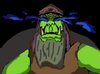
For those of you that cannot guess what it is, it's Shadow Strike
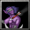
4th version. 3rd wip.
changed hair, added arrow, added contrast.
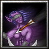
Lots of improvements from earlier versions. Maybe now you've taken the sword out of the icon, you should move the guy so he's more central, it's looking a little unbalanced now. Also, you need to remember that the arrow would cast a shadow onto his skin. Maybe you could think about adding a glow? Lots of blizzard icons are glow-y. xD Or kind of a trail-y glow, which shows he's moving.
There's a shadow ... perhaps not a very clear one ... I'll make it stronger.
opps my bad it didnt come up
Is shadow strike a warden spell, or am I thinking of something else? >_<
And I meant more what is it trying to show, than what ability, if you know what I mean.


Yeah its the Warden spell =D
Anyway, here's a little update. Think i'll be joinig the contest afterall, remaking the Shadow Hunter spell icons.
opps my bad it didnt come up
I think the arrow´s movement effect should have another color, because it would look even better thenadded contrast on the hair, made a movement effect.
looks more like a lazer beam right nowhow...? dont gove pointless critisism if you arent going to tell me how it looks awful
Hows this?


Nice
But could you insert a bigger picture, maybe then I or someone else can give you some tips.
I've made my first icon: Chain Lightning
Could someone give me tips ?
google some gimp tutorials.can anyone tell me about a good tutorial to learn how to draw icons like this beautiful ones. I've tried to draw but it only looks pretty ugly. I use Gimp. Would be great if anyone could link a tutorial cause i rly wanna learn it
Nice
But could you insert a bigger picture, maybe then I or someone else can give you some tips.
I've made my first icon: Chain Lightning
Could someone give me tips ?
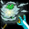
Been doing my best to make the frog stick out more, but all I got so far is a pair of hands comming out of the clouds.
Anyway, I started on the second ability, which is Healing Wave (Chain Heal). It has more shading and effects than you can see, will improve later.
PS. Damn, the layers are complicated, but wow how useful they are =D
I will do my best to make the glow better.

google some gimp tutorials.
recoloured the arrow with the hue and saturation tool.
changed the arrow movement blur from black to darkbrown