• Listen to a special audio message from Bill Roper to the Hive Workshop community (Bill is a former Vice President of Blizzard Entertainment, Producer, Designer, Musician, Voice Actor) 🔗Click here to hear his message!
  • Read Evilhog's interview with Gregory Alper, the original composer of the music for WarCraft: Orcs & Humans 🔗Click here to read the full interview.

Phoenix Trial #4 - Weapon and Armor Upgrade Sequences

Status
Not open for further replies.
Level 16
Joined
Mar 26, 2004
Messages
569
Even though i said these were only gonna be practice, i'm too lazy to make new ones.
(I'm allowed to update them if i want to change something right?)

icons_6554_btn.jpg
icons_6555_btn.jpg
icons_6556_btn.jpg


icons_6599_btn.jpg
icons_6600_btn.jpg
icons_6601_btn.jpg
 
Level 36
Joined
Jul 1, 2007
Messages
6,677
Well I said fuck the boot because it was a bit awkward for an icon.

So I made helmets. Working at 256x256 this time. I accidentally saved over the PSD for the first helmet, but for the red and purple ones I still have them. Is that ok?

Done with my swords now too. I don't really like them D:
 

Attachments

  • Helmet1 copy.png
    Helmet1 copy.png
    8.3 KB · Views: 163
  • Helmet2 copy.png
    Helmet2 copy.png
    8.8 KB · Views: 163
  • Helmet3 copy.png
    Helmet3 copy.png
    9 KB · Views: 154
  • sword1 copy.png
    sword1 copy.png
    6.5 KB · Views: 134
  • sword2 copy.png
    sword2 copy.png
    7.4 KB · Views: 132
  • sword3 copy.png
    sword3 copy.png
    9.2 KB · Views: 132
Last edited:
Well I said fuck the boot because it was a bit awkward for an icon.

So I made helmets. Working at 256x256 this time. I accidentally saved over the PSD for the first helmet, but for the red and purple ones I still have them. Is that ok?

Done with my swords now too. I don't really like them D:

They're nice, but don't look like something out of Warcraft at all.
 
Ahhh Void took my helmet idea... D:

nah i'm jocking... anyway its the same based concept.. but totally diffrent overall.. ^^ cause i think we (void an I) that these kind of helmet are AWSOMEmm.. :D anyway good job void..

i will try to make mine even more epic :p
 
Level 45
Joined
Jun 3, 2005
Messages
6,982
Yeah. I used this as a reference pic:
http://ui22.gamespot.com/1429/spartan_2.jpg
I totally agree with this statement

300-Helmet.jpg


oky here's a wip of my Armor diffrent levels.. no i haven,t start to recolor yet.. i just don't want someone to have the same idea D:

cause that would suck alot :p
I also think this user deserves every bit of applause for his creativity and originality.
medieval-helmet-corinthian.jpg


If you have the balls to enter this contest then have the balls to admit to your proper sources.
 
lol .. you got me on that one.. but like void said.. i took this picture as a reference... but anyway... if you totally desagree with my choice.. i can still redo it.. cause i haven't worked on it.. again anyway

i'm happy to see our moderators in alert :D

and for the concept.. i'm not redoing the same thing.. i'm aiming for a Highelf concept.. and NO! i'm not doing gladiator anymore :D
 
Last edited:
Level 34
Joined
May 1, 2008
Messages
3,213
No, Thorneon, that kind of "gradation" isn't well... it's like you made "Level 1 shield", "Level 1 shield + dot", "Level 1 shield + horde sign". It needs more imagination, make something of iron, Steel, GOLD!!
Make your third one be the first, and start making lvl 2 and 3

EDIT: oh, and you should ad more shadows and highlights, too! ^^
 
Level 10
Joined
Aug 2, 2008
Messages
374
New update. Still needs shading however, and borders :hohum:
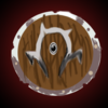
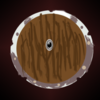
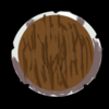
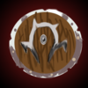
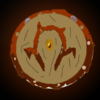
but i think I got the "color themes" pretty good. starts off a wood Orc foot soldier shield, then goes to a gold trimmed steel officer shield followed by a dragon skin warchief shield. The gold color is pretty sad at the moment but I'm looking for a good gold color. Another thing, is it ok if my sister helps me with my weapons? She is an insane drawer so, just wondering.
 

Attachments

  • ArmorUPG1.png
    ArmorUPG1.png
    75.9 KB · Views: 167
  • ArmorUPG2.png
    ArmorUPG2.png
    57.7 KB · Views: 176
  • ArmorUPG3.png
    ArmorUPG3.png
    41.2 KB · Views: 82
Last edited:
Level 36
Joined
Jul 1, 2007
Messages
6,677
It looks like you used a lot of smudge. Don't. It's bad!

Here's a tip for making good metal textures. Make a spatter brush that's fairly dark and dense, then set it to 20% opacity, take a larger size of it and go over the whole thing a few times (use variated darkness). Then take the same brush but a smaller size and go over the whole thing again. Now just use dodge and burn for the shading (fuck anyone who says it's bad; it usually is, but in this case it makes things 100 times easier and doesn't do too much damage)
 
Level 34
Joined
May 1, 2008
Messages
3,213
Hello! This is just me, stopping by and coming to tell you that... I've started with my "masterpiece". This is just a beginning, you haven't seen anything! Muahahaha!!

And on your left side, you can see a brilliant artwork from a crazy Panda who drawn something using "Bamboo One"

EDIT: New WIP! ^^
 

Attachments

  • start.png
    start.png
    50.3 KB · Views: 121
  • stage2.png
    stage2.png
    114 KB · Views: 104
Last edited:
Status
Not open for further replies.
Top