- Joined
- Apr 27, 2008
- Messages
- 1,047


Yes, it is a chinese jedi
Follow along with the video below to see how to install our site as a web app on your home screen.
Note: This feature may not be available in some browsers.


that other thingy that makes highlights *can't find the word*.
GRARGH!!!!
-_- damn... I suck...
I'll start new icon then...
EDIT: Stupid Star Wars!! >


is this what you meant or is it epic fail? (dont pay attention to burn and highlights, they suck)
(go see my tutorial in the tutorial submission)
 )
)


Uh huh..a big leap....Yet another WIP from me today(check first level on earlier post)
)

 even if it looks the same..


 . ill probably do some sort of gun or mechanical thing....weee


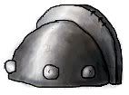
okay! here's my concept! (btw i will redo the helmets don,t worry
Tier 1 =
Tier 2 =
Tier 3 =
if you have any ''GOOD'' critic about the helmet concept.. ''Je suis toute Ouïe'' wich means, i will listen to your propositions
as you can see i keeped my old concept.. but i preffer this one more
btw .. my theme is GAULISH! things..


Mr. Goblin, if you include the helm wearer, 'twill be a bit odd, but the designs look awesome.


Personally i was thinking GLOW...The Silent, pretty cool but it needs something. (uhg I'm bad at critiquing)

 ~joke
~joke


