- Joined
- Mar 21, 2006
- Messages
- 341

bevel and emboss are filters.
Follow along with the video below to see how to install our site as a web app on your home screen.
Note: This feature may not be available in some browsers.


^indeedbevel and emboss are filters.


Are you crazy? Forcing people to work at 512x512 is retarded, and such a resolution is unneeded to work on in the first place
I'm not sure if this has already been discussed, though


Too bad, so sad.
changing it to 256, take it or leave it.


is It Really That Hard For You To Comprehend That You Must Use The Brush And Paint Your Stuff?!
No, were not, if you had actually looked through all the pages, you would see all the CnP and Filter bullshit, that is clearly against the rules stated at the start of the contest. Therefore, it appears that we cannot trust one another.

 , and stuff like that. I think we should tell Ralle to get rid of it.
  Anyways, I like it.
No, I'm just seeing if it annoys peopleSuPa-, did you turn gay or something? what's with those colors man...


Nice, really nice
rep me plz


No, I'm just seeing if it annoys people
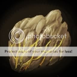
Rawr glowy rock!
I don't like it


Ice/Water
Frozen Death


Ice Torrent


Earth
Rock Fall


Stone Daggers


Festering Roots:
Stone Pillar:


