Okay, "my lead" now

*takes a breath*
l0w_Kwaliti:
#1 I think your molten/fire/magma/whatever hand would look better if it had no glow in background. That glow makes it blend into background, thus looking very messy. I suggest you to make the contrast between background and foreground bigger. Also, done at 256, according to rules.
WILLTHEALLMIGHTY:
#1 The icon shows what it is obviously, and is well done. What I would suggest (and what blizzard has done with the same type of icon) is, like I told Kwaliti, make stuff not blend into background. I mean, it has some contrast, but looks blurry. Take blizzard's icons for example, things usually have some kind of outline, while yours has a bit of smooth gradient there (working in 64 isn't as great :/).
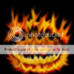
#2 Your second icon seems to be a lot better than the first one, because you can tell things apart more easily, there is a very good contrast and an outline, but the main problem is that it doesn't really look like fire, if that is what you intended to do. It looks more like orange lava.
Soul of Death:
#1 That icon simply cries for black background. Why? Because forehand is very bright. Either that, or you can put some really dark red colour, and shade it from center to the borders (put a kind of glow). However, I see a lot of smudge there, which is BAD.
#2 Your first icon was better than those three, they all look like simple drawings, and they all lack contrast, too bland. You also need some shading in places, rather than random darker brush strokes.
TDR:
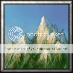
#1 Bloody hell, you should've just taken a photo. Really, that icon is extremely well done, but the only thing that bothers me is that it has no practical use in warcraft. To make it usable, make it a volcano or something, like others have said. Keep in mind warcraft is no peaceful game, there is war raging all over, and destruction is primary concept.
#2 That is one really nice tree, I like how you put glows over it as well as on the roots. However, you could've shaded it a tad more near borders, it would've looked cooler.
FF7 project-G:
#1 That tornado things lacks, shading and lighting. It has no contrast.
#2 Stop using filters, damn it! Just use your brush, it is all you will ever need, except for unsharp mask (which falls to filters I think though, but it is the only usable one).
#3 Like others have said, you don't need to show all you can do/know in one image. Simply do what is needed, you don't need to put a lot of fancy stuff in order to make a good icon.
#4 Okay, that thing is scratch made it seems, but it is, err, too simple. In order to make such stuff for wc3, you need to shade it properly, look at wc3 command buttons. It would also be nice to have some sort of perspective there, instead of just "straight" look.
Sansui:
#1 I really like that one, lighting is done very nicelly, footman helm is designed well, shading on face looks good, and rocks are well done. There is also nice shading to the borders, to prevent them from stealing focus. No real critiques here.
#2 Stone pillar looks really cool, nice idea, and very good execution. You have put a light source on the left side, and defined it well, as blizzard would, so it makes the icon fit even more. But the main problem is that it is not really warcraft III style. Frozen death is a great idea, and a great execution. It will also fit into wc3 perfectly. Good job on this one. Ice torrent is the one I didn't like much, mainly due to it looking a tad random. Rock fall looks very warcraftish, like some icons that take two looks to figure out what it is. Very good execution, and fitting. As for Stone daggers, I like how you didn't leave background completely blank, but put some colour instead. I like the idea, and how well defined it is. Lighting and shading are also well done.
#3 Damn, you always come up with awesome stuff, Flash freeze has a nice colour scheme, as well as the lighting is put well, as well as shading. I think I saw this concept in some game, could be some of might and magic series (it is not ripped or something, just the concept is alike).
~Void~:
#1 That one looks nice, but I don't see real definition nor use for it. Also, all those brush strokes are going to blend in well once converted to 64X64, which is a good thing. But don't stray off the theme, which is elementals, try to include something that has to do with them. What I see could reassemble some fire element or something, but it is not defined enough.
#2 I could barely see the hand shape, because it is not defined enough. It needs a lot more shading and highlights. Notice that it is in fire, it would've been cool if the part of hand that is in focus was affected by fire, so it looks a bit more red.
SuPa-:
#1 Yay firebolt! Nah, looks like something blizzard would do, I like how you did the fire, but it is rather... unoriginal.
#2 Well made one, looks nice, although you could make the glow in background extend to the edges, just with bigger saturation and lesser brightness. I like the general idea though, rarely thinks of "Gold" as an element, though it really is, technically.
CombatTheWombat:
#1 That thing looks nice, but it needs either borders or more contrast. Else it will look very messy in wc3. It could work though.
Technomancer:
#1 It looks very nice, I like how you've used big brushes and set a good light source. Except for it looking a bit bland I don't have any other critique. Maybe it could use some more satruation, though, to fit warcraft.
Burning_Dragoon5
#1 I like those trails after the ice blocks, though I am waiting for an update on that wip, work on the mountain.
Thyrael
#1 Your stuff is highly suspicious since your quality varies a lot. Comparing that giant or whatever to geyser or fireworks is ridiculous.
Elfsilver Lord
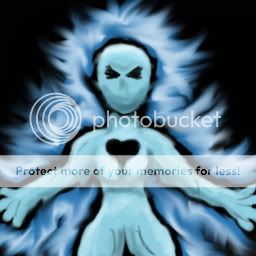
#1 Looks fairly nice, though I see no definition. I don't even know if it is ice or water.
Debode:
#1 Basing icons off warcraft III ones is prohibited.
#2 Filters are prohibited.
#3 Freehand in paint... is just a no. Please, get some better tools.
ike_ike:
#1 Looks weird, I don't really like those ice scales. However, it could work in wc3. It is got you put a glow there, rather than leaving it blank. I also think it needs some sort of background.
inverted:
#1 Good base, keep working on it. However, I don't like how it is completely straight, I think perspective view would've looked better. Also, add some more red to the bottom of the flame.
Ezikielth:
#1 Looks good, though I don't like white stripes in fire, just doesn't fit. Try putting orange or yellow instead?
#2 Those teeth look sexy, and it's got a good glow going out from the mouth. Good background as well, you didn't keep it only black. I guess you should name it "frost bite" though.
#3 It looks well made, but I think you should crop only the hand part of the icon, use your 512X512 version and crop only the hand and part of lighting, it loses much detail on 64X64.
#4 I like that thorn thing, and the glow. Nice how you put lighting on the poison.
Infinitynexus:
#1 Damn, this is one shitload of quality stuff right there! I like Obsidian Boulder the most, could be just my obsession with fire. What I like the most if how you kept contrast between obsidian and fire, while it looks good. For people to learn: When making fire icons, keep the background black, because it is fire you need to pay attention to, and it makes a nice contrast. Ice Horns got a nice idea, also well shaded (damn you and your metal making technique). I like the perspective you used for Wrath of Nature, though I don't like those green leaves there, they look a tad out of place. Ball spark has got a nice glow around the sparks, which looks cool. I also like how clean and detailed the sparks are.


")


