- Joined
- Jun 3, 2005
- Messages
- 6,982


Phoenix Competition #3 Results/Outcome
1st - TDR
2nd - Sansui
3rd - Ezikielth
4th - Technomancer
5th - CombatTheWombat
1st - TDR
2nd - Sansui
3rd - Ezikielth
4th - Technomancer
5th - CombatTheWombat
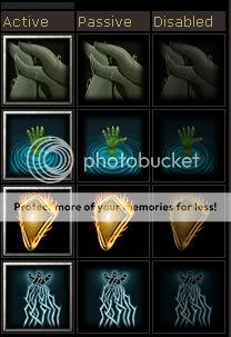
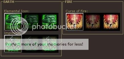
Technomancer
Creativity:The ideas seem rather basic and such, its not very surprising or intriguing. 10/15
Blizzard Feeling: They aren't very Blizzardy and dont fit in very well. The style seems too off to be blizzards. 9/15
Technical notes:
-Colour: The colours are decent, although lacking on some on the root icon. 3/5
-Style: The isn't very distinct and seems rather boring. 3/5
-Skill: The detail on the 2 middle icons seems to have good skill usage but the other 2 icons lack vastly in effort and quality it seems. 2/5
-Other: The icons overall are rather boring and not very flashy. They lack life and the black background doesn't help, it just makes them appear boring and seems as if they have little or no life at all.....there isn't much movement in them but the middle 2 do catch the eye, but only for abit. 3/5
30 + (1/46)*50 = 31.08
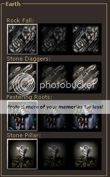
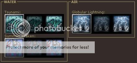
Sansui
Creativity: The ideas are different but some abit blant such as the rock fall. But there is overall good variety of creativity as the icons as a batch. 12/15
Blizzard Feeling: They seem abit too grey.. and blant to have that Blizzard feel. 10/15
Technical notes:
-Colour: The isnt much colour in the icons, they seem rather pale and saturated. 2/5
-Style: The style is unique but abit too ...unsuitable for bringing things to life. The overall style invokes a saturated and pale feel which doesn't bring it much life. 3/5
-Skill: Much effort seems to be put into the icons, however some lack abit here and there. More work could be taken on some of the icons and the overall skill level of the artist seems to be there and up to par.4/5
-Overall/Other: The detail and variety in each of the icons is right there, however as i stated they are too saturated and not vibrant. Some of the icons lack effort and some are abit hard to distinguish. Some of the icons lack overall life and motion (besides the stone daggers) thus making them feel abit stiff and stern.4/5
35 + (7/46)*50 = 42.60
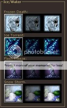
TDR
Creativity: The ideas are fantastic, however the tree icon seems abit generic. 14/15
Blizzard Feeling: They fit the Blizzard feel more than the other icons in this contest, however its Blizzard feeling isnt that strong as the style does interfere abit. 13/15
Technical notes:
-Colour: The colours really stand out and give the icons life. 5/5
-Style: The style is strong and very distinct, that too brings the icons to life. 4/5
-Skill: The overall detail and level of attention has been greatly done to all of the icons.5/5
-Overall: The icons are splendid, clearly the best batch iv seen in awhile. They are full of life and motion. However the implosion seems like a weird icon and confuses me abit but thats only a minor set back. 4/5
45 + (32/46)*50 = 79.78
CombatTheWombat
Creativity: The ideas seem abit odd and off, however the 3rd icon is very appealing in creativity. 9/15
Blizzard Feeling: They dont really have a strong blizzard feeling at all besides the 3rd icon. 7/15
Technical notes:
-Colour: The colour was decent but nothing impressive. 3/5
-Style: Overall style was messy and not very impressive, however the 3rd icon still has my eyes and mind set on it as it is appealing with its feel of style. 3/5
-Skill: There isnt much effort or skill in these icons as i can tell, they overall seem fairly blant. 2/5
-Overall/Other: The icons seem rather blant and the life elements are just no there, the first icon is ..hard to distinguish and the smudge abuse is rather apparent. The only appealing icon that really stands out is the 3rd icon and I believe that was pulled off well besides the lack of detail in it. 3/5
25 + (1/46)*50 = 26.08


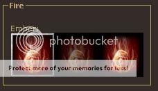
Ezikielth
Creativity:There is variety in the concepts of each icon but the only flashy one in creativity is the last icon. The first icon seems rather generic. 10/15
Blizzard Feeling: They dont really catch a strong blizzard feeling as the detail isnt distinct and they seem abit empty. 10/15
Technical notes:
-Colour: Colour is there, but there isnt much more to add, its nothing bad or impressive. 3/5
-Style: The style is there, but its not very distinct and hard to tell as all the icons are rather blurry and abit ambiguous. 2/5
-Skill: There seems to have been alot of effort and skill in making these icons, however its hard to tell as it was lost in compression. 3/5
-Overall: The icons are overall blurry and hard to tell whats really going on. The first icon is the only distinct one, the rest are too blurry to make out and this was due to compression, alot of things where lost and the icons dont really stand out much. 3/5
32 + (5/46)*50 = 37.43
Last edited by a moderator:


