- Joined
- Nov 26, 2006
- Messages
- 11,133


Attribute icons
Each contestant's aim was to create a set of 3 matching attribute icons

bananaHUNT
Creativity: 3/5
While first appearing very original, after some thought I've realized I've seen most of these ideas before.
Theme: 5/5
The icons all do a very good job of fitting their respective themes.
Blizzard Feeling: 5/5
The icons fit Blizzard icons very well in both quality and style
Technical Note: 9/10
Overall, good execution of your ideas. The quality is good and the dynamic backgrounds work well with the foreground subjects.
Total: 22/25
M0rbid
Creativity: 4/5
Though the figures themselves aren't anything interesting, the designs and symbols along the edges of the icons are quite cool and unique.
Theme: 4/5
For the most part, the icons fit their theme nicely.
Blizzard Feeling: 3/5
The icons do not have much Blizzard style to them, but the quality in comparison is okay.
Technical Note: 5/10
While the icons do contain various cool effects, symbols, and designs, the figures are very poorly done. Their proportions are inaccurate and their posing awkward.
Total: 16/25
-BerZeKer-
Creativity: 2/5
Overall the icons are more of the same of the original WC3 icons, just set ablaze in multicolored fires.
Theme: 4/5
The icons do an adequate job of representing their theme.
Blizzard Feeling: 2/5
The icons do not hold up to the quality and style of Blizzard icons.
Technical Note: 5/10
The firey effects done on the icons are cool, but the overall execution of the ideas wasn't done very well. The shading is very flat and in some places messy. Most of the shading registers merely as this lines.
Total: 15/25
UnholyDobry
Creativity: 3/5
There isn't that much new idea in these icons, and the idea that is there is rather plain.
Theme: 4/5
The Perception and Personality icons fit their theme. The Endurance icon, however, reads more like "strength" instead of "endurance."
Blizzard Feeling: 2/5
The icons do not hold up with the quality and style of Blizzard icons.
Technical Note: 4/10
The icons are very repetive. While repetition in an icon set can be a good thing, here it just makes for a bland entry. The finished icons are unpolished and messy.
Total: 13/25
Lightskin
Creativity: 2/5
A basic silhouette of a cannon and simple sail boat doesn't seem very original. Maybe if you had gone into more detail with the icons and not provided such a simple layout of your concepts.
Theme: 5/5
The icons all seem to fit their theme rather well.
Blizzard Feeling: 2/5
The icons do not hold up with the quality and style of Blizzard icons.
Technical Note: 3/10
While I understand the idea you were going for, it just didn't end up very well. The icons are dull and poorly contrasted. If you're going to try and make something so flat, at least have it be eye-popping.
Total: 12/25
Kola
Creativity: 4/5
Really like the ideas and the style behind them
Theme: 5/5
The icons fit their themes well
Blizzard Feeling: 3/5
The icons have a nice style to them, but it doesn't fit in with Blizzard icons
Technical Note: 6/10
The posing of your figures in the icons is pretty awkward and unnatural. In addition, due to your style choice everything seems very simplified.
Total: 18/25
Creativity: 3/5
While first appearing very original, after some thought I've realized I've seen most of these ideas before.
Theme: 5/5
The icons all do a very good job of fitting their respective themes.
Blizzard Feeling: 5/5
The icons fit Blizzard icons very well in both quality and style
Technical Note: 9/10
Overall, good execution of your ideas. The quality is good and the dynamic backgrounds work well with the foreground subjects.
Total: 22/25
M0rbid
Creativity: 4/5
Though the figures themselves aren't anything interesting, the designs and symbols along the edges of the icons are quite cool and unique.
Theme: 4/5
For the most part, the icons fit their theme nicely.
Blizzard Feeling: 3/5
The icons do not have much Blizzard style to them, but the quality in comparison is okay.
Technical Note: 5/10
While the icons do contain various cool effects, symbols, and designs, the figures are very poorly done. Their proportions are inaccurate and their posing awkward.
Total: 16/25
-BerZeKer-
Creativity: 2/5
Overall the icons are more of the same of the original WC3 icons, just set ablaze in multicolored fires.
Theme: 4/5
The icons do an adequate job of representing their theme.
Blizzard Feeling: 2/5
The icons do not hold up to the quality and style of Blizzard icons.
Technical Note: 5/10
The firey effects done on the icons are cool, but the overall execution of the ideas wasn't done very well. The shading is very flat and in some places messy. Most of the shading registers merely as this lines.
Total: 15/25
UnholyDobry
Creativity: 3/5
There isn't that much new idea in these icons, and the idea that is there is rather plain.
Theme: 4/5
The Perception and Personality icons fit their theme. The Endurance icon, however, reads more like "strength" instead of "endurance."
Blizzard Feeling: 2/5
The icons do not hold up with the quality and style of Blizzard icons.
Technical Note: 4/10
The icons are very repetive. While repetition in an icon set can be a good thing, here it just makes for a bland entry. The finished icons are unpolished and messy.
Total: 13/25
Lightskin
Creativity: 2/5
A basic silhouette of a cannon and simple sail boat doesn't seem very original. Maybe if you had gone into more detail with the icons and not provided such a simple layout of your concepts.
Theme: 5/5
The icons all seem to fit their theme rather well.
Blizzard Feeling: 2/5
The icons do not hold up with the quality and style of Blizzard icons.
Technical Note: 3/10
While I understand the idea you were going for, it just didn't end up very well. The icons are dull and poorly contrasted. If you're going to try and make something so flat, at least have it be eye-popping.
Total: 12/25
Kola
Creativity: 4/5
Really like the ideas and the style behind them
Theme: 5/5
The icons fit their themes well
Blizzard Feeling: 3/5
The icons have a nice style to them, but it doesn't fit in with Blizzard icons
Technical Note: 6/10
The posing of your figures in the icons is pretty awkward and unnatural. In addition, due to your style choice everything seems very simplified.
Total: 18/25
C -> creativity
T -> theme
BF -> Blizzard feeling
TN -> technical note
Unholy Dobry
14/25
4/5 C: Attributes on coins. Cool.
4/5 T: They're very coherent although I have some doubts about the perception icon as perception is, if I recall correctly, something you can't improve at.
2/5 BF: Colors used, shading etc... It wouldn't fit in that well.
4/10 TN: They look okay compositionwise. Only you should have added like a global highlight that actually goes through the centre of the coin and that is a lot stronger. I actually doubt you even took a coin from your pocket and looked at it just so you know what it looks like. You also should have added more and stronger highlights on the edges of the ingravings. That's pretty important.
Lightskin
9/25
3/5 C: Pirates again. Sorry but pirates are pretty much used in anything on the internet.
4/5 T: They fit the theme rather well.
0/5 BF: no resemblance whatsoever. I'm not even going to describe your style.
2/10 TN: They look very simple and they don't really look realistic at all. It also looks like you cnp'd the hero + thingy from wc3 but I don't really care about that. Even if it was cnp, you could have made it in 2 seconds.
M0rbid
17/25
3/5 C: Well it looks like you got your inspiration from just another fps.
5/5 T: The glow and the simplistic drawings make a nice set out of them.
2/5 BF: Doesn't really look like Blizzard icons at all. Your style is a lot different.
7/10 TN: The guys look really simplistic. The first icon looks pretty amazing but the other ones (and especially the red one) lack too many features. The glow makes up for those flaws, though.
bananaHUNT
21/25
5/5 C: Kings. Need I say more?
3/5 T: They fit really well and all. But charm imo is a part of manipulation. You wouldn't charm unless you didn't want something from a person. The manipulation icon isn't really using the same style as the other icons as it's a lot darker and the hand is effing purple. Makes it look rather demonic. If the hand was in a glove like in the charm icon, it'd a lot more like a set.
5/5 BF: Closer than this is very hard.
8/10 TN: The hand holding the rose in the charm icon is in a pretty weird position... I mean, I wouldn't hold a rose like that. Right? None the less, very nice icons there. The crown however looks pretty simplistic imo.
-Berzeker-
12/25
1/5 C: Seriously, a fist for depicturing strenght and a foot for Agility? It's the same in the game D:
3/5 T: The glows and the colors make it very coherent.
3/5 BF: It still doesn't look like Blizzard's icons at all but it looks more alike than most of the icons submitted, so...
5/10 TN: I can see outlines and wtf @ the blue hand. That really doesn't look good.Use more refs.
kola
13/25
3/5 C: yeah... Attack, Defence and magic. That seriously is NOT creative. Using people is sort of creative I guess.
3/5 T: yeah... The blue one's composition is wack. Colors make quite the set out of them, though. I'm also having my doubts if Atk, def and mag are really attributes.
3/5 BF: Shield could be made by blizz. The rest ... not at all, really.
4/10 TN: the blue one looks really bad. The pose, the proportions, shadings ... Everything, really. The poses looks bad overal and the green one has a black head but has a green body. Is that a shading failure or laziness? D;
((SuPa-'s judging + Devine's judging) * 2 * 0.75) + ((Votes / Total votes) * 25) = Total Score
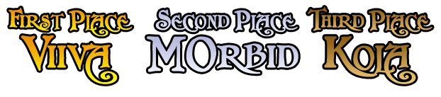
viiva (aka bananaHUNT): ((22 + 21) * 2 * 0.75) + ((58 / 130) * 25) = 75.6538462
M0rbid: ((16 + 17) * 2 * 0.75) + ((19 / 130) * 25) = 53.1538462
-BerZeKer-: ((15 + 12) * 2 * 0.75) + ((18 / 130) * 25) = 43.9615385
UnholyDobry: ((13 + 14) * 2 * 0.75) + ((10 / 130) * 25) = 42.4230769
Lightskin: ((12 + 9) * 2 * 0.75) + ((6 / 130) * 25) = 32.6538462
Kola: ((18 + 13) * 2 * 0.75) + ((19 / 130) * 25) = 50.1538462
4th - -BerZeKer-
5th - UnholyDobry
6th - Lightskin
5th - UnholyDobry
6th - Lightskin
Poll | Contest
Last edited:


")
")


