• 🏆 Texturing Contest #33 is OPEN! Contestants must re-texture a SD unit model found in-game (Warcraft 3 Classic), recreating the unit into a peaceful NPC version. 🔗Click here to enter!
  • It's time for the first HD Modeling Contest of 2024. Join the theme discussion for Hive's HD Modeling Contest #6! Click here to post your idea!

Icon Contest #16 - Custom Models/Textures

Status
Not open for further replies.
Level 34
Joined
Sep 17, 2010
Messages
2,734
F&*$ awesome!!!! looks really amazing man *-* *-* *-*


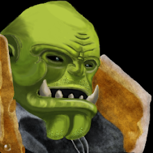
I'm still waiting for permission too :c, I choose the Orc chef, and i'm gonna start painting these tomorrow:
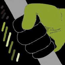
ORC CHEF PRESENTATION.jpg
 
Level 11
Joined
Oct 20, 2016
Messages
344
here's my finish portrait for Orgrim Doomhammer by @Tauer

u6W5eyPk9P0ooQjbV_7lRsKAuEE81eqGyILos5G_5PBEZCn-oiT7ZVJewsWS2LY9AmWjihyTuQaRdvZqI-9Ah4cQOESefPnAiMUQ=s64
L4ORdgE8ueND4FCc0UfcgI9KaM88V7KdLLY6-B_uF47tgvNDGJFnuFD5WLRdFzAMczUCq69jHjo8P-WqwKm4U6yvAnJfyjnY-wEp=s64


Gf-s25kMp1nPFaTf8xJ50jYjOj_Io2PrpgkMbXA5RhftFDM65jud8I6MejuPbrF8tsSoIzpLgz_oDgQ1jvfEkZY0vvDCzOSSlBBX=s220
-fh-tBw-QvrBilJF9EDP3tF167Dqoy41cwviatinoq2k5IvgQjRI_t26PwB0kIv8AUtYl2dt0CaUHeMfj4y76QYFigYIkmYKJeI3=s220


permission.png
 

Attachments

  • BTNOrgrim Doomhammer2.png
    BTNOrgrim Doomhammer2.png
    9.5 KB · Views: 80
  • DISBTNOrgrim Doomhammer2.png
    DISBTNOrgrim Doomhammer2.png
    6.6 KB · Views: 72
  • Orgrim Doomhammer1.png
    Orgrim Doomhammer1.png
    60 KB · Views: 72
  • Orgrim Doomhammer2.png
    Orgrim Doomhammer2.png
    94.6 KB · Views: 69
  • Orgrim Doomhammer2.png
    Orgrim Doomhammer2.png
    94.6 KB · Views: 66
Last edited:
Level 30
Joined
Mar 14, 2014
Messages
1,215
Level 19
Joined
Apr 21, 2013
Messages
1,194
Here's my first WIP:

iconcontest16wip1-jpg.276332

Next step is adding his armour and then details!

---------------------------------------------------

All the drawings look cool guys, keep them coming!
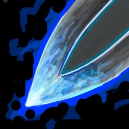
My 1st ability. I call it "Guardian of the Sea".

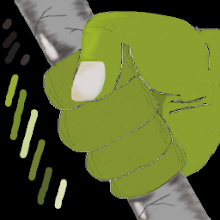
View attachment 276328

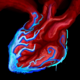
Though I'm not contented yet, it might be changed. I'm just experimenting different styles.

That looks like an OP spell haha and it's awesome!

Hopefully it will be better than what i did: Making a screenshot and editing it until it look's good.

I hope that too I want it to be used in games if possible :3 :D
 

Attachments

  • IconContest16WIP1.jpg
    IconContest16WIP1.jpg
    84.3 KB · Views: 681
Level 19
Joined
Apr 21, 2013
Messages
1,194
I will link your Icons anyway after they are uploaded. And Varok Saurfang is an Important figure your Icons will be used that i assure you.

Awesome news! Be on the watch for further updates ^^


EDIT: NEW WIP !! Open for any feedback ^^

iconcontest16wip3-jpg.276340

EDIT 2: Last update and I'll be on vacation without being able to draw anything for a week :(

iconcontest16wip4-jpg.276344
 

Attachments

  • IconContest16WIP3.jpg
    IconContest16WIP3.jpg
    158.4 KB · Views: 612
  • IconContest16WIP4.jpg
    IconContest16WIP4.jpg
    157 KB · Views: 648
Last edited:
Level 10
Joined
Jun 11, 2017
Messages
77
i'm probably cancel my participation, i usually yearn some feedback as someone who practice art, and i get the feel on wanting feedback, get some appreciation and get hurt by hard critics xD

and I just want to drop some opinion for the icons u guys made, prob useful :pal:
(i learned how to use bb code xD)

@PrinceYaser i think some people already covered up what i need to say :nemor:

@~Nightmare

btnqueenoftheforestp-png.276194


i just want to point out that the hue of the skin color doesn't really match with the original model that you use as reference. it's too much green to blue hue rather greenish yellow. other than that it looks fantastic.

@Stefan.K

cLnV52v.png


i think u did ur best on portraying the model. the hood is too blue, the model have dark grayscale color. just opinion, i think u overdid the wrinkle stuff around the face (wrinkle right? i mean face detail) the face looks too old, it seem the model itself is just a normal adult with beard with definite face shape. the shading seem a bit mushy there, or might be just personal taste.

dfciAIG.png
wvxAfIM.png
mxk74gr.png


these icons is a beast, fantastic idea and execution!

hZJ3vFU.png


this one i think i lose some focus there, the ice near icon border is dark, the ice near the eyes not quite visible. i think the most focus that i get to see from first glance is the ice that got the most bright color, not the eyes, which i think should be the main focus. if it does your original intention, probably try to make the face much brighter? eyes. if the ice near the center got that much light source it prob the best to make the skin much brighter too. the point is, i just suggesting that center part of the icon prob much better to get more attention for audience eyes rather the other parts of the icon.

@BLazeKraze

this is great, some doesn't really correct with the model looks but i get it what u want, that u want to portray the beard and the tentacle at the same time. bigger nose and smaller eyes to match the model might not work much with given perspective (or is it?) i think it could have more stronger expression given how the model looks in different perspective, just my choice xD still, a great job.

the second icon, the glow on his back? so he guarding the one that is on his back? xD it doesn't make sense for me, but i get it. it looks just like those movie scene when the character looks bad ass with silhouete on the front and explosion on the back (or without silhouette, it's probably just in cartoon or animation/anime xD)

it looks good, portraying the model on the deep sea. what i have in mind is probably personal taste, so all i can say for the icon it looks great.

@NightStalker

can't give much for early wip!

@trebla ratilla

u6W5eyPk9P0ooQjbV_7lRsKAuEE81eqGyILos5G_5PBEZCn-oiT7ZVJewsWS2LY9AmWjihyTuQaRdvZqI-9Ah4cQOESefPnAiMUQ=s64


it looks pale, the original skin looks much bright and have a higher contrast u need to apply stronger shadow and highlight.. the head shape of the model doesn't look that round. it have much more, strong definite face? i couldn't find a good word for it xD.

also, the little detail u put on bigger picture doesn't work on the icon, try simple but clear detail. tbh, it doesn't seem portray usual style of Warcraft icon angle, where it alwas be centered. if i were u i try different perpective, and adding stronger shadow highlight and simple clear detail.

HKRWBijEZrHD13xgAQJ2plNjWbadbcDIE72NEuYZizR8glWDodv-qz55rdZu4b_jBYUiwtqZzmTLuvjK20xW_JDGW8AXk-zkf0E=s64
Ahrz6emwCtFk_sjWcZk_4gAA4pVVjMBILLXYdWoY-1j7osQeI0uyzeul4u_RxaWUEBzWt0IhUFdOOVYs_Q7S8bL0bkauq6dI6eAW0A=s64
eC0fkUJLsEbIQA-sN_AkwzHWv5Tpft6ACQHytTKBg7h-z8vDIriyFfJn628JTwwiUxV1cG9mZjea1TwktC7W8rEvkbUZc6Sv1LDFlw=s64


and to be honest, your icons shading looks way too basic. most good thing i can say that u need to get to learn more about some technique, play with colors, stronger shading and highlight and practice more. see some Warcraft icon for reference. work hard play hard!


@Murlocologist

btn-wip-png.276653
btnwip-png.276251


i don't have much words, u know the drill and u did splendid job. (i should use that dark line to define my icon too! mine looks low definite compare to yours.)

@Naze

portraitwips-png.276339


my opinion was when i saw the second wip, the shape looks good, but the final icon for the color is way too much imo. too much color going on and I don't get the picture, and where i should pay my focus too on the icon.

@Edge45

need to know the model first before i drop a comment :pal:

@stein123

239216-930b4b389463636509fe167dc6e34138.jpg


hands down, i fall easily for bling - bling.
the idea very interestme. everything is right in order! (tho i think it better to distinguish the bling for the face) and except that black shading make it looks way cartoony and probably make it out of place for Warcraft 3 icon. try to get dark color of the hue choice, not black for shading.

edit : and probably rescale the smallest eye, not sure if it's visible much in smaller icon size xD

if you confuse for color, pick the sample of skin hue that u want to use reference, and measure the range of the hue, bright and dark, and saturation of the skin color sample, to get the exact color that u want/need. something like this, tho i think u get what i mean :pal:

screenshot_1-png.277113


all in all u guys did fantastic job with your work, good luck :pal:
 
Last edited:
Level 15
Joined
Dec 21, 2013
Messages
910
Subscribe, just in case I want participate

I have a question, are the art style must be same (or similar) with default warcraft icons? I'm not really understand this "Is the style used similar to otherstandard icons?". Is it a good thing or bad thing?

And there is a typo in the news panel. "You love Warcraft 3? You love drawing? Than You mustn't miss Icon Contest #16! Display Your skills, have fun and win awards!"
 
Last edited:
Level 10
Joined
Jun 11, 2017
Messages
77
Currently Done:

btnarcanehunter-png.276757


Wips:

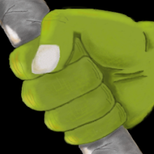
View attachment 277119 View attachment 277120


@Flute

Arcane Hunter by @MatiS,
still haven't recieved any pm permission, but I've started anyways

I really like the icon, love the 2 different glow idea :infl_thumbs_up:

if it were me : the facial expression could be more menancing as expressed on the model face, as the current look now the expression looks sad/calm/composed, which doesn't match imo (just a taste). it could use more detail too, the current face looks a bit young, and some wrinkle detail and darker shadow around the eyes, also no blue glowing eyes? might be overkill for 3 glow color but might worth a shot, also interesting icon wip too! :nemor:
 
Level 19
Joined
Apr 21, 2013
Messages
1,194

Attachments

  • IconContest16WIP5.jpg
    IconContest16WIP5.jpg
    140.4 KB · Views: 602
Level 19
Joined
Apr 21, 2013
Messages
1,194
Here's my first ability, I call it Berserker's Call which will be Varok's ultimate ability.

I'll explain each ability's description when I post the final entry for all icons.

berserkers-callwip1-jpg.277963


UPDATE:

btntry2-jpg.278008
btnbersekers-call-jpg.278009


UPDATE:
-Uploadedthe ultimate ability's 512x512 size in case it is needed.
berserkers-callcloserwip3-jpg.278058

-New WIP of another ability
varokfirstabilityicon-jpg.278059
 

Attachments

  • Berserker's CallWIP1.jpg
    Berserker's CallWIP1.jpg
    168.1 KB · Views: 397
  • BTNTry2.jpg
    BTNTry2.jpg
    1.9 KB · Views: 797
  • BTNBerseker's Call.jpg
    BTNBerseker's Call.jpg
    2.3 KB · Views: 807
  • Berserker's CallCloserWIP3.jpg
    Berserker's CallCloserWIP3.jpg
    197.2 KB · Views: 354
  • VarokFirstAbilityIcon.jpg
    VarokFirstAbilityIcon.jpg
    185.1 KB · Views: 354
Last edited:
Status
Not open for further replies.
Top