- Joined
- Jan 25, 2011
- Messages
- 2,294
Better?
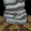
Still a WIP right?
You need a lot more shading, and a lot more texture yet. But it's looking good so far.
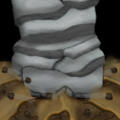
Better?


Hey, just gonna interrupt your warfare with a design question;
I'm considering to recolor the fire bolt icon to green and stick with green fire as a theme.
I'm doing this because of the skeleton mage model contains green fire (the burning skull and wand).
If I'm allowed to do this, I'll have to consider to remake the life drain abillity to a fire breath abillity or maybe do a seperate fire breath abillity and keep the life drain.
Also, new icon;
Rain of fire, it looks really alike the rain of fire from world of warcraft. I thought it existed in wc3 but apparently it didn't. I can confess I was inspired by it, but I drew it like from memory or something.

Green

Original


Why does it have to show part of him? Not every icon in War3 shows it's owner's hand/hoof/weapon/whatever he feels like showing off.

Still a WIP right?
You need a lot more shading, and a lot more texture yet. But it's looking good so far.
You could make the hoof/hand's edges stand out from the ground.
 Yeah. And such.
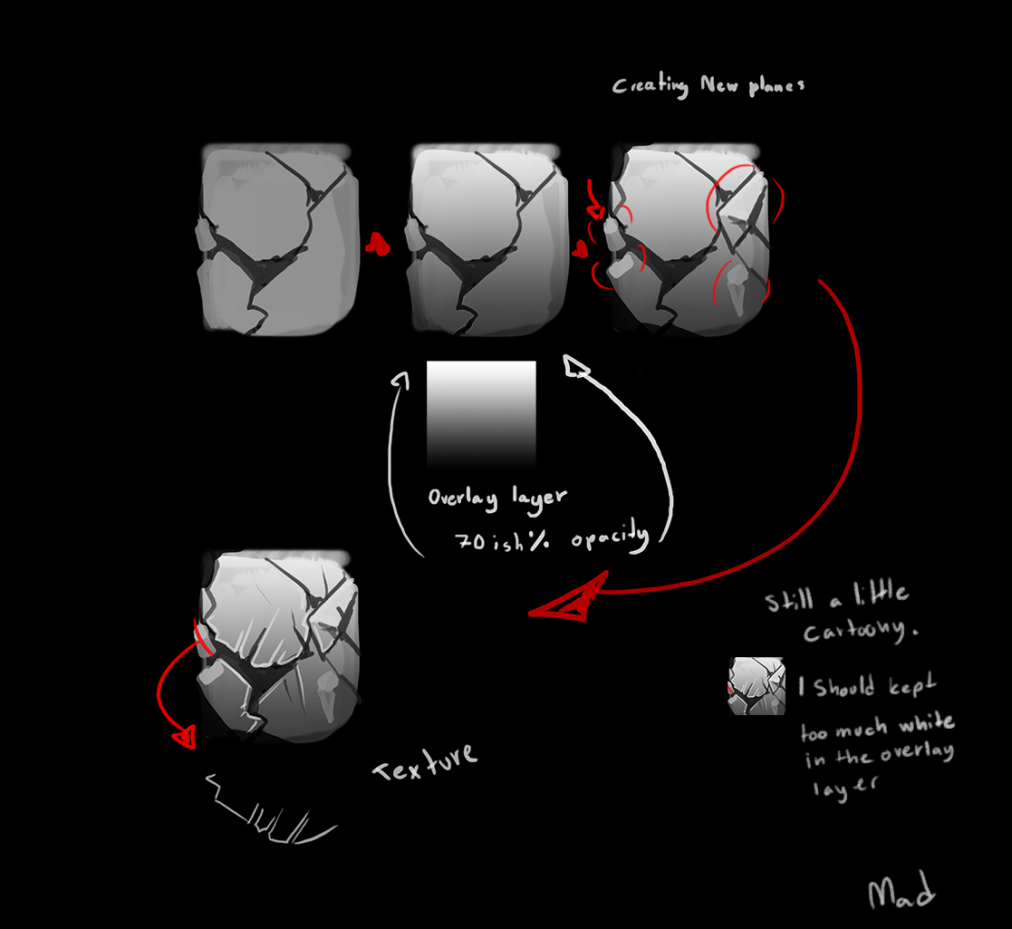
 Right lol, can't move on to next icon. You're right, I'll put shading & textuh.
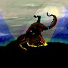
It's a Hand! And right, I think I'm gonna make it look like power is coming out the fist.

Fire rain looks cooler, but even then the tail looks really straight. Perhaps more flames in that part?

U can't recolor it to green, coz ingame the fire is red whenever u cast the ability.
Also, if u do this ability(rain of fire)for the skeleton mage, u can show at least a small part or weapon of the casting unit.
Better?
Pretty Last:
Thanks, Mad!
Still needs texture, shading and you need to visualize the impact. Some energy being released from the impact point. Like the War Stomp icon.
Aw, didn't see that happend, here is an update
Aight, I tried to incoporate a skull in the image at first (that one of the meteors are closer and are a skull was the first thought, but it went over to something like this:
http://i.imgur.com/VyK89cy.png)
I figured this would be too hard to depict so I gave up and just went with the rain of fire instead.
I greatly appriciate the fast responses and keeping me on the rail, mate
It looks really promising
I made this quickly to try and show what my next steps would be
I hope you find it usefull in some way


Early W.I.P.
Taunt for Abomination


Failed attempts
Just scale up the yellow rays in the first image.
Failed attempts


Lips charm. Cool idea Mad
Lips charm. Cool idea Mad

Hello Mad. I have an idea. U can make the skull looking over a crystal ball that may/may not have skeletal hands over it. And then u can show rain of fire inside it. What do u think?
Hmmm, I agree the yellow light is the simplest, but I also liked the others you tried to do, perhaps make the curved light a little more like an eyebrow?Failed attempts


Umm... Goodbye?I am leaving this contest, good luck to others who participate. In future maybe there will be some normal contest without silly rules of how the icon must be archived. Freehand rule is and always was the most irritating thing in the community. This is a Warcraft III Community not some art gallery. Maybe in future everything changes from this horrible system- Hive 2 + hope.
Looks pretty cool. While I love the idea of a "greenfire" (or maybe "plague") rain of fire, the green one looks too muted and odd. :<Hey, just gonna interrupt your warfare with a design question;
I'm considering to recolor the fire bolt icon to green and stick with green fire as a theme.
I'm doing this because of the skeleton mage model contains green fire (the burning skull and wand).
If I'm allowed to do this, I'll have to consider to remake the life drain abillity to a fire breath abillity or maybe do a seperate fire breath abillity and keep the life drain.
Also, new icon;
Rain of fire, it looks really alike the rain of fire from world of warcraft. I thought it existed in wc3 but apparently it didn't. I can confess I was inspired by it, but I drew it like from memory or something.
Green
Original
Why does it have to show part of him? Not every icon in War3 shows it's owner's hand/hoof/weapon/whatever he feels like showing off.
Eh... I would argue that it doesn't have to show a part of the character... But if I'm not mistaken, that was kind of the point of the contest; make an icon so someone other than the Blademaster can Mirror Image, or someone other than the Spell Breaker can Magic Defend, etc.Because the contest is an existing ability on a different unit. That is not shown by just recoloring the icon.
Aw come now. They're all really good... Hard to decide. Seems just the tiniest bit 'soft', though, for Warcraft; wouldn't mind seeing more stark contrasts.Failed attempts
Ohhhhh man. STAHP. You're not allowed to awexome all over other people's ideas; it leaves quite a mess. Lots of paperwork.It is a really beautiful naga face you've drawn
Something I'd do to make it a charm spell would be to zoom in to the mouth area. It works really well with the great naga you've drawn.
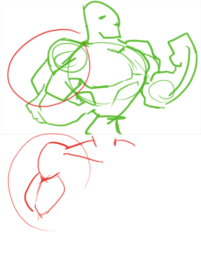
Here is an example I made, drawing on top of your icon, since I can't draw womens' faces well.
MAN. You almost make it lookMad said:To Chenralstrasz,
I don't know if I linked the image in my last post for you, so here it is again:
(I hope you can see what I've written, I've a pretty terrible handwriting)
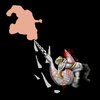
another thing that came to mind was that you could try to draw the image so the fist is rotated and more fingers are shown. But I might be too late to ask you to do this, considering how far you've come with the image.
STAHP STAHP STAHP.Glad you liked it
On another note; I've remade the rain of fire once again, please tell me what you think!
Edit:
I loved the idea, but I couldn't execute it.
Also i dont understand ? u did with the stone pic but looks cool. Good Luck to chentralz to implement that idea. Then yr icon will also look cool (i think)
Also, my username is Chenralstrasz, but if you want, just call me Chen So you're telling me my icon don't look cool but It will only be cool if i will do that? Sorry for being harsh, forgive me lokharke
I came up with a wicked idea. It goes a bit off of what Charm is, but you could do the following.Hmmm, I agree the yellow light is the simplest, but I also liked the others you tried to do, perhaps make the curved light a little more like an eyebrow?Failed attempts
ofc no. Your icon looks nice but i liked the detail that mad gave. It is not compulsory for u to modify it. If u think something makes your icon nice, u can implement it. All icons are nice for me as long as they can give the concept clearly.
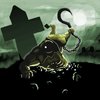
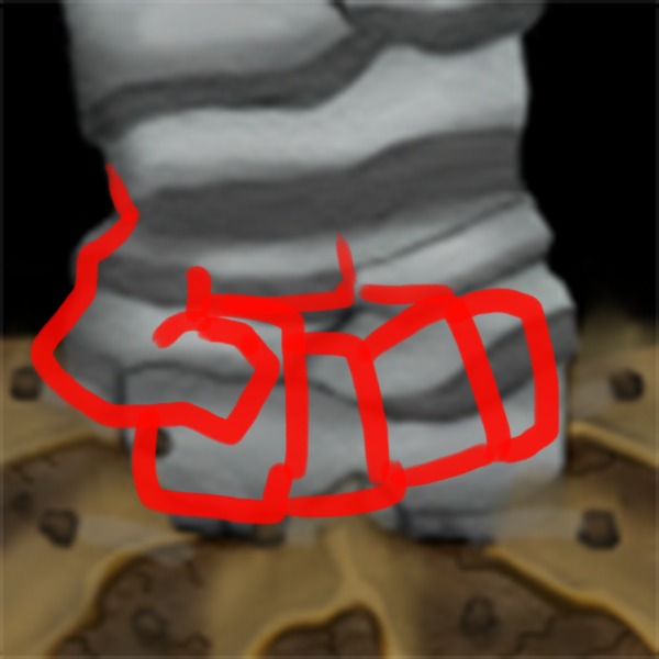
The icon looks nice except for the fact that it doesn't clearly indicate an abomination reincarnation. Here is 1 suggestion. U can make an abomination hand (the one that contains the butcher weapon) coming out of the ground.Abomination Reincarnation More complete
Early W.I.P. of Abomination Impale
Abomination Reincarnation More complete
Early W.I.P. of Abomination Impale
Here is two things I'd like to see: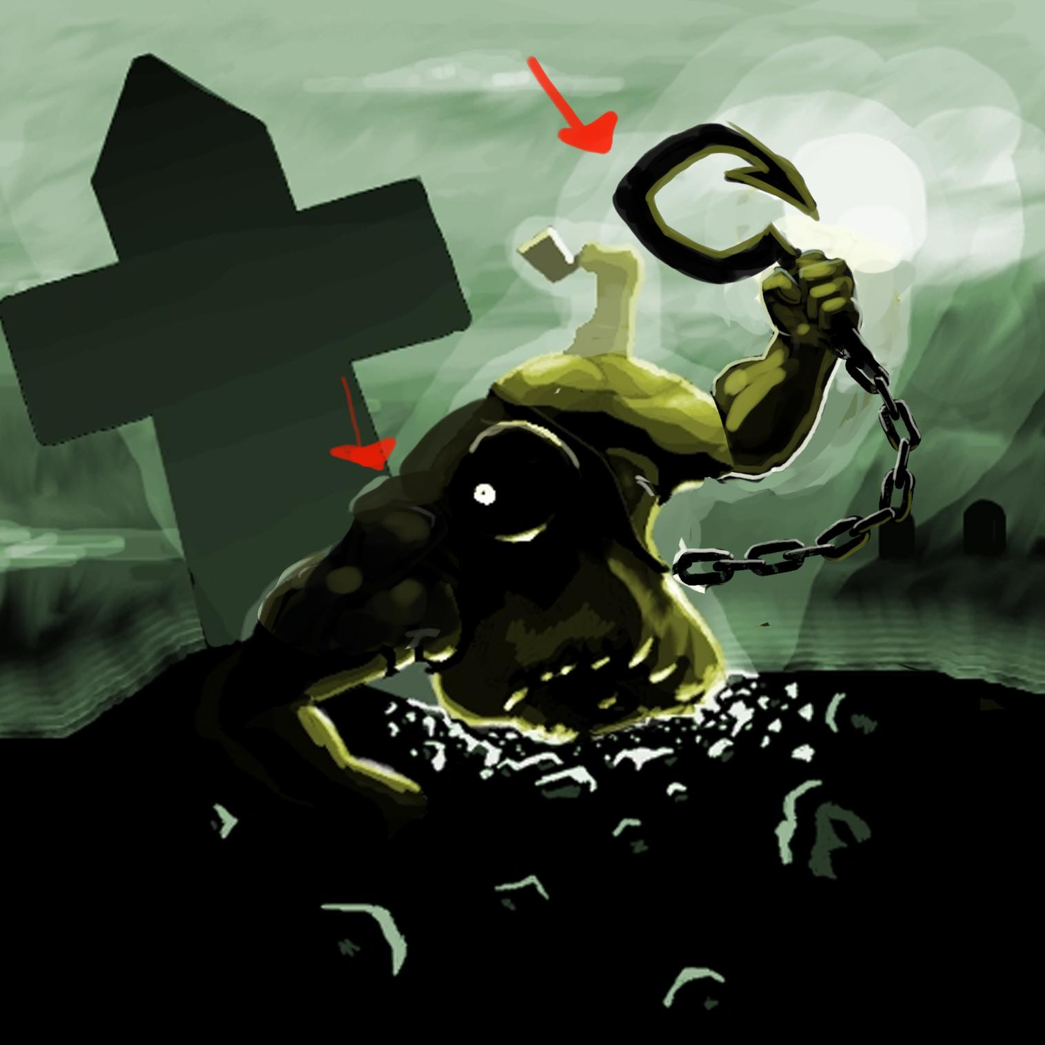


- The contest shall begin on 15.07.2014 and conclude on 15.08.2014, 23:59, GMT
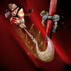
WIP for my second icon, Critical Strike for Sylvanas:


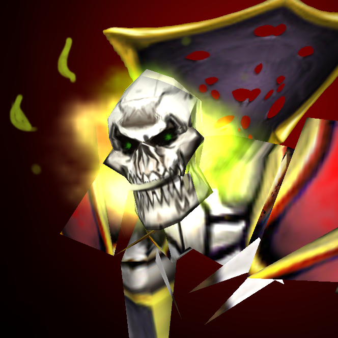
Hmm, I don't know why Mad, but the first one seems kind of cooler. It's a got a more wild fire-trail, like, more random, the skull has a nicer perspective and the front part doesn't have such a big aura of fire. I think that if the fireskull moves with great speed the front part of the fire will be very thin, as it is in the first icon.


Have you tried putting a stronger highlight on the cheeks, eyebrow area and teeth?I updated my rain of fire icon a little and I'd appriciate some further feedback
Old
New


I updated my rain of fire icon a little and I'd appriciate some further feedback
Old
New