• 🏆 Texturing Contest #33 is OPEN! Contestants must re-texture a SD unit model found in-game (Warcraft 3 Classic), recreating the unit into a peaceful NPC version. 🔗Click here to enter!
  • It's time for the first HD Modeling Contest of 2024. Join the theme discussion for Hive's HD Modeling Contest #6! Click here to post your idea!

Icon Contest #12 - Spells on Different Units

Status
Not open for further replies.
WIP for my 3rd icon, Fan of Knives for Harpy:

209577-albums5234-picture87016.png

Hah! I believe not many contestants had thought about making new icons for NPC units. The idea alone is friggin cool! :)
 
Level 7
Joined
Feb 16, 2014
Messages
322
Critical Strike for Illidan

This one took a lot of time but it was pretty fun. Besides, Illidan is the best character ever ^^

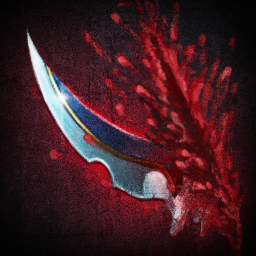
209078-albums5714-picture87024.png


209078-albums5714-picture87025.png

Nice! The blade and the ???wound??? look like they are pasted together in the icon. I say a little bit editing.
 
Level 7
Joined
Feb 16, 2014
Messages
322
Here's my first icon :
attachment.php
Peasant (Human worker) immolation
Not much inspiration for my next icons, I hope I find some before I run out of time !
Icon is nice and u can imagine a peasant like this. I would have preferred a tool indicating that the unit is worker but it may not look nice and would have to zoom out. Overall its nice.
 

Kyrbi0

Arena Moderator
Level 45
Joined
Jul 29, 2008
Messages
9,502
How's this?

137785d1406862849-icon-contest-12-spells-different-units-pasimmolation_peasant.png
Immolation and
attachment.php
Peasant (again) breath of fire

Building myself a fire peasant or I dont know xD Let's see where it goes...

Ooh.

I like that hand better than that face; the hand definitely shows good strong highlighting & contrast, where the face seems darkened & furry (beard-tastic!).

"fire peasant" is dumb... But it's hilariously dumb, so I approve. :D
 

Kyrbi0

Arena Moderator
Level 45
Joined
Jul 29, 2008
Messages
9,502
Hrm. I like the beard better on the Right, but the Left does show more skin (easier to contrast-ify)... But I think the problem I pointed out exists on both, actually. :<

See, the artwork is fine, it's great, it's really nice. But in terms of "does it look like it'd fit in Warcraft?"... I have to argue slightly against it. If you go with the beard, just make sure it's big, clear & well-lit:

BTNMilitia.png

BTNHeroMountainKing.png

BTNHeroPaladin.png

BTNChaosBlademaster.png

BTNBanditMage.png

BTNBanditSpearThrower.png

Even those with black/dark beards have strong contrast show it shoes up.
Lol.
"so it shows up"


Conversely, if you go with the skin, making it more lit & contrasted would be the way to go. (I mean heck, he's breathing fire; have some big fancy fire-highlights on those rosy Peasant cheeks :p).

All that I'm saying is incredibly subjective ("fittingness") and so take it with a grain of salt. And again, the artwork is great. Just saying.
 
Last edited:
  • Like
Reactions: Rui
Level 7
Joined
Feb 16, 2014
Messages
322
What do you think about this one?
If it had black hair and beard, I would have loved it. Now it looks a little rough But facial expression like that of militia is good. U can add this to prev icons if u want. May look good.
 
Level 31
Joined
Sep 11, 2009
Messages
1,812
Definitely better. Also you fixed something I didn't even point out last time; the fire. Looks more dynamic, contrasted & 'fiery' now. : )

Great, I wasn't sure if I could pull that warcraft-ish look ... Just need to find the inspiration and the time to create my 2 last icons but that's for another day because it's getting pretty damn late here! XD see you soon and thanks a lot for the helpful comments
 
I agree with rulerofiron99, the mouth should be much wider
right now it looks like he's vomiting fire, as if it were unintentional
also the eye makes it look like he's surprised it's happening because it looks like his pupil is focused towards the flame. he should be focused on his target if he's actually the one doing the firebreathing

maybe more lighting on the face too
 
Level 28
Joined
Aug 7, 2011
Messages
1,638
Nice! The blade and the ???wound??? look like they are pasted together in the icon. I say a little bit editing.

What do you mean? To edit the blood? It sucks, I know. Not good with drawing blood :X

http://img3.wikia.nocookie.net/__cb20090513193123/wowwiki/images/a/a8/PASBTNCriticalStrike.png
I decided to make it like Rend's blood because the wound seemed more realistic - http://www.wow-petopia.com/images/icons/Ability_Gouge.png Do you want me to make it like in Critical strike or..?

edit: actually, I should just remake the whole icon.
 
Level 7
Joined
Feb 16, 2014
Messages
322
What do you mean? To edit the blood? It sucks, I know. Not good with drawing blood :X

http://img3.wikia.nocookie.net/__cb20090513193123/wowwiki/images/a/a8/PASBTNCriticalStrike.png
I decided to make it like Rend's blood because the wound seemed more realistic - http://www.wow-petopia.com/images/icons/Ability_Gouge.png Do you want me to make it like in Critical strike or..?

edit: actually, I should just remake the whole icon.
I dont think enitire icon reqork is needed and definitely the 2nd desolater based icon looks clear (concept-wise) Just focus on the part where the blood/slash and the blade meet. And U are v good at drawing as u have shown.
 
Level 28
Joined
Aug 7, 2011
Messages
1,638
To be honest, I actually (until looking into the critical strike to realize what it is) thought it was a crab's leg.

Now I KNOW there are 100 hammers in Warcraft 3, especially in the same position but I just couldn't resist :X HAMMERS!

Endurance Aura for Paladin:

209078-albums5714-picture87075.png


209078-albums5714-picture87076.png


(I should also make a sword version, come to think of it. For Arthas.)
 
for your critical strike, if you distorted the blade to make it look like it was moving, it might make it more dramatic
as it is it looks like it's stabbing, and then the guy is just like, holding the blade in place for the picture, like a critical stab, not striking

but then again, the blade is naturally curved, so i don't know how you would achieve this affect without making it look really strange
 
Level 28
Joined
Aug 7, 2011
Messages
1,638
Aaa. True! That was what was missing. I had a feeling there was a missing piece. A very major one (cuz there are lots of others which I cannot fix due to lack of skill). I actually noted that when I was viewing the Critical Strike, since it has that type of distortion, but eventually forgot about it. It seems.

Thanks for pointing that out Just_Spectating.
 
Level 7
Joined
Feb 16, 2014
Messages
322
To be honest, I actually (until looking into the critical strike to realize what it is) thought it was a crab's leg.

Now I KNOW there are 100 hammers in Warcraft 3, especially in the same position but I just couldn't resist :X HAMMERS!

Endurance Aura for Paladin:
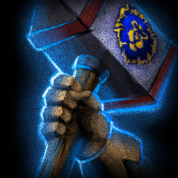
209078-albums5714-picture87075.png


209078-albums5714-picture87076.png


(I should also make a sword version, come to think of it. For Arthas.)
That is 1 cool hammer with cool light. Nice!

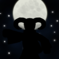
Did I say Necromancer Heal? Oh I forgot it's Necromancer Resurrection. Here's the first WIP.
attachment.php
This is turning v nice. I hope u can make the skull meld with the twilight. I remember the Baphonet for sigelang or maybe someone else. U can look at that icon for color if u want.
 
Level 7
Joined
Feb 16, 2014
Messages
322
This icon is turning out great. I like the eye color but maybe make it diffused? That is up to u. I say, let more light shine from the back and make necromancer more visible. Looks like you will complete this icon in 4-5 days. :)
 

Kyrbi0

Arena Moderator
Level 45
Joined
Jul 29, 2008
Messages
9,502
Abomination Reincarnation More complete
Early W.I.P. of Abomination Impale

I'll be honest Sin'Dorei (and I'm sorry this has taken so long in coming, so that you're basically already 'done' with this & other icons), but while looking really cool & with excellent artistry, it doesn't particularly strike me as a Warcraft-y icon. It's really detailed, with lots of subtle shading & colors, and a 'camera placement/angle' that is too... off.

If that's not what you're going for, then forget about it. :p However, if so, might I suggest a few thoughts...

One of the biggest things to me is that Blizzard icons tend to be really zoomed in pictures, and also very symbolic. They don't often try to encompass the 'whole' of a given spell/ability, but rather some symbolic element of them (i.e. Charm isn't a whole person with mental magic going around them, but a single glowing eye; Aerial Shackles isn't a dragonhawk rider shackling a target in fiery red magicks, but a single glowing magical loop; etc). There are definitely some exceptions... But they are just that, exceptions.

Consider my monstrously horrible MSPaint nightmare fever dream sketches that show some alternative "foci" for what an Abomination Reincarnation could be:
[[attach my MSPaint nightmare]]
One is just the outstretched Abom-Hand bursting out of the grave... Another is the Abom picking his teeth with a tombstone (lol)... Another is [[WHAT IS THE 3RD ONE]].

Hey Mad, let me know if you ever need some art lessons from me; I'm open for business.

[rainbow]:D :D :D :D :D :D :D :D[/rainbow]


Alternatively, just looking at the original Reincarnation gives another good direction; that of mimicking the original.
BTNReincarnation.png

It's literally just the upper torso of the Tauren Chieftain, all enraged & glowy & stuff... And it features, like, a total of 3 colors?

That's probably the key to me; Warcraft ability icons are just big, flashy, contrasted & colorful (There's that interview I remember reading about where the creative director would go around to the artists desks & open the window blinds, letting in all the light, telling them to make art that could be seen in such (non-ideal) conditions because that's how players will be playing them). A giant Abomination torso with hooks out-stretched and all big & (color? purple, green, ah dannae)... Makes sense.

Similarly for your Impale.

Keep on keepin' on! : )
 

Attachments

  • Abomination Reincarnation for SinDorei.png
    Abomination Reincarnation for SinDorei.png
    12.2 KB · Views: 89
@kyrbi0,
to me, those icons are just extremely uncreative, because it's just taking the warcraft icon and changing one part. I didn't join this contest to show you guys i can change the tauren into an abomination etc.
I want to incite new ideas for already existing ones
I made icons that are based off of my own imagination, rather than a warcraft employee's.

I will however keep working and i hope someone agrees with my direction...
 

Kyrbi0

Arena Moderator
Level 45
Joined
Jul 29, 2008
Messages
9,502
@kyrbi0,
to me, those icons are just extremely uncreative, because it's just taking the warcraft icon and changing one part. I didn't join this contest to show you guys i can change the tauren into an abomination etc.
I want to incite new ideas for already existing ones
I made icons that are based off of my own imagination, rather than a warcraft employee's.

I will however keep working and i hope someone agrees with my direction...
I respect your artistic decision/direction.

However, I have to point out that only 1.5 of my (poorly-drawn) suggestions could be considered "changing one part of a Warcraft icon" (bottom left).

The top-right may look like Animate Dead, but there's more to it than that; and I can assure you there is no icon of a character picking their teeth smarmily with a tombstone. :p

But still, to each his/her own.
 
Status
Not open for further replies.
Top