- Joined
- Jan 7, 2005
- Messages
- 7,551

Awesome stuff indeed^^
WIP for my 3rd icon, Fan of Knives for Harpy:

")


WIP for my 3rd icon, Fan of Knives for Harpy:
This one is amazing. Awesome idea. Even now it looks quite cool. This will turn out to be greatWIP for my 3rd icon, Fan of Knives for Harpy:


Critical Strike for Illidan
This one took a lot of time but it was pretty fun. Besides, Illidan is the best character ever ^^


Icon is nice and u can imagine a peasant like this. I would have preferred a tool indicating that the unit is worker but it may not look nice and would have to zoom out. Overall its nice.Here's my first icon :Peasant (Human worker) immolation
Not much inspiration for my next icons, I hope I find some before I run out of time !
How's this?
Immolation and Peasant (again) breath of fire
Building myself a fire peasant or I dont know xD Let's see where it goes...
"fire peasant" is dumb... But it's hilariously dumb, so I approve.


 ).
).The Right one. Beard looks niceAny thoughts? which one do you prefer?
vs

EDIT:
Don't you even try to mess with my workers now!
and flame naturally coming from mouth too.
If it had black hair and beard, I would have loved it. Now it looks a little rough But facial expression like that of militia is good. U can add this to prev icons if u want. May look good.What do you think about this one?


What do you think about this one?

Definitely better. Also you fixed something I didn't even point out last time; the fire. Looks more dynamic, contrasted & 'fiery' now. : )


What do you think about this one?


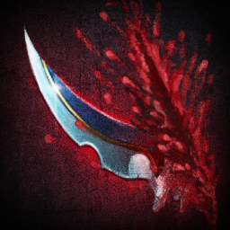
Nice! The blade and the ???wound??? look like they are pasted together in the icon. I say a little bit editing.


I dont think enitire icon reqork is needed and definitely the 2nd desolater based icon looks clear (concept-wise) Just focus on the part where the blood/slash and the blade meet. And U are v good at drawing as u have shown.What do you mean? To edit the blood? It sucks, I know. Not good with drawing blood :X
http://img3.wikia.nocookie.net/__cb20090513193123/wowwiki/images/a/a8/PASBTNCriticalStrike.png
I decided to make it like Rend's blood because the wound seemed more realistic - http://www.wow-petopia.com/images/icons/Ability_Gouge.png Do you want me to make it like in Critical strike or..?
edit: actually, I should just remake the whole icon.
Just don't shift+del the old icon. If it was me i would have already done that. v bad habit.I'm not happy with it anyways. The perspective is off, the blood sucks... I'm just going to rework it.


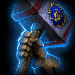


Or freezing/molten hammer passive etcpoisoned hammer passive?
That is 1 cool hammer with cool light. Nice!To be honest, I actually (until looking into the critical strike to realize what it is) thought it was a crab's leg.
Now I KNOW there are 100 hammers in Warcraft 3, especially in the same position but I just couldn't resist :X HAMMERS!
Endurance Aura for Paladin:
(I should also make a sword version, come to think of it. For Arthas.)
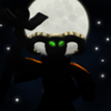
This is turning v nice. I hope u can make the skull meld with the twilight. I remember the Baphonet for sigelang or maybe someone else. U can look at that icon for color if u want.Did I say Necromancer Heal? Oh I forgot it's Necromancer Resurrection. Here's the first WIP.

Abomination Reincarnation More complete
Early W.I.P. of Abomination Impale
However, if so, might I suggest a few thoughts... [/rainbow]
I respect your artistic decision/direction.@kyrbi0,
to me, those icons are just extremely uncreative, because it's just taking the warcraft icon and changing one part. I didn't join this contest to show you guys i can change the tauren into an abomination etc.
I want to incite new ideas for already existing ones
I made icons that are based off of my own imagination, rather than a warcraft employee's.
I will however keep working and i hope someone agrees with my direction...