• 🏆 Texturing Contest #33 is OPEN! Contestants must re-texture a SD unit model found in-game (Warcraft 3 Classic), recreating the unit into a peaceful NPC version. 🔗Click here to enter!
  • It's time for the first HD Modeling Contest of 2024. Join the theme discussion for Hive's HD Modeling Contest #6! Click here to post your idea!

Terraining Contest #11 - Battlefields

Status
Not open for further replies.
Level 4
Joined
Dec 9, 2010
Messages
70
@Oziris, @AyeKantSpel

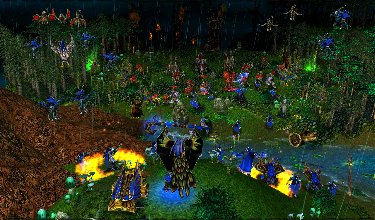
The cliff is inside the city of orcs, that is why the cliff going straight...And I have filled the left side with units, and doodads. So how is it?
 

Attachments

  • 1-3-2011 7-15-32 PM - Final Submission_4.png
    1-3-2011 7-15-32 PM - Final Submission_4.png
    1.1 MB · Views: 78
  • Like
Reactions: sPy
Level 12
Joined
Aug 22, 2008
Messages
911
@L2love, very nice concept and execution but the camera is focusing on the fortress itself and not on where the actual battle is. The siege weapons are too far and are not seen clearly when they are a very important element in the picture. However there are no units yet so I can't judge so much right now.
Your concept is interesting, I just hope you'll be able to fully develop it in time.

@Frutz, the environment looks better but you simply placed too much units on both sides! There isn't much room left for terrain after that. Reduce the amount of units and the terrain, the more important part of the submission, will be visible.

@David, your sky is simply cut at a certain point and that looks very ugly. Also the contrast of colors between the explosions and the sky stands out clearly, I'd recommend to find a more fitting sky. In addition the left side of the valley doesn't have environment in it leave the trees, so you could add some of the weeds and flowers you placed near Kael.
Otherwise good job.

EDIT: 775th post! :)
 
Level 4
Joined
Dec 9, 2010
Messages
70
@David, your sky is simply cut at a certain point and that looks very ugly. Also the contrast of colors between the explosions and the sky stands out clearly, I'd recommend to find a more fitting sky. In addition the left side of the valley doesn't have environment in it leave the trees, so you could add some of the weeds and flowers you placed near Kael.
Otherwise good job.

Thank you but can you please explain what is the meaning of your sky is simply cut at a certain point and that looks very ugly? Where is it? any recommendations for me?
 
@ idodik: i think that there should be a bit more units on the orc team and suggest if you do that make them look like that there comeing from out of the fog at the back of the picture and ill think it'll look better and also I think theres a bit too much leaves and should be a bit more dirt/rough dirt in the midle because if that is a bit more like a trail itll be more walked on and thatlle creale less dirt.
thx for reading if you found this usfull.
 
Level 17
Joined
Nov 11, 2010
Messages
1,974
I said I would redesign my terrain, and I think I finally have something going for me this time. Just still need to add the units though and some other stuff o:

2cz38rt.jpg


EDIT: Fixed WIP.
EDIT2: 2nd WIP - Ingame screenshot with units.

2wdszmo.jpg
 
Last edited:
Level 4
Joined
Dec 9, 2010
Messages
70
Just personal opinion here, but I think Thrall is way too big. He towers over all the other units like a giant. Kael being that size is believable, since he's in the foreground.

Thanks for the opinion, I made it intentionally because I feel that the Chieftain (Doomhammer) has to be in bigger size because he is an orc and is a leader of all orcs. So that's the size but if it is too big then let me know, i will resize him.
 
Level 2
Joined
Mar 26, 2010
Messages
11
Here's my final entry
It's doesn't have a big difference with the previous entry
It's still 15 days though
but today is my last holiday
so I can't improve my entry further (I'm busy at school)
(Damn! Holiday is over)
 

Attachments

  • tc11wip5.jpg
    tc11wip5.jpg
    247.1 KB · Views: 368
Level 17
Joined
Nov 11, 2010
Messages
1,974
FINAL WIP.
Loving the other entries in the contest so far, good job guys! :D

EDIT: Added a bit more insanity. :)
EDIT2: Okay added a bit more human encampment to the image, now I'll leave this alone and move on! :D
 

Attachments

  • final.jpg
    final.jpg
    255.3 KB · Views: 590
Last edited:
Level 17
Joined
Nov 11, 2010
Messages
1,974
This one here... Reminds me of actual battles from the campaign. Gave me this weird chill and intense urge to play through the campaign again.

Are you talking about the human mission where the shipments from Andorhal arrived at Hearthglen, and you have to defend the town from waves of Undead?
Yeah I got the idea from there, it was one of my favorite missions! :D
 
@David_89
Sky, please? Apart from that it's alright. The land around the Blood Mage is still a bit sharp though.

@Frutz
Good idea... But...

Battlefields: This terrain has to represent a battleground while or after a battle of two parties

@Raven0
I don't really like the ground. The rocks everywhere, it doesn't really look good in my opinion. And I suggest you change the trees as well. Great work on the citadel. :D

@supertoinkz
I feel that this is really missing some action in the scene...
How about make the existing forces there whilst another group is already engaging in battle? Like another group in front of the main angel fighting a small amount of troops from the evil side?

@Skycraft
Cavman is right. It gives me the good 'ol WarCraft III campaign feel. It's like any old melee scene...

@chilla_killa
Screenshot #1 is the best. It needs a teeeeny bit of smoke on the rocks on the back in my opinion.
 
chilla_killa, the second one! it's much better then the first one because you can see what's happening, in the first picture everything is too sharp and harder to notice but maybe that's just me. All in all, nice explosions.

Raven0, don't get me wrong but I've expected more from you.
Lets start with the rocks, they are freaking horrible, the models of course, not their placement.
The castle could indeed use a better wall model but I see why you've picked this one, you can actually construct destroyed parts which is a plus but a minus to it's looks. And they look small somehow.
The mountain there is just silly, instead of that mountain you can make a beautiful landscape swimming with trees with the moon above it shining with it's blue lights.
Why do the Ents have rocks on them? They don't grow underground, and rocks don't to grow on trees. You should use a different model for the tree, this one blends with the rest of the terrain which makes them hard to notice.
Btw, the shield, axe and sword don't make sense, why would someone leave them there? You could at least add a corpse near by to make it more realistic.
Hope this helped, good luck :)
 
Level 23
Joined
Dec 20, 2009
Messages
1,907
@Frutz
Good idea... But...


  • It's the contestants task to create a terrain that creates in any way the feel of a battlefield during or after a battle. Additionally a battlefield before the battle can be shown, because this is covered by while battle, since the lineup of the parties is a part of the battle itself.

also:

  • All submissions must follow the current theme. If any terrain does not fit, a moderator or the host will tell you as soon as possible as to avoid confusion.
 
Level 12
Joined
Aug 22, 2008
Messages
911
@Oziris: Much better. It looks somewhat blurry in the background though, and the tree's eyes are too big and too lazerlike.

@Frutz, you've spammed your units sooo badly I can't even see that tower in the distance. However the only spamming that really bothers me is the grunt spam... Couldn't you have added some more raiders, and some heroes or at least something else? You should also consider removing the Tauren, just bringing up thoughts.
There's not environment around the towers, and as manmade as they are they can't come over all of mother nature's creations. I'd suggest adding a bit rocks.
Other than that it looks good.

@Raven0, I like your idea but the ents aren't visible when you first look at the picture, and their "trunks" aren't brown enough. If you made them darker they would look much better in my opinion. And could you tell me what are those purple crystals they have?
Also the wall to the left of that rock looks a bit monotone in my opinion, you could add cracks or different signs on the wall to make it more interesting. One last thing, the arches look flat and stuck to the wall, and that decreases the terrain's value imho, perhaps you should use Dalaran arches or imported ones?
Other than that it looks amazing. Love the mountain, the ground and those flying fireballs.

@supertoinkz, there are several flaws I'd like to point out:
- The tiles you're using are too monotone, not only the blight you're using but also in general. For example consider using a bit more lava for the forces of Hell and a bit more grass for the celestial forces.
- The ground leveling is flat, simply put. I'd like to see the ground drop a bit more near the pit and raise a bit more near the spawning location of the celestials. Don't forget the area behind the dead tree and the pit.
- If you'll look where the ground and the sky meet you'll find an empty black line of nothingness, which looks very unprofessional. Terrain height and doodads will most probably fix that.
- I'm glad you decided to remove that tree (it doesn't contribute and hides important details), but you desperately need some more doodads in your terrain - whether if more trees on the left or more rocks or whatever on the right.
- Last question - what's that shrine to the right doing on that platform? lol
Other than that I like your concept, your unit layout is amazing, you just need to develop it a bit.

@Skycraft - I'd say this is nearly 100% copied from the WC3X Undead Campaign's first mission, and if not copied then dead similar to it. That annoys me so much I won't bother giving feedback. Your previous concept might have been better but I can't remember it.

@indomitable1319 - Basically both your submissions are the same, and their simple - flaming fields and a massive battle. It's nice but I'd like to see something more interesting coming out of that. Only thing that bothers me is those pillars of smoke coming out of the many fires.

@David - if you look at that distant orc barracks on the left you'll see that the sky is only existent on the left side - at a certain point it simply becomes black. If you don't see it - just look at the entire sky layer and tell me if there isn't anything wrong.

@DeathChef and tleno - thanks for the advice, but how do I make specific units display their walk anims ingame? I can't do it though the "Display walk animation for unit" function.

EDIT: 777th post! :p
 
Level 17
Joined
Nov 11, 2010
Messages
1,974
@idodik - Eh fair enough, I didn't get the concept from there anyway.
I'm not here to please, I'm just trying to get better at terraining. o:
Thanks for the comment anyhow ;D
 
Level 4
Joined
Dec 9, 2010
Messages
70
@David - if you look at that distant orc barracks on the left you'll see that the sky is only existent on the left side - at a certain point it simply becomes black. If you don't see it - just look at the entire sky layer and tell me if there isn't anything wrong.

Yea I saw it but actually the black part on the right side of the distant barracks is the high cliff located inside the city of orcs. And above the cliff, there are towers and citadel which the camera not captured on it.
 
Status
Not open for further replies.
Top