• 🏆 Texturing Contest #33 is OPEN! Contestants must re-texture a SD unit model found in-game (Warcraft 3 Classic), recreating the unit into a peaceful NPC version. 🔗Click here to enter!
  • It's time for the first HD Modeling Contest of 2024. Join the theme discussion for Hive's HD Modeling Contest #6! Click here to post your idea!

Warcraft III Reforged - Artistic/Textures/UI Feedback

Status
Not open for further replies.
Level 11
Joined
Nov 23, 2013
Messages
665
Greetings Hive!

So there has been a lot of discussion about Reforged already, with a great deal of hype and hopes, but also questions, concerns and speculation. What matters now is that the final product is still a work in progress and Blizzard employees stated several times they were going to have a lot of discussion with the community. They expect us to provide feedback, and hopefully Blizzard will heed our call! (Inviting you here @Kam , if you don"t mind)

I suggest we discuss visual changes in this thread: graphics, design and UI, which are the biggest changes so far. Let's try to be as specific and constructive as possible, not just deliver only vague and general opinions. I'll give it a shot myself, feel free to follow along.


UI:
  • I'm not a big fan of the new UI aesthetics, but I like that its size has been reduced, it provides a better view of the field, and it gives room for further modifications (I'm still hoping for a wider unit selection and more slots for buttons and inventory!)
  • Portrait area: I would prefer if there was a frame around the unit and a background. Also, I find portraits are a bit too big and invasive. I'd like portraits to be mostly about showing the unit's face, with their facial expressions.
  • Icons:
    • I feel like icons miss a larger rim (except for passive abilities, of course), which would make the buttons look like they're in 3D, like the original ones. Right now they seem rather flat.
    • New icons seem to be mixed in different styles. It seems it lacks consistency.
    • Redesigning all icons from scratch seems unnecessary: the original icons (with a higher resolution, if possible) would have certainly been enough, since they were already pretty good; remaking them is a waste of time a manpower.
    • But if the recreation of icons is absolutely necessary, don't make them look like too different from their original design. First, because the original design was good, and changing just for the sake of changing seems pointless. Secondly, and more importantly, we players have been seeing the current design for more than 15 years, and drastic changes will confuse us if it doesn't feel like Warcraft III anymore.
Units:
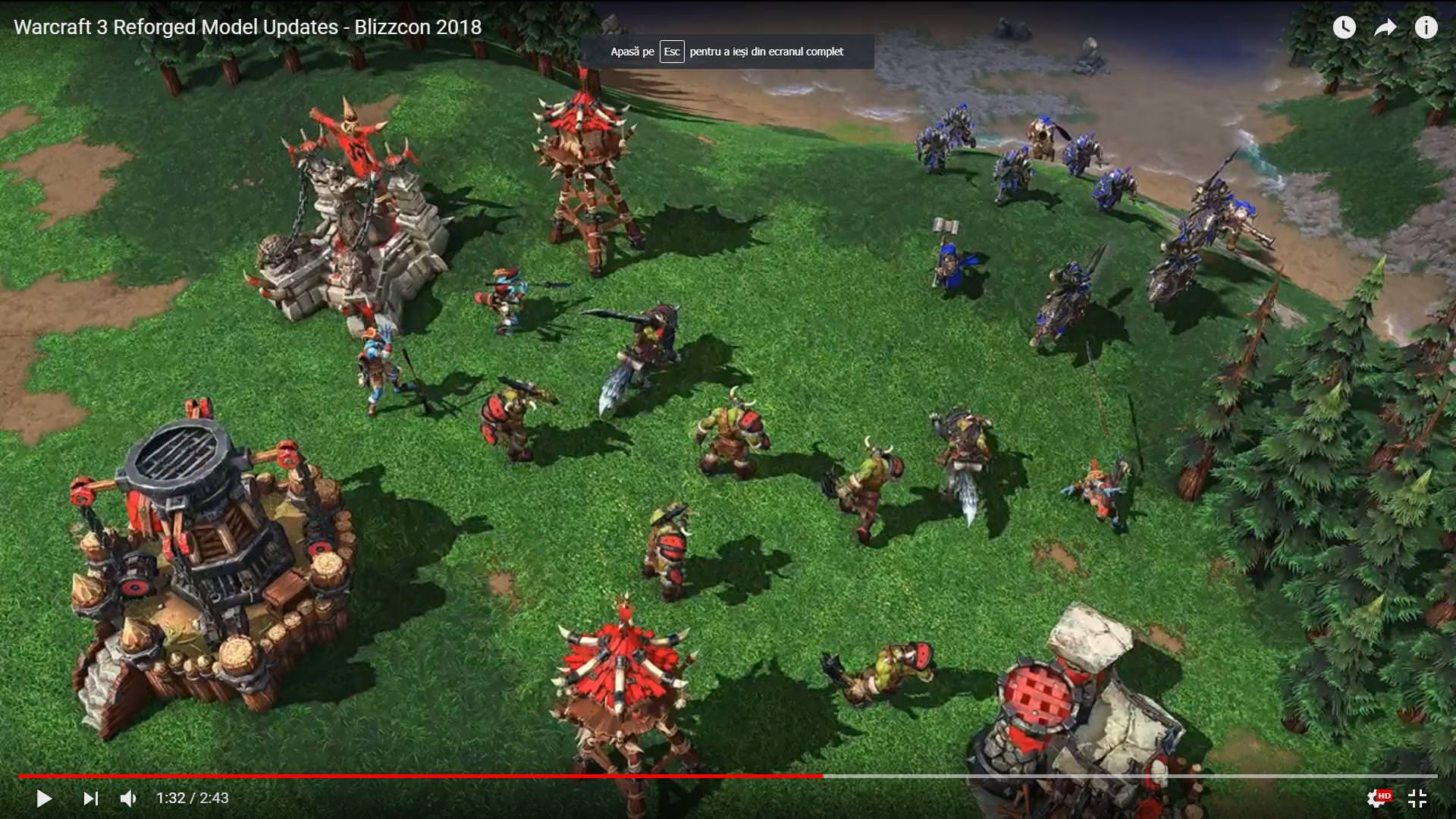
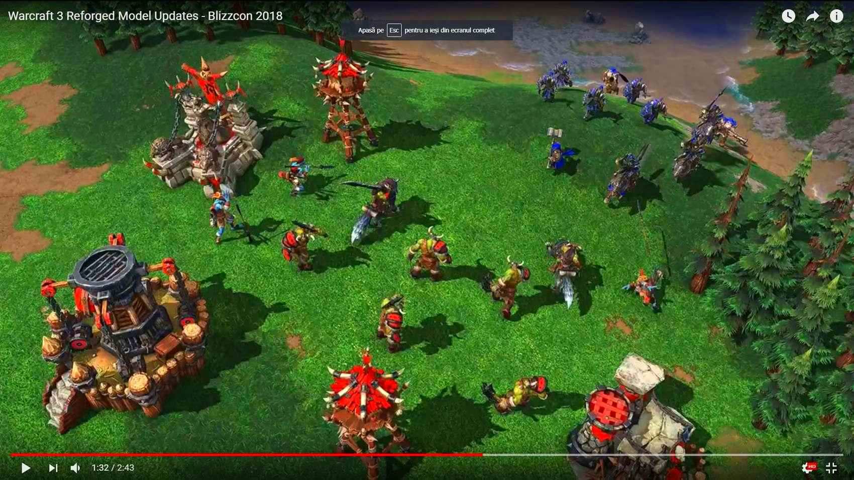
  • Proportions of almost all units:
    • Almost all units I've seen so far have absurd proportions. It is ok to have stylised units with unrealistic proportions, just like in the original game. However, new units proportions are way over the top, and don't match original units. New units would be better with exaggerated proportions, but not too much, just like the original game. Don't exaggerate what was already exaggerated!
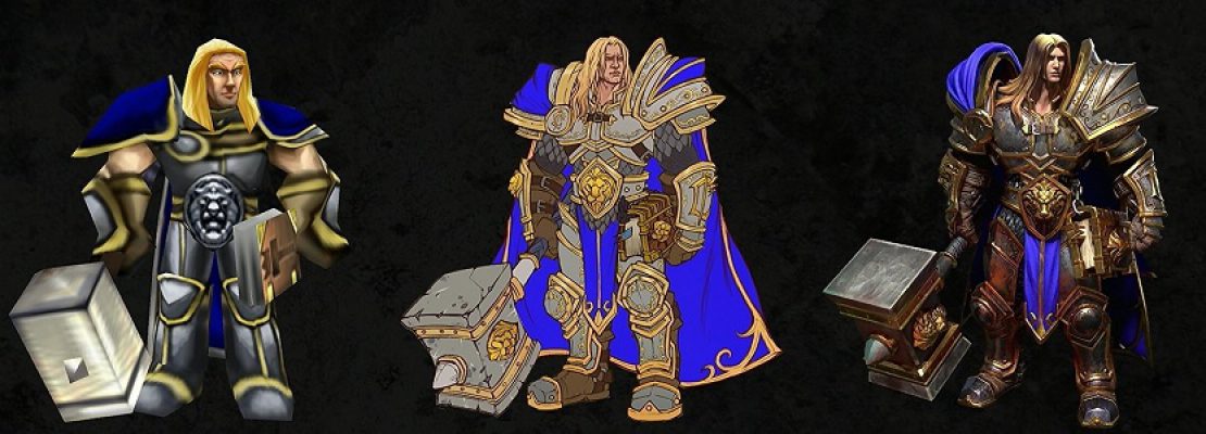
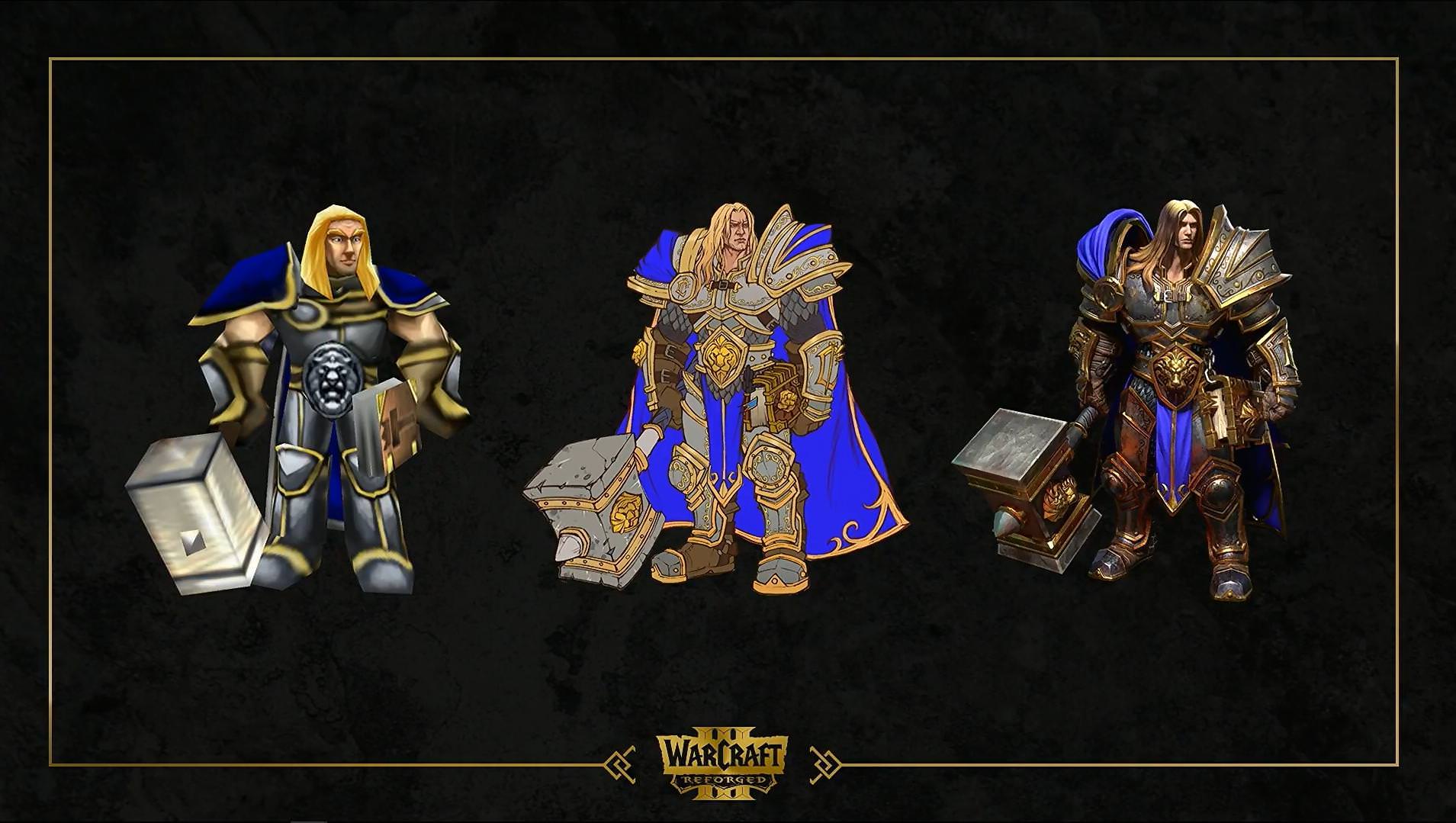
    • Most weapons are oversized. Arthas' hammer is probably the worst. I mean, the man has a hammer ten times the size of his head, this is ridiculous. I really wonder why this aesthetics choice has been made since WoW, I always found it ludicrous, but there is no need to introduce it into Warcraft III (which already had oversized weapons, there is no need to amplify this). Tauren's log, paladin's hammer... have the same issue.
    • Some units have their head way too small compared to the rest of the body, they look really silly with their tiny head (Arthas is the worst).
    • Almost all units have oversized armours. Again, I understand it's a deliberate choice and not just a modeling mistake, but I really don't like it and I'm definitely not the only one. The worst armour parts are spaulders, they are way too big on so many units: grunts, Arthas, footmen... Not only does it give a weird look to units, especially when they have such puny heads, but it's also totally unrealistic: how are fighters supposed to see what's happening in battle when having these large eye-blinders on both shoulders? Keep it sensible, guys!
  • Heroes:
    • Heroes have always been larger and taller than regular units, and it's a good thing. But now, isn't a bit too much, for some heroes (at least Arthas)? If you take a look here, for example, you'll see Arthas is twice the size of a footman, who look sooo teeny tiny compared to his master. I think heroes are recognizable enough, no need to exagerate their size. Blademaster seems ok though.
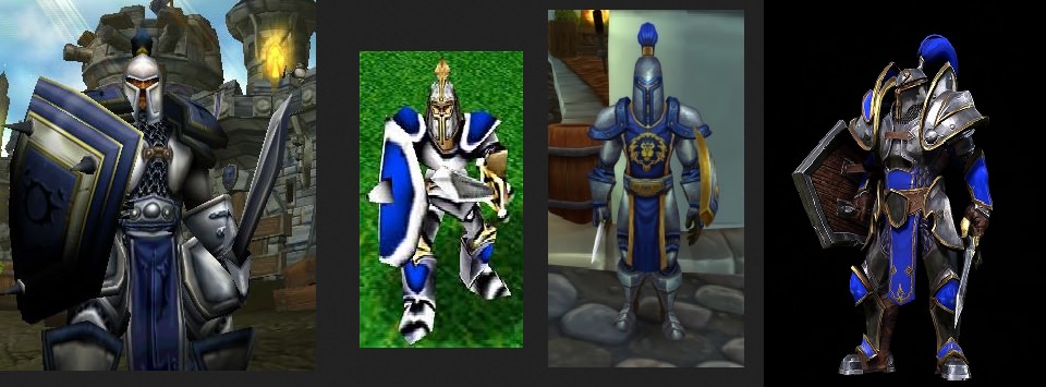
    • Arthas has such a long neck! And a tiny head! Also, giving him a more arrogant face would be nice. Plus, his pauldrons and his hammer are way too big.
    • Jaina: her face is different from the one she had in Classic WC3. Her staff is too big. Also, despite her design being relatively close to her Classic's version, one thing bothers me: she wears a weird metal corset with a huge cleavage and her belly button exposed. Half-naked chicks are such a cliché in video games/fantasy worlds. That kind of armour protects nothing and looks really ridiculous and unrealistic.
  • Footman:
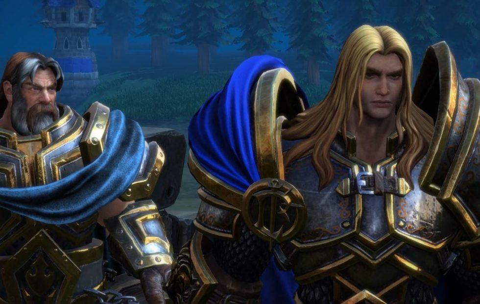
    • He doesn't look like a "real" footman. He's too epic, too noble, too fancy. He looks like a hero (like this iconic hero from game cinematic) or some commander, not a regular infantryman. Therefore, a few suggestions:
      • Remove the golden rim from some armour parts
      • Reduce the size of spaulders (drastically!)
      • Maybe remove the tabard
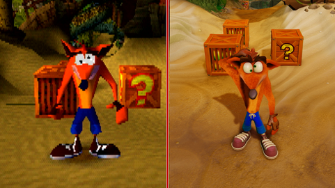
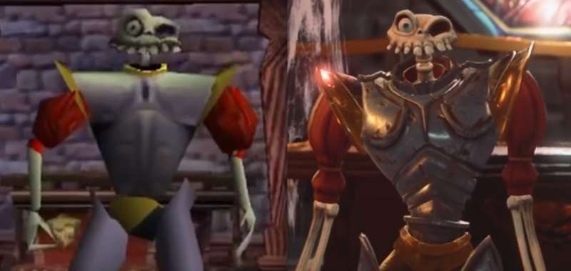
    • Pauldrons are insanely oversized. For some reason, in the recent years, many pauldrons in Warcraft games (footmen's pauldrons, or other units/characters') are big, really big, and it doesn't make sense. First, it's totally unrealistic. Of course, Warcraft is not supposed to be actually realistic, since there are Elves, Dragons, magic... But it needs to be coherent and believable. Gigantic pauldrons prevent Footmen to see around them. In a battle, they would be blinded. Secondly, it so far from the original design. And finallay, it doesn't look good: it looks like a spacemarine suit, or a strange carapace, or something like that. It's supposed to look epic, but it's so oversized it looks silly instead. Footman looks like a kid who just tried his dad's armour on. Just look at this picture:
      footmencomparison-png.318720
      This pictures shows how different Classic and Reforged Footmen are. It also shows that gigantic pauldrons don't look good at all, especially when seen from the side. And finally, WoW's version shows that Footmen/Guards can look nice with reasonably-sized armours and weapons.
    • Make the footman more recognizable. His design is not close enough to the original one, and it's harder to recognize footmen in the middle of an army.
    • Footman's posture doesn't reflect is personality and what he was in Classic WC3. In the current Reforged version, the guy stands straight, like posing for a fashion catalogue. He doesn't look like he's "ready for action"! On the other hand, the original version shows the footman not as straight, but in an alert position, ready for combat at anytime. It also reflects the fact that the footman is not a proud, noble and invincible hero who poses like a statue, but a man of the people, who's just here to defend his land and who is indeed "ready for action".
    • The crossguard of the sword looks make the sword look like a toy. It quite ugly, to be honest. Let's compare:
      retardedswords-png.318752
      (on the left is the sword the hero carries in the intro cinematic of Classic WC3)
      Footmen should have swords that look like the picture above, or something similar to Reforged Militia's sword.
  • Peasant:
    • Head is a tiny bit too small, perhaps.
    • Apart from that, they are quite nice. Militia is pretty cool, too. I would only swap their sword for an axe, like in the original game. Axe is more appropriate for a peasant: he already carries one around all the time to chop wood, and from a realistic point of view, a sword is expensive to craft/buy, not everybody can afford one! :)
    • It's odd to see a peasant building a structure using his axe! A hammer would be more appropriate for building animation.
  • Grunt:
    • Is the beard absolutely necessary? I can't get used to the idea that every single grunt of my army will have the exact same beard. Especially if you consider that Raiders also have a black beard. That's too many black beards.
    • I feel like textures make grunts look a bit like plastic figurines (mostly when using a close-up view). I'm not sure why, maybe because the skin is glowing a little, as if it was wet.
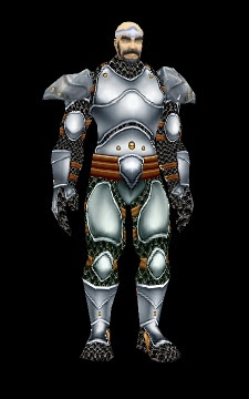
    • I think grunt's body is oversized. More specifically, they have gigantic shoulders, hands and chest, which makes their head and legs look ridiculously tiny. In Warcraft 1 and 2, grunts and footmen used to have pretty much the same size; in Warcraft III and WoW, orcs are a little bit larger than humans. In Reforged, Grunts' proportions are totally different than any other Warcraft game. There should be more consistency. Perhaps it would be better to stick with either choice (WC2 or Classic WC3 or WoW), but not make grunts so bulky (they almost have the size of a tauren right now, in my opinion). In the picture below, you can see what I mean about Grunt's proportions.
      gruntscomparison-png.318724
      Imho, Grunts' proportions are better in WoW.
  • Tauren:
    • Texture looks a bit like plastic figurine too.
    • The weapon is way too big. It's obvious when you compare it with the original tauren. The big log Taurens use shouldn't be as large as the Tauren himself.
  • Knight:
    • Knights have weird swords, just like Footmen. Those swords look like toys. Make them slightly more realistic, and mostly work on the crossguard, which is awful as it is currently.
    • One thing maybe could be tweaked: knights colours are too dark, which makes them too different from the original model and harder to identify in the battlefield.
    • I only dislike their lance that they barely use if not at all, but it's not about Reforged, it has always bugged me in vanilla Warcraft III! :) (I'd rather have a shield)
  • Rifleman:
    • Design is very nice, nothing much to say. Very faithful to the origina model, good job on this one. I'm just having one doubt: it's hard to tell when only watching videos, but aren't riflemen a bit too tall, compared to footmen, for example? Feels like they have almost the same size, unless I'm wrong.
  • Mortar Team:
    • The smoking pipe looks nice, but... who would smoke around explosives? 100% realism shouldn't be aimed for, but things need to be plausible.
    • The white-haired Dwarf has some sort of manga hair. It doesn't look like Warcraft at all, ans it will be weird to have an army full of Dwarves with bad hair cut.
    • Pilot goggles are not bad in themselves, but they seem unnecessary. Those Dwarves don't fly, they don't need glasses. Just because pilot goggles might look nice on Dwarves doesn't mean that they should wear them.
    • The scope: maybe its size could be reduced a tiny bit?
    • Apart from those points, Mortar Team is pretty good.
  • Spellbreaker:
    • Overall design is ok, but why such a big helmet? It's thrice the size of his head, while the original design had much more reasonable proportions. Also, the shape of the helmet is different from the original model; maybe it shouldn't have such curvy lines, and it should be more straight, like its original design.
      123-png.318838
      latest
  • Mal'ganis:
    • Some people have been complaining about the absence of tail.
  • Skeletons:
    • I would remove the shield, which seems unnecessary, although it's not a big deal.
  • Ghouls:
    • The main issue would be colours, too much grey, while it used to be pale yellowish in the original game. Units need to be more recognizable. It's not a big issue though, I could live with it, as long as it doesn't decrease efficiency, especially when playing melee games.
    • Ghoul's team colour should be more visible.
  • Units hit in combat:
    • Units don't react when hit in combat. Particles like blood when hitting flesh and sparks when hitting metal armour would be a nice addition. Also, there could be a hit animation. (thanks Abelhawk and Tauer for the idea)
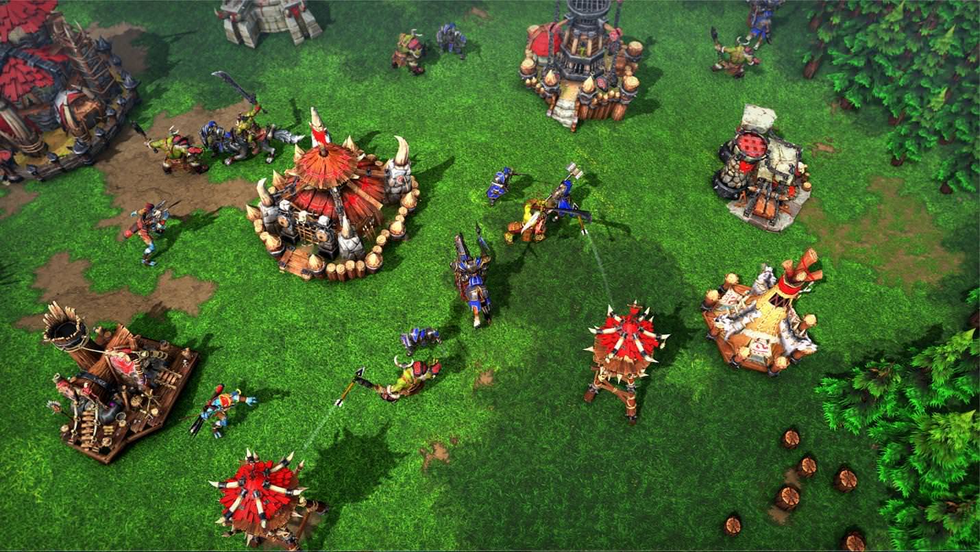
As for the other units, it's too soon, we didn't have the chance to see them closely enough or see them at all.


Buildings:
  • General opinion about buildings: human and orc buildings I have seen so far are too cartoonish and look like plastic toys. They look totally out of place. I suppose textures are to be blamed (but also maybe the meshes, which are probably a tad too stylized). Also, all buildings lack ground texture, which make them look like they were just dropped on the map like a SC2 supply deposit, but I suppose it's something that is planned for the near future.
  • Human buildings in general:
    • Most human buildings look too round, while they used to be more linear in vanilla WC3. This is one of the things that make them too cartoony or toyish. There is nothing wrong with linear walls!
    • Most wall textures are odd. By the look of them, you can't tell which material human buildings were made of.
  • Human Barracks:
    • For some reason, Barracks look way too small compared to they classic counterparts. The four towers are really tiny. It's obvious when compared to other buildings such as farms and lumbermill (which have been enlarged a lot!). Barracks should be a tiny bit higher, and towers should be much larger. I suppose there is a limitation here, so the model doesn't go beyond the structure's pathing, but please, go as far as you can so barracks don't look like some puny Playmobil replica of a real building! Apart from that, barracks are ok.
  • Human Farms:
    • Farms look rather larger than before, I'm not unhappy with it, it brings more realism.
    • However, I dislike the textures, especially the thatched roofs, which look like plastic, once again.
  • Human Towers:
    • I find human tower not big enough, compared to the original ones. The latter looked a bit more massive, while the new towers look a bit too thin.
  • Human Altar of Kings:
    • The Lordaeron banner looks cool, but it is unnecessary. It ruins all the potential of altar of kings in custom maps, because all custom maps don't take place in Lordaeron, all humans are not from Lordaeron, etc.
    • Textures are odd. They look too bland and smooth. The original Altar seem to be made of stone and marble, but Reforged Altar, once again I'm sorry, look like plastic.
  • Castle:
    • Castles lines are definitely too curvy.
    • Towers size could be slightly increased.

Overall graphics and art style:
  • Isn't there some sort of grey filter in the game? Not the UI, whose colours seem to remain untouched, but there is some kind of light fog in the field which make colours more bland, it's uncanny.
  • Some people, including me, are bothered with the graphics choices that have been made for Reforged. New graphics don't seem to capture the spirit of the original game, it doesn't feel quite like the same game at all. The atmosphere is different. Reforged style is close to modern games such as HotS (or also Fortnite, Civilization 6...), but it would have been wiser to update and enhance the original style instead of completely transforming it to follow the modern graphics trends.
  • For example, environment is not too bad in itself, but its textures are too smooth, too bright, the colours are too washed-out (too childish maybe?), and don't reflect the original atmosphere of the game.
  • Plastic-looking and cartoonish buildings. Human buildings don't look like they are made of stone.
  • Well-designed units, but some of them look like plastic figurines (grunt, tauren), and most units are probably overdetailed. Units need to look nice in close-up views, but too many details make them harder to recognise at first glance. Shiny armours probably don't help.
  • There may be a contrast between environment (bright, smooth...), semi-realistic units, and over-cartoonish buildings. Seems like environment, units and building come from three different games. It lacks cohesion.
  • Also, see what I said about oversized weapons and armours, and body proportions. Right now, just like some WoW models, these oversized parts look so ugly and absurd. I have seen this opinion very, very often.
  • There are many, many people who are not happy with the art style. I read various comments here and there (Hive, Reddit, Youtube...) and there is clearly something wrong with the graphics. For example, you may have a look at Grubby's video here and read the comments. It is best to see the same idea expressed in various ways by different people. I read several times there was too much inspiration from WoW and HotS. I think it is not entirely true; WoW's art style has cartoonish textures, but characters' proportions are almost realistic. In Reforged, proportions are bizarre. Some body parts are huge, some others are extermely small and same goes for armours parts and weapons; proportions are quite realistic overall, but some body parts or armour parts have highly exaggerated proportions (way too small or too big). It looks very odd, and it doesn't look like any other Warcraft game. For example, the Footman has almost realistic proportions, but his armour and his sword are totally cartoony. Anyway, I think a vast majority of people prefer an improvement of the existing graphics style and atmosphere, not a complete transformation.
  • In a nutshell: we don't want a totally different game. Reforged needs to feel like Warcraft, to be close enough to Warcraft III, whether it's about icons, atmosphere, environment, etc.

So, these are my thoughts after the first glance we had at Blizzcon. Whether you are happy or not with Reforged new assets, it would be nice if there was more feedback and some constructive debate. :)
 
Last edited:
Level 7
Joined
Jun 26, 2010
Messages
250
I'm personally VERY happy with Reforged. Until I've actually played it, I can't really give any criticism. Love the graphics.
 
Level 4
Joined
Dec 17, 2010
Messages
111
I watched the vids, I love the new graphics. TBH I love oversized weapons and I don't mind if every basic unit looks heroish. I would love realism, but buildings are so damn small compared to units I gave up on that long ago. If they made maps much bigger with buildings being very large then I would want them to rock more realism. Imagine if a Town Hall was like at least 5x the size...

Anyhow I love the new models :)
 
Level 21
Joined
Jul 6, 2014
Messages
6,791
Some of my issues

The Artstyle.It really feels and looks like a mod for HoTS.It's so clean and smooth looking and really does not give me the feel of a Warcraft game
The Portraits.I prefer the old style portraits,with a border as well as talk animations and moving of the head
Proportions.Now,Warcraft III had some out of proportion things,but this is next level
Colors:The colors,for me at least,seem very bright.This isn't a issue most of the time,but the troll's extremely light blue skin just doesn't look right to me
 
Level 18
Joined
Oct 25, 2006
Messages
1,170
Hello there, great initiative!

Overall it feels like new textures are maybe too "noisy" in terms of details. Which can lead to some extra 0.1 seconds of confusion when trying to quickly grasp the situation.

But I think I quite like the fact that everything is receiving an update.
 
Level 6
Joined
May 29, 2013
Messages
126
If Blizzard really sticks to current style, they must complete the following conditions:

1. More Sophisticated and dynamic animating than now. like the Total War series. While old modeling have simple graphics and great visibility but new modeling is hard to know what they are doing with simple animations in such complex design.
2. Number of animations must increase. like the Total War series. It seems ridiculous that the realistic characters repeat only two attack animations as before.
3. If they want to make it realistic, consistency must be maintained in game. like the Total War series. Realize size blance of buildings and units. and units and heroes too.

Yes. This is a nonsense and impossible. because they are trying impossible, like realistic warcraft3. new graphics can look great in trailers or short gameplay. But that's all.
this new graphics are not for warcraft, It is Total War like.


Not too late now. Store the current unit models for cinematic use and start full rework.
 
Last edited:

deepstrasz

Map Reviewer
Level 68
Joined
Jun 4, 2009
Messages
18,706
Yeah, units and heroes should look like normal people, their armour, weapons and gear too. They should stay away from JRPG-esque aesthetics and leave it Warcraft. The second game from the RTS series was best on this.
Since they retcon the story, I have no hopes of the original voices being there anymore, at least not on all/most characters. The same with music for some reason, they had to remake it too...
Many unit and hero looks were changed. Jaina has plating on the chest now and other stuff like that. Technically speaking such an armour would not ensure good protection. On the contrary because it's too curved.
Hopefully they won't add wings to Kil'jaeden and exaggerated weirdness like that.

But whatever, it's their game and no one is forced to buy it. I like the current Warcraft. There are stable versions for it still.
 

deepstrasz

Map Reviewer
Level 68
Joined
Jun 4, 2009
Messages
18,706
@Archian now that's more like it!


So, guys, you can really make this game awesome thus having most fans happy.

1. In terms of aesthetics, just have the Warcraft III base models and make them look nifty like you did but don't change them to look like the WoW/HotS characters because Warcraft III's timeline is before WoW and people looked different and wore other garments back then. Consider what @Sieben wrote as much as you can. Their faces and character should coincide with the original game's as much as possible.

2. I'm glad you want to connect Warcraft III to WoW but don't change the RTS' story, only add to it so it would make sense as WoW's prequel.

3. Stress your voice actors to have the tone of the RTS characters as much as they can. Don't cast other actors than in the RTS or WoW. That's not ideal.

4. The original music is quite fine. It's not midi, 16bit or old sounding. I think it should not be remade. On the contrary, you could add new stuff alongside it.

5. If you're going to recreate the campaign maps please make them more fun. Evaluate them properly. See what gives and what doesn't. Remove stressing or boring factors, leave the fun part and also enhance with your long time experience so players would be amazed by the old+new content therein.

6.
Please consider the official custom campaign Exodus of the Horde too! Also, hopefully the Custom Campaign option accessed through the menu will stay in Reforged.

7. Implement as much new/advanced stuff you can for Reforged's custom/modding scene, like better (unit) pathing, more than 12 units for selection so on and so forth but what you can of these add to the classic game as well through patching.

8.
Enhance the classic engine if possible with better shadows and lightening. If not possible or if it would make for a lousy implementation due to its age, then have Reforged be welcoming to old original and custom/community made resources (models etc.).

9. In what classic maps are concerned. Say, you'd want to play them on Reforged but there would be issues with custom imported stuff. Maybe have some sort of analyzer to detect the issues and eliminate them so the map can be played on Reforged. Say, some imported models won't show up or would break the game. If possible have the game replace them with original game ones so the map could be played.

10. Do not bury the fans in microtransactions, please. It's better to offer tools for the community to play with and create content.

Most of all, don't hurry up! Take your time to deliver the best of the best.
 
Last edited:
Level 4
Joined
Dec 17, 2010
Messages
111
Damn the hardcore players got some demands! Love it. I for one will be happy with any graphics improvements because I play War3 -in spite- of the graphics. Amazing game, amazing gameplay, but... the models are just . . . old as hell. Terrible to look at, some I can't even see what they hell they are lol
 
Level 2
Joined
Feb 16, 2013
Messages
20
The possibility to change the zoom-Level in the settings would be pretty useful - at least a bit to have a bigger field of view. Otherwise in bigger battles you can't see everything that is going on or when you try to control bigger armies you often don't see all of your units at once.
 
Just keep up this new style you made but please be loyal and don't change original concepts, make other 'retcons' as skins that we can choose, buildings' style and doodads' style are awesome! Units are great too but ghoul for example, it is better to use the old concept it was alot more unique
And maybe you can make textures abit more like WoW but I'm fine with current choice.
 
Level 14
Joined
Jan 8, 2015
Messages
424
I still advocate for artstyle to be more inline with originals, or at very least animations to be exacly alike originals but with improvements - which can be done since we seen overhauled 100% faithful animations in Warcraft3HDassets for Starcraft 2 with heroes and demons. It has animated faces and hands, why not atleast attempt this for new models. And partially tone down on realistic texturing to make it resemble original's and wow's ingame style? Animations are most important, same with sounds these shouldnt be replaced but improved if nessesary which as i said was already done in 2015, please consider this. I was outspoken...even aggressively, because i care for this game so much..... For sake of Wc3's legacy try to make it feel like original visual and soundwise with animations and spell effects as close to original as possible. There were several reason to why WC3 had cartoony artstyle one most important was unit recognition and how it would allow game to endure and look still fine, since obviously early 3d that tried to be realistic, especially with poorly done reflections aged terribly, case and point Warcraft 2 and Starcraft 1 cinematics which were alike graphics from games few years later in the period of 2000-2001.

Team Fortress 2 has this artstyle for similar reasons and there are commentaries by Valve on how important it is for unit recognition with sillouttes and defined characteristing movements(animations). Grubby mentioned it during his playthrough and later interview with out of your developers. So please consider to remake the animations to be like originals but with improvements. 20 frames dont matter as limitation since animations could be linerized, pretty much creating infinite amout of frames and that's how it works ingame for most part. You dont need to make it realistic forcefully, it makes it look silly aswell since of the speed up animations that try to fit in the timing frame. So please remake the animations from originals like it was done in 2015 Sc2 Wc3hd assets, it will do only good for the game in several ways.
 
Level 39
Joined
Jul 26, 2004
Messages
1,481
Just want to drop in and say that the weapons are not really oversized compared to vanilla. What makes them seem that way is the fact that the actual models now have more "realistic" proportions. This is especially noticeable when you look at the Arthas model:

Arthas-WC3-Reforged-Remake-Bild-Held-Panel-1110x400.jpg


As you can see the hammer is not bigger than vanilla, but his head is smaller. This makes the hammer seem larger in comparison. Same goes for the size difference between the heroes and units really. Look at this picture. Arthas is just as much taller in vanilla as he is in Reforged. Again I think the "realism" of the new art style just makes this a bit more apparent. Whether or not you like this is a matter of preference I guess. Personally, I think hits the right balance between realism and stylized WC3-ism.

I'd also like to point out that you will have the option to switch between the old and the new art style at will. That means that if you don't like this art direction you can always switch to the old one, and still enjoy the other benefits that Reforged will offer. Honestly, a lot of this criticism seems a bit like nitpicking to me. I think any changes to the art style will always be met with some degree of animosity from the fans who grew up with this game. I think it's impossible to please everyone when it comes to as sensitive a subject like this. So really, I think Blizzard made the best choice in giving players the option to play with the old art style, while also remaking the models in HD to appeal to a wider audience and people like me who drools over art like this :)
 
Last edited:
Level 11
Joined
Nov 23, 2013
Messages
665
Just want to drop in and say that the weapons are not really oversized compared to vanilla. What makes them seem that way is the fact that the actual models now have more "realistic" proportions. This is especially noticeable when you look at the Arthas model:

Arthas-WC3-Reforged-Remake-Bild-Held-Panel-1110x400.jpg


As you can see the hammer is not bigger than vanilla, but his head is smaller. This makes the hammer seem larger in comparison. Same goes for the size difference between the heroes and units really. Look at this picture. Arthas is just as much taller in vanilla as he is in Reforged. Again I think the "realism" of the new art style just makes this a bit more apparent. Whether or not you like this is a matter of preference I guess. Personally, I think hits the right balance between realism and stylized WC3-ism.
The original game already has oversized weapons indeed (and it is already a bit too much, but it's just my opinion), but since Arthas' proportions have changed (head mostly, but also taller body, thiner legs), while the size of the hammer remains the same, it emphasizes the contrast between the hammer and the rest of the model. Also, Arthas' body has more (semi-)realistic proportions (apart from a few details), so now it looks really odd to see him heave such a massive hammer. But of course, you are totally right to point out that it is a matter of taste :)
We could also compare with paladins' hammers from Warcraft 2! :p
Now, for the heroes' size, it's the same idea: it was already the case in vanilla WC3, but I think it was too emphasized in Reforged. It was the impression I got when watching the videos anyway. I may think differently if I could play the game and compare models more easily.

Honestly, a lot of this criticism seems a bit like nitpicking to me.
Of course, I'm aware of that, but I also think perfection is in the details. That's what would make all the difference, to me at least! Besides, I tried to be as specific as possible and to justify my opinions, in order to generate a constructive debate, but of course not everyone has to concur with me :)
 
Level 5
Joined
Jul 15, 2015
Messages
118
Yeah, Arthas is a bit wacky-looking, gigantic shoulderpads and hammer, also his hair looks too much like a girl. :p It should have a less perfect flow... :p
If I had to pick which one of those are most out of place, I'd say the humongous shoulderpads (reducing the size of those would make his head not look tiny lol).
 
Last edited:
Level 3
Joined
Sep 28, 2016
Messages
31
My biggest gripe is still that units are too rich in detail, which isn't in line with the simpler, easier to read classic style. It makes little sense for a humble footman to look like a noble hero in an armor that can only be described as "outlandish" for a rank-and-file troop. Pictured are all the known iterations of footman, from the human campaign screen, the in game footman, World of Warcraft and Reforged, and I dare anyone to say the Reforged one doesn't look out of place. I think something akin to the first one (with far less gold trimming) would be a nice compromise.

zoPEU52.jpg


The proportions and stance are another thing, with Reforged opting for a weird kind of realism that has never had a place in Warcraft. I can only guess at the motivations, since it doesn't quite match World of Warcraft either (and we know they're trying to tie Reforged with it). Warcraft has always had wide, heroic stances and exaggerated proportions, both best showcased on the first two pictures; big head, hands and feet all jump out, but are very much in line with the aesthetic we're used to.

The flat, lifeless textures, shadows and lighting are my third (and final) major gripe, but we can all see they need work and I'm convinced Blizzard does too, so I'm not overly concerned about them. But I think if there's anything that's critically important to get right, it's the units, and I'm hoping (probably against hope) that the designs aren't set in stone yet. Otherwise I'm gonna have to finally start to learn how to model. :grin:
 
Level 5
Joined
Jun 13, 2015
Messages
129
Some problems I have with Reforged;
Artstyle: Shares too much resemblance with HotS(too smooth and clean) and doesn't give me the Warcraft 3 vibes anymore. It feels like if HoTS had a world editor!
UI: Not a fan of the new UI and would rather the old building grid. The old building grid allowed for techtree "layers", eg. The tier 1 techtree on the first row and tier 2 on second row... etc.
This also allows player to use QWER for building and what not.
Not sure how inventory would work, but I think that's not too big of a problem.

(Am also hoping for an option in the world editor to allow more units to be selected at once, allowing "Risk" custom games to be played much easier)
 

Triceron

Hosted Project: W3CSW
Level 11
Joined
May 13, 2010
Messages
99
Lore is by far the biggest criteria for me. With alternate skin options and female zombies in the picture, they need to be careful what they open up to and what they keep the same.

Blood Elves for example have green eyes in TBC to fit them better in lore and alongside the greenskinned orcs. Yet this was not a thing for War3 and shouldnt be a thing until they reach Outland. Small details like this are important. Giving them green eyes at the start of the TFT campaign would break the lore behind their change.

Another would be named heroes sharing models with generic ones. The stormreaver warlock Maiev meets shares the same model for Guldan in the flashback. I think two separate models will be best.

Blackrock champions in the original campaign should also have dark skin and not be the demonic type. They should be remnants of Rends dark horde.

I hope they can add different models for the dreadlords too. It was hard to make out who was who in their meetings.

Shandris and Naisha should get their own models too. They were never differentiated like the alliance footman Captain.

Also I really want the easter egg modelsbremade too. Zergling, hydralisk, even the orc chaos space marine. PlzaddETCtoo.

There is one thing that bothers me now...
They said that all of the heroes are going to have male and female versions of their models

...What about Crypt Lord?
Something like this?

2ad0X0A.jpg


Crypt Queen Zagara skin
 
Last edited by a moderator:
Level 32
Joined
Oct 26, 2014
Messages
369
God damn it people, I was about to write down all my thoughts on the artstyle and now when I come here you pretty much already said everything I had to say.

My main gripes are the violent clash between more realistic body proportions and cartoony outfits, which out-ridiculous even those from vanilla. It worked good there because it had both the bodies and armor designs hyper-stylised. You don't just put warcraft armour on real people and expect it to like like anything other than a cosplay party getting violently out of hand (I'm looking at you, Warcraft the movie)

And yeah, the footmen look too lavish, as it was already said. That's not how you dress your conscript cannon fodder. I loved the plain and simple look of the vanilla footies, like their absolutely awesome PLAIN AND SIMPLE BREASTPLATES (yes, blizzard, just one plain and solid plate is sometimes enough), or their non-gigantic minimalistic shoulderpads
 
Level 5
Joined
Jul 15, 2015
Messages
118
Honestly though, for us humans it sholdn't really be easy (or even possible) to differentiate between a female and a male Nerubian. :p
They should both look sorta simmilar. I mean we have the Nerubian Queen model in Wc3, and it isn't much different then others. :D
I mean really? Nerubian woman with breasts and a humanoid face while Anubarak looks like a simple oversized armored roach? :p They don't fit. haha but Ladybug Nerub would be rich. :D

The one thing I MOST hated about Dranei in WoW (and the reason I will NEVER play them) is the huge disparence between male and female physical form - while males look like buffed up mudafakas that spend entire days at a gym and taking creatine, larger then Orcs and about the same size as Taurens MEANTIME theyir women look like fucking models, slim and cute! NO! THEIR WOMEN NEED TO BE FATTER TO FIT THEIR MALES! :D Fuck that race, Dranei in Wc3 are much more cooler then the perfectass nerds from WoW.
I mean I understand that they need to share some resemblence to the Eredar but why make them so fat? They look like baloon versions of action figures. :p
If Orcs and Tauren get cowy women, why should the blue baloons get perfect women??
 
Last edited:
  • Like
Reactions: ISL

Vidovit

Banned
Level 3
Joined
Sep 27, 2014
Messages
37
I agree that many things look too plastic.
Arthas looks like an anime character, where did his bushy brows go?
Footmen should become more plain, but keep the model for captain or royal guard.
Buildings look placed on their location, instead of built. So more connection to the ground.
Really dislike orc towers, they are too spiky and not realistic. Imagine having 15 of them next to each other.
Tauren has too big totem, rifleman too big compared to footmen.
Infernal in intro is a smiley face.

I don't think the general look will change so hopefully these specifics can be adjusted.
Generally i like the art style but i agree it should all be more like the original.

Also i understand voices are to be changed because of IP; for example the Arthas voice actor from war3 no longer works for Blizzard etc.
I even think many people would like new music, for example imagine the barrens music from wow when you're doing thrall mission in barrens.
 
  • Like
Reactions: ISL

deepstrasz

Map Reviewer
Level 68
Joined
Jun 4, 2009
Messages
18,706
Lore is by far the biggest criteria for me. With alternate skin options and female zombies in the picture, they need to be careful what they open up to and what they keep the same.
They still haven't made zombie kids and pets/farm animals.
I mean really? Nerubian woman with breasts and a humanoid face while Anubarak looks like a simple oversized armored roach? :p They don't fit. haha but Ladybug Nerub would be rich. :D
Hell no.
The one thing I MOST hated about Dranei in WoW (and the reason I will NEVER play them) is the huge disparence between male and female physical form - while males look like buffed up mudafakas that spend entire days at a gym and taking creatine, larger then Orcs and about the same size as Taurens MEANTIME theyir women look like fucking models, slim and cute! NO! THEIR WOMEN NEED TO BE FATTER TO FIT THEIR MALES!
Actually, the lower part looks bigger like that of some (black) African women.
 
They still haven't made zombie kids and pets/farm animals.

Hell no.

Actually, the lower part looks bigger like that of some (black) African women.
As long as the WoW goat people don't make it into Wc3 as Draenei I'm fine

Also @Triceron Gul'dan and Drak'thul models were different and damn they are my second favorite models I hope they won't change Gul'di with his half demon WoW look...
 
Level 39
Joined
Jul 26, 2004
Messages
1,481
After looking at the models some more, I find that the problem doesn't lie in the proportions being too absurd, rather in them not being absurd enough. The issue is that all the armour, weapons and gear have the usual Warcraft-y exaggerations (as they should), yet the anatomical features are way more realistic than before. This creates a sort of disconnect and ends up looking jarring for some people. I think the solution here wouldn't be to reduce the exaggeration of the gear (and thereby losing the ever important silhouettes) but to make the anatomical features way more pronounced, like making the heads, hands and feet bigger. I think this would make the art style feel more in line with the old one, while still keeping the modern feel that they have achieved so far.

Saying that it looks plastic is just silly to me. This is most likely because some people are too used to WC3 only having diffuse maps, which makes them look very flat. Reforged uses PBR (physically based rendering) maps to achieve a much more realistic and dynamic look, hence the delicious shininess of the weapons and armour. Equating this to "plastic-ness" seems a bit disingenuous to me. Another thing I cannot agree with is saying that the old footman model was somehow better. I'm sorry, but the vanilla footman model is probably the shittiest model Blizzard has ever made. Ever.

Another tweak that I think could be cool is the introduction of impact particles when a unit is hit. This could be changeable in the World Editor, so unarmed units would bleed when hit, and armoured units would send sparks flying. Could do a lot to make the combat feel more visceral and impactful. As it is right now there seems to be a lack of impact when a unit is attacked, and this is somehow more noticeable with the more realistic art style and upgraded animations. Speaking of animations, introducing "hit" animations could help a lot in this area as well, but this might add some compatibility issues with the SD version. Ragdoll effects on death could be great too but again might bring some compatibility issues. Something to consider at least.

That's really all I have to say about the art style. All in all, I think it looks fantastic, and with a few tweaks, it would be perfect.
 
Last edited:
Level 12
Joined
Sep 28, 2012
Messages
277
I agree with a bit of everything everyone's saying here. The body proportions do look odd, but that's because they made the bodies too realistic for the models in Warcraft 3, so the dissonance is jarring. If you look at the original War3 Arthas's head, it's huge compared to his body, but it looks fine in the bulky armor he has. Arthas looks weird because his head has been shrunk to normal size inside the same suit of armor. Either go all out on proportions or dial it back, but you can't do one way and the other on anatomy and gear.

I think the only thing I'm concerned about is that the animations didn't quite look right in the gameplay video of the battle. The tauren in particular didn't seem to realistically swing their totems. With increased realism like this, I think maybe there should be some kind of bash or blood effect when units attack each other, because it just felt weird to see the tauren swing his totem at a rifleman and the rifleman didn't flinch. It might be another example of dissonance where in original War3, the graphics were poor enough for stuff like that to go unnoticed. But with better graphics now, there may be a new need for animation changes like that.

I hope that Warcraft 3 stays true to its status as being made before World of Warcraft while also making room for smoothing out the transition from Warcraft 3 to World of Warcraft. That is, I hope they don't up and retcon all the models of Warcraft 3 to fit with WoW. They should be distinctly original, but with some elements that help harmonize their changes later on. An example I can think of in this was mentioned earlier: The blood elves should have green eyes only after they join Illidan in Outland. Before that, being high elves, their eyes were gold or blue.

Someone also mentioned this, but I think effort should be made in making sure that duplicate models used for cinematic purposes should be done away with. The flashback in the Tomb of Sargeras should show actual Gul'dan and a silhouette of actual Sargeras, rather than just a Stormreaver Warlock and a Doom Guard. I'm sure they'll do all the cutscenes really well, though, so I'm not worried.

I disagree with everyone saying it doesn't keep the feel of Warcraft 3. It looks much more brightly colored than Heroes of the Storm and hails back to that almost cartoony look that Warcraft 3 had. I think they can smooth everything out so that it doesn't look like plastic, but I think texturewise they're on the right track.

Lastly, I hope the special effects are improved. This is probably on the backburner for a good reason, but disease cloud, fire doodads, and even maybe Arthas's devotion aura should all be improved to fit in with the look of everything else. Everything should look brand new and distinct.

Besides that, I'm really excited for Warcraft Reforged. I love the loading screen look and I think they're on track for making an amazing remastered version of my favorite PC game of all time.
 

deepstrasz

Map Reviewer
Level 68
Joined
Jun 4, 2009
Messages
18,706
Before that, being high elves, their eyes were gold or blue.
They still called themselves the Blood Elves after Quel'thalas, no, Silvermoon fell.
The flashback in the Tomb of Sargeras should show actual Gul'dan and a silhouette of actual Sargeras, rather than just a Stormreaver Warlock and a Doom Guard.
I don't remember it being confirmed that the Doom Guard was indeed Sargeras. Gul'dan might have thought it was but that's another thing.
Lastly, I hope the special effects are improved. This is probably on the backburner for a good reason, but disease cloud, fire doodads, and even maybe Arthas's devotion aura should all be improved to fit in with the look of everything else. Everything should look brand new and distinct.
Not very fond of all changed FX. For instance the Resurrection angel is not a being of light anymore but made of gold.

Also, changing all icons to those of WoW is not such a good move. Sure, WoW fans will right away recognize them but Warcraft RTS players will have to adapt.
 

Triceron

Hosted Project: W3CSW
Level 11
Joined
May 13, 2010
Messages
99
Proportions are off but we can't judge until we get it in our hands and get accustomed to the way they look in context to the game. Videos and screenshots are very deceiving. I have to say, I felt the same way about original Warcraft 3 compared to Warcraft's clean cartoony style or Starcraft's rendered sprites. Hands were cubes, feet were giant blocks and it felt so odd watching them all squash and stretch oddly. Just look at the Knight's portrait and the way his jaw flaps like a muppet.

But we all got used to it and it became second nature. I feel like we just need to give the graphics a bit of time because we all aren't used to seeing them in context to the world.

I do think they stand out and the units and environments don't meld together cleanly yet, but I'm giving the benefit of the doubt that this is just an early look before polish. Following the Starcraft 2 visual development, there was a huge jump in graphics within the last year before the game came out. I just hope this is given the same amount of care that the main teams would put into it.
 
My main concerns are =
1 - The material they are using, Everything seems to have a gloss that feels plastic and unatural. Either reduce the reflections or what not, but it really makes everything looks like figurines.

2 - The terrain texture work.... The textures in warcraft3 looks far better then the one in reforge.... why.... D:, warcraft3 had that realistic estetic for the tilesets but with blasted satured colors. It looked very nice. In Reforge, it seems like handpainted but with a lack of blending. By looking at the Grass and Long grass textures shown in the Demo, they really don'T blend well. In warcraft3 at least the borders felt more natural. - Same for the city textures. I feel like the blending between all the tilesets aren'T working proprely.

3- These cliffs textures are HOOOORRRIBLE! OH GAWD WTF.

4 - The units are overdetails (3D sculpted wise). I'd rather have nice looking painted textures then over the top zbrush relief. Due to aspect it looks very wierd. WOW had a great balance of using textures for details over sculpted details.

5 - Art direction = As much as I like the 3D models they are showing, I feel like they didn'T quite hit the mark to bring back a warcraft3 feel. I feel like they choose details over design. The footman for example had a huge shield with a white border. this made it easily identifiable in the gameplay. In the reforge version, it just feels like an other hero unit. Small details are to be considered.

----------------------
I also hope they have better dynamic lights. in Reforge to allow modders to create epic atmospheres. Also, I'd like to see some proper FPS and racing games from the reforge, I'd like blizzard to give us proper tools to be abble to create such games.
 
Level 39
Joined
Jul 26, 2004
Messages
1,481
Am I the only one who doesn't see the "plastic" thing? I mean, how does this look plastic? Only things that are shiny are things that are supposed to be shiny, like armour. This is one complaint I really don't get. I mean, it's all fair to prefer the handpainted look of WoW/WC3 to the more realistic PBR style, but again I think calling it "plastic" is disingenuous.

I dunno, I just think people are taking the whole "please provide feedback" thing a little too seriously. Obviously, they're not going to change the entire art style of the game and throw out months of work just because some people prefer one art style over the other. It just seems a bit nitpicky to me. Instead, I think we should be focusing on providing suggestions that they actually can implement.

The terrain texture work.... The textures in warcraft3 looks far better then the one in reforge....

I don't think that's entirely fair. I think it's pretty obvious that these ground textures are better than these. I don't really think that hyperboles like these help anything, to be honest.

I also hope they have better dynamic lights. in Reforge to allow modders to create epic atmospheres.

They confirmed that the materials for Reforged use PBR technology, which gives me hope for some awesome improvements to the lighting engine.
 
Last edited:
Level 11
Joined
Nov 23, 2013
Messages
665
After looking at the models some more, I find that the problem doesn't lie in the proportions being too absurd, rather in them not being absurd enough. The issue is that all the armour, weapons and gear have the usual Warcraft-y exaggerations (as they should), yet the anatomical features are way more realistic than before. This creates a sort of disconnect and ends up looking jarring for some people. I think the solution here wouldn't be to reduce the exaggeration of the gear (and thereby losing the ever important silhouettes) but to make the anatomical features way more pronounced, like making the heads, hands and feet bigger. I think this would make the art style feel more in line with the old one, while still keeping the modern feel that they have achieved so far.
Good point here. It would be better if proportions were either more realistic (an option that most people will probably reject) or, as @Abelhawk and you said, more pronounced. To be honest, I have a preference for semi-realistic WoW proportions (with reasonably-sized weapons!), but I would be more than happy if the original Warcraft III style, with similar proportions, is respected.

Another thing I cannot agree with is saying that the old footman model was somehow better. I'm sorry, but the vanilla footman model is probably the shittiest model Blizzard has ever made. Ever.
It's not that original footman was excellent per say (it's not the best model indeed), but he was more recognizable and he was looking like some regular random soldier, not a hero with shiny epic armour :)

Tauer said:
Another tweak that I think could be cool is the introduction of impact particles when a unit is hit. This could be changeable in the World Editor, so unarmed units would bleed when hit, and armoured units would send sparks flying. Could do a lot to make the combat feel more visceral and impactful. As it is right now there seems to be a lack of impact when a unit is attacked
I think maybe there should be some kind of bash or blood effect when units attack each other, because it just felt weird to see the tauren swing his totem at a rifleman and the rifleman didn't flinch.
This is a great idea!

As for the plastic thing, well again it's probably a matter of taste, but I've seen several people having this impression too. The picture you linked is precisely the one that made me think that. It's not about being shiny, it's probably just the textures that give me that feeling. However, I'll put some water in my wine here: the "plastic issue" is certainly not my main concern; also, seeing a grunt on a picture and seeing a grunt moving in the battlefield are two different things, and the plastic feeling might vanish once I tried the game and got used to it. Wait and see!

I don't think Blizzard should throw away their entire work on graphics, of course, but I've seen so many people having hesitations about some visual choices (I read a lot of comments about graphics on Youtube, Hive and official forum). And we know this is a work in progress, so there will be changes. Actually, despite my feedback which might seem demanding with so many specific details, I actually believe Reforged graphics are not so far from being really good. :)
But there are issues that many people have spotted, and it would be nice if Blizzard could address as many of them as possible. I mean, we're talking about Warcraft III here, the game is legendary, and fans love it so much, it would be a disappointment if the final product was too distinct from the original style and atmosphere, wouldn't it?

Anyway, it's nice to see people sharing constructive ideas about this topic, and it's good that artists such as @Tauer and @Mr.Goblin do it too, thanks guys.
 
Level 22
Joined
Jan 6, 2017
Messages
307
It really does look like a board game with "living" figures rather than a real setting with natural creatures and environments. Everything looks quite plastic to me, especially on a screenshot like this, for example leather and tiles on the great hall look as if they're made out of same material. I'm not sure if this is the art style they wanted to go for or if it just somehow mistakenly turned out this way, but I can see how the style change wouldn't appeal to some Warcraft 3 fans - for me personally the change isn't a big deal, I find it quite interesting..

Off the gameplay videos I've seen on twitch and youtube the graphics look a lot less saturated in comparison to images you can find on google, I feel like the google images with more saturated colors resemble the old Warcraft 3 slightly more, kinda confused with the difference here, are the colors desaturated because of the campaign level having some sort of fog effect or the pictures on google are enhanced (don't see a point in that)?

My biggest disappointment really is the peasant and probably peon models (haven't seen the peon yet), but the peasant looks a lot more generic now, the soundset doesn't fit the model at all anymore since the unit lost all the goofyness of the original concept and now is just a generic worker guy you'd find in a realistic RTS game (like Age of Empires).. It's also surprising how muscular these guys are, why aren't they recruited as footmen or knights being this tough looking! Same for their militia version, it's a lot more serious and a lot more realistic and there's no unique nor interesting character in the new designs.

Footmen and knights became a lot more generic aswell, you can't really "identify" the unit like you used to - like Grubby was saying about the design of the rifleman compared to the footman. Knights used to have this cool arrogant appeal in their expression and looks, which is gone now too. I think also having the footmans helmet show less of his face than it did on original model makes him look like a less important character (again like Grubby was saying "one of the many").
They made the armors of the units darker in order to push realistic plate shinyness, but that makes the units blend slightly more into the background. For example, originally knights and footmen armor was using brighter palette than the palette used on a Tower (which made them stand out more in comparison to a tower), with the new graphics update it's the opposite way around. This is another thing that makes a difference between the new riflemen and footmen/knights, riflemen having the bright white beard stand out quite a lot in comparison, even more so considering they preserved the original rifleman concept. Only issue with riflemen is the size, they seem larger than footmen - not sure if their scale value is actually larger or they just appear to be larger due to brightness of their model (due to beard and team coloring of the cape).

That's about all I got for now, if I sound too harsh I just wanna say that I'm really hyped for this remaster and I actually do like the graphics for most part and from what I can tell so far, I'm also really glad to see Blizzard put this much effort into Warcraft3, and I'm totally hyped to see the female versions of the heroes and new skins or whatever cool stuff Blizzard has in store for us in action!
 
Level 35
Joined
Nov 24, 2007
Messages
4,367
I don't think the units look too detailed, I don't think they should "downgrade" the level of detail
on any units, I think the art style is amazing and I love that Blizzard is actually doing this, where
I do take issue, though, is with the silhouettes.

And I must say that I kind of agree with HT here, the level of anatomical correctness, especially for
the humans, is part of what makes the silhouettes too... Difficult to tell apart. As it stands, I find that
many of the units are too similar and that a simple glance won't be enough to quickly decide what unit
composition an army has. Furthermore it takes away from the character of the units, take the knights,
for instance, the knight just looks like a footman on a horse, it doesn't have the same level of flair as
it had in the old version.

This is mostly directed at the humans, though, because that's the race we've seen the most of and
because its the race with least diversity of races.
 
Level 6
Joined
Apr 7, 2012
Messages
184
First of all, I really appreciate all the detail put into the models and while I am really excited about the possibilities of PBR, I am not entirely sure the realistic texturing works in Warcraft. It is indeed true that Warcraft 3 is more realistic to WoW, or at least closer to vanilla wow but that realism comes from the proportions and the style of the armors, not from the colors. As far as colors go, even modern WoW still looks like Warcraft 3. It kinda stopped looking like Warcraft 3 once every piece of armor became super huge and ornate, having lots of impossible details for the sake of awesomeness.

Here is how metal is supposed to look in Warcraft:

1200px-Warcraft_III_Human_Campaign.jpg


overlord%27s+plate.jpg


See? It's a lighter shade of gray and also looks a bit matte. Compare to:

Warcraft-3-reforged-980x620.jpg


want to repeat that the realism the devs mentioned comes NOT from the textures but from the shapes of the armor. Don't make it too awesome and overly detailed. Compare the footman from the image I posted to the new one.

Also, the sword the Footman uses looks very strange, not at all reminding me of realism/believability. It looks like a green from WoW that no one would ever use.

upload_2018-11-6_9-31-30.png


Make it look more like this, realistic but stylized:

240px-Human_Crest.jpg


Finally, the terrain and buildings look good but are strangely desaturated. To recap, the realism comes from the models, not from the colors.
 

deepstrasz

Map Reviewer
Level 68
Joined
Jun 4, 2009
Messages
18,706
They made the armors of the units darker in order to push realistic plate shinyness, but that makes the units blend slightly more into the background. For example, originally knights and footmen armor was using brighter palette than the palette used on a Tower (which made them stand out more in comparison to a tower), with the new graphics update it's the opposite way around.
As a person who played games like Armies of Exigo, I don't have a problem with it. But, yes, some might have to adapt. I really like it that they've gone for realism but they still have to do more to get there; see Arthas' armour and weapon size (he can't even see on the sides because of the shoulder armour).

And most importantly, they should just make the old characters/creatures in the current highpoly art not change them dramatically as to become unrecognizable/new creatures/characters.
Also, the sword the Footman uses looks very strange, not at all reminding me of realism/believability. It looks like a green from WoW that no one would ever use.
Wait, why does it have the cross sides upward? That doesn't look like the Footman's sword at all.
 
Level 3
Joined
Sep 28, 2016
Messages
31
Also, the sword the Footman uses looks very strange, not at all reminding me of realism/believability. It looks like a green from WoW that no one would ever use.
The sword looks terrible, mostly because the crossguard is comically big. The blade is sort of weirdly shaped too, instead of just straight like you'd expect, but that doesn't bother me as much since it's similar to the original footman. It all seems like an easy fix though, and I agree the sword on the crest of Lordaeron would be a much nicer choice.
 
Level 6
Joined
Apr 7, 2012
Messages
184
Maybe they made the pommel so big because they wanted to make sure you could see it from a bird's eye view. Doesn't change a fact that it looks like an ugly WoW green item.

Anyway, I know Blizzard are reading this. I appreciate all the effort going into this but they really need to get it right. And as much as I love PBR as a 3D modeler, I am not sure it fits in WoW. What you see in the screenshots I posted is really how "realistic" metal is supposed to look like in Warcraft.
 
Level 12
Joined
Jul 13, 2008
Messages
401
[Copied from other thread]

Blizzard should take at look how other developers made/are making awesome remasters:
ex.:
Crash N. Sane Trilogy (everything is same as in original but made from 0 with higher quality)
Spyro Reignited Trylogy or MediEvil.

That's how you make remasters IMO.
screen-shot-2017-06-28-at-20048-pm-1498683956782_270h.png

Spyro-Reignited-Trilogy-comparison-shots.jpg

small_860273386.jpg


Everything is just redone in HQ.

For now here's my Wc3R model rating:
Peasant: 4/5
Militia: 4/5
Footman: 1/5
Rifleman: 5/5
Knight: 3/5
Jania: 5/5
Arthas: 2/5
Uther: 3/5
Grunt: 5/5
Dradlord: 2/5
Ghoul: 1/5
Abo: 4/5
 
  • Like
Reactions: pyf
Level 6
Joined
Mar 28, 2007
Messages
192
I like the direction they've taken. It needs some adjusting, I agree. (Like the ghoul doesn't feel like a ghoul) (the footman is too fancy)

But the comparisons you made are really a different kind of beast.

This is a better comparison:


Edit: Or maybe not, since WC3 is more 3D based. AoE:DE is more comparable to SC:R.
 
Level 12
Joined
Jul 13, 2008
Messages
401
My examples are good imo. Cuz they are 3D.
Models are recreated in HQ. Without changing the design.
I played new Crash Trilogy.
That game is great. Missions are identical, all boxes etc. are in the same place just gameplay feels is smothier, models are high-poly. Sounds are same, just recorded from scratch.
That is really a good example of remastered game.
 
Level 6
Joined
Mar 28, 2007
Messages
192
l6O2vgO.jpg


The old models look really strange. Look at the size of the head and arms. Sadly they kept the size of that hammer..
 
Level 6
Joined
Apr 7, 2012
Messages
184
The game needs to look more saturated. I repeat, the realism comes from the models, not from the textures/colors.

aSKRvMB.jpg

yyezOUd.jpg


Also, is it just me or does the remaster have a slight fog effect? Not entirely sure I like that.
 
Last edited by a moderator:
Level 6
Joined
Mar 28, 2007
Messages
192
They made Arthas too young or effeminate compared to the original game and that concept art. Arthas had that arrogant look. Now he doesn't anymore and makes it look unbelievable to what he becomes and how he acts.

I can agree with that. His facial expression and hair should be tweaked. (And please change that hammer a bit ;( )

The game needs to look more saturated. I repeat, the realism comes from the models, not from the textures/colors.

aSKRvMB.jpg

yyezOUd.jpg

Yup. The colors need to 'pop' more. Now it looks as if I'm comparing a HDR game to a non-HDR game. The original has way brighter color. Both in the unit models, the buildings and the ground textures. I'm also afraid that we won't be able to differentiate units as easily in Reforged. They should really look at this.
 
Last edited by a moderator:
Level 6
Joined
Apr 7, 2012
Messages
184
Here is a quick mock-up with more saturation. Maybe don't take it too seriously, but I think it looks more like Warcraft.

HO1l70o.jpg


Maybe we should also take into consideration that Blizzard was afraid people would accusing them of making it too much like WoW, so they made the colors darker.
 
Last edited by a moderator:
Level 6
Joined
Apr 7, 2012
Messages
184
Hmm, it seems to me like the screenshots all portray different stages of development. I mean, look at this, definitely brighter.

We should also take in mind that because of PBR, materials behave a lot more realistically. This means that the game can look very different during nightime and daytime.

2xznUyS.jpg
 
Status
Not open for further replies.
Top