Greetings Hive!
So there has been a lot of discussion about Reforged already, with a great deal of hype and hopes, but also questions, concerns and speculation. What matters now is that the final product is still a work in progress and Blizzard employees stated several times they were going to have a lot of discussion with the community. They expect us to provide feedback, and hopefully Blizzard will heed our call! (Inviting you here @Kam , if you don"t mind)
I suggest we discuss visual changes in this thread: graphics, design and UI, which are the biggest changes so far. Let's try to be as specific and constructive as possible, not just deliver only vague and general opinions. I'll give it a shot myself, feel free to follow along.
UI:
Buildings:
Overall graphics and art style:
So, these are my thoughts after the first glance we had at Blizzcon. Whether you are happy or not with Reforged new assets, it would be nice if there was more feedback and some constructive debate.
So there has been a lot of discussion about Reforged already, with a great deal of hype and hopes, but also questions, concerns and speculation. What matters now is that the final product is still a work in progress and Blizzard employees stated several times they were going to have a lot of discussion with the community. They expect us to provide feedback, and hopefully Blizzard will heed our call! (Inviting you here @Kam , if you don"t mind)
I suggest we discuss visual changes in this thread: graphics, design and UI, which are the biggest changes so far. Let's try to be as specific and constructive as possible, not just deliver only vague and general opinions. I'll give it a shot myself, feel free to follow along.
UI:
- I'm not a big fan of the new UI aesthetics, but I like that its size has been reduced, it provides a better view of the field, and it gives room for further modifications (I'm still hoping for a wider unit selection and more slots for buttons and inventory!)
- Portrait area: I would prefer if there was a frame around the unit and a background. Also, I find portraits are a bit too big and invasive. I'd like portraits to be mostly about showing the unit's face, with their facial expressions.
- Icons:
- I feel like icons miss a larger rim (except for passive abilities, of course), which would make the buttons look like they're in 3D, like the original ones. Right now they seem rather flat.
- New icons seem to be mixed in different styles. It seems it lacks consistency.
- Redesigning all icons from scratch seems unnecessary: the original icons (with a higher resolution, if possible) would have certainly been enough, since they were already pretty good; remaking them is a waste of time a manpower.
- But if the recreation of icons is absolutely necessary, don't make them look like too different from their original design. First, because the original design was good, and changing just for the sake of changing seems pointless. Secondly, and more importantly, we players have been seeing the current design for more than 15 years, and drastic changes will confuse us if it doesn't feel like Warcraft III anymore.
- I feel like icons miss a larger rim (except for passive abilities, of course), which would make the buttons look like they're in 3D, like the original ones. Right now they seem rather flat.
- Proportions of almost all units:
- Almost all units I've seen so far have absurd proportions. It is ok to have stylised units with unrealistic proportions, just like in the original game. However, new units proportions are way over the top, and don't match original units. New units would be better with exaggerated proportions, but not too much, just like the original game. Don't exaggerate what was already exaggerated!
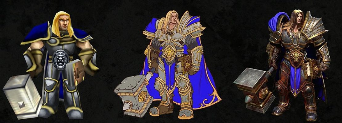
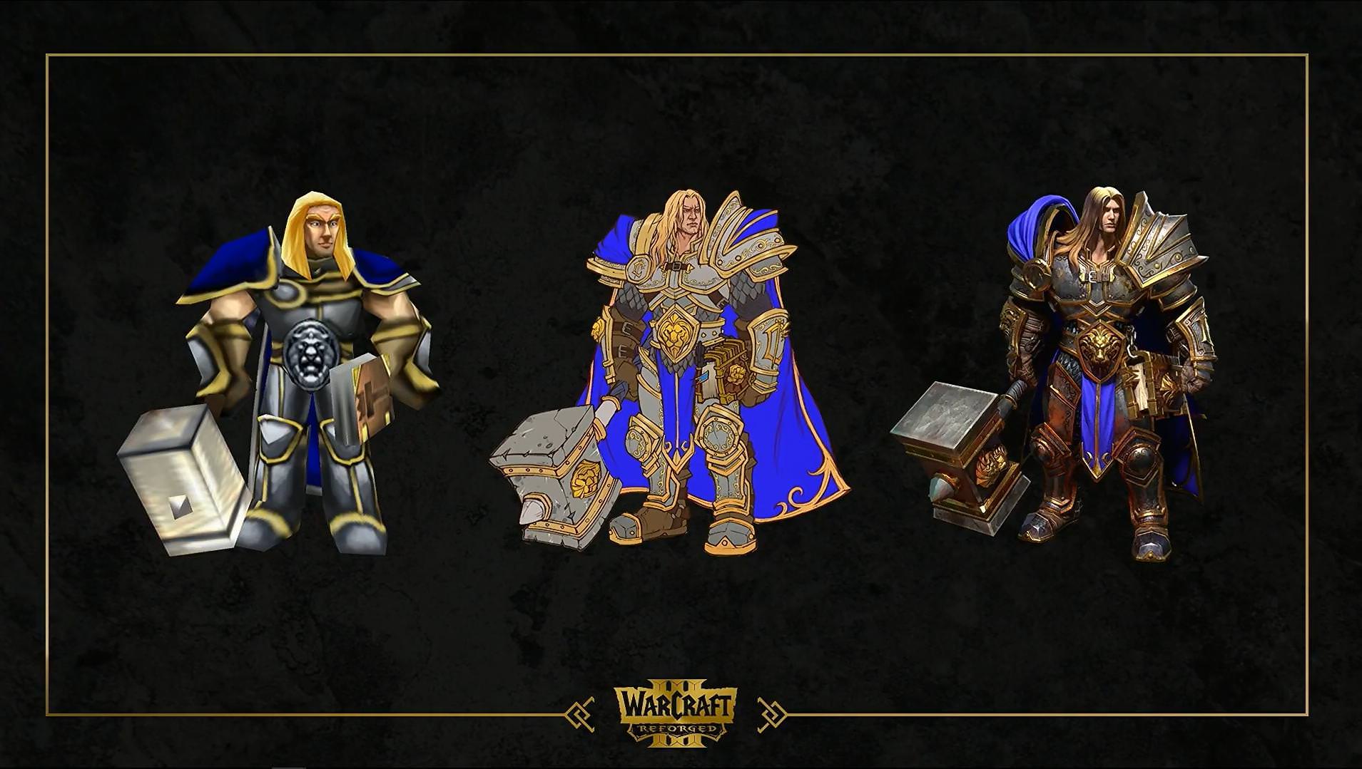
- Most weapons are oversized. Arthas' hammer is probably the worst. I mean, the man has a hammer ten times the size of his head, this is ridiculous. I really wonder why this aesthetics choice has been made since WoW, I always found it ludicrous, but there is no need to introduce it into Warcraft III (which already had oversized weapons, there is no need to amplify this). Tauren's log, paladin's hammer... have the same issue.
- Some units have their head way too small compared to the rest of the body, they look really silly with their tiny head (Arthas is the worst).
- Almost all units have oversized armours. Again, I understand it's a deliberate choice and not just a modeling mistake, but I really don't like it and I'm definitely not the only one. The worst armour parts are spaulders, they are way too big on so many units: grunts, Arthas, footmen... Not only does it give a weird look to units, especially when they have such puny heads, but it's also totally unrealistic: how are fighters supposed to see what's happening in battle when having these large eye-blinders on both shoulders? Keep it sensible, guys!
- Almost all units I've seen so far have absurd proportions. It is ok to have stylised units with unrealistic proportions, just like in the original game. However, new units proportions are way over the top, and don't match original units. New units would be better with exaggerated proportions, but not too much, just like the original game. Don't exaggerate what was already exaggerated!
- Heroes:
- Heroes have always been larger and taller than regular units, and it's a good thing. But now, isn't a bit too much, for some heroes (at least Arthas)? If you take a look here, for example, you'll see Arthas is twice the size of a footman, who look sooo teeny tiny compared to his master. I think heroes are recognizable enough, no need to exagerate their size. Blademaster seems ok though.
- Arthas has such a long neck! And a tiny head! Also, giving him a more arrogant face would be nice. Plus, his pauldrons and his hammer are way too big.
- Jaina: her face is different from the one she had in Classic WC3. Her staff is too big. Also, despite her design being relatively close to her Classic's version, one thing bothers me: she wears a weird metal corset with a huge cleavage and her belly button exposed. Half-naked chicks are such a cliché in video games/fantasy worlds. That kind of armour protects nothing and looks really ridiculous and unrealistic.
- Heroes have always been larger and taller than regular units, and it's a good thing. But now, isn't a bit too much, for some heroes (at least Arthas)? If you take a look here, for example, you'll see Arthas is twice the size of a footman, who look sooo teeny tiny compared to his master. I think heroes are recognizable enough, no need to exagerate their size. Blademaster seems ok though.
- Footman:
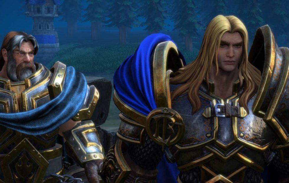
- He doesn't look like a "real" footman. He's too epic, too noble, too fancy. He looks like a hero (like this iconic hero from game cinematic) or some commander, not a regular infantryman. Therefore, a few suggestions:
- Remove the golden rim from some armour parts
- Reduce the size of spaulders (drastically!)
- Maybe remove the tabard
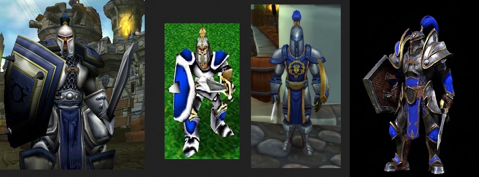
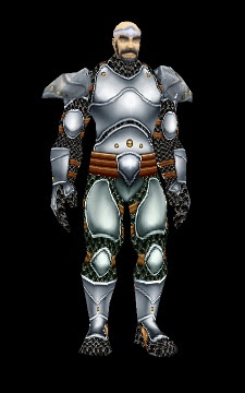
- Pauldrons are insanely oversized. For some reason, in the recent years, many pauldrons in Warcraft games (footmen's pauldrons, or other units/characters') are big, really big, and it doesn't make sense. First, it's totally unrealistic. Of course, Warcraft is not supposed to be actually realistic, since there are Elves, Dragons, magic... But it needs to be coherent and believable. Gigantic pauldrons prevent Footmen to see around them. In a battle, they would be blinded. Secondly, it so far from the original design. And finallay, it doesn't look good: it looks like a spacemarine suit, or a strange carapace, or something like that. It's supposed to look epic, but it's so oversized it looks silly instead. Footman looks like a kid who just tried his dad's armour on. Just look at this picture:
This pictures shows how different Classic and Reforged Footmen are. It also shows that gigantic pauldrons don't look good at all, especially when seen from the side. And finally, WoW's version shows that Footmen/Guards can look nice with reasonably-sized armours and weapons.
- Make the footman more recognizable. His design is not close enough to the original one, and it's harder to recognize footmen in the middle of an army.
- Footman's posture doesn't reflect is personality and what he was in Classic WC3. In the current Reforged version, the guy stands straight, like posing for a fashion catalogue. He doesn't look like he's "ready for action"! On the other hand, the original version shows the footman not as straight, but in an alert position, ready for combat at anytime. It also reflects the fact that the footman is not a proud, noble and invincible hero who poses like a statue, but a man of the people, who's just here to defend his land and who is indeed "ready for action".
- The crossguard of the sword looks make the sword look like a toy. It quite ugly, to be honest. Let's compare:
(on the left is the sword the hero carries in the intro cinematic of Classic WC3)
Footmen should have swords that look like the picture above, or something similar to Reforged Militia's sword.
- He doesn't look like a "real" footman. He's too epic, too noble, too fancy. He looks like a hero (like this iconic hero from game cinematic) or some commander, not a regular infantryman. Therefore, a few suggestions:
- Peasant:
- Head is a tiny bit too small, perhaps.
- Apart from that, they are quite nice. Militia is pretty cool, too. I would only swap their sword for an axe, like in the original game. Axe is more appropriate for a peasant: he already carries one around all the time to chop wood, and from a realistic point of view, a sword is expensive to craft/buy, not everybody can afford one!
- It's odd to see a peasant building a structure using his axe! A hammer would be more appropriate for building animation.
- Grunt:
- Is the beard absolutely necessary? I can't get used to the idea that every single grunt of my army will have the exact same beard. Especially if you consider that Raiders also have a black beard. That's too many black beards.
- I feel like textures make grunts look a bit like plastic figurines (mostly when using a close-up view). I'm not sure why, maybe because the skin is glowing a little, as if it was wet.
- I think grunt's body is oversized. More specifically, they have gigantic shoulders, hands and chest, which makes their head and legs look ridiculously tiny. In Warcraft 1 and 2, grunts and footmen used to have pretty much the same size; in Warcraft III and WoW, orcs are a little bit larger than humans. In Reforged, Grunts' proportions are totally different than any other Warcraft game. There should be more consistency. Perhaps it would be better to stick with either choice (WC2 or Classic WC3 or WoW), but not make grunts so bulky (they almost have the size of a tauren right now, in my opinion). In the picture below, you can see what I mean about Grunt's proportions.
Imho, Grunts' proportions are better in WoW.
- Is the beard absolutely necessary? I can't get used to the idea that every single grunt of my army will have the exact same beard. Especially if you consider that Raiders also have a black beard. That's too many black beards.
- Tauren:
- Texture looks a bit like plastic figurine too.
- The weapon is way too big. It's obvious when you compare it with the original tauren. The big log Taurens use shouldn't be as large as the Tauren himself.
- Texture looks a bit like plastic figurine too.
- Knight:
- Knights have weird swords, just like Footmen. Those swords look like toys. Make them slightly more realistic, and mostly work on the crossguard, which is awful as it is currently.
- One thing maybe could be tweaked: knights colours are too dark, which makes them too different from the original model and harder to identify in the battlefield.
- I only dislike their lance that they barely use if not at all, but it's not about Reforged, it has always bugged me in vanilla Warcraft III!
(I'd rather have a shield)
- Knights have weird swords, just like Footmen. Those swords look like toys. Make them slightly more realistic, and mostly work on the crossguard, which is awful as it is currently.
- Rifleman:
- Design is very nice, nothing much to say. Very faithful to the origina model, good job on this one. I'm just having one doubt: it's hard to tell when only watching videos, but aren't riflemen a bit too tall, compared to footmen, for example? Feels like they have almost the same size, unless I'm wrong.
- Mortar Team:
- The smoking pipe looks nice, but... who would smoke around explosives? 100% realism shouldn't be aimed for, but things need to be plausible.
- The white-haired Dwarf has some sort of manga hair. It doesn't look like Warcraft at all, ans it will be weird to have an army full of Dwarves with bad hair cut.
- Pilot goggles are not bad in themselves, but they seem unnecessary. Those Dwarves don't fly, they don't need glasses. Just because pilot goggles might look nice on Dwarves doesn't mean that they should wear them.
- The scope: maybe its size could be reduced a tiny bit?
- Apart from those points, Mortar Team is pretty good.
- Spellbreaker:
- Overall design is ok, but why such a big helmet? It's thrice the size of his head, while the original design had much more reasonable proportions. Also, the shape of the helmet is different from the original model; maybe it shouldn't have such curvy lines, and it should be more straight, like its original design.
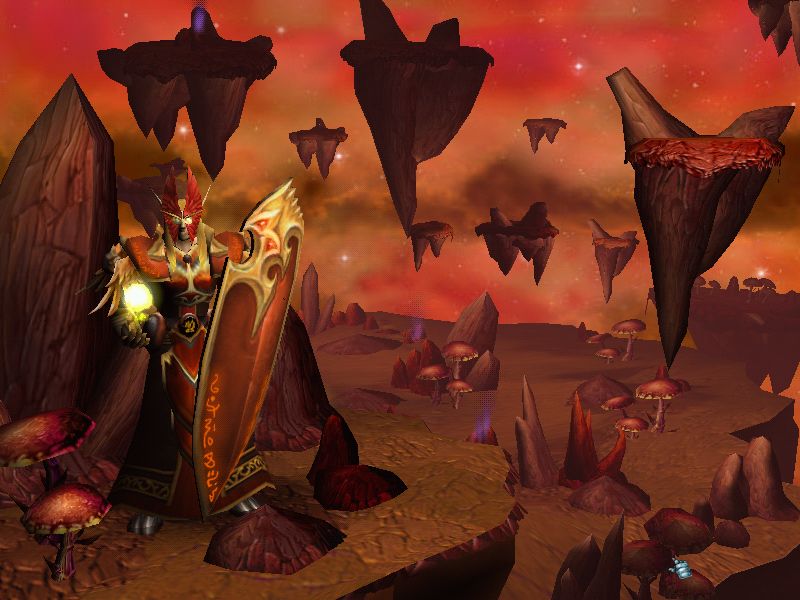
- Overall design is ok, but why such a big helmet? It's thrice the size of his head, while the original design had much more reasonable proportions. Also, the shape of the helmet is different from the original model; maybe it shouldn't have such curvy lines, and it should be more straight, like its original design.
- Mal'ganis:
- Some people have been complaining about the absence of tail.
- Skeletons:
- I would remove the shield, which seems unnecessary, although it's not a big deal.
- Ghouls:
- The main issue would be colours, too much grey, while it used to be pale yellowish in the original game. Units need to be more recognizable. It's not a big issue though, I could live with it, as long as it doesn't decrease efficiency, especially when playing melee games.
- Ghoul's team colour should be more visible.
- Units hit in combat:
- Units don't react when hit in combat. Particles like blood when hitting flesh and sparks when hitting metal armour would be a nice addition. Also, there could be a hit animation. (thanks Abelhawk and Tauer for the idea)
Buildings:
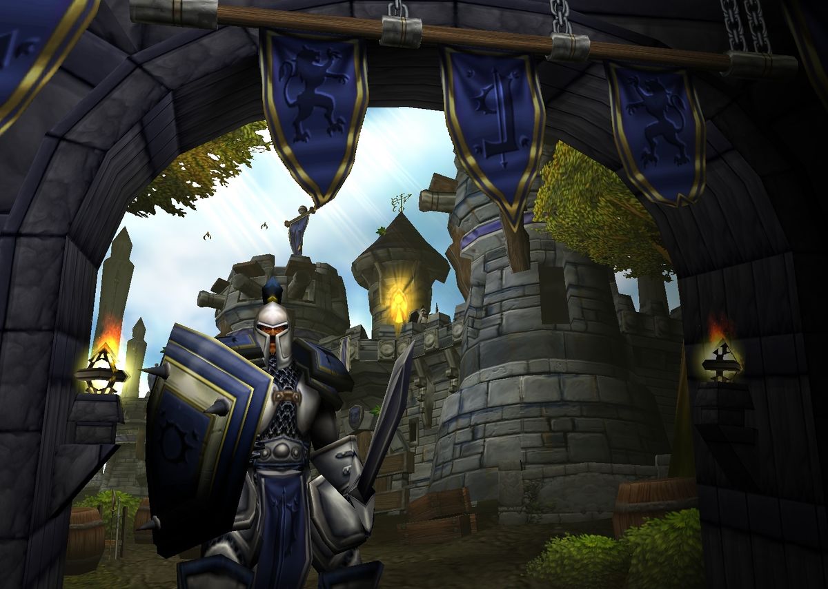
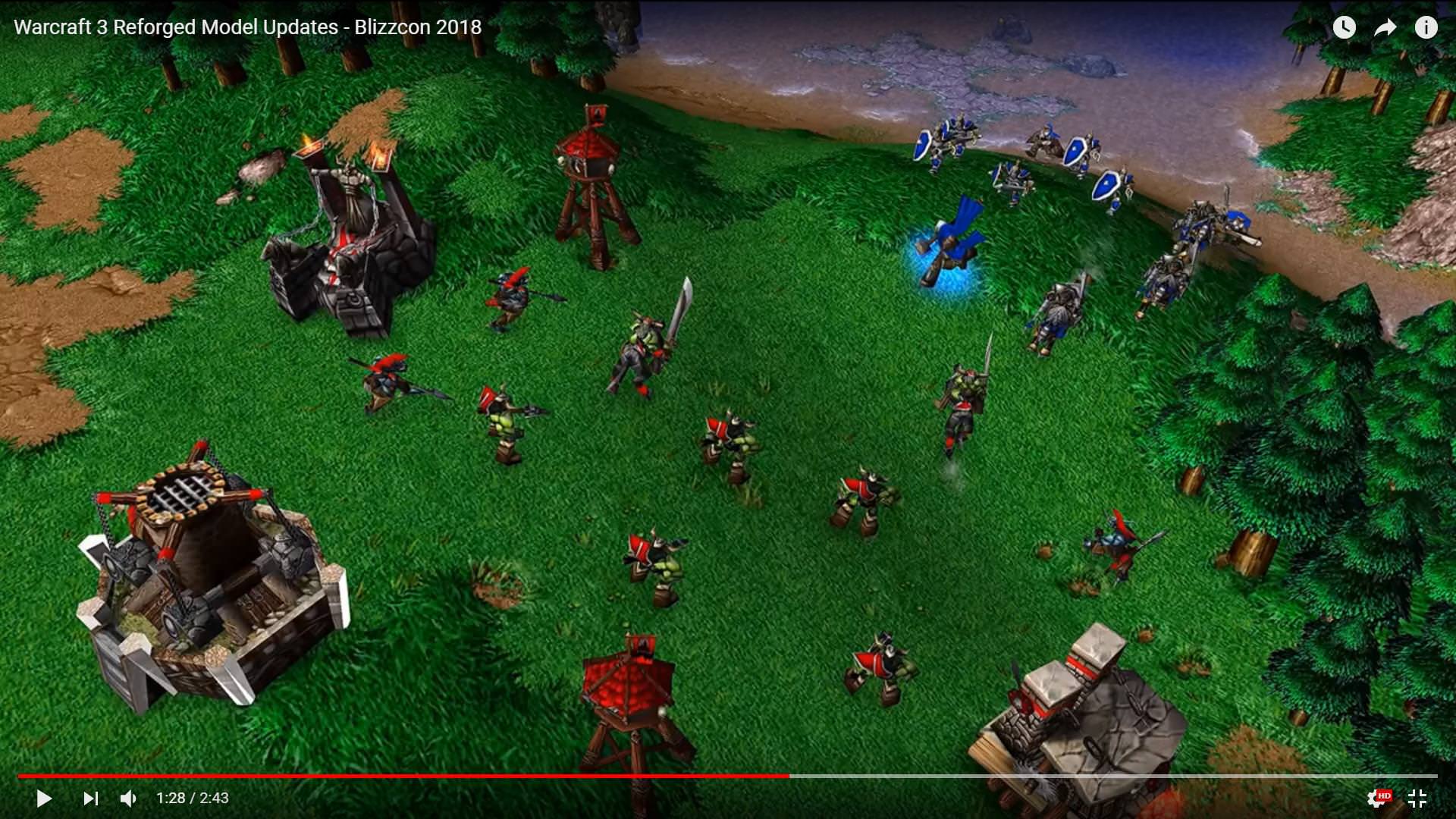
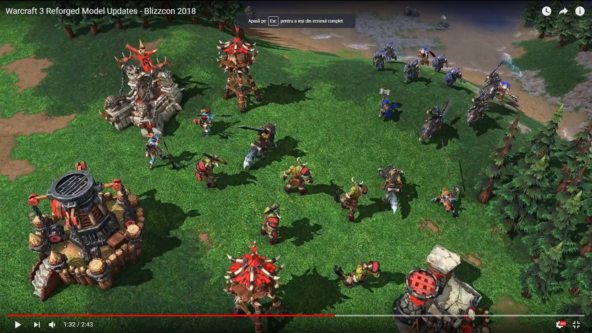
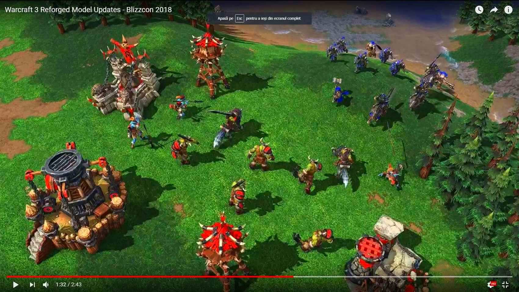
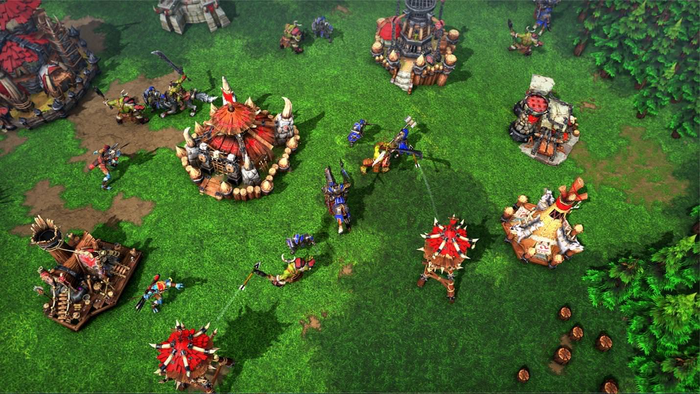
- General opinion about buildings: human and orc buildings I have seen so far are too cartoonish and look like plastic toys. They look totally out of place. I suppose textures are to be blamed (but also maybe the meshes, which are probably a tad too stylized). Also, all buildings lack ground texture, which make them look like they were just dropped on the map like a SC2 supply deposit, but I suppose it's something that is planned for the near future.
- Human buildings in general:
- Most human buildings look too round, while they used to be more linear in vanilla WC3. This is one of the things that make them too cartoony or toyish. There is nothing wrong with linear walls!
- Most wall textures are odd. By the look of them, you can't tell which material human buildings were made of.
- Human Barracks:
- For some reason, Barracks look way too small compared to they classic counterparts. The four towers are really tiny. It's obvious when compared to other buildings such as farms and lumbermill (which have been enlarged a lot!). Barracks should be a tiny bit higher, and towers should be much larger. I suppose there is a limitation here, so the model doesn't go beyond the structure's pathing, but please, go as far as you can so barracks don't look like some puny Playmobil replica of a real building! Apart from that, barracks are ok.
- Human Farms:
- Farms look rather larger than before, I'm not unhappy with it, it brings more realism.
- However, I dislike the textures, especially the thatched roofs, which look like plastic, once again.
- Human Towers:
- I find human tower not big enough, compared to the original ones. The latter looked a bit more massive, while the new towers look a bit too thin.
- Human Altar of Kings:
- The Lordaeron banner looks cool, but it is unnecessary. It ruins all the potential of altar of kings in custom maps, because all custom maps don't take place in Lordaeron, all humans are not from Lordaeron, etc.
- Textures are odd. They look too bland and smooth. The original Altar seem to be made of stone and marble, but Reforged Altar, once again I'm sorry, look like plastic.
- Castle:
- Castles lines are definitely too curvy.
- Towers size could be slightly increased.
- Castles lines are definitely too curvy.
Overall graphics and art style:
- Isn't there some sort of grey filter in the game? Not the UI, whose colours seem to remain untouched, but there is some kind of light fog in the field which make colours more bland, it's uncanny.
- Some people, including me, are bothered with the graphics choices that have been made for Reforged. New graphics don't seem to capture the spirit of the original game, it doesn't feel quite like the same game at all. The atmosphere is different. Reforged style is close to modern games such as HotS (or also Fortnite, Civilization 6...), but it would have been wiser to update and enhance the original style instead of completely transforming it to follow the modern graphics trends.
- For example, environment is not too bad in itself, but its textures are too smooth, too bright, the colours are too washed-out (too childish maybe?), and don't reflect the original atmosphere of the game.
- Plastic-looking and cartoonish buildings. Human buildings don't look like they are made of stone.
- Well-designed units, but some of them look like plastic figurines (grunt, tauren), and most units are probably overdetailed. Units need to look nice in close-up views, but too many details make them harder to recognise at first glance. Shiny armours probably don't help.
- There may be a contrast between environment (bright, smooth...), semi-realistic units, and over-cartoonish buildings. Seems like environment, units and building come from three different games. It lacks cohesion.
- Also, see what I said about oversized weapons and armours, and body proportions. Right now, just like some WoW models, these oversized parts look so ugly and absurd. I have seen this opinion very, very often.
- There are many, many people who are not happy with the art style. I read various comments here and there (Hive, Reddit, Youtube...) and there is clearly something wrong with the graphics. For example, you may have a look at Grubby's video here and read the comments. It is best to see the same idea expressed in various ways by different people. I read several times there was too much inspiration from WoW and HotS. I think it is not entirely true; WoW's art style has cartoonish textures, but characters' proportions are almost realistic. In Reforged, proportions are bizarre. Some body parts are huge, some others are extermely small and same goes for armours parts and weapons; proportions are quite realistic overall, but some body parts or armour parts have highly exaggerated proportions (way too small or too big). It looks very odd, and it doesn't look like any other Warcraft game. For example, the Footman has almost realistic proportions, but his armour and his sword are totally cartoony. Anyway, I think a vast majority of people prefer an improvement of the existing graphics style and atmosphere, not a complete transformation.
- In a nutshell: we don't want a totally different game. Reforged needs to feel like Warcraft, to be close enough to Warcraft III, whether it's about icons, atmosphere, environment, etc.
So, these are my thoughts after the first glance we had at Blizzcon. Whether you are happy or not with Reforged new assets, it would be nice if there was more feedback and some constructive debate.
Last edited:


