• Listen to a special audio message from Bill Roper to the Hive Workshop community (Bill is a former Vice President of Blizzard Entertainment, Producer, Designer, Musician, Voice Actor) 🔗Click here to hear his message!
  • Read Evilhog's interview with Gregory Alper, the original composer of the music for WarCraft: Orcs & Humans 🔗Click here to read the full interview.

Phoenix Trial #6 - Themed Icons

Status
Not open for further replies.
Level 38
Joined
Jan 10, 2009
Messages
854
Well it sopoused to be copper, gold is more yellow and less brown but what a hell i'll try to do something to get it to be more copper.

That wrench does not look like it is made out of copper, more like chrome something. Waaay to shiny to pass as copper.

its a bit noobish but i just want a bit of feedback on the look of the idea.

its honestly been a while since I drew icon art

You should get rid of the gold trim on the back, it makes the cushion look to flat. I'm curious to know what theme you are going for with that.

My new theme will be "Maces" :p

This will be a first wip :D


Demonic/blighted mace of death!

EDIT: Played around with it some more.
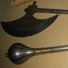
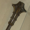
That icon looks all right, but the actual mace looks a little plain. I'd recommend going past the cube on a stick idea for your next icons and try something a little more interesting. Here are some pictures of maces and warhammers (and an axe) that were created in medieval Italy :D
IMG_0158.JPGIMG_0165.JPGIMG_0168.JPGIMG_0184.JPG

Anyways, here is what I've got so far...
66513d1254285005-phoenix-trial-6-btnphoenixhelmet.jpg
BTNPhoenixChest copy.jpg
 
agreeing. the BG looks too intense and distracts the attention away from the main objects. try darkening the BG or toning down the sparks(?) a bit.

67chrome said:
You should get rid of the gold trim on the back, it makes the cushion look to flat. I'm curious to know what theme you are going for with that.

its a mage theme.

but now that i think about it... i might want to restart and do a Narcainian Theme >:D
 
Level 15
Joined
Jun 11, 2007
Messages
969
Palaslayer: I like all, but just.... In my opinion, this is what I think:

Warden - Looks very nice. The best of the ones you've made for this competition, you should not touch it more.

Demon Hunter - 1st: The shape of the blade is nice, and the icon is awsome. Tho, the glow could (IMO) be a bit more "Sharp", looks a bit slimey and round.
2nd: I know that many people like this icon. Well, I've seen you do better, it looks better than average, but I think you have more to give :thumbs_up:

Druid of the Talon - 1st: Nice! Looks like Blizzards "Claws of Attack" (Which is not bad). The fingers look a bit too cartoony, but still they are also very well-made.
2nd: Awsome aswell. I really like this one, though (Lol) I guess it's not much of an item, but that's up to the judges, for it's great!

Priestess of the Moon - 1st: Looks very nice aswell, but it looks kind of steelish and plain. But the glow in the background is awsome.
2nd: I really don't see what this is. The shape of the item is unclear.

This is just fo "perfection". I think all of your icons are totally awsome and should deserve 5/5 ratings, so don't get me wrong! :)
 
Level 38
Joined
Jan 10, 2009
Messages
854
The priestess bow could stand to have more color variation, and from what I remeber it has spikes on it, which could look pretty cool if implemented into the icon. Other than that, the warden and demon hunter icons are my favorite, the claws are pretty nice, and I can't really tell what the other two icons are supposed to be. The druid wooden thing/keeper hand/staff could be a little clearer in what it is supposed to be. I really have no idea what the second priestess icon is supposed to be :(

But I'd say the warden icon, demon hunter icons, and druid claws. If you work on the bow and nature icons some more they could be worthy candidates as well :)
 
Level 10
Joined
Oct 22, 2006
Messages
599
Bump!
Priestess of the Moon - 1st: Looks very nice aswell, but it looks kind of steelish and plain. But the glow in the background is awsome.
2nd: I really don't see what this is. The shape of the item is unclear
I really have no idea what the second priestess icon is supposed to be :(

Seriously, WTH is the 2nd priestess icon? (yeah I know, curiosity killed the cat):gg:
 
Level 11
Joined
Jul 27, 2008
Messages
175
I've been working on icons a bit wrench icon gave me some problems trying to find right color, so i need feedback which one looks better, also i did bolts icon give me some feedback there too.

palaslayer first 3 icons are pure win, i would sugest you use first 3 and make another icon maybe wardens halm or something like that. Btw what is that last icon tyrandes hand of star fall :) ?
 

Attachments

  • BTNBolts.jpg
    BTNBolts.jpg
    16.3 KB · Views: 207
  • Wrench 2 copy.jpg
    Wrench 2 copy.jpg
    15.5 KB · Views: 182
  • Wrench copy.jpg
    Wrench copy.jpg
    15.6 KB · Views: 212
Level 10
Joined
Oct 22, 2006
Messages
599
You reduced the contrast, that mayby helped, but the basic problem is the reflection. It seems like the background reflects to the wrench, which should not be possible, you don't go polish your wrench after you use it! Now either you remove the background light, making it glow less, or greatly reduce the highlights. If you move a light towards the wrench it shouldn't reflect and glow like a diamond or cosmetic stone of some kind. Wrench is a work tool.
 
Level 11
Joined
Jul 27, 2008
Messages
175
helm and remote control will stand out as they are not so misic as other i was thinking of makeing pipes but i ended up waisting 1h of life need some other idea, since i made all 3 icons with construction theme within dwarf theme i need something used in construction by dwarfs, but thx.

EDIT: I know maybe i should do a hammer.
 
Level 10
Joined
Oct 22, 2006
Messages
599
helm and remote control will stand out as they are not so misic as other i was thinking of makeing pipes but i ended up waisting 1h of life need some other idea, since i made all 3 icons with construction theme within dwarf theme i need something used in construction by dwarfs, but thx.

EDIT: I know maybe i should do a hammer.

- Hammer was my first thought too, only if you manage to make it look like a construction hammer and not a weapon hammer.

@ banana_HUNT
- The thing down-right is the hand or the edge of the weapon?
 
Status
Not open for further replies.
Top