• 🏆 Texturing Contest #33 is OPEN! Contestants must re-texture a SD unit model found in-game (Warcraft 3 Classic), recreating the unit into a peaceful NPC version. 🔗Click here to enter!
  • It's time for the first HD Modeling Contest of 2024. Join the theme discussion for Hive's HD Modeling Contest #6! Click here to post your idea!

Phoenix Trial #6 - Themed Icons

Status
Not open for further replies.
Level 31
Joined
Sep 11, 2009
Messages
1,812
i would continue it if i was u... the only failing part of ur icon is the Blade... its ez to make some nice details and some shading on it...

lol u edited after i posted this :p anyway... i would still keep it.. and finish it and post it on the hive.. doesnt need to be an icon for the contest :p but its ur choice lol
 
Level 31
Joined
Sep 11, 2009
Messages
1,812
HOLYSWORD.jpg kk.. what u think about this update?
 
Level 9
Joined
Oct 22, 2006
Messages
599
October 25...
at 12 Midnight
...the dead shall rise 'n eat your guts 'till you die and eat another guy's guts so he dies and eats someone else's guts and the "someone else" dies and eats another guy's guts and the "another guy" dies and eats your guts and you say " -WTF dude? We're both zombies! " and he says nothing 'cause he eats your guts. Is this spam? No. Why? Because I will say: - Great job everyone! Keep working! Wonderfull Icons!:mwahaha::mwahaha:

Counter :
ands : 9
guts: 6
dies: 4

PS: Really great job :plol: I am planning on using a number of icons from the contest.
 
67chrome, don't take it personal, but could you show me the psd file of your icons?

Reasons
#1 to see if you are CNPing (bah, take this more has a shown of respect, but still)
#2 to see how you are working.

Pyramidhe@d = dude you rock, you so have your own style :p
 
Level 38
Joined
Jan 10, 2009
Messages
854
67chrome, don't take it personal, but could you show me the psd file of your icons?

Reasons
#1 to see if you are CNPing (bah, take this more has a shown of respect, but still)
#2 to see how you are working.

Ya, sure.
Son of a __. Accidentally shrunk the chest
66074d1253681239-emoticon-contest-2-creeps-nefacepalm.gif


That took a while to do. Oh well, the other two are fine, and at least I'm happy with the chest and shouldn't need to edit it any more :)

Anyways, here is one of the screenshots I'm using for comparison of what my armor bits are supposed to look like :)

WoWScrnShot_032809_193305.jpg
 

Attachments

  • BTNPhoenixChest.psd
    63.9 KB · Views: 77
  • BTNPhoenixHelmet.psd
    181.9 KB · Views: 67
  • BTNPhoenixShoulder.psd
    183.6 KB · Views: 62
That's not good anof I have to say... because right now, with these psb file I could seriously think you are even more Cnping than I expected in the first time.

Tought, I might be wrong, and I don't want to get into any conclusion about calling you cnp. There's is still 1 icon you have to make, and I would sincerly like to see a good psb file.

wich is... a file with all the layers.
Layer 1 = Color
Layer 2 = Shadow
Layer 3 = Lines
Layer 4 = effects
Layer 5 = background
Layer 6 = The icon panel.
(for example)

cause you might just have merged all your icons together, why I still want to be shure you are not CNPing.

So please, 67chrome, with all my respect, I would really like to help you. Just show us how you make your icons and all your wip and you shall receive reputation from me, for doing these epic icons :D
 
Level 26
Joined
Apr 13, 2008
Messages
2,049
aw dude, holy crap 67chrome, that looks so kickass..... i HOPE

EDIT:..... ok i looked at the psd files. and chrome, why are the armors on 1 layer... and why is there a background layer with a colorized pixelated version of the armorpiece underneath it.... it is... disconcerting to say the least...
 
Last edited:
all i have to say is the style of the chest and the helmet is really different imo
the helmet you cose to define things using a good shading and so on and yet the chest was mostly defined by thick black lines.

you also used thin black line to define the spikes on your shoulderpad and yet i havent seen you do that for any of the other 2 items or any where else on the shoudler pad.
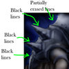
then there is this too
pew pew.jpg
well it could be the blood sugar level talking but that looks sus
why would you draw it then erase it....

i dont know. jsut pointing things out
 
Level 38
Joined
Jan 10, 2009
Messages
854
all i have to say is the style of the chest and the helmet is really different imo
the helmet you cose to define things using a good shading and so on and yet the chest was mostly defined by thick black lines.

you also used thin black line to define the spikes on your shoulderpad and yet i havent seen you do that for any of the other 2 items or any where else on the shoudler pad.
then there is this too
View attachment 67355
well it could be the blood sugar level talking but that looks sus
why would you draw it then erase it....

i dont know. jsut pointing things out

I did most of my icons on one layer, then roped it off with a selection and pasted it to another layer, hence the mysterious blue helmet under the helmet as well. With working on my skins I usually like keeping similar textures on the same layer, usually I only use multiple layers if I either A:
constantly need to make a specific selection for various modifications (armor, skin, hair, etc.)
or B - I'm creating intricate details which will be infinitely more manageable if they are in a separate layer. My icons only really have one texture type (The helmet has some beard-hair thing to, but I didn't feel it needed another layer), and the background. Hence only three layers.

Also, I was looking directly at what I was trying to re-create with these icons, so it shouldn't be much of a surprise that they look like what they are supposed to. As for the shoulder, the spikes are off and so is the perspective, I don't see how you can confuse that with CnP, if I'm motivated enough I'll probably re-do it.

I'll just save multiple versions of my next icon and give you guys a wip sequence instead of giving you a PDF, but probably won't get to it this weekend.
 
Than it's perfect, there's no need to stress about that 67chrome, I'm waiting for your complete WIP with all the layers icon.

Captain Faulcon = Show your moves!

EDIT1: New icon made, my theme will be ''Druid'' after all :D

Item = Druid's Cape

BTNcape copy.png

(based on my druid concept I made for Gaulish village survival)

EDIT2: New icon made, A druid's book. :D

BTNBook copy.png

EDIT3: That's the first icon I made btw :D

66639d1254456471-phoenix-trial-6-btnmushroom.png
 

Attachments

  • BTNcape.psd
    84.8 KB · Views: 108
  • BTNBook.psd
    88.4 KB · Views: 61
Last edited:
Level 31
Joined
Sep 11, 2009
Messages
1,812
i love ur icon style :p but heres something i dislike... idk if its just me but the head of the druid cape is more for a priest or something like this... make the head more druidic and i thikn it will be rly better.. on the druid book, make the flower thingy green instead of making it white...
 
i love ur icon style :p but heres something i dislike... idk if its just me but the head of the druid cape is more for a priest or something like this... make the head more druidic and i thikn it will be rly better.. on the druid book, make the flower thingy green instead of making it white...

get your mind out from Warcraft3 for a sec please :p

In Diablo 2 for example, the druid wear that colors alot, has well for any kind of RPG, it's Wool! :D

and for the book, I already tryed to make it green, and it doesn't work with the background, because it creates a visual effect called ''tension'' in art. Why i made it white.

@Mr.Goblin
What's mushrooms got to do with druids?

Druid were known (in the history of humanity has alchemist) so it's a simple item for a recipe they can use. :D

The last icon could be something else, like a special root or leave.
 
Status
Not open for further replies.
Top