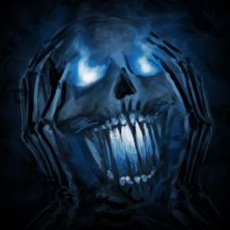
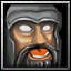
I think the abomination in the reincarnation icon needs to be more distinguished. The background color and the abomination's color is really similar, if you were to make the abomination stand out more it would be easier to see what is going on. Perhaps you could try have a complementary color in the background rather than something so similar to the abo color.
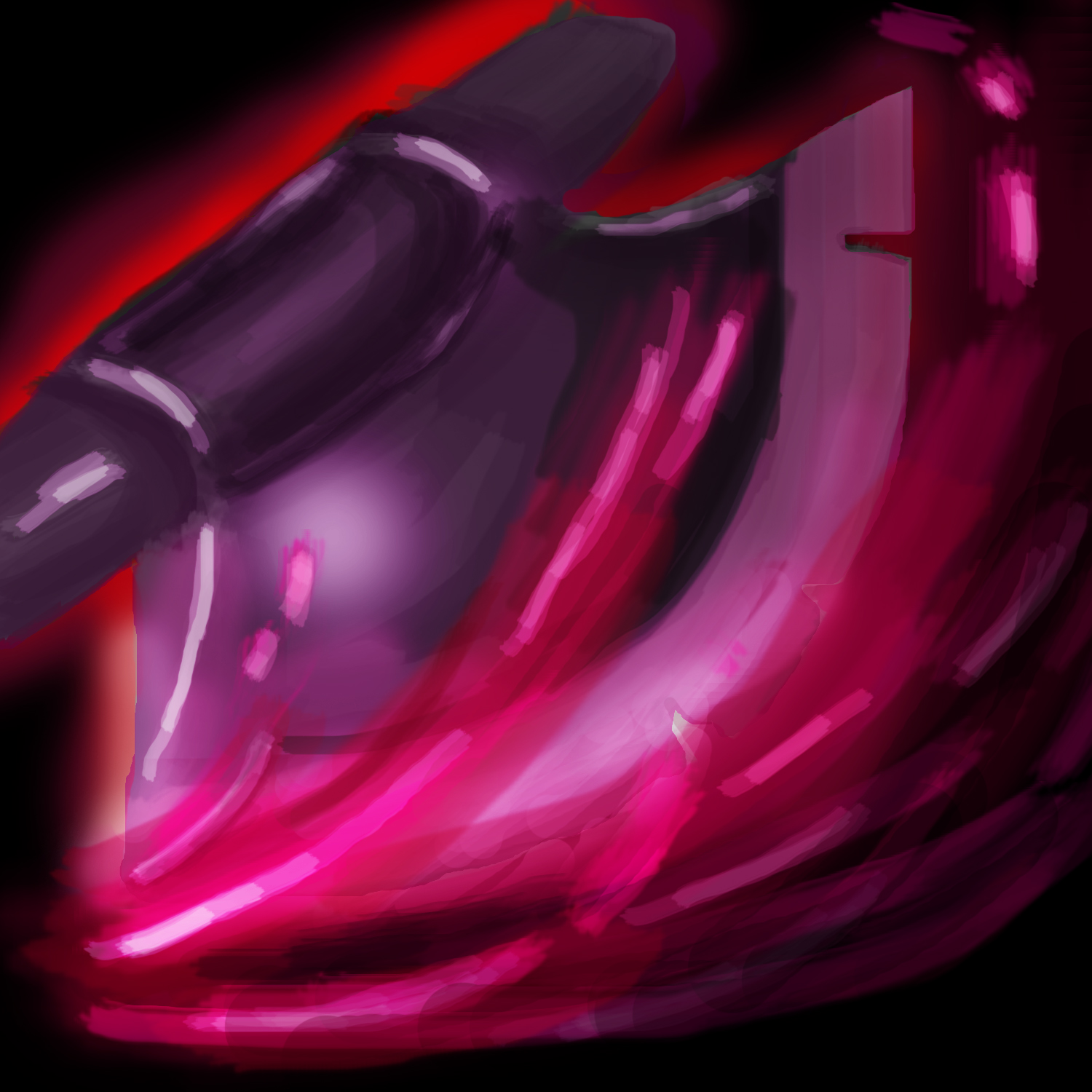
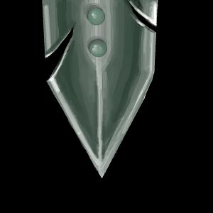
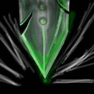
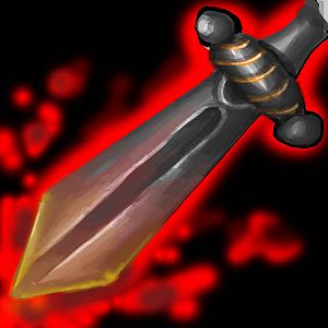
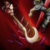
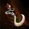
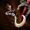
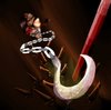
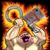
Your impale icon is a great idea, though it is starting to become quite cluttered as well. As the focal point in the icon is the actual impaling you could try and enlarge the soldier and make him more centered and make the hook impale right through him rather than that extra "magic" or whatever you have right now. The latter is just a personal suggestion.
I actually believe you should remove the abo alltogether from that icon because we will still know that the icon is showing a "hook impale". Makes it easier to see what is going on.
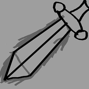
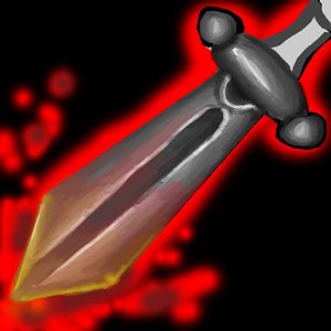
The normal impale icon actually just show the impale itself. You probably wanted to do something more interesting than that. But you have to be careful not to put too much stuff in an icon. It is important that the player sees what's going on.
If you do want to keep the abo I think you should try to put him lower down, or at least make the hook impale the soldier from below rather than the angle you have now, because it looks kind of odd.
As the icon is now you can't even make out what the object is that he is impaling with that hook.
OR if you want to keep the composition as it is, I believe you should try to keep the ground brown rather than red. Or at least try some other colors, because just like in your reincarnation icon the colors sort of blend together.
Oh wow, enormous wall of text.
TL

R - The art is looking pretty neat, but don't forget it is an icon you are designing, not a big-size artwork.