Community
Projects
Maps
Tutorials
Gallery
Support Us
Install the app
How to install the app on iOS
Follow along with the video below to see how to install our site as a web app on your home screen.
Note: This feature may not be available in some browsers.
-
Listen to a special audio message from Bill Roper to the Hive Workshop community (Bill is a former Vice President of Blizzard Entertainment, Producer, Designer, Musician, Voice Actor) 🔗Click here to hear his message!
-
Read Evilhog's interview with Gregory Alper, the original composer of the music for WarCraft: Orcs & Humans 🔗Click here to read the full interview.
-
The Hive's 22nd Icon Contest: Creep Abilities is now concluded, time to vote for your favourite set of icons! Click here to vote!
-
✅ The POLL for Hive's Texturing Contest #34 is OPEN! Vote for the TOP 3 SKINS! 🔗Click here to cast your vote!
-
✅ The POLL for Hive's Techtree Contest #20 is OPEN! Vote for the TOP 3 FACTIONS! 🔗Click here to cast your vote!
You are using an out of date browser. It may not display this or other websites correctly.
You should upgrade or use an alternative browser.
You should upgrade or use an alternative browser.
Beta Test
- Status
- Not open for further replies.
Chaosy
Tutorial Reviewer
- Joined
- Jun 9, 2011
- Messages
- 13,291


Nothing will be lost. For better or worse.
Ralle
Owner
- Joined
- Oct 6, 2004
- Messages
- 10,379

Warhammer 40,000 TD
As I said:Woah! this is great, I love it! But what about the members stuff (E.g : Rep / Posts counts/ Awards, etc) can they also be moved to the new site?
All content will be moved[...]
- Joined
- Jul 29, 2007
- Messages
- 5,174

Looks cool, but will all our posts be saved?
I would say yes
All content will be moved
- Joined
- Jul 25, 2014
- Messages
- 490
Convenient usage, great new features like "Social Groups" tab, I like how you can find anything pretty quickly.
Really excited for Hive 2.
Really excited for Hive 2.
Chaosy
Tutorial Reviewer
- Joined
- Jun 9, 2011
- Messages
- 13,291
Too bad we'll get it in a few years at best. (considering for how long it has been talked about)
- Joined
- Feb 18, 2014
- Messages
- 3,709
I'm not sure all people will agree the idea of allowing unregistred memebers to view their profile posts [...]
- Joined
- Apr 2, 2013
- Messages
- 3,954

I'm not sure all people will agree the idea of allowing unregistred memebers to view their profile posts [...]
All people wouldn't agree with Hive 2 anyway, or anything in life. Point is, if you disagree with something and are willingly trying to change or preserve something, you have to do a better job than, "not all people."
I actually prefer guests looking at profiles as it shows how active the site is in the social and community aspect.
- Joined
- Feb 18, 2014
- Messages
- 3,709
I believe it's the likes you should recieve or rep.
 smile.It only makes the eek smile with the ops: next to it
Ralle
Owner
- Joined
- Oct 6, 2004
- Messages
- 10,379
Warhammer 40,000 TD
In case you want an update.
I am in the process of making import script for SC2 resources and packs (I have done models, maps, skins, spells, tools, icons already and the forum things are imported by XenForo scripts). I then need to import hosted project custom pages and make sure all old links are redirected to new ones.
Finally I will do a test import of everything and have you guys look at it and make sure everything looks alright. A week after that if everything is fine, I will do the final import.
Chaosy
Tutorial Reviewer
- Joined
- Jun 9, 2011
- Messages
- 13,291
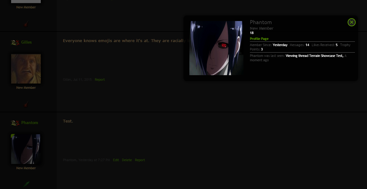
2
I just noticed something CRITICAL.
(animated) GIF avatars do not work properly.
In fact it works fine until the site automatically resize the avatar which somehow removed the image sequence. If you visit the profile of the user "Phantom" you'll see that the avatar works as it should but if you check a post by that user it wont. Same goes for visitor messages.
edit:
In case you want an update.
I am in the process of making import script for SC2 resources and packs (I have done models, maps, skins, spells, tools, icons already and the forum things are imported by XenForo scripts). I then need to import hosted project custom pages and make sure all old links are redirected to new ones.
Finally I will do a test import of everything and have you guys look at it and make sure everything looks alright. A week after that if everything is fine, I will do the final import.
I just noticed something CRITICAL.
(animated) GIF avatars do not work properly.
In fact it works fine until the site automatically resize the avatar which somehow removed the image sequence. If you visit the profile of the user "Phantom" you'll see that the avatar works as it should but if you check a post by that user it wont. Same goes for visitor messages.
edit:
Last edited:
- Joined
- Feb 18, 2014
- Messages
- 3,709
That's very odd, I never realize that you can create a link so easly in the Hive 2, if you just tip "www.---.com" it became a true link who doesn't even excist O-o, You don't believe me, then just write a conversation and tip for E.g some random link and you'll see.
Also I think some smiliers are still missing tho, I could add some more...
And why I can't give someone rep for the second time, a message says : 20 users must give him rep before I can give it again? Quite weird...
And I don't think it's a wise idea to importe screenshot for an icon on the top, that will make people think that this ressources is so value if you upload for her a 3D picture!
What a nice way to approve your ressources")
P.S : I was thinking what if you make a private chat group?
Also I think some smiliers are still missing tho, I could add some more...
And why I can't give someone rep for the second time, a message says : 20 users must give him rep before I can give it again? Quite weird...
And I don't think it's a wise idea to importe screenshot for an icon on the top, that will make people think that this ressources is so value if you upload for her a 3D picture!
What a nice way to approve your ressources
P.S : I was thinking what if you make a private chat group?
Last edited:
All of them are being ported overAlso I think some smiliers are still missing tho, (MasterHaosis will get angry if he didn't find that smilier
I think that's the idea of the conversations I talked about.Ill show you when you come online on the beta site againP.S : I was thinking what if you make a private chat group?
- Joined
- Jul 29, 2008
- Messages
- 10,254


Lol, I just found this thread...
Pretty cool to see all your hard work coming to fruition, Ralle ( & Co)! I'll admit, I'm the kind of guy who's not a big fan of change, so no matter what I'll miss vBulletin. Still, cool stuff!
Pretty cool to see all your hard work coming to fruition, Ralle ( & Co)! I'll admit, I'm the kind of guy who's not a big fan of change, so no matter what I'll miss vBulletin. Still, cool stuff!
Roland
R
Roland
Hey ralle? When this site gets migrated to the XenForo Domain will you merge the Accounts here in Vbull (to)> XenForo?
Because I want to have the same password here in hive To hive2 <(Which I damn forgot my pass)
Because I want to have the same password here in hive To hive2 <(Which I damn forgot my pass)
- Joined
- Nov 4, 2010
- Messages
- 6,233


When this site gets migrated to the XenForo Domain will you merge the Accounts here in Vbull (to)> XenForo?
As the Mighty Chieftain said:
All content will be moved
However, about the passwords, I think...
it would probably be the same as before
Hey,sorry to bother with my problems again but I receive this error when I try to rep someone
The following error occurred
The server responded with an error. The error message is in the JavaScript console.
Ralle
Owner
- Joined
- Oct 6, 2004
- Messages
- 10,379
Warhammer 40,000 TD
Hey,sorry to bother with my problems again but I receive this error when I try to rep someone
Is that when you rep a resource or a post?
Ralle
Owner
- Joined
- Oct 6, 2004
- Messages
- 10,379
Warhammer 40,000 TD
I am looking into it.2
I just noticed something CRITICAL.
(animated) GIF avatars do not work properly.
In fact it works fine until the site automatically resize the avatar which somehow removed the image sequence. If you visit the profile of the user "Phantom" you'll see that the avatar works as it should but if you check a post by that user it wont. Same goes for visitor messages.
edit:
I'm curious,how does the conversation system work?
I'm talking about the conversations you create,that appears under Home once created.
It's like threads except you specify who can see it. Much better.
Chaosy
Tutorial Reviewer
- Joined
- Jun 9, 2011
- Messages
- 13,291
Thank you.I am looking into it.
- Joined
- Feb 18, 2014
- Messages
- 3,709
How on earth can I delete a map ?
Ralle
Owner
- Joined
- Oct 6, 2004
- Messages
- 10,379
Warhammer 40,000 TD
Resources are inside bundles and bundles are technically also threads. Try looking for a "delete thread".
The beta site has been updated.
The beta site has been updated.
- Joined
- Feb 8, 2013
- Messages
- 1,476

Is it just me, or did the 3d viewer stop rendering skins on the models.
Ralle
Owner
- Joined
- Oct 6, 2004
- Messages
- 10,379
Warhammer 40,000 TD
Could be a misconfiguration on my part. Can you send a link to a model that is rendered wrong?
Ralle
Owner
- Joined
- Oct 6, 2004
- Messages
- 10,379
Warhammer 40,000 TD
Okay that is fixed now. Was a misconfiguration. The Warcraft MPQ files were not uploaded to the recently replaced server.
- Joined
- Feb 8, 2013
- Messages
- 1,476
It's still giving me bug messages. "Rats, WebGL hit a snag" and a 404. Might be my chrome.
Ralle
Owner
- Joined
- Oct 6, 2004
- Messages
- 10,379
Warhammer 40,000 TD
Weird. Works for me. Can you send a link to one it says is broken?
- Joined
- Feb 8, 2013
- Messages
- 1,476
It's working now. It may have been some temporary files or something because I had the old one open when it wasn't working and then refreshed it. Now, I've restarted my cpu and I cannot duplicate the error. So I guess ... my bad.
- Joined
- Nov 29, 2006
- Messages
- 1,267
I haven't checked the beta site for a while. I really like the 3d viewer for models which is an excellent idea, I would no longer be needed to download each model to checkout for animations.
That will increases the chance to draw out models which only exists in other sites to be submitted here as well.
It would be nice if Repositories perhaps changed name, maybe call it Resources instead. (Many won't click on it by instinct, its a word unknown for most people who have english as secondary)
- Joined
- Oct 9, 2006
- Messages
- 6,392

For me it is mostly graphical things, that might likely just now have been implemented yet. I hope to see the good old brown color some more, that I have come to associate with Hive. There is also the whole frame in frames, that for me is a big part of what I like about Hive's appearance (Meaning leafs both as a frame around central "posts" and under menu, with another frame for the background, giving it all a very "warcraft" or fantasy like look). But as for functionality, it feels fast and agile. Also like that there is a logo. Social icons (the twitter one) should have an update to better fit the theme (perfectly changing pending on theme chosen).
Also does the beta site run on something related to the members of the other site? Just noticed that logging in appears to be a lot slower than usual, with no slow downs after login has finished.
Also does the beta site run on something related to the members of the other site? Just noticed that logging in appears to be a lot slower than usual, with no slow downs after login has finished.
Ralle
Owner
- Joined
- Oct 6, 2004
- Messages
- 10,379
Warhammer 40,000 TD
For me it is mostly graphical things, that might likely just now have been implemented yet. I hope to see the good old brown color some more, that I have come to associate with Hive. There is also the whole frame in frames, that for me is a big part of what I like about Hive's appearance (Meaning leafs both as a frame around central "posts" and under menu, with another frame for the background, giving it all a very "warcraft" or fantasy like look). But as for functionality, it feels fast and agile. Also like that there is a logo. Social icons (the twitter one) should have an update to better fit the theme (perfectly changing pending on theme chosen).
Also does the beta site run on something related to the members of the other site? Just noticed that logging in appears to be a lot slower than usual, with no slow downs after login has finished.
Thanks for the feedback. I guess we could make a 'Classic' theme at some point, sure.
Login is slow? That's weird. I didn't get that experience.
- Joined
- Oct 9, 2006
- Messages
- 6,392
Login is slow? That's weird. I didn't get that experience.
I am a sucker for the classic one
 so that sounds good. Well, dunno what it is with the login. As mentioned it is fast after the first login, like a cache system, where it loads everything the first time and then doesn't have to for the next. Anyway its not really a big issue.
SpasMaster
Hosted Project: SC
- Joined
- Jan 29, 2010
- Messages
- 2,018
Sunken City
Yes, please. <3I am a sucker for the classic one
- Joined
- Jan 30, 2013
- Messages
- 12,930


Just noticed that there are two "home" buttons at the BETA site.

https://www.hiveworkshop.com/forums/pastebin_data/v8crwo/Jepretan Layar 2016-03-03 pada 11.08.14.jpg
https://www.hiveworkshop.com/forums/pastebin_data/v8crwo/Jepretan Layar 2016-03-03 pada 11.08.14.jpg
Ralle
Owner
- Joined
- Oct 6, 2004
- Messages
- 10,379
Warhammer 40,000 TD
Weird. I don't have that locally.
Chaosy
Tutorial Reviewer
- Joined
- Jun 9, 2011
- Messages
- 13,291
I checked too, I can also see two home buttons.
- Joined
- Feb 18, 2014
- Messages
- 3,709
Actually they ain't the same home tab, yes the first one is the forum, the second one is more like an item section or something like that...
- Joined
- Jan 25, 2011
- Messages
- 2,293
One more time. Do we need to create a new profile? Mine says "The requested user 'Solu9' could not be found."
- Joined
- Oct 9, 2006
- Messages
- 6,392
I aware that most of this is likely utterly irrelevant, given that it is not something you have worked on yet, but still going to comment on it, as to say how I would prefer it. (Firefox user here):
- Would like to still have skins and models separated
- The script for the 3d viewer is called "rolfmania"? (And now having realized why it is called that, it isn't as fun as I thought )
)
- The 3D viewer has quite a lot of wasted space around it.. making it feel rather empty given that it is not in a new windows.
- Actually the space thing seems to be general problem.. looking at members list and all, it just feels so empty, which isn't good. I don't feel cozy on the beta site, nor feeling the site is unique, it feels more like a random forum.
- The View 3 Button should be more prominent. In fact, several features is somewhat hidden in the UI, being just text, with no buttons/graphics.
- Also why call it repositories, when everyone is so used to it being known as resources? I would really avoid renaming overall tabs.
- The message says explore XenFore.. shouldn't it be Hive 2?
- The second Home button has an inaktiv sub menu called quick links. (Several actually have irrelevant sub menu's. Like chat having chat as a sub menu)
- Resources (or repositories ) should given its importance be located after forums on the menu.
- The page for trying to view a user page without being logged in isn't very informative. Just says error as the headline, where I would say something about permission denied.
- Having to specifically click the tiny white arrow to view sub menus is annoying. So as they show after you clicked a top menu (except for instance with Home 2), I would just remove the white arrow.
- All resources should have their own menu area in my mind, given each area individual supporters and influences. Then sub menu's for those could be things like directors choice if any is even needed.
- Members online shouldn't be above new posts, but next to or part of the statistics.
- I like that there is a social group menu now, hopefully something that will make it easier to realize how to make them as well as I have yet to discover how to do that on Hive.
- The reputation icons isn't final right? At least the current ones are somewhat hard to see on black surfaces.
- While I like idea, I don't like the bleed effect on the top posts in a thread (background image). Though I am guessing that is not part of final.
- I miss the old bot tester
- Like the idea about an emotion contest.
- Register now pop-up still visible while logged in.
- See no need for a light-box instead of directly going to user page. Though maybe open it in a new window/tab automatically.
- Like the odd Customize rank thing.
- Hope to see all the profile features on a CP page when you go to your profile, instead of being as a giant sub menu your login tab. Oh wait. There is an account page (that should be called user CP), but it has no direct menu link.
- Hiveworkshop.com is not a valid url for homepage on profile?
- If the "liked you received" will end up showing all and not just latest 15 then it is freaking awesome
- Some switching of priority in the UI for the user cp/account area. Like the whole social one, with conversations being above settings.
- What will alerts be?
- The search button seems somewhat out of place - But is a lot more visible than on the current Hive, which is a good thing.
- Copyright in footer unchanged
- Like the chat setup, although slightly confusing that you start in the chat window, meaning with the chat in the background.
- Took me a few seconds to realize that it always opens in tab if you click anything while being in the chat..it is practical to some extend, but not sure I like that. Would prefer an option instead. Meaning if I click something that would open it in the same windows, I get asked if I want to leave the chat.
- Is social forums and social groups the same? Or maybe not, since I can watch them? Do we need social forums then? Or if it is meant just for off-topic stuff then I don't believe we should separate it.
- No picture limits
- As home goes to forums, I am assuming there will be an actual home front area at some point.
- Somewhat hard to see the icons for actions you can do to you posts, when its green on slightly lighter green.
- Like that editing the post shows as a light box.
- More options doesn't give more options, just more space between two functions.
- Would be useful to have the "line through text" option, alongside bold, italic and so forth.
- The having read a thread "bold" or not bold, doesn't appear to work correctly. Or I have misunderstood its function
- It feels deliciously fast - but given how little is on it, it makes sense.
- I miss seeings others profiles.
- Can't edit status text? (the one under/above the avatar).
- Not sure I get the bundle resource idea? So the bundle is always visible, even if you have just one resource in it?
Yea, you need to create a new one.
- Would like to still have skins and models separated
- The script for the 3d viewer is called "rolfmania"? (And now having realized why it is called that, it isn't as fun as I thought
)- The 3D viewer has quite a lot of wasted space around it.. making it feel rather empty given that it is not in a new windows.
- Actually the space thing seems to be general problem.. looking at members list and all, it just feels so empty, which isn't good. I don't feel cozy on the beta site, nor feeling the site is unique, it feels more like a random forum.
- The View 3 Button should be more prominent. In fact, several features is somewhat hidden in the UI, being just text, with no buttons/graphics.
- Also why call it repositories, when everyone is so used to it being known as resources? I would really avoid renaming overall tabs.
- The message says explore XenFore.. shouldn't it be Hive 2?
- The second Home button has an inaktiv sub menu called quick links. (Several actually have irrelevant sub menu's. Like chat having chat as a sub menu)
- Resources (or repositories
) should given its importance be located after forums on the menu.- The page for trying to view a user page without being logged in isn't very informative. Just says error as the headline, where I would say something about permission denied.
- Having to specifically click the tiny white arrow to view sub menus is annoying. So as they show after you clicked a top menu (except for instance with Home 2), I would just remove the white arrow.
- All resources should have their own menu area in my mind, given each area individual supporters and influences. Then sub menu's for those could be things like directors choice if any is even needed.
- Members online shouldn't be above new posts, but next to or part of the statistics.
- I like that there is a social group menu now, hopefully something that will make it easier to realize how to make them as well as I have yet to discover how to do that on Hive.
- The reputation icons isn't final right? At least the current ones are somewhat hard to see on black surfaces.
- While I like idea, I don't like the bleed effect on the top posts in a thread (background image). Though I am guessing that is not part of final.
- I miss the old bot tester
- Like the idea about an emotion contest.
- Register now pop-up still visible while logged in.
- See no need for a light-box instead of directly going to user page. Though maybe open it in a new window/tab automatically.
- Like the odd Customize rank thing.
- Hope to see all the profile features on a CP page when you go to your profile, instead of being as a giant sub menu your login tab. Oh wait. There is an account page (that should be called user CP), but it has no direct menu link.
- Hiveworkshop.com is not a valid url for homepage on profile?
- If the "liked you received" will end up showing all and not just latest 15 then it is freaking awesome
- Some switching of priority in the UI for the user cp/account area. Like the whole social one, with conversations being above settings.
- What will alerts be?
- The search button seems somewhat out of place - But is a lot more visible than on the current Hive, which is a good thing.
- Copyright in footer unchanged
- Like the chat setup, although slightly confusing that you start in the chat window, meaning with the chat in the background.
- Took me a few seconds to realize that it always opens in tab if you click anything while being in the chat..it is practical to some extend, but not sure I like that. Would prefer an option instead. Meaning if I click something that would open it in the same windows, I get asked if I want to leave the chat.
- Is social forums and social groups the same? Or maybe not, since I can watch them? Do we need social forums then? Or if it is meant just for off-topic stuff then I don't believe we should separate it.
- No picture limits
- As home goes to forums, I am assuming there will be an actual home front area at some point.
- Somewhat hard to see the icons for actions you can do to you posts, when its green on slightly lighter green.
- Like that editing the post shows as a light box.
- More options doesn't give more options, just more space between two functions.
- Would be useful to have the "line through text" option, alongside bold, italic and so forth.
- The having read a thread "bold" or not bold, doesn't appear to work correctly. Or I have misunderstood its function
- It feels deliciously fast - but given how little is on it, it makes sense.
- I miss seeings others profiles.
- Can't edit status text? (the one under/above the avatar).
- Not sure I get the bundle resource idea? So the bundle is always visible, even if you have just one resource in it?
One more time. Do we need to create a new profile? Mine says "The requested user 'Solu9' could not be found."
Yea, you need to create a new one.
- Joined
- Feb 18, 2014
- Messages
- 3,709
One more time. Do we need to create a new profile? Mine says "The requested user 'Solu9' could not be found."
That won't be necessary :
All content will be moved to the new site and the old site will disappear. The new site will have the same domain name.
Ralle
Owner
- Joined
- Oct 6, 2004
- Messages
- 10,379
Warhammer 40,000 TD
Thanks RED BARON. Most of the things you referenced are settings. I have not gone through the settings on the beta site yet as it will just be deleted when we are done.
Archian
Site Director
- Joined
- Jan 1, 2006
- Messages
- 3,211


Trust me on this, the current BETA site is NOTHING compared to the final version of Hive 2.0. The primary goal of the current BETA is for users to try out XenForo and not Hive 2.0.
Most of points you make RED BARON are we well aware of and will rectify.
Most of points you make RED BARON are we well aware of and will rectify.
- Joined
- Oct 9, 2006
- Messages
- 6,392
Trust me on this, the current BETA site is NOTHING compared to the final version of Hive 2.0. The primary goal of the current BETA is for users to try out XenForo and not Hive 2.0.
Most of points you make RED BARON are we well aware of and will rectify.
Yea, I figured
Really looking forward to how it goes with it. And I can see some things have already changed since I commented on them, like accounts going directly to account page. (Don't have the option of modifying username icon (the flag + unit one) anymore).- Joined
- Feb 18, 2014
- Messages
- 3,709
I dunno why while I insert a picture link into a post and save it then I click on "edit" that link disappear and turn directly into a picture, this isn't the same as the original hive?
- Status
- Not open for further replies.
Similar threads
- Replies
- 78
- Views
- 12K