Community
Maps
Tutorials
Gallery
Support Us
Install the app
-
Listen to a special audio message from Bill Roper to the Hive Workshop community (Bill is a former Vice President of Blizzard Entertainment, Producer, Designer, Musician, Voice Actor) 🔗Click here to hear his message!
-
Read Evilhog's interview with Gregory Alper, the original composer of the music for WarCraft: Orcs & Humans 🔗Click here to read the full interview.
You are using an out of date browser. It may not display this or other websites correctly.
You should upgrade or use an alternative browser.
You should upgrade or use an alternative browser.
Texturing Contest #15 - Futuristic
- Status
- Not open for further replies.

- Joined
- Jul 30, 2007
- Messages
- 888
I haven't thrown up a WIP since I showed the face of mine. But I am still working on it, progress is coming slow and steady. I will put up another WIP when I have a little more to show.
- Joined
- Jan 30, 2009
- Messages
- 2,273

Well, i'm out but i will stay tunned here. I want to see what you have. ^^
Again, Good Lucks to all.
@Denth: r u crazy? i'm not so good xD
See ya skinnars!
what you don't think you could beat me? i think you easily could!
and good luck pyramidhe@d. You'd better beat me.
- Joined
- Aug 2, 2008
- Messages
- 442
Ok im probably way out of my league here but i guess it cant hurt to improve skinning skills ;p.
Im working on a robotic frost wyrm atm.

Messy but i shall learn o)
Im working on a robotic frost wyrm atm.
Messy but i shall learn o)
Mr.Goblin
Art & Graphics Design Moderator
- Joined
- May 26, 2008
- Messages
- 4,467


WOOT!, epic concept you got there, but yes, you should still improve the skin if possible
- Joined
- Jan 10, 2009
- Messages
- 854


Ok im probably way out of my league here but i guess it cant hurt to improve skinning skills ;p.
Im working on a robotic frost wyrm atm.
View attachment 66941
Messy but i shall learn o)
That looks pretty epic so far, can't really go wrong with that model choice either
- Joined
- Aug 2, 2008
- Messages
- 442
thanks
Ive worked on the skin more and decided to alpha the spinal fin things.

I think he looks much better without it. Almost like a different model.
I shall call him... Mini-me.... (Nightwing)
More editing to come
Ive worked on the skin more and decided to alpha the spinal fin things.
I think he looks much better without it. Almost like a different model.
I shall call him... Mini-me.... (Nightwing)
More editing to come
- Joined
- Jun 7, 2007
- Messages
- 2,395


thanks
Ive worked on the skin more and decided to alpha the spinal fin things.
View attachment 66944
I think he looks much better without it. Almost like a different model.
I shall call him... Mini-me.... (Nightwing)
More editing to come
Looks great, but there's barely enough definition. In-game it will probably look like a black blob. I suggest you add more contrast.
- Joined
- Aug 2, 2008
- Messages
- 442
it does. but im no where near done
- Joined
- Nov 8, 2007
- Messages
- 2,263


something more substantial
a turskarr turned into a mutant thingy
dont really know what you would call it
i just need to do a bit more then i am done
hurray for coffee-rush
- Joined
- Jun 7, 2007
- Messages
- 2,395
View attachment 66965
something more substantial
a turskarr turned into a mutant thingy
dont really know what you would call it
i just need to do a bit more then i am done
hurray for coffee-rush
Looks great so far.
- Joined
- Feb 17, 2009
- Messages
- 1,758

Hello everyone. I've been away for a long time since i don't have a proper comp. I still don't have one.
Anyway this is my epic skin. This will probably blow your minds out.

Ok. Maybe it won't blow your brains out. Bare in mind that i don't have WCIII on this comp so i cant do anything else other than simple skins like sammycube.
I know i won't win but i just made this for fun.
View attachment companion cube.blp <-- Best skin EVAR
Anyway this is my epic skin. This will probably blow your minds out.
Ok. Maybe it won't blow your brains out. Bare in mind that i don't have WCIII on this comp so i cant do anything else other than simple skins like sammycube.
I know i won't win but i just made this for fun.
View attachment companion cube.blp <-- Best skin EVAR
- Joined
- Dec 16, 2007
- Messages
- 451
it's better to make All-Spark out of it instead of that
- Joined
- Nov 8, 2007
- Messages
- 2,263
he thought the allspark will be bit too ambiguous
- Joined
- Aug 2, 2008
- Messages
- 442
Edit: nvm fixed
Last edited:
- Joined
- Jun 16, 2008
- Messages
- 1,939

View attachment 66965
something more substantial
a turskarr turned into a mutant thingy
dont really know what you would call it
i just need to do a bit more then i am done
hurray for coffee-rush
a lil messy
- Joined
- Nov 8, 2007
- Messages
- 2,263
which part exactly?
please dont tell me the whole thing :O
please dont tell me the whole thing :O

- Joined
- Apr 13, 2008
- Messages
- 2,050


darkdeathnight, lol awesome skin, id vote for that, but its pixelated, try smoothing it a bit, like drawing it in a larger format and resizing it in paint.net or photoshop or gimp or something with an antialiasing filter on it's scaling. Bigapple, i love the concept of that one i mean... deathwing isn't a robot but i like the robotdragon concept, the wings are kind of an odd shape, but otherwise good job
i mean... deathwing isn't a robot but i like the robotdragon concept, the wings are kind of an odd shape, but otherwise good job - Joined
- Jan 30, 2009
- Messages
- 2,273
very nice Apple!
A.R.
Skin Reviewer
- Joined
- Mar 12, 2008
- Messages
- 347


I'm seeing some good work here, people
PH: great concept, but the colours look random and chaotic. The yellow on the belly is a big detractor. It took me a moment to find the face in there as all the surrounding elements are competing for attention. You could probably tone down the red on the tusks and try unify it more as a helmet. It's got too many bright, saturated, unrelated colours all fighting for attention. I'd recommend you pick either the red or the green for the glowy bits rather than having them both in there.
Hmm, I might have to take it up a notch >
Attachments
- Joined
- Apr 13, 2008
- Messages
- 2,050
lol ghost in shell?
Mr.Goblin
Art & Graphics Design Moderator
- Joined
- May 26, 2008
- Messages
- 4,467
YIPI! A.R is back..
you only show yourself for competitions don't you :3 <3
you only show yourself for competitions don't you :3 <3
- Joined
- Feb 17, 2009
- Messages
- 1,758
I smoothed out my lines for my companion cube.

It looks a bit blurry but i can't really smooth it out well on a 64x64 image. That's the most i can smooth it out before it just looks like a blob.
View attachment companion cube3.blp
It looks a bit blurry but i can't really smooth it out well on a 64x64 image. That's the most i can smooth it out before it just looks like a blob.
View attachment companion cube3.blp
- Joined
- Apr 18, 2008
- Messages
- 8,453

Awesome! What model is it for?
- Joined
- Jun 16, 2008
- Messages
- 1,939
i love you
ok i changed up the skin a bit; removed massive team glow and brought the wings back along with some color shifts
View attachment 67009
I will put the files together later on.
pretty nice now
- Joined
- Jan 10, 2009
- Messages
- 854
I smoothed out my lines for my companion cube.
View attachment 67039
It looks a bit blurry but i can't really smooth it out well on a 64x64 image. That's the most i can smooth it out before it just looks like a blob.
View attachment 67038
You can always make the skin bigger than 64x64 and it will still work. I'd recommend going up to at least 128x128
That's pretty hot AR
- Joined
- Feb 17, 2009
- Messages
- 1,758
Cool. I never knew that. Is there something between 64x64 and 128x128 because 128 seems a bit big.
- Joined
- Apr 13, 2008
- Messages
- 2,050
whole number multiples of 64 are better than fractions. 128 wouldn't be that bad for better quality. But if you like you can try 96 (64+32 for a multiple of 1.5)
- Joined
- Feb 17, 2009
- Messages
- 1,758
Thanks
- Joined
- Nov 8, 2007
- Messages
- 2,263
anywhos
Wasteland mutant

View attachment Tuskarr.blp
replace Units\Creeps\tuskar\Tuskarr.blp
never knew how well the tuskar skin was made. so much easier than bloody felhound :\
Wasteland mutant
View attachment Tuskarr.blp
replace Units\Creeps\tuskar\Tuskarr.blp
never knew how well the tuskar skin was made. so much easier than bloody felhound :\
A.R.
Skin Reviewer
- Joined
- Mar 12, 2008
- Messages
- 347
lol ghost in shell?
Yesssss! Hence the Fuchikoma skin I started with (Fuchikoma were present in the manga as well as the original PS game. They were replaced by Tachikoma in SAC due to copyright issues).
YIPI! A.R is back..
you only show yourself for competitions don't you :3 <3
xD I am a shy and reclusive creature, rarely seen in the wild
Anywho, quick update on my skin:
Attachments
- Joined
- Jun 15, 2006
- Messages
- 2,651


anywhos
Wasteland mutant
View attachment 67068
replace Units\Creeps\tuskar\Tuskarr.blp
never knew how well the tuskar skin was made. so much easier than bloody felhound :\
the teeth look a bit strange to me :/
- Joined
- Jun 7, 2007
- Messages
- 2,395
Some more minor body tweaks:

I only need to do the weapon now.
I only need to do the weapon now.
- Joined
- Apr 18, 2008
- Messages
- 8,453
l0w, that's some amazing shit you got there. I only just don't really like the orange cables, they stand out too much compared to the rest of the body since they are so low-res.
- Joined
- Sep 13, 2008
- Messages
- 249
Pyramidhe@d ahahaha you made a helmet out of the usual face EPIC!
AR just great
l0w_kwaliti you may need some more reflections/highlights on the armor,it looks very nice so far.
EPIC!AR just great
l0w_kwaliti you may need some more reflections/highlights on the armor,it looks very nice so far.
- Joined
- Dec 13, 2005
- Messages
- 2,784


- Joined
- Apr 18, 2008
- Messages
- 8,453
Cool, what model is that?
- Joined
- Dec 13, 2005
- Messages
- 2,784
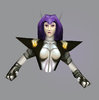
Dryad
- Joined
- Jun 7, 2007
- Messages
- 2,395
l0w, that's some amazing shit you got there. I only just don't really like the orange cables, they stand out too much compared to the rest of the body since they are so low-res.
That's copper wiring. I'll try and make it darker and/or less saturated.
@TurtleRacingCar: Well, it's basically some white metal, so I really see no need for reflections. Thanks for noting anyway
@Dio: Shit, a dryad skin?! Nobody made one in centuries!
- Joined
- Dec 16, 2007
- Messages
- 451
I made one and that was a failure xD
A.R. if you give her a white hair and a little bit darker face she'll become a Storm from X-Men
A.R. if you give her a white hair and a little bit darker face she'll become a Storm from X-Men
- Joined
- Dec 13, 2005
- Messages
- 2,784
I think I know why, Archangel.
- Joined
- Jan 30, 2009
- Messages
- 2,273
Is their any way i could improve on the narcainian Assasin? i feel like it needs a bit more of somthing.
A.R.
Skin Reviewer
- Joined
- Mar 12, 2008
- Messages
- 347
Ugh, getting those lips right was a total nightmare...
Just wait 'til you get to the chest. The Dryad is a depressing model to skin :<
@Dentothor: The lighting is a bit flat; if it's meant to be shiny and metallic, it needs more strong sharp highlights to really define it. The texture is also a bit monochromatic. Avoid using unsaturated black and white combinations in WC3 because they really stand out next to the other, more colourful textures.
- Joined
- Jan 30, 2009
- Messages
- 2,273
its bug-ish skin. thats what i intended it to be.
but what do you think i should do about the colour?
but what do you think i should do about the colour?
A.R.
Skin Reviewer
- Joined
- Mar 12, 2008
- Messages
- 347
Even bug-ish skin tends to be chitinous and shiny, gettyimages is a good source for references
About the colour, at the very least you need to break it up a bit more. Maybe find edges of armor plates that you can put lining on. You could define the metallic areas from the chitinous areas through colour as at the moment, the only difference is in the visual texture of the different areas, which is going to get lost ingame. There's not much you can do about the unsaturated black and white at this point without redoing much of the skin - it's something to remember for the future. You can, however, in Photoshop create a new layer above the texture, set the blending mode to 'color' and paint over the texture. It's not perfect use of colour, but it can give some nice results
You've got the glowyhax red-orange for the eyes (which are great btw) and the sword. You could try work that into the hooves, horns, wrist spines and the tail; that'd help liven it up a bit
- Joined
- Dec 16, 2007
- Messages
- 451
I think I know why, Archangel.
Chest is same as back, hair is same as leaves on her
bore...- Joined
- Nov 8, 2007
- Messages
- 2,263
- Status
- Not open for further replies.
Similar threads
- Replies
- 214
- Views
- 27K
- Replies
- 311
- Views
- 59K
- Replies
- 280
- Views
- 25K