- Joined
- Nov 6, 2009
- Messages
- 1,456
Logged in to tell ya guys ur awesome and heres and Idea, Fable style.
Follow along with the video below to see how to install our site as a web app on your home screen.
Note: This feature may not be available in some browsers.

I got an idea if no1 have done it yet.
Rune Interface??
Stone and dimond/gold


Maybe a Sketch Looking UI for diary of Wimpy Kid styled map?


That's awesome! But I think you should work on the inventory area. It doesn't looks too good; remember you'll need those small backpack icons covering the whole place, and honestly the borders would look better if they went all the way to the top and the sides.
")


I've been playing around with the UI to see exactly were the alpha channels are and figured I'd share what I've found with you guys.
View attachment 91059
The red is the part of the UI that can support alpha. Anything below it will appear black, anything above it won't appear on the UI and will be cut off.
The icons are solid green to make them stand out more easily and be more easily selectable. I replaced the resource icons as well, though the WC3 UIs aren't designed for square-edged resource icons. I also have icons were the first hero and idle workers would appear over on the left of the UI.
The map is laid over the UI as a semi-transparent layer, and is rather transparent at that. Any texture underneath it really shows through. Could be interesting in you wanted to do some effect underneath it though. Alphaing out the section of it that protrudes into the red will cause the terrain below to show through it, so I'd recommend staying away from alpha underneath the map.
Alternately, the unit portrait is entirely reliant on alpha channels to show anything. Could be a useful piece of information if you plan on making a UI for a tower defense that only uses doodads for units, though I don't imagine anyone will cover it up.
Anyways, I also included a .tga version to make magic wand selections and similar opramands easier for anyone who would like to use this.


correctso are the icons for abilities and items overlayed on top?
and do you know if the UI can support semi transparent alpha channels?


View attachment 92678
i gave some thought and Anarchian has goaded me into this contest.
the theme is industrial machine or construction machine.
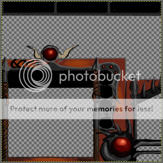


Meh.. some quick stuff that might turn into something later. It's not enough troll right now, though, so I will most likely redo a lot of it.


When I looked at it I thought that it was samurai or red dragon themed, or dragon hunter themed, and I thought that it was pretty creative and cool.Meh.. some quick stuff that might turn into something later. It's not enough troll right now, though, so I will most likely redo a lot of it.
View attachment 92678
i gave some thought and Anarchian has goaded me into this contest.
the theme is industrial machine or construction machine.


") looking great cant wait to see detail. I think I might join in the comp, if I have time, wont let you know till I do though
looking great cant wait to see detail. I think I might join in the comp, if I have time, wont let you know till I do though
so are the icons for abilities and items overlayed on top? or is the UI on top of the icons? (like if you wanted to make a filter or an odd shape overlaying the icons? and do you know if the UI can support semi transparent alpha channels? or is it an "all or nothing" sort of deal?
.... also i might join because pyramidhead is joining :3

CHaos Troll?
You don't like trolls? Well, the Chaos Trolls aren't your average Blizzard troll apart from their physical appearance. Without letting out too much details, the Chaos Trolls are, in a sense, related to red dragons, which is why I've used some dragon-hinting elements, but I just think there's too much of it right now. Might keep it though. Thanks anyway.When I looked at it I thought that it was samurai or red dragon themed, or dragon hunter themed, and I thought that it was pretty creative and cool.
But I have to admit that I was disappointed to hear it was about a Troll UI.
IMO you should stick to it but give it a different theme, as the details go on.


@Pyramidhe@d it's kind a cartoonish, hmm maybe make it more warcraft-ish.
@Pyramidhe@d it's kind a cartoonish, hmm maybe make it more warcraft-ish.
I thought you knew it and you were just making your UI for fun, what would be nice of you. but apparently you're just up for a vain award icon and some stupid amount of useless reputation.well, im not allowed to participate here. so, have fun guys and good luck