• 🏆 Texturing Contest #33 is OPEN! Contestants must re-texture a SD unit model found in-game (Warcraft 3 Classic), recreating the unit into a peaceful NPC version. 🔗Click here to enter!
  • It's time for the first HD Modeling Contest of 2024. Join the theme discussion for Hive's HD Modeling Contest #6! Click here to post your idea!

Icon Contest #13 - Icons for Director's Cut Models

Status
Not open for further replies.
Level 49
Joined
Jan 12, 2010
Messages
1,771
still feeling something is wrong.. so, will rework it soon.
 

Attachments

  • artas22.jpg
    artas22.jpg
    284.4 KB · Views: 103
Here is the ability of my icon entry :)
I'm too busy again, See yah next time :)
I will post my second ability icon maybe in the next few days with WIP :vw_death::vw_sleep:
Abilities :
#DeathCoil - Fires a blast of unholy energy at the target, causing Shadow damage to an enemy or healing an Undead ally.
 

Attachments

  • Necromastery.png
    Necromastery.png
    8.4 KB · Views: 278
  • NMagus_Necromastery.png
    NMagus_Necromastery.png
    183.8 KB · Views: 75
  • d.png
    d.png
    9.3 KB · Views: 140
  • NMagusCurse.png
    NMagusCurse.png
    201.6 KB · Views: 36
Last edited:

Ardenian

A

Ardenian

Well, I give up... I cannot make my tank icon look realistic, probably because I chose the wrong light source, being behind the tank. It always look like being executed in Paint..

Good luck you all!
 

Ardenian

A

Ardenian

That's very kind of you.

UrsaTank_UnitIcon12.jpg


UrsaTank_UnitIcon14.jpg


BTNUrsaTank_UnitIcon12.jpg


As you can see, I cannot get make the step between drawing the base and going advanced. It is not only the lighting, but also the perspective.

I think it is too advanced for me.
 
Level 28
Joined
Aug 7, 2011
Messages
1,638
Ok Ardenian, first start with lineart. For some artists it is easier this way, don't know about you, but it's worth a try. It will help you establish the shapes of what you want to draw, perspective and so on. Then paint in the base colors, then try to divide the icon in black and white. That's right, use only black and white, see where your shadows are and where your highlights are. Then of course remake this and try to blend it all, using more values and colors. I think the main problem right now is lighting, so focus on that.
 
  • Like
Reactions: Mad

Ardenian

A

Ardenian

Thank you very much, morbent.

The progress of drawing black and white to see shadows and highlights sounds very interesting, I am going to try it out and give it a another shot.
 

Ardenian

A

Ardenian

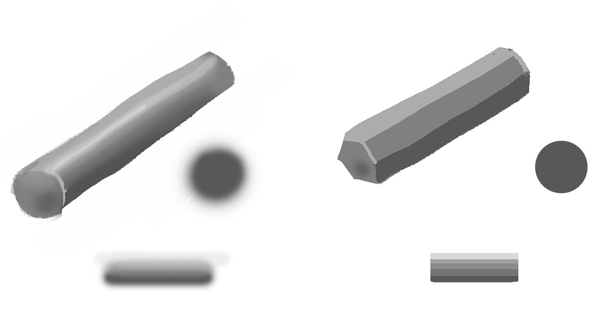
Start with grey and just keep adding lighter and lighter grey for the highlights and darker grey for the shadows. :)
Just remember to not go straight for black or white too early.

In case the light source is coloured yellow/orange ( I intend to make explosions in the background), do I change the highlight colours to yellow/orange, too ?

I use GIMP ( for everything) glow brush to add glows and shadows, not the highlights of them tho. Is it recommended to use a 'glow' brush with a small opacity, that's how I learned to draw glows ?

I made a few edits and I think it looks much better now. I didn't expect that the lighting ( not even finished) makes it look that much better.

Thank you very much, guys! Now I am motivated again!
 

Attachments

  • BTNUrsaTank_UnitIcon15.png
    BTNUrsaTank_UnitIcon15.png
    8.7 KB · Views: 279

Mad

Mad

Level 15
Joined
Feb 17, 2014
Messages
134
In case the light source is coloured yellow/orange ( I intend to make explosions in the background), do I change the highlight colours to yellow/orange, too ?

I use GIMP ( for everything) to add glows and shadows, not the highlight of them tho. Is it recommended to use a 'glow' brush with a small opacity, that's how I learned to draw glows.

I made a few edits and I think it looks much better now. I didn't expect that the lighting ( not even finished) makes it look that much better.

Thank you very much, guys! Now I am motivated again!

Yes, the highlights will look more orange / yellow.
I've personally never used GIMP myself but you should use what tool you feel is confortable.

I'd also want to give advice on choosing brushes as well. I assume that the glow tool in GIMP probably are using a pretty soft edged brush but if you can find a sharp brush to erase edges or if you are going to draw a flat surface. Soft brushes are really great to draw values (shadows & lights) on round surfaces, like pipes.


jwjnHAY.png

(Excuse me how poorly this looks, I'm not so used to draw with mouse :>)
 

Ardenian

A

Ardenian

Yes, these two brushes has GIMP too.
I usually use a sharp brush to draw solid things and the glow brush for light and non-material stuff.
Using a eraser with a sharp brush is great then to give the shape a good form, as you describe.

I didn't know this concrete difference, thank you for your effort and the example!
 

Attachments

  • BTNUrsaTank_UnitIcon16.png
    BTNUrsaTank_UnitIcon16.png
    8.5 KB · Views: 273
Level 28
Joined
Aug 7, 2011
Messages
1,638
There are several ways you can go for it, now I am no light expert just gonna give you methods I've seen used by others:
- Start with black and white to get the main idea of where the darks and lights are, 2 values only.
- Start with the darkest value on the certain part of the painting you are drawing (for example you have some cloth and the darkest value is Dark Blue) and lighten it up as you go.
- Start from the middle range value and darken and lighten, what Mad suggested.
- Start from lights to dark (method 2 but the other way around).
You can also try to imagine where your light source is and draw some lines to see where it would fall, it's easier to follow it this way. Also, mind that in darker areas the colors get desaturated. Always remember to use more than 1 colors - if you have a red cloth do not only paint with red, add a little bit of purple, maybe orange, etc. It makes it look more real. But uhm.. that's offside advice, not really the biggest problem right now. I'd say you should first focus on the shapes, then the light. Cuz right now it is unclear what exactly is going on when the image is resized. Try to draw it only with lineart first or silhouettes, whatever suits you. If you're drawing with a mouse it would be harder to get the shapes correct, but I do know a few who can do it without a problem (NFWar, just unbelievable..), so you just gotta get used to it I guess.
 

Ardenian

A

Ardenian

Thank you again, morbent!
I pay attention to it, it is a great advice, and I am going to work on the things you mentioned.
 

The Panda

Icon Reviewer
Level 57
Joined
Jun 2, 2008
Messages
8,912
Aight.
So I've made another icon (Cataclysm), but it didn't please me when I shrunk it down. I will try some other designs and if that doesn't work out I'll probably go back to this one.
T81EJvj.png


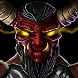
Here is some WIPs and a silly redesign on Deathwing (I had copy pasted a part of his face that I used as color palette)

http://i.imgur.com/bSNoitF.jpg

Man!!!!
 
@ardenian: i see that morbent and mad have basically said all that needs to be said, but i'll try to offer some new insight and not repeat their words

firstly, it's best to follow the aforementioned process: line art > greyscale lighting > basic colours > shading the colours (i'm doing this myself; i'll attach my .psd to let you see how i've layered the line art and greyscale lighting)

onto lighting, the biggest factor in giving an artwork form. there's no simple 'trick' to learn lighting unfortunately, the only way is to look at tons of references on how light bounces off different surfaces, and then practice. it's best that you make a greyscale (black and white) lighting mock-up before shading the actual colours, because it's much easier to experiment & adjust mistakes when the image is monotone

i also suggest you move the light source from the back to kinda above and in front of the icon, if that makes sense. if you take a look at most blizzard unit icons, most of them have a front-above light source. the most obvious icon i can think of is the rifleman; it looks like someone is shining a flashlight on his face from above his forehead

lastly, you honestly should be using hard-edge brushes almost exclusively. it just looks much more blizzard-y and has a more rich & crisp look than if you were to shade with soft-edge. see this tutorial if you have troubles shading with hard-edge
 

Attachments

  • process.psd
    205.2 KB · Views: 46

Ardenian

A

Ardenian

Thank you very much, GhostThruster!

Did you use the 'sketch' layer in the psd to select an area, so you cannot draw over the lines ( I am not sure what's the exact expression for the process, I hope you know what I mean) ?

Hm, I understand. Maybe I can add 'front explosions', explosions that add light to the front part of the tank. Tho, wouldn't this erase every shadow, as the light comes as well from the back and the front ? Or could I limit to little explosion reflections, so the effect wouldn't be room consuming ? I think I take a look on some fire/ explosion reflections and try to adapt them.

For the exclusive use of hard-edge brushes, I cannot speak of great experience, but wouldn't using a smooth brush with the use of the smudge tool create exactly the same as using hard shaped ? This does not apply to the outline, of course, but for the 'interior', doesn't it ? I try it out, let's see.

Thank you very much, guys!
I am gladly surprised and I appreciate that you take care of me!
 
Level 28
Joined
Aug 7, 2011
Messages
1,638
Mainly shape. The left part is weirdly distorted. Also, imagine the whole helmet as one big cylinder (like the Templar helmets) - it has to be shaded accordingly. If the light is coming from the front then the left and right part should slowly go into darkness. But before moving to lighting and all that, lay down all your shapes on the picture - some atmosphere effect behind the helmet, his body (if you intend to draw it under the helm) the crown part with the spikes, etc.
 
Thank you very much, GhostThruster!

Did you use the 'sketch' layer in the psd to select an area, so you cannot draw over the lines ( I am not sure what's the exact expression for the process, I hope you know what I mean) ?

Hm, I understand. Maybe I can add 'front explosions', explosions that add light to the front part of the tank. Tho, wouldn't this erase every shadow, as the light comes as well from the back and the front ? Or could I limit to little explosion reflections, so the effect wouldn't be room consuming ? I think I take a look on some fire/ explosion reflections and try to adapt them.

For the exclusive use of hard-edge brushes, I cannot speak of great experience, but wouldn't using a smooth brush with the use of the smudge tool create exactly the same as using hard shaped ? This does not apply to the outline, of course, but for the 'interior', doesn't it ? I try it out, let's see.

nope i didn't. you don't really need to, it's not very hard to keep the colour inside the lines

i think you're thinking of the term 'light source' too concretely. a light source doesn't need to be visible in the frame of the icon/artwork, nor does it need to be something physical like an explosion.

no, smooth + smudge = messy, ugly, non-blizzard-like blur. it doesn't hurt to experiment, but trust me you should be shading with hard brushes most of the time.


edit: colourrrr
 

Attachments

  • BTNLindormr.JPG
    BTNLindormr.JPG
    2.1 KB · Views: 235
Last edited:

Deleted member 238226

D

Deleted member 238226

hi everyone, i will participate in this contest.
i think this one will be fun for practicing too.

i don't know if my work is good enough since this is my first time i drawing stuff digitally. so, suggestion and feedback will be really appreciated :)
below pictures is two of my work, i attach both of them because i can't choose which one of them is better.
 

Attachments

  • Barbarian Complete.jpg
    Barbarian Complete.jpg
    83.9 KB · Views: 59
  • BARBAR.jpg
    BARBAR.jpg
    73.2 KB · Views: 69
Last edited by a moderator:

Moy

Moy

Level 49
Joined
Jan 25, 2011
Messages
2,382
Level 8
Joined
Jul 8, 2014
Messages
433
  • Like
Reactions: Moy

Ardenian

A

Ardenian

I quit my unit icon for now, calling it 'finish'. I take a closer look for the lighting again after I advance with the ability icons.

First WIP of the first ability, Rocket Launch.
 

Attachments

  • BTNUrsaTank_PseudoFinal.png
    BTNUrsaTank_PseudoFinal.png
    8.6 KB · Views: 231
  • RocketLaunch3.png
    RocketLaunch3.png
    7.2 KB · Views: 230

Deleted member 238226

D

Deleted member 238226

that's a really great icon Nightmare, your work is so inspiring :)
 

Moy

Moy

Level 49
Joined
Jan 25, 2011
Messages
2,382
Thanks, tried my best though. Even though, I have a busy real life. Yours looks good too. I prefer the first one, but definitely I don't know what others will think.

Actually the eyes and nose of yours needs love and the light source could also be fixed. In my own perspective XD
 

Deleted member 238226

D

Deleted member 238226

Thanks, tried my best though. Even though, I have a busy real life. Yours looks good too. I prefer the first one, but definitely I don't know what others will think.

Actually the eyes and nose of yours needs love and the light source could also be fixed. In my own perspective XD

thank you :)

as i said, this is my first time painting digitally. i will try my best as i possibly could for more improvement.
perhaps you right about the light source, i will try to update it soon.

oh, your work is good too chen :)
 
Status
Not open for further replies.
Top