- Joined
- Mar 23, 2008
- Messages
- 1,804

Kola, That windwalk looks very rushed compared to your other icons. It's quite blurry as well, it haven't got the same crispness your icons usually have.
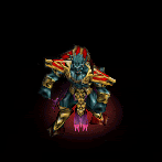
The head of the fire breath guy have some really weird anatomy going on.
But the thunder clap and the immolation icons are simply gorgeous!
The head of the fire breath guy have some really weird anatomy going on.
But the thunder clap and the immolation icons are simply gorgeous!


")