- Joined
- May 16, 2007
- Messages
- 7,285


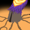
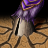
U are leaving the spikes? lol i already told earlier but now that i see abo and spikes gone the whole attention goes to the hook and for me it looks a little ugly. I liked abo and spikes.Maybe a simpler impale?
what do you guys think


@kyrbi0,
to me, those icons are just extremely uncreative, because it's just taking the warcraft icon and changing one part. I didn't join this contest to show you guys i can change the tauren into an abomination etc.
I want to incite new ideas for already existing ones
I made icons that are based off of my own imagination, rather than a warcraft employee's.
I will however keep working and i hope someone agrees with my direction...


Wait, no filters, no custom brushes? But I've already used Noise a couple of times to give the icons some "teeth". And custom brushes.. what if I made them myself? Besides, custom brushes are just like using an old paintbrush in traditional arts which is very random due to missing hair. And textures.. well, if used correctly they are completely destroyed in the process, it's not like you can see the pattern. All digital artists use these kinds of stuff, I thought we were permitted to use those :/
Sin'dorei, I'm pretty sure it's not such a big deal if the icon is mostly drawn, but filters and etc are used to polish the icon and give it a better finish? :O
I don't see what's the difference. An art is an art,....
I don't see what's the difference. An art is an art, whether it's 64x64 or 1000x1000. Besides, if we can use sharpen and contrast, why not noise? And all the other stuff as well.


Ooh, I rather like it. Perhaps the chain makes it look more like a Line-Damage spell, but zoom in a bit on that Hook & add some contrast & gruesome detail, ala the source material...Maybe a simpler impale?
what do you guys think

...As a Meat Hook icon, I like the simpler version better. But it doesn't fit the Impale spell - Impale is a bunch of spikes coming out of the ground to impale units. This Meat Hook is a projectile.
I think for the purpose of this contest's theme you can label it as a Shockwave/Carrion Swarm - a line damage spell.
Tooltip said:Slams the ground with the Crypt Lord's massive claws, shooting spiked tendrils out in a straight line, dealing damage and hurling enemy ground units into the air in their wake.
). It is, in fact, his massive frontal horn, covered with blood after touching not the ground, but a person's body.That's a good line. : )...An art is an art...
I see where you're coming from... But like the whole "freehand" thing, this appears to be one of those "understood/non-stated rules", which In My Opinion should really be made explicitly clear. Stuff like this shouldn't be left up to the imagination, no matter how "obvious".It is assumed that real artists make art with their own hands and using their own talent/skills and not infrequently, their own imagination.
Honestly, it saddens me to hear such arguments from you.
Actually, I think that an artist presents his idea, not his skill. Illustrators, concept and traditional artists all want to show a mood/composition/design, rather than anatomy skills/details/etc. Sure, they know how to do the second stuff, but they do, just because they want to present the primary ones better. Which of these two can be called art: http://www.drawing-factory.com/image-files/figure-drawing-female.jpg or http://www.dustinperkins.com/ashcan/wp-content/uploads/2009-12-05-Figure-Drawing-03.jpg?And if u use all sorts of filters and other stuff, then what is your contribution to the icon, which is your merit, what u want to prove to yourself and to the others, is this a editing contest?
Ehh... Perhaps for art contests, but I do prefer "tests of skill" for the Contest I join here (Hero, Zephyr, Techtree, etc)And, I don't know why everyone views these contests in Hive as arenas, as tests of skill. I've said it before but, if people wanted to test their skill, it wouldn't be here. There are tons of art/modelling/(yea no mapping, I lose here) sites where you can face people at your own level weekly.
... But if it's not for skill, and it's not for the community, what's it for? The fun? Because if it's not for skill, I say "making cool stuff for the community" is a pretty good goal.morbent said:But back on the theme, I was arguing earlier that Hive's contests shouldn't be so much about making icons for the community, but for having fun. That's why I disliked this theme at first place, because it limits your creativity, your ideas, your fun at creating. But in the end I kind of accepted this.
Fun is on the side.
Yeah I gotta side with Just Spectating on this one, Kyrbi0, sorry about that =P@kyrbi0,
to me, those icons are just extremely uncreative, because it's just taking the warcraft icon and changing one part. I didn't join this contest to show you guys i can change the tauren into an abomination etc.
I want to incite new ideas for already existing ones
I made icons that are based off of my own imagination, rather than a warcraft employee's.
I will however keep working and i hope someone agrees with my direction...


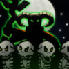
1st three icons are extraordinary. Artistically beautiful and conceptually on the mark. Focused on the right part and not the whole 64x64. Essence of blight has a little *ugly* hand as far as I can see. All your icons were distinct and top-notch. What happened to this one???I have no idea what you guys are arguing about atm since I've been absent for a little while, being Mad. It has been a pain in the back to figure out the last icon. In the start I was looking forward drawing skulls, but now when I've been using skulls in every single icon, I fear that people won't appriciate the set since it's just a bunch of skulls. Considering that skeletons in warcraft mostly wear gloves makes it impossible to make an icon featuring a hand.
Anyway, I kind of gave up and did Essence of Blight.
Now I'll have to finish the details on the rain of fire icon and wait for your feedback on the latest icon.
Thanks!
Not ass dramatic as it looks but just a little not-the-very-best.


Well no offense, but that's exactly the kind of mindset I hope to modify with the changes I am espousing for many of the Contests here at the Hive.Kyrbi, what I actually meant about test of skill is that THW is not good at it. ... In THW contests we don't improve skill, nor do we compete fairly. ...
Man, you just never cease to amaze. I like the positioning & coloring of the hand (weird fingers yo), and I especially love the wispy-spirity effects wafting off the skull.I have no idea what you guys are arguing about atm since I've been absent for a little while, being Mad. It has been a pain in the back to figure out the last icon. In the start I was looking forward drawing skulls, but now when I've been using skulls in every single icon, I fear that people won't appriciate the set since it's just a bunch of skulls....
Anyway, I kind of gave up and did Essence of Blight.
Now I'll have to finish the details on the rain of fire icon and wait for your feedback on the latest icon.
Thanks!
Granted, but take a look at "BTNRegenerationAura" and "BTNUpgradeRegenerationAura" (think that's the name); they feature what is essentially a gloved skeleton hand. And it looks great.Mad said:Considering that skeletons in warcraft mostly wear gloves makes it impossible to make an icon featuring a hand.
Glad to see some variety from the 'fire-craze'. More importantly, that is a really excellent icon; really fitting, nice & colorful, vibrant & all that jazz. Lookin' snazzy, kola. It's really getting to be a toss-up between you to.Didn't have any good idea for another fire themed icon so I came up with this...
Thunderclap (Human worker edition)
thoughts?
And I made a few changes on my previous icons...
-> opened up the mouth a bit more and added some highlights
-> Changed the fire background
I like the 1st icon best. I like abstract maybe bec of that??? Ya, the hair like effect is so cool but hand seems weird, maybe something to do with the shape.I actually like the 3rd and 4th most lokharke :X The hand is a bit weird but the colors and darkness is awesome
Like the new one. Peasants are getting to OP bec of u. The peasant has still got the bloodthirsty eyes. I like that but a little bit edit on that could make it look more scary. Fire hand's new background is cool. The first icon's BG reminded me of nerubian spider's projectile and was a little like invoker balls also. But i like them better removed.Thunderclap (Human worker edition)
thoughts?
->opened up the mouth a bit more and added some highlights
->Changed the fire background
It is assumed that real artists make art with their own hands and using their own talent/skills and not infrequently, their own imagination.
...
And if u use all sorts of filters and other stuff, then what is your contribution to the icon, which is your merit, what u want to prove to yourself and to the others, is this a editing contest?
Didn't have any good idea for another fire themed icon so I came up with this...
Thunderclap (Human worker edition)
thoughts?
And I made a few changes on my previous icons...
->opened up the mouth a bit more and added some highlights
->Changed the fire background


I have no idea what you guys are arguing about atm since I've been absent for a little while, being Mad. It has been a pain in the back to figure out the last icon. In the start I was looking forward drawing skulls, but now when I've been using skulls in every single icon, I fear that people won't appriciate the set since it's just a bunch of skulls. Considering that skeletons in warcraft mostly wear gloves makes it impossible to make an icon featuring a hand.
Anyway, I kind of gave up and did Essence of Blight.
Now I'll have to finish the details on the rain of fire icon and wait for your feedback on the latest icon.
Thanks!


Fixed the eyes, the eyebrows, the ear and the beard of the breath of fire peasant...
Don't fuck with the peasants xD
Fixed the eyes, the eyebrows, the ear and the beard of the breath of fire peasant...
Just a suggestion

You'll need to define those skeletons more though
They're too toy-ish now.
Nope.Anyways Heinvers, have you already tried joining this?
Looks cartoony as said, better shape could do. Also I think it would be better for only 2 skeletons.
//cats are just another minion of cake.
A few more WiPs and a Final. Let me know what you think