• 🏆 Texturing Contest #33 is OPEN! Contestants must re-texture a SD unit model found in-game (Warcraft 3 Classic), recreating the unit into a peaceful NPC version. 🔗Click here to enter!
  • It's time for the first HD Modeling Contest of 2024. Join the theme discussion for Hive's HD Modeling Contest #6! Click here to post your idea!

Icon Contest #11 - A Hero's Skillset

Status
Not open for further replies.
160036-albums4747-picture59500.png


160036-albums4747-picture65011.png


Pick a hero from an older Hero Contest and create their ability icons (sub-abilities not included)


160036-albums4747-picture59725.png

  • Active and disabled versions of all icons are required.
  • No plain screenshots (or shallowly modified) icons are permitted.
  • The icons must be made specifically for the contest. Previous work is not allowed.
  • Blizzard icon naming conventions must be followed: BTNAttack*.blp etc.
  • Works in progress (WIPs) of the icons are encouraged as they keep the contest active.
  • The icons must be physically attached to a post when complete. (.blp files only)
  • An in-game screenshot must be included with all submissions.
  • A link to the hero submission post is mandatory.
  • List of Hero Contests (warning, some entries no longer work, because they were uploaded on Pastebin - these entries cannot be picked):
  • Judges may not participate in the contest.
  • You will need to be able to provide the judge with the *.psd/*.xcf files (if you have worked with either Photoshop or GIMP) if they find it necessary.

160036-albums4747-picture59735.png

  • First Place: 45 reputation points and your entry on the award icon
  • Second Place: 30 reputation points and an award icon
  • Third Place: 15 reputation points and an award icon

160036-albums4747-picture59736.png


Creativity
How original and unique is the icon? This can be estimated with the conceptual approach, the colors' combination, the technique, etc./20

Theme
Was the concept tied to the represented ability or was it too generic?/20

Blizzard Feeling
Icons should be executed in such a manner that they can be implemented in a Warcraft map, compliment other Blizzard icons and replace the existing ones. How well was the previous statement executed?/20

Technique
Did the technique offer a unique appearance and what quality did it result in?/40

  • 75 % of the winner shall be determined by the contest's appointed judge(s).
  • 25 % of the winner shall be determined by the results of a public poll.

160036-albums4747-picture59727.png


The contest shall begin on 17th of January and conclude on 17th of February, 11:59 PM [UTC].
 
Last edited:
Cool, a new contest.

I like the idea of using the spells/heroes of an older contest.
Does this include the #6 too or what does "older Hero Contest" include?
What about the judges, who are they (if you found any yet)?
Does this exclude judges of Hero Contests too?

Hoping for a lot of interest from the community :)
 

Kyrbi0

Arena Moderator
Level 45
Joined
Jul 29, 2008
Messages
9,495
You should allow contestants to make icons for Hero #6 So that way the Nightwalker can get some custom love for the good of all mankind. :p

More importantly, I would suggest allowing users to make icons for heroes from the Hero Contests over at Wc3C.net; they had an excellent selection, some of the best heroes I've ever seen.

1) No, because every entry is potentially at risk. If one entry gets disqualified for one reason or another, it's not a legit option for this contest. The contest must have officially ended in order to pick a theme from.

2) Five Hero Contests are enough for our contestants to pick an entry and we've had some pretty nice entries so far. :)


Edit: Updated the main post with the Hero Contests. Check the rules.
 
Level 30
Joined
Jun 13, 2011
Messages
1,483
Pretty awesome theme! :D

I'd join but, too bad wc3 is no longer installed on this piece of crap called PC =)

Or maybe I'll give it a shot, for the sake of good old times.

dsc0067.jpg


edit:

No, go... figured you need WE to check out the spells :/

So you will not be able to make stuff? (

1) No, because every entry is potentially at risk. If one entry gets disqualified for one reason or another, it's not a legit option for this contest. The contest must have officially ended in order to pick a theme from.

2) Five Hero Contests are enough for our contestants to pick an entry and we've had some pretty nice entries so far. :)


Edit: Updated the main post with the Hero Contests. Check the rules.

The 5 contest are not enough seriously saying, and takes a lot of time to pick the desired hero from them/
Actually icon for model/skin was awesome you can pick whatever model and go and participate/

I have picked Trickster by Hemske
 
Last edited:

Of course you can.

So the contest is a single icon or an icon pact? (hero / hero+abilites ?)

The whole skillset of the hero. You don't need to create the hero's icon. If the hero also has sub-abilities, you don't have to make an icon for them either.

--------------------

Also, the contest has of course started, you can begin with your WIP's! :)
 
Level 15
Joined
Dec 19, 2007
Messages
1,233
I'll work with many references, although that might compromise the criterion of creativity.

I'm without good ideas for the icons, unfortunately.

Ideals? I could give some... Well considering the last posts, there will be a lightning user hero and a reviver hero which is undead.
Lightning user hero icons should be pictures with lightning sparks going out of them, this because his abilities are area of effect and are using lightning effects.

Undead reviver icons should be pictures with skeletons and red+darker red+black colors inside of them, this is because his abilities are point or unit rather than area of effect, and red = blood dark red = dead blood black = evil darkness or death unseenability.

for further details about those heroes read the comment 5 before that one.
I'll try to make it in to this contest.

If I do find the time for it I will be making icons for either this hero or this one.
 
Level 28
Joined
Aug 7, 2011
Messages
1,638
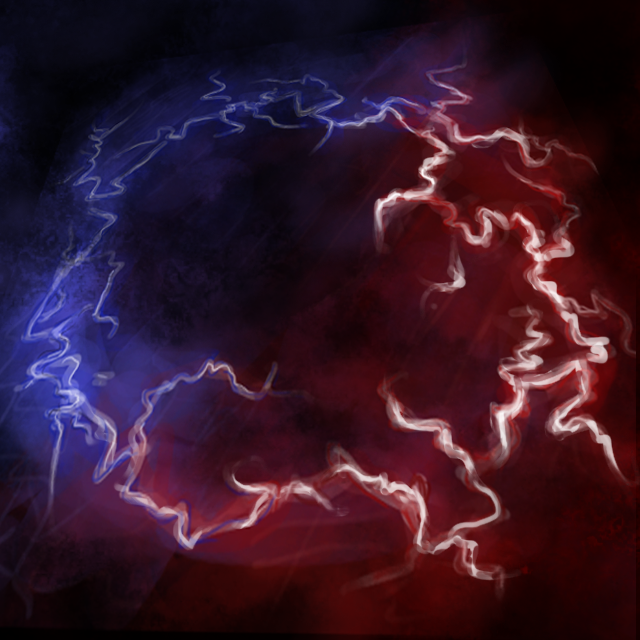
Well I was thinking on whether to put purple but Pharaoh_, problem is that the spell itself doesn't allow it. Since it is Red/Blue because of the Polarity switch and I need to make it sharper. Like the icons nerovesper used http://www.hiveworkshop.com/forums/2066311-post215.html . I'm not happy with this icon, I'll probably remake it... like, I should use an angle or something and add some lightning effects on the empty spots.
 
morbent said:
icons_16037_btn.jpg
Perfectly fine example on how to use opposing colours to your advantage.
I suggest using some fade-to-black spots as used in this example, to define the effect and/or background, and thus the object (lightning), more.
morbent, you already highlighted some parts within the lighning, but they don't show in the iconsized image.
Be more blunt with it, make it show, try thickening some parts of it.
It will make lightning more vivid.​
 
Level 15
Joined
Dec 19, 2007
Messages
1,233
Ok, here's the updated version:

209078-albums5714-picture65133.png


209078-albums5714-picture65132.png


Increased the white, as suggested, and added some perspective, just to make it look cooler. I could add some special effects, but I can't think of anything right now.


(Sorry Pharaoh_ only your suggestion wasn't fulfilled :cgrin:)

Its looks like a basketball, which is great: "the hero is creating electric ball, which ignoring terrain and hit with 2 colors electric" its great, but you might call me an idiot , but , I think it should have a bit more black color in the center of the image, though I could be wrong, its just don't seems right, too much white and not yet black in middle to define its final form, maybe its just me... :ogre_datass:
 
Level 28
Joined
Aug 7, 2011
Messages
1,638
Yes I'll see what I can do best player, it's just that my computer's Brightness is too low and I when I look at my icons from the laptop they suck. Cuz the laptop is very bright. I can see (if I look the monitor from above) that it has a lot of red and blue in the center which isn't cool... but seriously, basketball? I should really fix that icon xD It's meant to be a lightning ring. And it's not red-blue actually, it's red, blue. Cuz with the 3rd spell of the Hero you can change your polarity and use red/blue lightning :] Oh well, I guess I should stop trying to convince you people that it's not a red-blue spell :D If you have some free time, read this - http://www.hiveworkshop.com/forums/2066311-post215.html it will help you understand this icon a little bit more :\ I guess :cgrin:
 
The transition within the lightning needs to be smoother towards the blue area - it currently looks like being separated. Note that this only applies to the lightning.
Make the white transgression towards the blue area more prominent.

Laptops usually don't have the best screens, so if you want to test the look of your icon, try other screen sources.
If there are none available, stick to your main computer screen. If you're satisfied with the results here, it should be fine to go.
 
Level 28
Joined
Aug 7, 2011
Messages
1,638
Well, not really. Yes I guess you're right to some degree BD, but really, the idea isn't to be one spell which is red-blue. It should be red and blue.

Like in here http://www.hiveworkshop.com/forums/2066311-post215.html I have to separate them. I was thinking on whether to use a line, like the icons of the Hero but aa... this would look silly. I don't know.. if you people want this purple, I'll put purple between red and blue. It will look cooler, surely, but it won't answer to the spell. Since the spell has no purple lightning in it. However, I should increase the blue part a little, make it more "powerful" cuz atm, red is stronger. When you look at this icon from a distance you see only red, all blue is lost. NaaI don't know, I'll see what I can do about this icon :\
 
Status
Not open for further replies.
Top