• Listen to a special audio message from Bill Roper to the Hive Workshop community (Bill is a former Vice President of Blizzard Entertainment, Producer, Designer, Musician, Voice Actor) 🔗Click here to hear his message!
  • Read Evilhog's interview with Gregory Alper, the original composer of the music for WarCraft: Orcs & Humans 🔗Click here to read the full interview.
  • The Hive's 22nd Icon Contest: Creep Abilities is now concluded, time to vote for your favourite set of icons! Click here to vote!
  • ✅ The POLL for Hive's Texturing Contest #34 is OPEN! Vote for the TOP 3 SKINS! 🔗Click here to cast your vote!
  • ✅ The POLL for Hive's Techtree Contest #20 is OPEN! Vote for the TOP 3 FACTIONS! 🔗Click here to cast your vote!

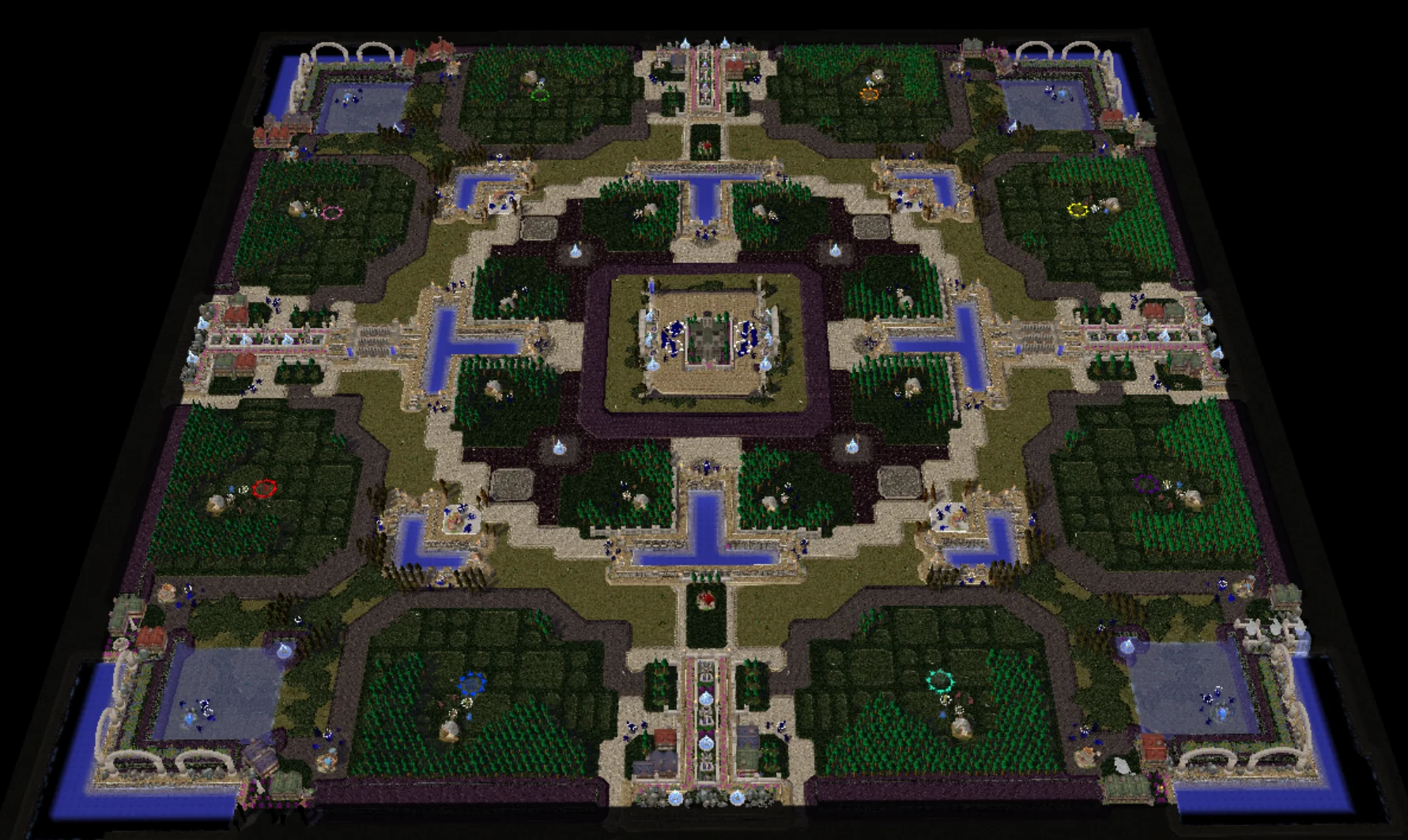
(8)Xenisma v1.1

Xenisma
Player Suggest: 4v4
Map Creator: Zucth

388390-fb382ed02407cff21f5fbbe2b12476ed.webp

Map Description:
Holy spires rise,
above drowned Andorhal's scars,
Light crowns silent tides.

Neutral Building:
16 Goldmines (All - 12500)
4 Lab
4 Goblin Merchant
4 FoH
2 Tavern

Creep Camp:
38 Green
30 Orange
14 Red (-8 base)

v1.1
-remove the middle polar bear on w3c ladder version due to mistake.
-switch first orange camp and merc/lab camp. As it seem that most people are going for greedy. So I do it as a life quality improvement.
(first AoW is now possible on merc/lab)
-matching Hiveworkshop version with the current one on W3Champion site.

Information:
-Playable size 148x148.
-Top vs Bottom.
Previews
Contents

Xenisma v1.1 (Map)

Reviews
deepstrasz
Pretty blocky, squary and flat. Also seeing map edges, like reaching them is not nice to the eye. I appreciate the quite wide starting building space. Just too controversial to have a fountain so near your base, especially the starting one. Approved...
not a fan of doodads placed by dragging the cursor at random, and leaving stuff clipping or floating around walls and stuff lol.
tried to fix the map by removing said random stuff but the map is full of that crap, didn't want to waste so much time "fixing" crap.
 

Attachments

  • WC3ScrnShot_061626_162307_000.webp
    WC3ScrnShot_061626_162307_000.webp
    302.3 KB · Views: 16
Pretty blocky, squary and flat. Also seeing map edges, like reaching them is not nice to the eye.
I appreciate the quite wide starting building space.
Just too controversial to have a fountain so near your base, especially the starting one.

Approved
.


If you want more reviews, you should participate in the The Grand Review Exchange!

R U L E S

Site Rules
Map Submission Rules

M A P - D E S C R I P T I O N
BB CODES
BB Codes | HIVE

MELEE MAPS
Description Guide - Melee Maps
Describing Your Melee Map
Melee Map Description Generator v1.3


MAPS IN GENERAL
The importance of a Description
Description Guide - Maps
Map Thread Guide
Map Description Making: Good & Bad
Map Description - Templates
Map Description Generator [1.2]

How to Add a Screenshot to your Map Description


ADDITIONAL NECESSARY INFORMATION
  • A credits list in the map thread description is required where the names of the resource (models, skins, icons, spells, sound etc.) authors are mentioned along with the specific resource. It would be a luxury to have links leading to the used resources. Credits in the Quest Log would be appreciated too.
  • A detailed changelog in the first post would be helpful to reviewers and notify fans about the newest implementations to your map.
  • Map thread tags are important. Please use those that fit and not more or none.


M A P - C R E A T I O N - G U I D E S

If you're not satisfied with the review and wish another opinion, contact the other reviewers or use the staff contact:
https://www.hiveworkshop.com/forums/staff-contact.692/
 
Back
Top