• 🏆 Texturing Contest #33 is OPEN! Contestants must re-texture a SD unit model found in-game (Warcraft 3 Classic), recreating the unit into a peaceful NPC version. 🔗Click here to enter!
  • It's time for the first HD Modeling Contest of 2024. Join the theme discussion for Hive's HD Modeling Contest #6! Click here to post your idea!

Icon Contest #12 - Spells on Different Units

Status
Not open for further replies.
Level 31
Joined
Sep 11, 2009
Messages
1,812
Peasant wind walk, what do you think?

BTNWW_Peasant.pngBTNBreath_of_fire_Peasant2.pngBTNThunder_clap3.pngPASImmolation_peasant3.png
Thunderclap : Added the hand (will remove it if you think its unclear) ---- Old version :
137901d1407036321-icon-contest-12-spells-different-units-btnthunder_clap2.png

Breath of fire : Changed the mouth and a bit of the beard ---- Old version :
137907d1407044490-icon-contest-12-spells-different-units-btnbreath_of_fire_peasant2.png

Immolation : Changed the fire ---- Old version :
137897d1407034848-icon-contest-12-spells-different-units-pasimmolation_peasant.png
 
Last edited:
Peasant wind walk, what do you think?

View attachment 137949View attachment 137937View attachment 137936View attachment 137946
Thunderclap : Added the hand (will remove it if you think its unclear) ---- Old version :
137901d1407036321-icon-contest-12-spells-different-units-btnthunder_clap2.png

Breath of fire : Changed the mouth and a bit of the beard ---- Old version :
137907d1407044490-icon-contest-12-spells-different-units-btnbreath_of_fire_peasant2.png

Immolation : Changed the fire ---- Old version :
137897d1407034848-icon-contest-12-spells-different-units-pasimmolation_peasant.png

Personally peasant needs to have dark hair just like in-game, the mouth is a little too forced, it looks like he is actually forced to open his mouth and his eyes should look directly into the opponent that the fire is moving towards.

Wind Walk has something different from it that does not fit with the other icons. The white outline is also a poor choice.
This one is nice. Looks like a shot straight out of a 3D movie. Nice. The face is excellent.

lol.
 
Early WIP of Cannibalize for Zombie:

209577-albums5234-picture87143.png

I noticed that all of your uploaded icons converted to BLP loose so much quality? You should get BLP Lab, from tools section. Right now the zombie cannibalize looks very poor compared to other quality icons in War3 and in this contest. Converting icon should not be too difficult with maxed settings of conversion. Button Manager even converts with more quality..

Example:
nwh3k2.png
<- Your (Properly Converted).
357pxug.jpg
<- Your (Terrible Quality) (Uploaded).
 
Transformed the Charm for Naga Siren to Charm for Priestess of the Moon:

209577-albums5234-picture87175.png
209577-albums5234-picture87173.png


Opinions?

Trying not to be an ass kisser but that new version is a lot better. It just fits the idea better in my opinion. The whole color scheme is also appealing to me much more.
The hair on the right side (from our point of view) looks great. The hair on the left could use some more love. The anatomy of the face itself is just... really really good.

Oh and the left icon looks the best to my eyes.
 
I noticed that all of your uploaded icons converted to BLP loose so much quality? You should get BLP Lab, from tools section. Right now the zombie cannibalize looks very poor compared to other quality icons in War3 and in this contest. Converting icon should not be too difficult with maxed settings of conversion. Button Manager even converts with more quality.

It isn't actually quality loss. He just sharpened the image. ;) Although, I agree that it would look better with slightly less sharpening.
 
It isn't actually quality loss. He just sharpened the image. ;) Although, I agree that it would look better with slightly less sharpening.

Thats, the problem. I wonder how come nobody even noticed how terribly-sharpened are Sin'dorei300's icons. I mean they are excellent in big image, but when made into War3 Icons they just seem to look worse than Wc3's Icons. My advise for Sin'dorei300 would be to stop sharpening too much.
 
Level 25
Joined
Jul 10, 2006
Messages
3,315

IMO, the image is too busy. For an icon you just want 1-2 main elements.

If you want to represent a Necromancer reviving, you need to tone down the other elements (tombstone, skeletons).
If you want to represent resurrection of skeletons, you should tone down the necromancer by e.g. putting him in a small corner of the image.
 
Level 7
Joined
Feb 16, 2014
Messages
322
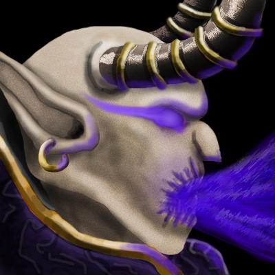
Open more mouth like it is hungering for magic. I think after that only minor things would have to be worked on.
 

Attachments

  • BTNDreadlordDevourMagic.blp
    9.6 KB · Views: 41
  • DreadlordDevourMagic.tga
    16 KB · Views: 77
  • DISBTNDreadlordDevourMagic.blp
    5.4 KB · Views: 71
  • DreadlordDevourMagic.png
    DreadlordDevourMagic.png
    255.5 KB · Views: 86
First WiP for Dreadlord Soul Burn.
P.S. I fucking suck at drawing hands, plz don't laugh :D

EDIT: WiP 2 added. Fire will be recolored.
EDIT2: Here's something that looks like a final... Tweaks will be added in 64x format.
EDIT3: Okay, here's the final. Let me just compile my shit in one post so i can tag it as final.
P.S. I accidentally overrode the first WiP :(
EDIT4: @Just_Spectating (next post), I'm afraid I can't do much better. As I said, I suck at drawing hands. :/
 

Attachments

  • DreadlordSoulBurnWIP2.png
    DreadlordSoulBurnWIP2.png
    177.9 KB · Views: 82
  • DreadlordSoulBurnWIP3.png
    DreadlordSoulBurnWIP3.png
    250 KB · Views: 62
  • BTNDreadlordSoulBurn.blp
    9.3 KB · Views: 41
  • DISBTNDreadlordSoulBurn.blp
    5.3 KB · Views: 83
  • DreadlordSoulBurn.tga
    16 KB · Views: 44
Last edited:
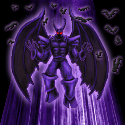
FINAL [Blood Raven] [Dreadlord Skillset]

Here's my final guys. Hope you like them, and I apologize for not being able to fix, polish or update my icons further because of my holidays. Because the contest will be over when I come back, I wish every one contestant the best of luck in the contest. We've all had some fun here and I'm looking forward to the next icon contest. :)
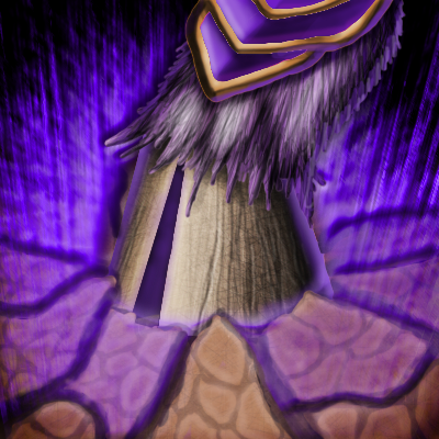
194769-albums4261-picture87252.png

194769-albums4261-picture87254.png

194769-albums4261-picture87251.png

194769-albums4261-picture87253.png

You can browse my previous posts if you're interested in seeing WiPs.
And here's the final Skillset:
194769-albums7341-picture87255.png

________________________________________________
194769-albums7341-picture87256.png


______________________________________
Icons in .blp format attached below (in a zip).
Hope you enjoy it! Well, goodbye I guess, I'm going on holidays! :3
 

Attachments

  • DreadlordSkillset.zip
    110 KB · Views: 57
Last edited:
Level 7
Joined
Feb 16, 2014
Messages
322
I like the dreadlord's horn in devour magic. Ya, sould burn's hand looks too slender almost like that of a skeleton but is ok. I didn't know dreadlords also had hoofs before this (only illidan). Goodbye and enjoy your holidays.
 
Level 18
Joined
Aug 22, 2013
Messages
1,290
Here's my final guys. Hope you like them, and I apologize for not being able to fix, polish or update my icons further because of my holidays. Because the contest will be over when I come back, I wish every one contestant the best of luck in the contest. We've all had some fun here and I'm looking forward to the next icon contest. :)
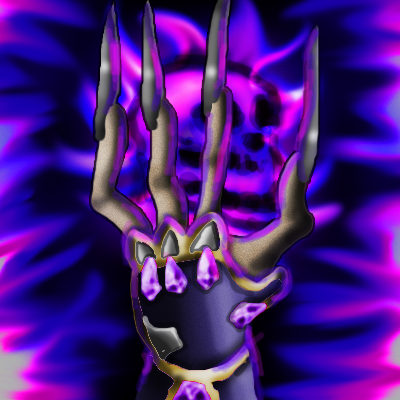
194769-albums4261-picture87252.png

194769-albums4261-picture87254.png

194769-albums4261-picture87251.png

194769-albums4261-picture87253.png

You can browse my previous posts if you're interested in seeing WiPs.
And here's the final Skillset:
194769-albums7341-picture87255.png

________________________________________________
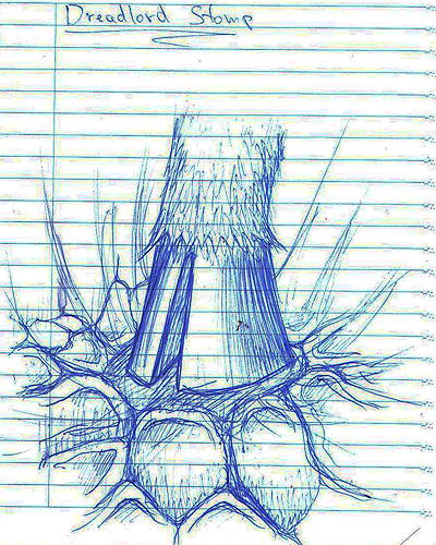
194769-albums7341-picture87256.png


______________________________________
Icons in .blp format attached below (in a zip).
Hope you enjoy it! Well, goodbye I guess, I'm going on holidays! :3

Cool
 
Status
Not open for further replies.
Top