- Joined
- Apr 13, 2008
- Messages
- 2,046


Ya, almost done on the judging... i think
Follow along with the video below to see how to install our site as a web app on your home screen.
Note: This feature may not be available in some browsers.


 " smiley face for a head with no neck. There is some shading on the blue armor, but this is obviously an unfinished product.

Muscular Demon-man... Not really original. But it does fit with wc3, it almost looks like archimond. Proportionately uneven. It looks like there was an attempt to show defined muscles, you can see the biceps, but the forearms are sticks. And i have no idea what is going on with those crooked wings. It isn't colored... i don't know if that's because it's suppose to be a lightly-white ghost on a black background or if the artist was just too lazy/didn't have time to put color in. I can see a small attempt at shading, but the light source is undefined.
 it was supposed to be a wip but I didnt finish it.


I am not entirely sure what i am looking at here... i mean, i know that it is suppose to be a blimp or zepplin or something. But I cant say that i see a cockpit to drive this thing. I dont see what that single giant gear is attached to, or where the smoke for those smokestacks is coming from. The propeller in the back looks like it's literally 90 degrees to the right of where it is suppose to be facing (strait back). It's not colored and it looks like there is very little shading. I know it's a "Wip" but it's blurry and undefined and confusing.
it was awesomes.


Just do percentage like already mentioned. Average percentage, sure, but average total doesn't work.
Contestant X:
Judge 1 - 46/50
Judge 2 - 21/25
Judge 3 - 85/100
Judge 4 - 42/50
Makes 92 + 84 + 85 + 84 = 345/400 = 86%
Not 46 + 21 + 85 + 52 = 204/225 = 91%
I am sure you actually understand, but you're not giving us the impression you do.
It does work, average total in percantage is just simple calculation.
For example there are 4 judges, and one contestant. When you calculate judging results you get (eg.): 56% ; 70% ; 62% ; 55%
All you have to do is (56+70+62+55) / 4 = 243 / 4 = 60.75.
So contestant has average total score of 60%.
You didn't even read my first sentence.
Literally means:Contestant X:
Judge 1 - 46/50
Judge 2 - 21/25
Judge 3 - 85/100
Judge 4 - 42/50
Makes 92 + 84 + 85 + 84 = 345/400 = 86%


")
What do you want me to post? i already send you a PM.
Ends - July 6th
 )
)
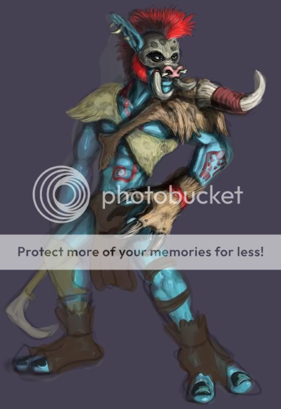
 " smiley face for a head with no neck. There is some shading on the blue armor, but this is obviously an unfinished product.

and will try to fix the lazyness,


