• 🏆 Texturing Contest #33 is OPEN! Contestants must re-texture a SD unit model found in-game (Warcraft 3 Classic), recreating the unit into a peaceful NPC version. 🔗Click here to enter!
  • It's time for the first HD Modeling Contest of 2024. Join the theme discussion for Hive's HD Modeling Contest #6! Click here to post your idea!

TWIF - Custom Chat Icon Contest #1 - Concept Art

Status
Not open for further replies.
Level 49
Joined
Apr 18, 2008
Messages
8,421
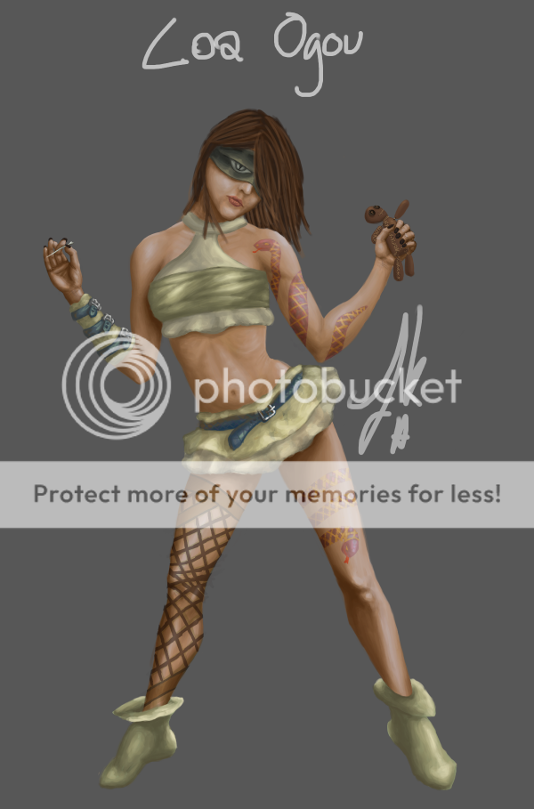
She doesn't have giant eyes. *sigh*
It's a mask, you can't even see the eyes.

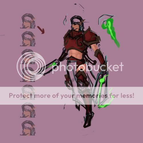
Oh, and as for the not looking like a witch doctor comment, well, whatever details I intended to add would've made it more obvious. Either way, they won't be part of the evaluation, I didn't have time to finish it and that's all my fault, so it's being left like this.

So yeah, just clarification: she's got a mask, she's got a voodoo doll and a needle. The intended weaponry is darts (and a passive ability adding poison to those).. the rest is voodoo related.


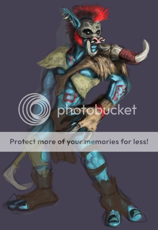
Good luck everyone! That tauren is awesome, enjoy.

Aren't female witch doctors like... Old, crippled hags with those creepy faces and lots of skull paint all over them? Yeah...

But not really, she doesn't really looks like a possible unit in-game. I mean who heard of a Human Witch Doctor? :p (In Warcraft, I mean)
 

Deleted member 157129

D

Deleted member 157129

Wouldn't have been original if there already were one.
 

Deleted member 157129

D

Deleted member 157129

I honestly don't think a human puppeteer is a far-fetch, but it really isn't up for us to decide. Either way, after the contest I'll finish this drawing up and you'll see how I intended it to be. It sort of goes in line with Rexxar, a lone warrior in a harsh world working as a mercenary.
 
Level 20
Joined
Feb 24, 2009
Messages
2,999
36/50
84836d1278237095-twif-custom-chat-icon-contest-1-concept-art-draneiworker.png

Originality - How original is your concept?
This category was hard to judge, the idea isn't original in the sense
that there were Draeni workers in the wc3 campaigns. However. You have done
very well in making it original otherwise, showing the tool it would use,
the way it would dress, changed it's skin colour and shown examples of how
it would carry resources.

7/10

Colour - How was your use of colors? too bight? not enough contrast?

I like the use of green, it differs from the typical blue or grey Draeni of
WOW and Wc3, however I think in some places it does get a bit bright, a darker, less
sickly green would've been more pleasing to the eye.

6/10

Shading - Does your art have detailed shading?

The shading is rather impressive in some areas, you've used shadows and ighting
fairly well, but I often find the shading is a bit too sudden, each highlight
contrasting too much with the one beforehand.

7/10

Details - Is your art detailed? is your art just a smudge?

The detail on the logs, cloth and gold are pretty good, the shadows add some
depth to the image. The wrapping/detail lines on the chest, don't perform as I believe you intended, they stand out "too" much.

6/10

Theme - How well did you follow the theme?
You pretty much nailed the theme, this is a very useful and realistic concept. Well done.

10/10


37/50
LoaOgouHaitanVodouWIP23FinalEntryby.png

Originality

Nothing amazingly original here, a human girl holding a puppet and wearing kinky barbarian clothes.
Ah, I guess it's not that bad... But it's not particularly groundbreaking either.

5/10

Colour

Brilliant. The contrast is great, the tones are great. My only complaint is the blue and that's
personal preference so you won't lose marks for that, however The face mask could've been a bit lighter, it stands out more than it should.

9/10

Shading

Again, near perfect, smooth, progressive, shadowed. I can't fault much at all here.

10/10

Detail

The detail on the tattoos, belts and well the whole picture really is simply epic. However
the anatomy is a bit out, the eye a prime example. The hair could've done with some more highlights
to.

9/10

Theme

I don't really see this fitting into Sc2Wc4, don't get me wrong it's a great drawing, in a nice pose and would work
well as concept art for another project but the idea just doesn't seem to fit anywhere, MAYBE as a mercenary hero or
campaign character, I suppose a Thermorian general who spends to much time with the orcs. You have to push your imagination.

4/10


39/50
106cx8i.png

Originality

If we ignore (WoW? I am guessing Tauren can be death knights..? I never played it)
It's a fairly original concept and it's executed well. I can imagine that is what a Tauren
Death Knight would actaully look like if it were in WoW/Wc4. However at the end of the day it's
just two ideas merged into one, so won't get full marks.

8/10

Colour

Loving it, dark and moody, steel/evil coloured armour, lovely tone of blue, light enough to contrast but
not so bright as to hurt the eyes, although tiny bit more variation wouldn't have gone a miss.

9/10

Shading

Definitely the strong point of this piece. I can't flaw it.

10/10

Detail

After looking at some of the other entries, I think you could have gone a bit further with this.
Nevertheless what level detail there is done well.

8/10

Theme

This is original and good for a concept, but it's just not wc4.

4/10


34/50
85629d1279205883-twif-custom-chat-icon-contest-1-concept-art-junglemancer.png

Originality
The first thing I thought of when I saw this was, 'wtf is it?' I think that alone makes this worthy of...

10/10

Colour
Yeah, well there isn't an awful lot of that.

2/10

Shading
Considering the lack of the above, the shading is done very well. The way you
bring out the ribs, shoulder blades and directional light is pretty astounding.

8/10

Detail

The attention to detail on the face and hair is what won points here.

7/10

Theme

I thought at first it was very original then I thought it looks/seems and acts rather like a Satyr.

7/10


80% (Dropped two criteria and took a percentage)

Originality - How original is your concept?
Ok. I've just realised how much I hate this criteria, ugh.
The concept doesn't strike me as particularly inventive, however the shaman is a characteristic unit from past Warcraft games and Mr.Goblin has indeed taken it a step a further, similar to WherewolfTherewolf and nara. A good update of an old classic.

6/10

Colour - How was your use of colors? too bight? not enough contrast?

Can't judge fairly seeing as it's impossible to shade clay and I wouldn't expect you to have a massive array of colours at your disposal...

-/10

Shading - Does your art have detailed shading?

Can't judge fairly seeing as it's impossible to shade clay and I wouldn't expect you to have a massive array of colours at your disposal...

-/10

Details - Is your art detailed? is your art just a smudge?

Finally something I can comment on!
I adore the detail in this, everything from the muscles, runes and fur hood - it's epic (and you did this in 4 hours?). The scars and crevices, the beady little eye. Awesome.

10/10

Theme - How well did you follow the theme?
It's an old classic update, the concept isn't new but it is most certainly useful.

8/10


35/50
troll21-1.jpg

Originality - How original is your concept?
Eh, to me it looks a lot like a witch doctor or something. However I can see where your coming from with the whole
troll boar master.

6/10

Colour - How was your use of colors? too bight? not enough contrast?

The colours are fantastic, there is nothing particuarly unique or fresh, but the blizzard troll theme of blue skin and fur and leather
apparel is hit spot on. Not a shade out.

9/10

Shading - Does your art have detailed shading?

The shading is very impressive, however it isn't consistent, only the top half of the image seems "done".

7/10

Details - Is your art detailed? is your art just a smudge?

Again only half the image seems to show proper detail, whether this was intetional or you ran out of time, depsite this
what detail is there, is amazing. The fur strands, the hair strands, the tusk crevices etc.

8/10

Theme - How well did you follow the theme?
It would fit, but I personally don't think it's quite as imaginative as some of the other "concepts".

5/10


27/50
83589d1276297936-twif-custom-chat-icon-contest-1-concept-art-wip_final.png

Originality - How original is your concept?
I must say I am not 100% sure what this is supposed to be, some kind of dreadlord/demon hunter mix? Well it must be fairly
original if such is the case.

7/10

Colour - How was your use of colors? too bright? not enough contrast?

Not much to say here, although the contrast of black and white is nice, it'd be unfair to give you too many points for it.
Side Note: I would really like to see this coloured, if you plan on finishing it outside the contest.

2/10

Shading - Does your art have detailed shading?

It's minimal but rather effective, especially considering the lack of colour variety.

6/10

Details - Is your art detailed? is your art just a smudge?

I think considering the stage you left it at it's actually rather detailed, the muscles are good and don't look out of place.
The facial expression is very genuine etc.

6/10

Theme - How well did you follow the theme?
It does look like something out of Warcraft, though I can't see it bringing anything new to the game. As mentioned above
it looks like some cross between a demon hunter and dreadlord. It would good for a campaign hero perhaps.

6/10


11/50
83837d1276643508-twif-custom-chat-icon-contest-1-concept-art-scan0001.png

Originality

Not Really.

4/10

Colour

I'm afraid I can't give you anything here.

0/10

Shading

Nope.

0/10

Detail

It's not completely bland.

3/10

Theme

It's ok, just about pheasible.

4/10


30/50
Valkyrie10-6-10.jpg

Originality

It's an elf with two swords. Not very original in my books, sorry.
It has teh wings n lobs the swords, like boomerangs?!? O.O

4/10
7/10


Colour

Better, the red is good, just like blood elf armour, good choice of tone. The brown contrasts
well and is used appropriately. The green is very sickly/bright but is used minimally
and does more good than bad.

6/10

Shading

There isn't a lot that I can see, the skin/stomach has made a good start, as has the armour it
could've done with some further work though.

5/10

Detail

Again, it seems unfinished, the proper detail is minimal.

4/10

Theme

It does fit the Warcraft theme and could be used for a unit
or hero.

8/10


43/50
83375d1275931036-twif-custom-chat-icon-contest-1-concept-art-sniperhead.jpg

Originality

It's uh-riginal there is no doubt about that.

9/10

Colour

Good use of colour all round, well contrasted and appropriate.

9/10

Shading

Again very good, easily one of the best in this category.

10/10

Detail

Generally very good, the musket body and skull cap are pure epic. Although it's back hairs and feet/claws would
have benefited from more attention and some of the white lines, especially nearer the face could've done with less opacity.

8/10

Theme

At first I thought you'd lost the plot a bit, but now I know it's a musket I'm thinking this ain't a half bad idea.

7/10


29/50
153136-albums2534-picture30206.jpg

Originality

It's not 100% original, but like nara, you've done a very good job of updating
an old concept and giving it something fresh.

7/10

Colour

Once again not a lot I can say here.

1/10

Shading

Fairly effective use of pencil shading, you seem to progress nicely and know
where to shade and by how much.

7/10

Detail

Your attention to minute detail isn't amazing, but the overall drawing is very
neat and orderly, you've included the bolts, wooden poles on the sails etc.

6/10

Theme

A fairly useful concept, it's a fresh looking remake of an old classic, something
that may definitely be of some use.

8/10


11/50
83081d1275576065-twif-custom-chat-icon-contest-1-concept-art-wip3.png

Originality

It's basically a priest, we have one in every wc3 so far.
You can have a few points for his "new look".

2/10

Colour

...

1/10

Shading

Wow, there is actually a bit of shading on the coloured bit!

2/10

Detail

It could've done with fine tuning...

1/10

Theme

Well, it is concept and it does fit the lore.

5/10
 
Last edited:
Level 26
Joined
Jun 15, 2006
Messages
2,651
erm....your review looks rather strange to me, as many concept arts are often made like Kimberly did hers. I also don't get why she only gets a 5/10 in theme, because the job was to create a concept for a warcraft themed mod and hers is a warcraft troll which fits perfectly into that theme.
 

Deleted member 157129

D

Deleted member 157129

You gave me more points in the total than what I get when I count each individual score. P:
Anyway, I'm not going to complain at all, well.. one thing; there is no eye. For a 60% done piece to accumulate 78% of a full score is more than satisfying.

So yeah, looking forward to seeing the final results.
 
Level 20
Joined
Feb 24, 2009
Messages
2,999
@ Nara, I am but one judge, there are 3 others yet D= no one has won anything!! :p

- Speaking of which, TWIF can't do it apparently he is away for the week, so if someone could step in for him...? That'd be great.

@ DonDustin - The competition is for concept art, unit ideas etc, the usefulness of the her's is minimal, as it looks like any other troll, except it has a different facemask. It isn't an amazingly useful concept, therefore it got a lower score. Don't get me wrong it's still a brilliant drawing (one of the best) but this isn't a plain old art competition. As for the unfinished mark downs, talk to TWIF he set up the criteria, I am satisfied that my reviews follow such.

@ Debode - No I didn't as it wasn't in his final submission post, I will review it again tomorrow. My apologies.

@ Shiik - I'm glad, it's really hard to judge fairly. Thankyou for understanding. btw I am lost about the "eye" ??? :S
 
erm.. you guys don'T seems to understand what are concept arts.. it's something artistic that can show your concept.. (sculpting, painting, drawing, digital art, 3D modeling) each of them can be consider concept art.. as long as it is not the final product.

I could have made something out of lego and it would still count as Concept art...
Concept art wise, when you are a concept artist, the one hiring you only wants you to explain your ideas.. by giving description, what you had in mind exactly, the execution doesn't have to be perfect, since concept arts are mostly (sketches/art pieces 2/3 competed.)

yes drawing your concept art is more used in the industry, cause it's cheep and can be done anywhere, in your bed/ in the bus/on the plane/ etc. compared to scuplting that $$$ more and that you need something stable and the right tools to work with it.

Now please read and consider this...
I'm a tad pissed right now, cause none of you seemed to have read my previous message, plus you give the scores before having judging everyone else... which is not faire at all.

If you win pyramidhead = I'm damn happy for you :p
 
Level 20
Joined
Feb 24, 2009
Messages
2,999
Actually it's just me and I did that because a. I started and didn't quite finish and b. I like to let people know/prove I am doing something. It's really nerve-racking waiting for results, I'm not one to withhold them, that's just me. =/

I will finish them now...

EDIT: Oh also, forgot. I am perfectly happy reviewing your sculpture I am just unsure as to how to go about it.

-> Fixed Shiik's total.

-> Bumped Ike_Ike's points up, my bad. +Debode for pointing it out.
 
Mr. Goblin, All i want is one picture that you would like judged, if not, the judges will choose one and one only to judge. this keeps it organized and fair to the other contestants, who too only have 1 entry... i understand, and appreciate your comment, and apologise for requiring only one option.

I won't be judging, so if somone else, who hasnt entered, wants to...?
 

Deleted member 157129

D

Deleted member 157129

Heh, the eye, I thought it was pretty obvious, but I guess I didn't clarify enough nor make it look that way, so here's a more detailed explanation:

The mask (wrapping around her head covering her eyes and partly the nose) is ornamented with a pair of eyes to give enemies the impression they are being seen all the time whilst she in reality is blind. They are grossly oversized to symbolize the fact it's just art and not real eyes.

Pardon me if I sound kind of harsh, but it seems everybody has mistaken it for eyes over and over, even after I've tried to explain it several times. You can't see her eyes and thus have nothing to say about them, there could be eight eyes in there for all you know, so please don't judge the anatomy of her eyes. That's all, it's nothing major and I bet it didn't even damage overall score. I'm just trying to clarify, because I don't want people to think I draw eyes that way.

Doesn't matter if TWIF is gone for a week, I guess.. things like these usually take a while 'round here either way.
 
Actually it's just me and I did that because a. I started and didn't quite finish and b. I like to let people know/prove I am doing something. It's really nerve-racking waiting for results, I'm not one to withhold them, that's just me. =/

I will finish them now...

EDIT: Oh also, forgot. I am perfectly happy reviewing your sculpture I am just unsure as to how to go about it.

I'm fine with that! ^^ but it IS wrong to give the scores before you're done with it.

Edit =
Mr. Goblin, All i want is one picture that you would like judged, if not, the judges will choose one and one only to judge. this keeps it organized and fair to the other contestants, who too only have 1 entry... i understand, and appreciate your comment, and apologise for requiring only one option.

I won't be judging, so if someone else, who hasnt entered, wants to...?

hum it's a sculpture, I worked on it on 360 degrees, I would like to send you the sculpture... so you can judge everything, but it can't be done.. so you need all my pictures to build the hole sculpture in your mind.

so yeah, I do think it's fair, because when you do a concept art, you are supposed to show - what you want to show, that you think it's important.

Example = what I did in my drawing about the features in the back.
 
Last edited:
Level 20
Joined
Feb 24, 2009
Messages
2,999
lol, ok - I get you now :p no worries, that explains a lot :D

EDIT: I apologise, it's my first time judging a comp here @ thw, so I am unaccustomed to this, I will finish the others ASAP.

+ as TWIF asked, please could you link us to the exact image you want reviewed, or we will choose one (of the scuplture?).
 
+ as TWIF asked, please could you link us to the exact image you want reviewed, or we will choose one (of the scuplture?).

I edited my post.. read it again to see the missing information.

and it's the same sculpture, it's just layers of it.

-Orc shaman without armor
-Orc shaman with most of the armor (so you can better understand every layer)
-Orc shaman with the hole set.

so basically it's like a Barbie without her cloths and than her princess cloths one..
(sorry it's the best example I had in mind)
 
Level 49
Joined
Apr 18, 2008
Messages
8,421
Mr. Goblin, All i want is one picture that you would like judged, if not, the judges will choose one and one only to judge. this keeps it organized and fair to the other contestants, who too only have 1 entry... i understand, and appreciate your comment, and apologise for requiring only one option.

I won't be judging, so if somone else, who hasnt entered, wants to...?

You seem to completely ignore what Goblin has to say. A concept art is not a 'single picture', although in many cases it IS represented by one. A concept art is basically a piece of art - it can be anything - that is supposed to give someone an idea for, well, anything - a unit in a game in your case. You can't tell him to pick one picture, it's a god-damn sculpture, in reality it should be viewed from ALL sides. If you can't understand that, you can't understand concept art.

Seems fair to me, I'll need TWIF to clarify though. All reviews are done now except yours. Sorry but it's his contest/his criteria, I don't feel I can do anything until he gives me the all clear. Which I'm sure he will ;)

Your judging criteria SUCKS. What if someone came up with a model? What if someone made a black and white art? Black and white is art as well. Why do you have so many points for color anyways? It's how well the concept fits the project, how original it is and how implement-able it is in the project that should matter while judging, not how 'awesome' an art is, although you can probably give bonus points for a good piece of art.

I suggest you to re-judge, and all further judges to consider their judging criteria before starting.
 
Level 20
Joined
Feb 24, 2009
Messages
2,999
Well I already judged using the criteria he layed out on the front page =/
+ TWIF said he might be offline for most of the week :S

@TWIF if he turns up..

*TWIF, Mr Goblin. Sort him please it's not fair. Kinda annoying that you can't be here on the week of "your" competition :(

I haven't got a clue what were doing, which is why I used the "criteria" from the front page -_-
 

Deleted member 157129

D

Deleted member 157129

I just want to shoot in a comment or two on the whole sculpture versus single photo/illustration debate: if I had drawn my entry from both front and back (like I usually do when I do concept art, in addition to a side-view) would I have been inclined to crop it to one single view, or would it count as one illustration regardless of the number of perspectives? Because that's all this is about, Mr. Goblin has sculpted his concept and as such can provide as many perspectives as he likes (each and every one making it easier for the next step in developing the concept, which is the sole purpose of concept art). More perspectives doesn't make more concepts, it's still one concept and when it comes to reviewing a concept, additional views serves no benefit to the rating. While you have to assume how the other perspectives look when you only have one or a few, you will not need to assume anything if you're given enough views. Regardless, it is still the same concept. If anything, providing more than one photo of his sculpture should be well received, because it leaves you with less work.

Remember, you're not evaluating the piece itself (or photo), but what it depicts. You're interested in the concept and not the execution of art (or photography). Which sort of moves me over to the list of criteria. It's partly based on how you'd review Promotional Art (or any other, non-concept art). How our submissions would look on a poster is completely irrelevant.

Just my two cents.
 

Deleted member 157129

D

Deleted member 157129

I see what your saying, but if you guys want the criteria changed in anyway we must wait for TWIF to return.

I don't really want the criteria changed (it's not so important to me). I'm giving some feedback on it for further notice, so that next time a concept art contest is hosted, it is made to fit with exactly concept art. What I do want is for Mr. Goblin to have his concept properly and fairly reviewed.
 

Deleted member 157129

D

Deleted member 157129

There's no rush for me, so that's no problem at all.
 

Deleted member 157129

D

Deleted member 157129

In that case I might as well withdraw my entry, I'm not participating in a contest where an entrant is treated unfairly.
 
Level 49
Joined
Apr 18, 2008
Messages
8,421
What the f**k?! TWIF, we've been spitting sense in your eyes for the last days. Don't you ****ing get it? You just CAN'T tell him to pick one image of his. In reality, in a REAL concept art contest, you'd have to tell him to send the entire sculpture to you, but we all know that it's not gonna happen, so you must at least use all of his images to judge.

You also have missed that the judging criteria is incorrect and just suck. You'll have to remake it if you want a CONCEPT ART contest and not a DIGITAL ART contest or w\e.
 
Ok, fine, if you all feel that way then all of his images can be judged. god. i dont see what the big deal is, i am just simplifying the process. -.- There is definetly no need to start swearing or getting agressive or nasty. wow. this is just a fun little contest for a 40X40 img in a chat, there is no need to have any sort of agressive feelings at all.
Next time i will be more clear with the rules.

All of his stuff can be judged, if your so pissy about it, now just calm down, geez.

Debode, i fully understand everything you people have said, it seems youa are the one who doesent understand that i understand that. just because i understand does not mean that i do a magic fairy dance and give you three wishes, now i dot like being sworn or yelled at for no good reason, and especially not in this thread, so take it to vms, chat, or pms, thanks.

No i hope this is resolved, and i will be clearer in the future. Because if it doeset, it should say that there can only be ONE entry, and that ONE entry must be submitted as ONE .psd image file. which i think it does say. even though i will waive this fo now, I apologise for my lack of clearness.

anarchianbedlam will be judging i belive, thanks, and again, sorry for not being clear. all of his stuff will be judged, sorry.
 

Deleted member 157129

D

Deleted member 157129

I'm not quite sure what you're saying, but it sounds like you're implying that there was a rule saying it should only be one image, so I quoted the rules for reference:

Rules & Information:

*
* The Concept art must be 100% freehand.
* The Concept art must be 100% your artwork.
* If you use a reference image, you MUST post it with your submission.
* No WoW-Related Artwork will be Evaluated.
* Your art must be of a reasonably viewable size.
* Your submitted artwork may or may not be used by the LoTD project team.
* Your Artwork must be submitted as a .png file format.
* Your Artwork must not violate any of the Hive's Rules.
* Your artwork must not contain any Nudity. (or atleast your hive submission must have it censcored.)
* Blood, gore, intense violence, and extreme visions of the grotesque are allowed as long as they follow site rules and are appropriate for the concept.
* At least 75% of the creature(s) must be shown, this is a concept.
* Backgrounds are allowed so long as they do not detract from the concept.
* Photomanipulation, paintovers, tracing, and so on are not allowed in this contest.

Either way, I am glad we've come to a mutual agreement.


Oh, and also, this contest, although you may have intended it otherwise, is more of a competition between entrants and for "fame" than a competition for a tiny chat-icon, as I don't think many of us care for the prize.
 
Level 49
Joined
Apr 18, 2008
Messages
8,421
Debode, i fully understand everything you people have said, it seems youa are the one who doesent understand that i understand that. just because i understand does not mean that i do a magic fairy dance and give you three wishes, now i dot like being sworn or yelled at for no good reason, and especially not in this thread, so take it to vms, chat, or pms, thanks.

Okay. Good luck judging a sculpture's shading and colors then. ^^

And the main problem here is that you do not respond to my arguments with sense. We(mainly me and ShiiK) provide you with full, long messages with arguments and etc, and you just say "no" without explaining or responding or ANYTHING.
 
Last edited:
Status
Not open for further replies.
Top