- Joined
- Jul 30, 2007
- Messages
- 887
Dont worry, it will be significantly different, just have the base skin layed down so far. You will see what I mean when I post my next update.
Follow along with the video below to see how to install our site as a web app on your home screen.
Note: This feature may not be available in some browsers.


No can do, man. There's not enough pixels
Also, I am loving how people are working in true res xD


")
 )
)


I believe if you use the alpha channle and use a color fairly close to white you can make the skin semi transparent. It gives it a purplish hue though.
you need to fix some issues with the wrapping, you may need to adapt the skin to it, since you can't make any edits to the model.
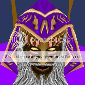
O hai thar. Here is evil mage.

You have an obligatory blue blood mage with a mask and it's supposed to represent.. What? If I didn't know the theme of the contest, I wouldn't have a clue what your mage is supposed to be. There are no visual cues, no thematic representations, nothing. It's just a blue mage, which falls short of passing the "theme" qualifications as far as I'm concerned.Dionesiist said:I get it people would like him to have a bare face? And Dusk, I don't really get the "theme" thing :/