- Joined
- May 7, 2010
- Messages
- 9,269


Well, you put it more softly 
Follow along with the video below to see how to install our site as a web app on your home screen.
Note: This feature may not be available in some browsers.


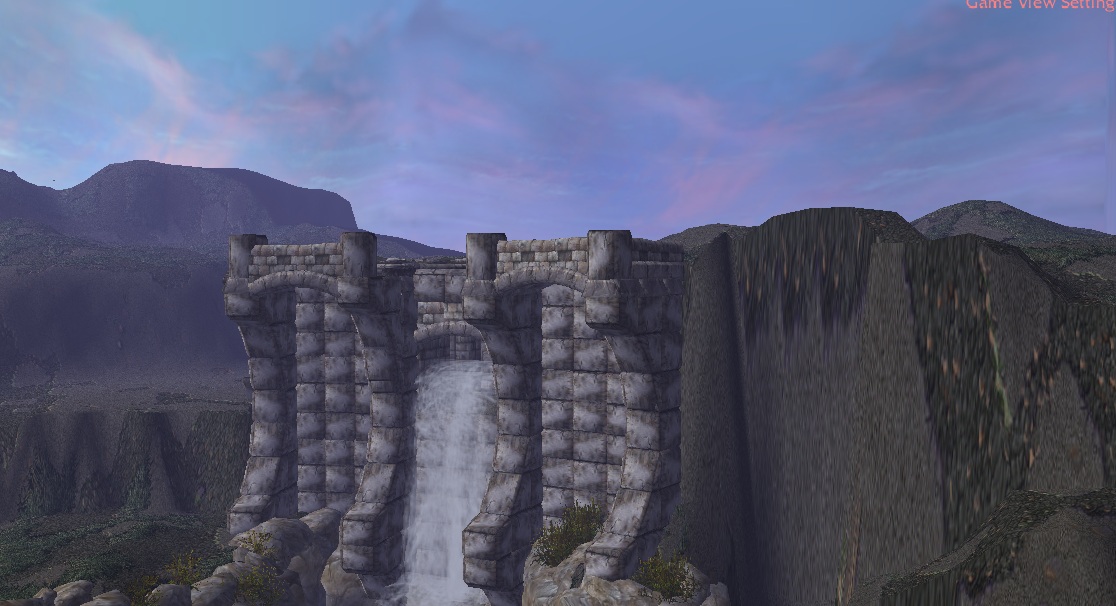


Okay so i think i need toremoveimprove the tower . Anyway , thanks Edge.
-Added New Building ,i guess it's a library , i dont know ...
-Removed the lilypads
-Added few details... and etc.... fixed the omnilight bugs.


Here's what I think. The new building is the best thing out of the whole terrain. You want to know why? It's simple and looks like something an architect would actually make. There's not a lot of unnecessary additions and it has sleek lines, and it also doesn't have a bitch ton of ugly windows clogging up it's facade, ya' catch my drift?
They deserve that...@Stryderzero why did you remove the lily pads?
 I will replace them with "real texture" lilypads (The one from B2M pack)
Awh yes..More like a lack of contrast. Gray, grey and gray is a tad boring.
I think those light reflections look more "eye candy" than placing water details/lilypads... :]Now the water needs eye candy. And now that you removed the ground, that part needs more eyecandy as well. The new buildings look nice though.

Why have you commented?@Stryderzero why did you remove the lily pads?


You are allowed to use graphical calculators though.The rules don't allow me to use paint, I can't work under these circumstances.
The rules don't allow me to use paint, I can't work under these circumstances.
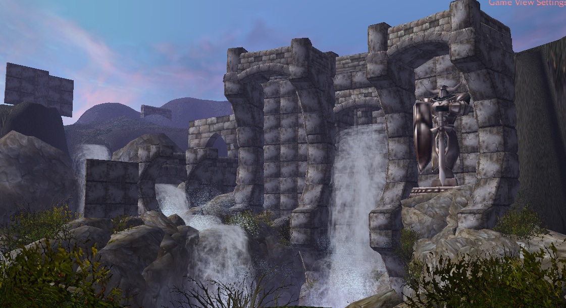
Of course. This isn't The Picture.Is the changing of the camera view okay?
Of course. This isn't The Picture.
Also this camera angle is pretty sweet. You'll have little space for a castle/cathedral though. Are you cropping your images? Because I seriously doubt your monitor is that small.


Is the changing of the camera view okay?, I got some plans on this view
and ignore the sky and those other objects that are scattered, kinda forgot to
move them
Of course. This isn't The Picture.
Ah. Well. In the off chance that he didn't.I kind of think he meant in general, as does it look good compared to the other one.
That much should be evident.fladder you've already updated the front page with WIP's list? o.o


I shall join here. xD
Just the first WIP.
Sorry. The judging is almost entirely based on the terrain being done in the WarCraft III world editor. It would be like playing tennis with the net down. If you feel like it, though, make a submission for the hell of it. The judges could ― if they feel like it ― review it for fun and inspiration. But it would not strictly be competing against other entries.Say, are submissions made in SC2 allowed?
A decent attitude. Also, if you feel like it, try doing a terrain in WarCraft III. Just as a point of reference.A decent reason. I might still consider making a terrain when I've got some more time.
A decent attitude. Also, if you feel like it, try doing a terrain in WarCraft III. Just as a point of reference.
I shall join here. xD
Just the first WIP.
That said, I'm consistently amazed at what a lot of you keep making with the Wc3 engine. I doubt anyone ever expected anything made in this engine to look half as good as many terrains posted here.

Stryderzero are u rendering that in the world editor? @_@


As long as you imported anything to your import manager , they are already considered as import.Does the Mighty Alpha Tile count as an import?
Yes...Stryderzero are u rendering that in the world editor? @_@
That WiP looks good, though higher quality walls could help. Dark metal perhaps?
The whole idea of it is to use the default/vanilla resources which although not that HQ can look good when used right.
Good but if I were you I'd import the skysphere, and glow models too.
And Talavaj's models ^_^
I see where this is going :>
Of course. This isn't The Picture.
Also this camera angle is pretty sweet. You'll have little space for a castle/cathedral though. Are you cropping your images? Because I seriously doubt your monitor is that small.
Other comments (include top)