- Joined
- Sep 3, 2007
- Messages
- 1,812
Neither do I, thx ^^
@LiOneSS: I quote Elenai:
^^
I don't recall EL being judge or making many icons..
Neither do I, thx ^^
@LiOneSS: I quote Elenai:
^^
I don't recall EL being judge or making many icons..
Arr, the mighty Pyrite has spoken! Hes word is law. Must consider to obey or not!
Anyway, made some changes.
And dont glare at me evily while laughing at your success LiOneSS!
Before:After: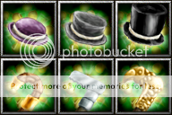


Ive worked a bit on the Sticks, and here is the result:


The complete sequence looks like this:


It's alright, you just have to make a new sequence
heres a WIP of my shield.
Here come some heavily WiP icons. I think I need to up the brightness, and add a bit more... life to em, but yeah, branches.
View attachment 45608View attachment 45609View attachment 45610
View attachment 45611View attachment 45612View attachment 45613
I don't agree with Elenai because I don't like agreeing with Elenai.
I suggest we stop asking for icons to be warcraft-ish though.
Lowered the opacity of the background again:
BEFORE:AFTER:
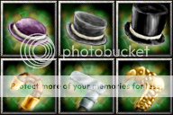
I can still see the brush strokes - even more than before. Also, the only difference I see is in the top hat (third tier armour).
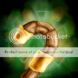
It's fine on the cane, but it's making my very pissed with the hats.

do that explain the brushstrockes?
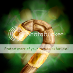

Personally i like BEFORE the best.
Ike, i love it. Also, though i hate warcraft icons, yeah, there is no point in making non-warcraft ones.
edit: improved tier 2 (hopefully)
