Follow along with the video below to see how to install our site as a web app on your home screen.
Note: This feature may not be available in some browsers.
Listen to a special audio message from Bill Roper to the Hive Workshop community (Bill is a former Vice President of Blizzard Entertainment, Producer, Designer, Musician, Voice Actor) 🔗Click here to hear his message!
It looks awesome, i love the thin frames.
Here's an idea for the central ball:
If you want this one, i have the picture in 1280x800, also i can remove the 'blade and soul' sign for you.
EDIT - Sorry, i DIDNT see that the first post is 2 years ago, i just added reply to the first page.
I hope i dont break the rulls of the forum with image with sign of other game
Well, I don't particularly mind random ideas, however, this specific one, I don't really like.
It would make the UI messy. Messy is bad.
Currently preoccupied with work, will tweak this stuff at the end of the week,
then send it off to Russian, who hopefully will get some time to look into it. ;P
Come on, he's just trying. Don't be mean.
But bowser, we told you not to post or edit Minimage's stuff in here. Why do you insist of showing that to us know that you will eventually have to take it down?
Come on, he's just trying. Don't be mean.
But bowser, we told you not to post or edit Minimage's stuff in here. Why do you insist of showing that to us know that you will eventually have to take it down?
Nah, I specified that I have no issues if people are inspired by what I do, I pointed out that he could tinker with the UI until I found it good.
He was not allowed to submit it until I deemed it good though. I also stated that I'd be rather blunt when I didn't like it and I didn't think it was good now.
So to be consistent, I bluntly stated what I thought. I still haven't sent the thing to CrazyRussian yet. So many things have kept me preoccupied.
But bowser, we told you not to post or edit Minimage's stuff in here. Why do you insist of showing that to us know that you will eventually have to take it down?
Are you really thinking that I am just gonna delete my own work?
75% of the stuff you see on my UI are not from MiniMage version ^^
It also has the right to live. It will live.
Are you really thinking that I am just gonna delete my own work?
75% of the stuff you see on my UI are not from MiniMage version ^^
It also has the right to live. It will live.
Are you really thinking that I am just gonna delete my own work?
75% of the stuff you see on my UI are not from MiniMage version ^^
It also has the right to live. It will live.
bowser as soon as u upload that ui im going to report it for stealing the work of minimage. give it a fucking rest coz even if it looked good u dont hav minimage's permission to edit the ui.
As soon as CrazyRussian has done the final touches, anyone will be allowed to use it.
Also, I need to remember to remind him, I keep forgetting about it.
Actually, CrazyRussian seems to take an awful lot of time, which is probably due to his busy work schedule..
Nevertheless, I want this UI done ASAP. Anyone else up for the task of giving this UI some final touches so that I can submit this to the public?
Atm, all that really needs to be added are some leaves above the minmap.
The difficult thing however, is to make sure that it does not look awkwardly placed, it should look like it leans towards the UI, as if it had falled from a invisible tree above. That's a kinda hard thing to pull off. XD
Also some fixing with the different direction characters and and all around fixing of minor flaws throughout the UI. Pixel art can only do so much. XD
If you look at the right of the minimap, that's my pixel art at work. But yeah.
I could tweak some parts though, but to do the serious parts, I need an experienced artist. ;P
I know it does not mean much to you, but I think that the current state of the UI is pretty damn excellent.
I am just wondering whether you are going to adapt the ESC menu and the
logs too.
I tinkered some with the UI, pixeling the minimap. Also utilized pieces of GhostThrusters attempted fix. Now all that remains is fixing errors and color issues into a solid UI.
Thoughts?
I'm not that satisfied with the letters imo. Seems like some turned out to look as if they were a bold style while others did not.
Also, frankster. Idonno. It's a lot more annoying to make menu stuff because your stuff needs to loop. But idonno. We'll see.
If someone else were to help me with that, it wouldn't be that difficult to imitate the style of this one.. I think.
Oh and I got no Inventory protector either.
I'm not that satisfied with the letters imo. Seems like some turned out to look as if they were a bold style while others did not.
This UI in my opinion, is darn good and ready to use. I suggest that you release it as a skin, or if not, in this thread atleast.
There are a few things that bother me though.
1. The part cut from the Orc clock UI next to the unit portrait doesnt really fit with all these sexy ornate thingies around, i suggest that you remake it with freehand, using the same style you used on the other silver parts of the UI.
2. The colored part above the skills grid stands out too much. I suggest that you either desaturate it, or put some leaves on it.
3. The resources bar right of the clock should have lines between Gold/Lumber, Lumber/Food and Food/Upkeep. You can also leave it like that it seems interesting.
4. I suggest that you remove that planet from the clock UI for the users who actually need the clock You can also make a separate texture overriding the Day/Night cycle inside the clock UI, changing it to that planet or whatever it is.
Even with these things this UI is one of the best i've seen around. Great job on it, even though a few parts are CNP'ed or Recolored (Who cares anyway, it looks amazing )
1. I'm not the freehand kind of guy. The silvery ornate thingies was done using pixel art. Because I'm more of a pixel artist kind of guy. That's kinda my thing. I do pixel art and mod WC3 and occasionally write stories. I'm still waiting for CRAZYRUSSIAN to have enough time to do his thing. If someone else comes along and are willing to do my desired tweaks, just send me a PM.
2. I disagree.
3. I don't want the lines. Because I like the Might and Magic: Heroes look.
4. The idea was to have cracks in the planet thingy, which then light seeped out of. This would thus serve as the time indicator. However, this vision only exists in my mind.
1. I'm not the freehand kind of guy. The silvery ornate thingies was done using pixel art. Because I'm more of a pixel artist kind of guy. That's kinda my thing. I do pixel art and mod WC3 and occasionally write stories. I'm still waiting for CRAZYRUSSIAN to have enough time to do his thing. If someone else comes along and are willing to do my desired tweaks, just send me a PM.
2. I don't want the lines. Because I like the Might and Magic: Heroes look.
3. I disagree.
4. The idea was to have cracks in the planet thingy, which then light seeped out of. This would thus serve as the time indicator. However, this vision only exists in my mind.
I heard you were talking shit about m-- oh, wrong website!
I don't really see anything wrong with that UI tbh (in fact it looks pretty amazing). The only criticism I could make would be how the time indicator thing would work with the crack in it (which imo would look pretty darn sweet if it works) and the places where the menu buttons would be; if the spaces are too large they'll just be floating in a black box, and currently the spaces look like they are too big. If would also be nice if you could put the separators between gold/lumber/food/upkeep, but that is more a personal impression than anything.
As far as the orc timer near the portrait goes, I really don't find it distracting; in fact I hadn't even noticed it until now, and I should have because I recently worked with it (also if you hadn't mentioned the silver swirls were pixel art I would have never guessed, so hats off to that).
As a final note, I'd be super curious to see what item cover you made/have planned for this UI.
PS: if you need anything drawn, I can't really help you. All my stuff is textures and photomanipulation, thus why they tend too look photo-like instead of drawn like the default UIs.
I've been working some more with my UI. Apparently a bastardized version of Bowsers, you know the christmas tree version. Apparently a group developing a map that was abbreviated Tkok uses this horrible shitty version.
So; I began tinkering with the version a little. If you're still up for it spellbound, you can apply your final touches to this;
I tried to fix the letters around the minimap. But to me, the S still looks a little weird. I think the W is better though.
Thoughts, people? I figured that if I completed this baby, the use of bastardized copies would stop in favor of the completed version.
Well, besides a couple tweaks, minor ones this time. Basically tweaking the leaves somewhat. There's the next part, the Transparency. Specifically making cracks in the orb so that light can seep through.
This also must be done without destroying too much of the detail in it. I wanted a major workthrough and correction of details, but since no one wants to do it, I guess I'll skip waiting any longer.
Found a tutorial on devinatart on how to do cracked glass, but I'm not very used to do it though. Also, I don't think it was intended to use as a transparency filter either.
Should I just make the time indicator hidden? It's a pain trying to draw cracks and Idonno what to do. I mean, I generally want this thing done. However, I haven't even started on an inventory protector. Hm.
Well, i guess you can have 2 versions of the TimeIndicatorFrame.blp - with and without orb. I guess that will be fine and will fit everyone's taste No need for cracks or anything.
Also the inventory cover shouldn't be any difficult. Maybe put a dragon mosaic or an orb there or something.
Keep it up bro
Woah, this really is something. Great work man. Can't wait to try it out. As for the inventory cover, you could try something like a gem socket or a trigram of sockets. Maybe some kind of symbols representing words or even a generic shield if you can't think of anything else. I'd say take a look at "Dark Souls" and "Demon's Souls", might give you some inspiration.
CrazyRussian did some tinkering with the UI. Then got an artist block and asked me for direction, then I gave him some.. and then I think he got wrapped up in his christmas preperation and forgot about it. Will probably remind him after all this christmassy stuff is over and done with. Nevertheless, I experimented a little with the tweaks he did.
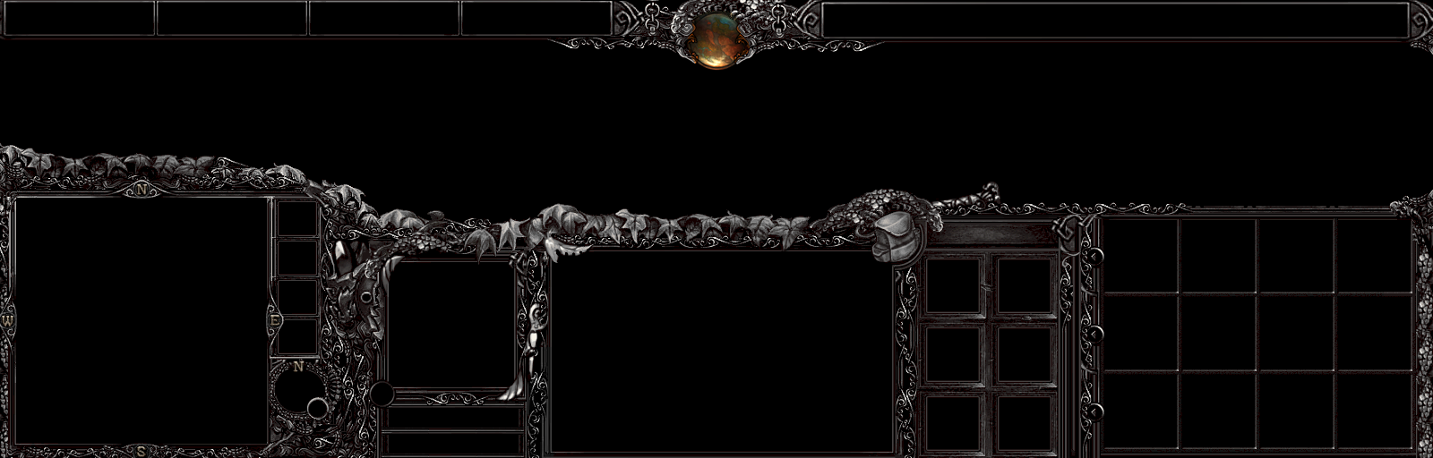
The idea with my UI was to emulate folklore and ornate elements into a dungeon crawler UI. It may actually need a splash of color, but eh, this is todays experiment.
Think conan the barbarian meets dungeon seige meets slavic folklore meets viking mythology.
CrazyRussian did some tinkering with the UI. Then got an artist block and asked me for direction, then I gave him some.. and then I think he got wrapped up in his christmas preperation and forgot about it. Will probably remind him after all this christmassy stuff is over and done with. Nevertheless, I experimented a little with the tweaks he did.
The idea with my UI was to emulate folklore and ornate elements into a dungeon crawler UI. It may actually need a splash of color, but eh, this is todays experiment.
Think conan the barbarian meets dungeon seige meets slavic folklore meets viking mythology.
Well, this looks quite amazing, but as you said, also a bit colorless (though it has a brownish hue) It would have been better to leave the colored leaves and the red eyes of the dragons (they looks awesome, like living statues), also i liked how some of the parts had a little golden hue unlike the rest of the UI, though now it's all one color and nothing stands out.
The new parts look good, though they are not as sharp as the rest of the UI and stand out as not-made-by-you, but they fill some otherwise empty spaces and are okay i guess...
I like how you've removed the hue of the time indicator dragon to fit with the rest of the UI, but you should have left the color in the brown part around the planet. It kinda gave life to the whole indicator frame.
I like what you've done with the frames around the menu buttons though, they look better now.
All in all, the new design in better, whereas the new color is not to my liking. (That's my opinion)
Now enough about the old-new comparsion, it always bothered me that some parts of the UI are missing (not made or you just dont show them) like the inventory cover when a unit without inventory is selected. I'd suggest a dragon mosaic with a few ornaments or something will work.
Other than that, a cursor. I think you could make an amazing cursor with your ornament skills (Yes they rock ) Give it a try and make it fitting with the UI. What's left are the menu buttons and the menu/cinematic Frame. It shouldn't be too hard and in my opinion would look fantastic.
The menu buttons could be retextured and desaturated defaults with little ornaments on the edges perhaps. I'm sure you'll figure it.
Otherwise, this is the best UI i've ever seen for Warcraft 3, you did an amazing job on it! Keep up the good work.
P.S. I'm using this UI to replace the default ones in the WC3 MPQ (with a 3rd party program ofc), client-side only, hope you're okay with that. Though as of late i'm planning to do a walktrough of a WC3 custom campaign and the UI will be shown ingame, and therefore i must ask your permission to use it.
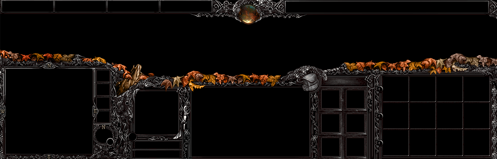
Apologies for having you guys wait. Mad has been helping me out with giving the UI a little of a autumn feel.
He began helping me a little yesterday. Also added more leaves, which he helped me by painting some custom leaves to make it all flow together.
I appreciate to hear from you guys who have waited with patience. If I can chat with Mad today and if he's willing, I might actually complete the UI today. ;P
But we'll see. Currently designing the Inventory Protector.
That was actually my intention. A fiery mixture of autumn colors that focuses your eyes to the middle of the screen. If you look at it more closely, you can see my pixelart throughout the UI and the nice planet where the time indicator is supposed to be.
Ok, first, this is outstanding and I'm looking forward to finally download it ^^.
But I want to point out, that while you manage it very well to focus the payer on the center of the screen, all the work of the rest of the UI (the grey parts)
just somehow looks 'lost' inside this leaves. You only have: bright, clear leaves, and 'grey in grey thingies' that just feel very random in comparison to the leaves (I'm not even sure what it's supposed to be in some areas), for example you have this log (?) next to the portrait, and then there are a bunch of textures below it that feel very random in comparison to the rest of the UI. IMO you should consider trying to give some parts of the grey areas some color (not much, low saturation - i hope this is the right word -) to give the UI even more depth. You could even try to make raise the saturation, the more it's in the center of the UI.
That's great, but i agree with jopi, having almost everything grey except some leaves looks strange.
I think you may try to tint some grey parts with a copper tint to smooth the transition between the leaves and the rest of the UI. Maybe a gradient from copper to grey from top to bottom.
This site uses cookies to help personalise content, tailor your experience and to keep you logged in if you register.
By continuing to use this site, you are consenting to our use of cookies.


 You can also make a separate texture overriding the Day/Night cycle inside the clock UI, changing it to that planet or whatever it is.


")