• 🏆 Texturing Contest #33 is OPEN! Contestants must re-texture a SD unit model found in-game (Warcraft 3 Classic), recreating the unit into a peaceful NPC version. 🔗Click here to enter!
  • It's time for the first HD Modeling Contest of 2024. Join the theme discussion for Hive's HD Modeling Contest #6! Click here to post your idea!

NEW UI WIP, Misha's Request.

Status
Not open for further replies.
Level 26
Joined
Jun 5, 2008
Messages
1,767
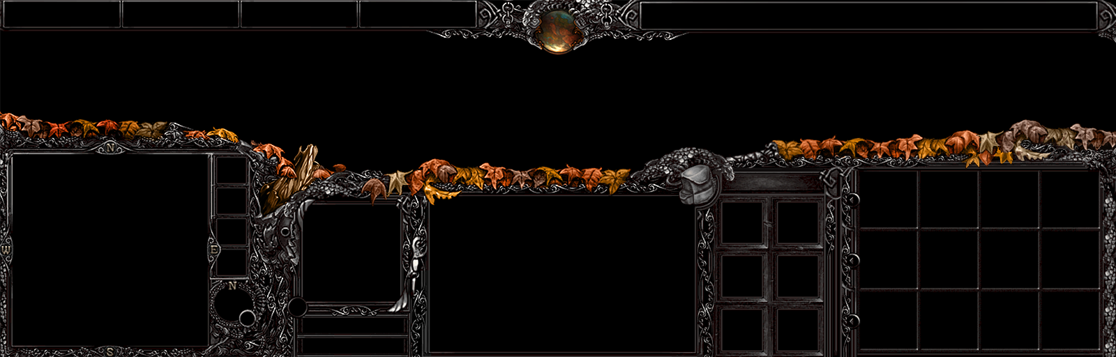
Hello boys and girls. Mad is once again helping me out. Here's the inventory protector WIP.
I made a conceptual design and explained what I want using a simple meshing of stuff to show my general idea.

Then Mad's artsy know-how made this. It's a neat WIP.
peFsYfa.png

KeKGgvG.png


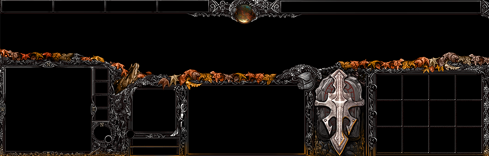
The idea was a kind of Metal Cross thingy on a rune stone.
It reminds me of Tibia. Just looking at it is enough to for me to feel nostalgic. ;D

Thoughts, gentlemen? Give the UI a critique if you feel up for it.
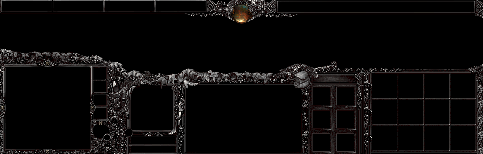
Do you by any chance prefer the one with less color?
si4L4zc.png

n9wvJCQ.png
 
Last edited:

Deleted member 212788

D

Deleted member 212788

Must . . . Have .. .

In all honesty, I am looking forward to the day this is released, it is amazing. Good Job to you and to Mad ^^
 
Level 10
Joined
Aug 30, 2007
Messages
270
ok, nice inventory hide-up thingy. On it's own it looks really amazing but TBH at the moment for me it looks a small bit more 'cartoon-ish' than the rest of the UI, maybe its not that bad but its sheer size just draws so much (of at least my) attention. The classic inventory hide-ups in wc3 UIs just aren't so big and don't draw that much attantion IMO, still great work.

And to answer your question at the moment I like the version with the small color gradient on the bottom quite a bit more, it feels to me as a smooth transition from UI to the outside of the screen, while in comparision the one without seems to be kinda cut-off. As well as it works as a counterpart to the leaves.

If you still want to have the leaves as only colour source, then you might go with a color gradient in to darker gray/black on the bottom?

And out of curiosity how it looks like, would you mind posting a version with green leaves (and maybe green color gradiant on the bottom), if it's not to much on an effort?
 
The version with the colored light coming from below seems to be better.
Also, the only problem with this UI is that the quality of some elements don't match with the overall quality. Just look at all those detailed pixel-perfect ornate thingies, then look at the leaves, which are quite blurry in comparison. Just the same, look at how high quality and good looking the rock in the inventory cover is, then look at the cross on it. It just annoys the eye when its not the same quality. I suggest that these blurry elements be remade with more detail.
Otherwise, still the best UI there is :)

P.S. It would be awesome if you could do menu UI textures and cursor with the same theme ^.^
 

Mad

Mad

Level 15
Joined
Feb 17, 2014
Messages
134
The version with the colored light coming from below seems to be better.
Also, the only problem with this UI is that the quality of some elements don't match with the overall quality. Just look at all those detailed pixel-perfect ornate thingies, then look at the leaves, which are quite blurry in comparison. Just the same, look at how high quality and good looking the rock in the inventory cover is, then look at the cross on it. It just annoys the eye when its not the same quality. I suggest that these blurry elements be remade with more detail.
Otherwise, still the best UI there is :)

P.S. It would be awesome if you could do menu UI textures and cursor with the same theme ^.^

I will try to redraw the stuff that looks blurry, even though it might be the end of me :>
 
Level 26
Joined
Jun 5, 2008
Messages
1,767
I was being serious >.>
Really? let me laugh harder for that. XD

The golden rule of complaints. If something that others considers to be good, is considered bad by you, then you need to properly explain why you think that and suggests ideas to replace the thing you are complaining about.

Your comment kinda felt like those complaints I heard a long time ago. When a guy commented on a Orc Hero and he said he liked everything but the Orc. That's why your comment amused me so.
 
Level 6
Joined
Jul 1, 2012
Messages
188
I like the progress so far, I prefer the version with less colour and the inventory looks fantastic. Just wondering, how far are you from finalizing the UI? Are you getting close to the look you want?
 

Kazeon

Hosted Project: EC
Level 33
Joined
Oct 12, 2011
Messages
3,449
Really? let me laugh harder for that. XD

The golden rule of complaints. If something that others considers to be good, is considered bad by you, then you need to properly explain why you think that and suggests ideas to replace the thing you are complaining about.

Your comment kinda felt like those complaints I heard a long time ago. When a guy commented on a Orc Hero and he said he liked everything but the Orc. That's why your comment amused me so.

Kinda weirdo rule :/

It was not a complaint anyway. Just some opinions. Tho I don't have any idea what could fits better than those leafs.
 
Level 26
Joined
Jun 5, 2008
Messages
1,767
I like the progress so far, I prefer the version with less colour and the inventory looks fantastic. Just wondering, how far are you from finalizing the UI? Are you getting close to the look you want?

At this stage, the design is done, the final work is basically up to Mad.
As he said up there, he'll try making the things that Blood Raven mentioned less blurry.
 

Kyrbi0

Arena Moderator
Level 45
Joined
Jul 29, 2008
Messages
9,501
Apologies for having you guys wait. Mad has been helping me out with giving the UI a little of a autumn feel.
He began helping me a little yesterday. Also added more leaves, which he helped me by painting some custom leaves to make it all flow together.

BasCelikLatestTweak.jpg


I appreciate to hear from you guys who have waited with patience. If I can chat with Mad today and if he's willing, I might actually complete the UI today. ;P
This is super. I really like how the design is shaping up. And you couldn't be working a better artist-partner than Mad; I'm really pleased that I'm not the only one monopolizing him. xD

And, of course,
It's as Kyrbi0 would say 'Axesome' :p

~~~

MiniMage said:
The golden rule of complaints. If something that others considers to be good, is considered bad by you, then you need to properly explain why you think that and suggests ideas to replace the thing you are complaining about.
Dalvengyr said:
Kinda weirdo rule :/
It's not so much a "rule" as it is an "unwritten standard of common courtesy".

It really stems, at it's most foundational, from the idea of "Show Your Support"; don't just say something, support it. If you have an opinion, think about the why or how; e.g.:
"I don't like the leaves... they are too bright"
"I don't like the leaves... they ruin the feelz"
Whatever.

This stems from the study of linguistics, where a guy named Paul Grice formulated a series of statements known as Grice's Maxims. They stem from the Cooperative Principle (i.e. "communication between people is meant to be as cooperative as possible, in order to facilitate the exchange of information").

Next to that would be (what I just learned about today) what are known as the accompanying Politeness Maxims, perhaps more pertinent to this discussion.

MiniMage makes the point that he would like more than just a simple "I like/dislike this"; he wants to know what you like/dislike so he can make it better (if necessary/possible). This is especially true for someone with a divergent (from the majority) opinion; i.e. "if all these other people like it, what reason have you to disagree?" It's OK to disagree, but not thoughtlessly.

/soapbox
 

Kazeon

Hosted Project: EC
Level 33
Joined
Oct 12, 2011
Messages
3,449
Look, I don't want to start an off-topic debate. But I feel kinda positioned as immoral person here.

That is one invalid rule/standart/term/anything I can say. In this case, me, I don't always have time and effort to think about what I would suggest. Moreover,
Tho I don't have any idea what could fits better than those leafs.
And I was not very sure if it's mostly iron. Now that I have been sure if it's iron then I can say:
Leaf and iron are not matching each other. They make a bad synergy. Maybe that's why I dislike. I suggest you to change those leafs and branch to something else, or just remove them (I prefer this one).

Anyway, why should I follow that rule/standart/term lol? I don't want random smartass fagots make a rule/standart/term upon me that easily. They just want to be well known, they want to popularize their names that's all, that rule/standart/term itself doesn't exist. NS

Thanks for schooling me anyway
 
Level 26
Joined
Jun 5, 2008
Messages
1,767
Actually, that one unwritten rule does exist. Constructive criticism is fine, but whine is what I would deem deconstructive criticism,
it lessens motivation and demotivates people to work harder. I'm just not following the dogma of the guys who has written about it but I'm just following good ol' Logic.

Basically, you should follow the rule, because you don't want to be a deconstructive douche. More or less.

Appreciate the opinion though. Even though it doesn't add much. During medieval times, blood, leaves and steel was an everyday occurrence.

Slavic mythology, as the UI began was originally influenced by, shares a lot with Viking mythology. So I went for a cold hard steel base, with autumn leaves and detailed statues and symbols.
Basically, I went for an Magical Autumn Viking UI. That's also why the inventory protector is a runestone under a mangled fantasy cross, hammered ontop of it.
 

Kyrbi0

Arena Moderator
Level 45
Joined
Jul 29, 2008
Messages
9,501
Look, I don't want to start an off-topic debate. But I feel kinda positioned as immoral person here.

That is one invalid rule/standart/term/anything I can say. In this case, me, I don't always have time and effort to think about what I would suggest. Moreover,

And I was not very sure if it's mostly iron. Now that I have been sure if it's iron then I can say:
Leaf and iron are not matching each other. They make a bad synergy. Maybe that's why I dislike. I suggest you to change those leafs and branch to something else, or just remove them (I prefer this one).

Anyway, why should I follow that rule/standart/term lol? I don't want random smartass fagots make a rule/standart/term upon me that easily. They just want to be well known, they want to popularize their names that's all, that rule/standart/term itself doesn't exist. NS

Thanks for schooling me anyway
Fair enough; moved to VM's.

That being said, regardless of whether it's "common courtesy" or "coordination principles" or "social communication etiquette in general", it's something he's asking for, so it's respectful to oblige (if you can; even you're statement of "tho I don't have any idea what could go better" is fitting).
 
Level 26
Joined
Jun 5, 2008
Messages
1,767
Oh yeah, forgot to mention this. Mad specified that he wishes to prioritize the contest he's in, because he don't want to miss the deadline, unless someone impatient out there is waiting for him to add some final touches to the UI.
So give him some time to do his magic.

Also, for those who are interested, my UI apparently inspires poems nowadays. Check it out while you wait and by chance, maybe even get inspired yourself. http://www.hiveworkshop.com/forums/...g-concept-creation-291/tribute-autumn-258419/
 
Last edited:
Level 26
Joined
Jun 5, 2008
Messages
1,767
A lot of time has passed and I kinda forgot about this a little bit, what fixes was it that Mad was supposed to tweak again?
We don't remember what it was he was supposed to tweak so that I could cut it up into pieces and make it available for download.

If you don't remember either, I might as well start cutting it up now then, unless you can figure out what needed work.
Well, it is quite fine as it is, just needs some menu textures (the ones you see when clicking F10 for example) and possibly a fitting cursor (diggin these curly ornament thingies ^^)
 
Level 4
Joined
Sep 27, 2014
Messages
47
By Black and White do you mean the "Newest tweak"? or one of the older ones but with the leaves and what not?
I'd like the newest one, however the one with the leaves when its black and white is perfectly fine with me as well :D
 
Level 2
Joined
Jan 12, 2015
Messages
10
He just PMed me! Take B&W version!

//Edited by MiniMage. April fools to those that downloaded it.
 
Last edited by a moderator:
Level 4
Joined
Sep 27, 2014
Messages
47
umm could you post here saying that its posted once you post it? It'll make it easier if you do :D
 

Ardenian

A

Ardenian

Looks great!

+1 person who hopes you finish and release it one day.
 
Level 26
Joined
Jun 5, 2008
Messages
1,767
You should get achievement: "The most laziest human"

I go up at 06:00 and get home at 18:30 on average. Yesterday I woke up at 04:00 and got home at about 16:30. It's not just about being lazy, it's about having priorities.
Also, I probably have to reinstall my photoshop and that stuff too. But yes, I am lazy as well. But not very much. Just a little.
 

Kyrbi0

Arena Moderator
Level 45
Joined
Jul 29, 2008
Messages
9,501
I go up at 06:00 and get home at 18:30 on average. Yesterday I woke up at 04:00 and got home at about 16:30. It's not just about being lazy, it's about having priorities.
Also, I probably have to reinstall my photoshop and that stuff too. But yes, I am lazy as well. But not very much. Just a little.
QFT.

Working a "9-5" is one thing... But try having kids! Maaaaan.

(this was said in support, rather than accusation)
 
Status
Not open for further replies.
Top