• 🏆 Texturing Contest #33 is OPEN! Contestants must re-texture a SD unit model found in-game (Warcraft 3 Classic), recreating the unit into a peaceful NPC version. 🔗Click here to enter!
  • It's time for the first HD Modeling Contest of 2024. Join the theme discussion for Hive's HD Modeling Contest #6! Click here to post your idea!

Le' texturing attempts

Status
Not open for further replies.
title_ThreadT&S.png

I've compiled my texturing works that I've done and the ones that I'm working on in this thread.
Criticism and comments are welcomed as long as you don't go kuku with those along the way.

Listed below are my texturing projects, easier to find and to offer criticism if people feel like giving some.
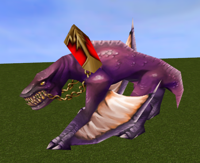


My current texturing works include both in-game textured models and custom one from the Hive.

~Enjoy searching through and hopefully leave some comments ^^
 
Last edited:
Level 25
Joined
Jun 3, 2008
Messages
3,858
I really like your style, it's very clean and sharp, and kinda reminds me of Dionesiist's style.

You did a great job on the shoulders, all of the leather straps (the wrist-part of the gloves, the belt, and the strap that goes across the chest), and the legs (I think. It's kinda hard to see how it wraps from that angle, but the unwrap looks good). The belt bucket is well-made too, but it's a bit.. odd. It doesn't really represent anything?

I would get rid of the fur on the cloak, or otherwise remake it in a more layered fashion (like how Blizzard makes their fur textures in WoW). The leather part of the cloak is very well shaded and highlighted, but still looks slightly off. The folds make it look like it's composed of multiple leather straps, so I think you might have to tinker a bit with the folds.

Personally, I actually kinda like the face. It is, once again, very well shaded and highlighted (man, you've really got that part under control). Only the facial structure might need some more work :p
However, the hair looks kinda plastic-y.

The arm, hand-part of the gloves and boots look a bit boring. Generally, the arm is alright, but WC3 textures have a tendency of over-defining muscles. For the hand, maybe you could draw a clenched fist, so it looks more like a hand, and not just a leathery stump. The boots look rather unfinished (which makes sense, since this is a WIP) - I'd simply suggest adding some more details here.

Unfortunately, I don't have an idea for the breastplate either. I've never been too good at coming up with breastplates myself, which is why I mostly just draw my skins bare-chested >.>

To round off, I'll say this is a particularly great WIP. I hope I was able to provide some suggestion you could use, and I look forward to seeing the continuation of your work! :)
 
@Chaosy, yep.

@chr2

Thanks for the feedback.
It really proves to give a great insight.


So, here's some update to it.
Still no ideas for the hair though.

Nomadv2.png


Nomv2.png


Edit: I'm also working on this Paladin. Pretty much done but hearing feedback is good since I feel that it's missing something.
chr2 you might recognize that face and hair since I reused it from that old texture I did 2 years ago :d

Heropaladin.png


Heropaladinv1.png
 
Last edited:
Level 49
Joined
Jan 20, 2010
Messages
3,029
for me the paladin looks much better in flat texture than wrapped in the model itself, its just that wc3 models have this insane way of wrapping textures. the UV map thingy might help you in this situations as it has those guidelines that determine the proper place to put shading. i think 67chrome has a download link in his signature. i used that UV map for wc3 models too when i was still onto texturing. it helped me alot on which i should place my shadings to match the model's geometry.

all in all, long text aside, i think both are great textures. like what chr2 said, it reminds me of Dionesiist's style (which i really like)
 
@-Grendel, yes I'm already using Anemic Royalty's unwraps (chrome's sig link to wc3c.net). It's just that after not texturing for awhile I must catch up on things :p
Oh and thank you for the remark.

@Footman16 thank you. Will consider that if I'll be pleased by the final result.

@Gismo359 indeed, it's one of those ugliest wraps Blizz ever made so it get's distorted as hell when wraped on the model. Thanks.

Also, while I get ideas for those textures I'm fighting a war against the Spell Breaker neck wrap :d
Just calling this the Zandalari High Priest.

zandpriest.png


Reference

Edit: A small update.
Well, that's it for today.

zandpriestp2.png
 
Last edited:

Chaosy

Tutorial Reviewer
Level 40
Joined
Jun 9, 2011
Messages
13,182
@chr, yep, cloth color changed 'bit.

Update 'bit here and there.
Here's something shield and some mask-ish thingy plus a cheesy hair filter (I don't fancy filters in skins but I'm out of ideas for the hair atm).

Thoughts?

Also the unwrap attached in case you guys wanna see it.

That is a really nice one! I like everything but the hair. But I think it's a 4/5 even with the not so nice hair.

edit: though I dislike the shape of the hair not the texture on the hair so I guess that's not your problem so to speak.
 
Those textures look very clean. I really like them! Especially the spell breaker. I think you outdid yourself on that one.

For the Arthas/Paladin one, I suggest that you enlarge the inner eye a bit more (the iris + pupil). When we're in a relaxed state, our eyelids almost always cover a part of our iris. The bottom/top edges of the iris are only visible when we are looking up/down or when our eyes widen (for that "shocked" look). Eyes are pretty hard to do--if they are too small, the character looks like a demon; if they are too large, the character looks like gollum (bug-eyed).

Good luck! I look forward to seeing more. :)
 
Level 25
Joined
Jun 3, 2008
Messages
3,858
Well, pretty much done I suppose.

Not too keen on the tusks-thingy though.
I also redid the hair since I disliked that filter.

So, worthy releasing?
What do you guys think?

I really like the way you managed to implement the tusks - very creative! They seem a bit blurry though, you think it'd be possible to sharpen them or otherwise define them a bit more? Also, it'd be cool if there were some cracks on the mask around where the tusks emerge.

Personally, I'm not too fond of the pink color on the front piece (the thing connected to his belt). The pink looks good on the robes, as it compliments the purple robe well, but it seems a bit out of place on that front bit. Maybe it'd look better with the beige color from his shoulder-piece, or the brown-gray from the belt, or even the purple from the shield. That's just my opinion anyway.

All in all, this is a very nice looking skin, at it's easily worth uploading.
 
Small update done to it.


bsdhtfy.png


Can't do that much to the tusks though, I did define and sharpened those bit more(that part of the mask wrap is darn fugly).

However since I'll upload the resized 256 version which will be sharpened a bit dunno if it will be seen that much...
...or should I put the 512 version?
 
Last edited:
Level 25
Joined
Jun 3, 2008
Messages
3,858
Small updated done to it.
Can't do that much to the tusks though, I did define and sharpened those bit more though (that part of the mask wrap is darn fugly).

However since I'll upload the resized 256 version which will be sharpened a bit dunno if it will be seen that much...
...or should I put the 512 version?

I don't think it really matters which one you upload, if you just attach the other.

The tusks are much better now, and I like the new color for the front bit a lot more too. Once again, incredible job on this! IF you wanna improve it more before uploading, I have one last thing I just noticed. The golden border of the belt bucket could use some more/stronger highlights. And that's the very last comment I have, I promise! :p
 
that pink fiend , i hope you release it on the skin section :)
Actually that's nearly done. I need to add more details and texture work to the torso and underbelly(they're quite lacking and bland now).
I also need to diversify the color variation depending on its position and whatnot.

'bit of update on the Justicar. I did some work on the pauldrons and lining plus the boots and armor.


serbthf.png


Justv2hi.png
 
Last edited:

Deleted member 238226

D

Deleted member 238226

Thanks.
wopsy daisy 'bout the non replies and lack of updates.
Here's a near finish for the Justicar.

C&C appreciated.

very amazing :)

your style really reminds me of dionesiist texture. it's so clean and really sharp.
for suggestion, perhaps use a different color for the pants or the cape part? i think both of them blend to much. maybe contrast them a little bit? though i think this is really not necessary.

but still, this skin is really amazing. maybe there will be another dc pops out from you. :)

will wait for the release of this masterpiece
 
your style really reminds me of Dionesiist texture. it's so clean and really sharp.
for suggestion, perhaps use a different color for the pants or the cape part? i think both of them blend to much. maybe contrast them a little bit? though i think this is really not necessary.

I added some slight contrast to it overall.
Thanks for the post.

Click to download and leave further comments if you'd prefer that~

Edit: So, I've been doing some update on that Nomad skin.
Here are some wip's for it.


Arthas.png


argvs.png


C&C appreciated.
 
Last edited:
Darkborne released.

The Hound has been released. Posting is appreciated.

Did some progress on the Twin Knight and began work on the Hellfire Spawn.


Hellf.png


Progress on the Satyr one.


Helff2.png


Edit: Started work on Jack 'o Lantern skin.


JackL.png


Edit: The Hellfire Spawn is pretty much done. Check it out and leave a message.
 
Last edited:
Mega threader-bump!
~Ohai~

So, after some centuries....
Been warming up to some texturing, you know so I don't loose my touch(too much).
Came up with some undead/pirate themed skin for HerrDave's Hook model.


und_ext_her.png


Wrap's kinda funky but we're getting....somewhere.
Hair color is just there, will get to it eventually, same for the placeholder face texture.


und_ext_her2.png


C&C is appreciated as always
 
Last edited:
Status
Not open for further replies.
Top