Community
Maps
Tutorials
Gallery
Support Us
Install the app
-
Listen to a special audio message from Bill Roper to the Hive Workshop community (Bill is a former Vice President of Blizzard Entertainment, Producer, Designer, Musician, Voice Actor) 🔗Click here to hear his message!
-
Read Evilhog's interview with Gregory Alper, the original composer of the music for WarCraft: Orcs & Humans 🔗Click here to read the full interview.
-
Create a faction for Warcraft 3 and enter Hive's 19th Techtree Contest: Co-Op Commanders! Click here to enter!
-
Create a void inspired texture for Warcraft 3 and enter Hive's 34th Texturing Contest: Void! Click here to enter!
-
The Hive's 21st Texturing Contest: Upgrade is now concluded, time to vote for your favourite set of icons! Click here to vote!
You are using an out of date browser. It may not display this or other websites correctly.
You should upgrade or use an alternative browser.
You should upgrade or use an alternative browser.
Icon Contest #15 - Unit Corresponding Icons
- Status
- Not open for further replies.
- Joined
- Sep 23, 2012
- Messages
- 1,307
Yeah i messed up the colors and was too lazy to change it, would see if I'm motivated enough to 'fix' it.on the model there isnt much blue, maybe instead of blue make it darkish purple?


- Joined
- May 15, 2013
- Messages
- 3,782

The first one:


And started the second,


And started the second,
- Joined
- Jun 2, 2008
- Messages
- 12,917

The first one: View attachment 269538
And started the second,
View attachment 269598 View attachment 269599
Nicee
Nice one but it more looks like a root than a blood to meThe first one: View attachment 269538
And started the second,
View attachment 269598 View attachment 269599
I may participate in this
- Joined
- May 7, 2010
- Messages
- 9,278


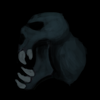
Pretty dope. Though, I'd try to make a bit of differentiation between the lower jaw and the blood. It's rather smeared as of now. Also, the background bleeds too much into the figure.The first one: View attachment 269538
And started the second,
View attachment 269598 View attachment 269599
Are you always using the pencil tool to make your object's shape? Rather unexpected for me.
Anywho, 'think that the start is promising though be sure to emphasize more on the eye features as opposed to the foreground leaves.
Last edited:
- Joined
- May 7, 2016
- Messages
- 2,194


My first icon:

Going to start the second one.
Going to start the second one.
- Joined
- Apr 18, 2008
- Messages
- 8,453


I love the concept for this contest. Good luck everyone.
- Joined
- May 16, 2007
- Messages
- 7,285


wasn't this the same concept for Icon contest 12?
- Joined
- May 7, 2016
- Messages
- 2,194
That contest was about different units but this contest is just about melee standard units.wasn't this the same concept for Icon contest 12?
- Joined
- May 7, 2016
- Messages
- 2,194

- Joined
- Jun 2, 2008
- Messages
- 12,917
Please dont double post just edit your last post, also the effect around the arrow makes everything seem blurry and the arrow doesnt look sharp at all.Other WIPs:

And 2nd icon:


(Sorry for double posting. I'll merge them later.)
- Joined
- May 7, 2016
- Messages
- 2,194
That's not arrow. It's the staff of Dryad.also the effect around the arrow makes everything seem blurry and the arrow doesnt look sharp at all.
About the effect, I'll try to fix it in the last works and fixes. Thanks!
- Joined
- Apr 18, 2008
- Messages
- 8,453
The dryad throws spears, though - it's not a staff. :O

- Joined
- May 15, 2013
- Messages
- 3,782


I feel more unmotivated updating stuff than making one.
Anyway. Nice work guys ^^
Need to see more your works!
- Joined
- Jan 2, 2016
- Messages
- 472


- Joined
- Jun 2, 2008
- Messages
- 12,917
Work Wip's please!
Start with a bigger explosion and make the "beams" you have coming off the explosion too be shards of rock flying upward, as for the ground, make it one flat color, maybe a light brown and then go over it with a darker brown and make rocky textures in spots. Around the blast zone, where the the light hits the most should have a light effect projected on the ground area since its a explosion. Lastly, the colors need to be more vibrant and apealing, look up explosions on the hive and youll find some icons that have nice colors.
View attachment 269914
If anyone has any suggestion on how to make the ground a little better i'm all ears.
Start with a bigger explosion and make the "beams" you have coming off the explosion too be shards of rock flying upward, as for the ground, make it one flat color, maybe a light brown and then go over it with a darker brown and make rocky textures in spots. Around the blast zone, where the the light hits the most should have a light effect projected on the ground area since its a explosion. Lastly, the colors need to be more vibrant and apealing, look up explosions on the hive and youll find some icons that have nice colors.
- Joined
- Jun 2, 2008
- Messages
- 12,917
3rd icon

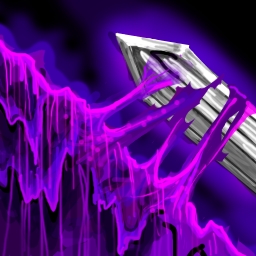
Looks nice, but some of the purple gets lost when down sizing, maybe add some more light purple in spots. Also the sword seems dull and not so sharp to me.
- Joined
- May 7, 2016
- Messages
- 2,194
Why a sword?3rd icon
- Joined
- Mar 14, 2014
- Messages
- 1,213
Why a sword?
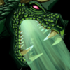
If i had interpreted it right, then the sword is representing the attack that is absorbed by the sludge-Monster's Skin/Slime.
- Joined
- Dec 30, 2007
- Messages
- 1,556


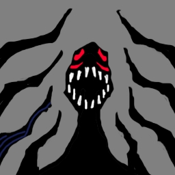
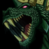
Hello flowers, ladies and gentlemen, looking great so far! I'll be take a swing at this and Green Dragon will be my unit of choice until I change my mind and scrap it! Earlier WIP-stages can be found below and the icons are based on the same base image, simply two variants.
Icon Format


Canvas Format


 I used the game portrait as reference and some other crap that I didn't save. If it is to much, I'll just scrap and do something else! Serves as a WIP as well, as I'm horrible at actually documenting my progress.
Cheers!
Icon Format
Canvas Format
Regarding existing artwork, is this "too heavily referenced"?And the contest has started. It lasts til 1st of next month and extension will be given only if all contestants agree to have one (which never happens). One month is more than enough time to draw 4 icons so I hope you'll all get it on time. About the judges, I will most likely take that role, but anyone who knows how to review icon can ask to be contest judge. Ask me or post here.
To highlight most important rule of all: Only freehand work is accepted. CnPs, in-game screenshot edits, excessive filter-work, trace-overs or heavy referencing existing artwork are not permitted. Cheaters will be awarded with immediate disqualification and pocketful of warning points.
Have fun. xoxo
Cheers!
Attachments


Last edited:
- Joined
- Jun 2, 2008
- Messages
- 12,917
Hello flowers, ladies and gentlemen, looking great so far! I'll be take a swing at this and Green Dragon will be my unit of choice until I change my mind and scrap it! Earlier WIP-stages can be found below and the icons are based on the same base image, simply two variants.
Icon Format
Canvas Format
Regarding existing artwork, is this "too heavily referenced"?
I used the game portrait as reference and some other crap that I didn't save. If it is to much, I'll just scrap and do something else! Serves as a WIP as well, as I'm horrible at actually documenting my progress.
Cheers!
To me it doesn't really seem heavily referenced if you didn't completely trace the reference picture.
- Joined
- May 15, 2013
- Messages
- 3,782
@Arowanna
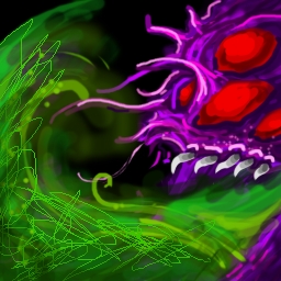
Whoa that's cool and a unique-styled work. It becomes cartoonish when turned into an icon, but man the concept-making is great!
The Devour part looked like its gonna spit out something or rather abduct somebody (dragon-ufo style). The light comes out too unnatural, consider spreading it. Ah well, that's my opinion. Good work ^^
As for the other part, I can't say really if that's allowed (the mods will decide that. But in my opinion, it's fine. It would be called heavy referencing if you screenshot it, edited that screenshot and used it as base, then put your own details and continued on that, etc.
But the screenshot portrait was just used as a normal reference. Plus, you did it by scratch and that concept (~ loving it).
- Joined
- Mar 22, 2016
- Messages
- 588


Interesting shape but you need to make it less blurry. Foreground blends into background too much. Maybe give the object some outline.
Pure black should be reserved for background only, use dark purple instead. Try to add more purple tones. I also think you could make it a bit brighter to make it blend in game more. Nice so far.
Give it more shading, make the volcano more prominent, more sharp, more in triangular shape. Background is overwhelming at the moment. Eruption could do with more vibrant coloring, add some chaotic movement to it.
I like how you did the slime, very warcrafty and interesting, both the definition and colors. Purple tones got very nice transition. But you fucked up the sword. It lost too much of its shape on left upper side and shading of it should be better.
I'm afraid it is, you'll have to draw something else.Regarding existing artwork, is this "too heavily referenced"?

Joking aside, of course it is good. But what's not good is to ruin such very nicely drawn dragon with simple green effect. I'm sure you can make effect better.
- Joined
- Jan 25, 2011
- Messages
- 2,386


- Joined
- May 7, 2016
- Messages
- 2,194
I've done some changes:
 >>
>>

I think it's a better color match for my previous icon.
Btw, is it still blurry?
Edit:
I think it's a better color match for my previous icon.
Btw, is it still blurry?
Edit:
Looks good! What's your unit?I dunno which is which, though.
Corrupting Presence (still a wip)
View attachment 270049 View attachment 270050 View attachment 270051
EDIT:
I don't know what I'm doing, but oh well.
Uncontrolled Fury
View attachment 270120
All of these are tentative and may change :<
The first icon needs a teeth redo
Attachments

Last edited:
- Joined
- Jun 2, 2008
- Messages
- 12,917
Way better than the last, still work on defining the spear or arrows head as it gets blended too much with the background effects and makes it seem blurry.I've done some changes:
>>
I think it's a better color match for my previous icon.
Btw, is it still blurry?
Edit:
Looks good! What's your unit?
- Joined
- Jul 29, 2008
- Messages
- 9,913

Those are lookin' great, though, especially the Hide; don't give up!View attachment 269900
View attachment 269899
View attachment 269901 View attachment 269902
I feel more unmotivated updating stuff than making one.
Anyway. Nice work guys ^^
Need to see more your works!
You were doing the Sludge Monster/Dalaran Reject, right? Man, there's plenty.I'm out of ideas, please send 911.
- You could do "Mitosis", a splitting ability (have the ooze splitting into two)
- You could do "Consume", like those gelatinous cubes from D&D (with the skeletons & weapons suspended in the ooze)
-
- You could do a "Oozy Evasion", where the thing partially separates around an enemy attack, dodging it
- You could do a "Toxic Pit", where he burrows into the ground temporarily to make a sludgy death pit (ooh, that's not a bad idea actually...)
- You could do a "Slime Trail", like having him move fast & leave a gooey trail of death-slime in his wake that damages enemies (like a slug/snail)
Probably some more good ideas, but that's what comes to mind.
- Joined
- Sep 23, 2012
- Messages
- 1,307
@Kyrbi0 Appreciated!
I'll be honest, all of the ideas you suggested are on my list except the Toxic Pit.
I'm also filtering the complicated ones so it would be easier for people to make actual spells based on them (assuming if anyone would use a sludge as playable unit)
Again, thanks for the heads-up.
I'll be honest, all of the ideas you suggested are on my list except the Toxic Pit.
I'm also filtering the complicated ones so it would be easier for people to make actual spells based on them (assuming if anyone would use a sludge as playable unit
)Again, thanks for the heads-up.
- Joined
- Jul 29, 2008
- Messages
- 9,913
You are very welcome!@Kyrbi0 Appreciated!
I'll be honest, all of the ideas you suggested are on my list except the Toxic Pit.
I'm also filtering the complicated ones so it would be easier for people to make actual spells based on them (assuming if anyone would use a sludge as playable unit
Again, thanks for the heads-up.
Playable Sludge Unit, did you say?... (have to admit, several of those are very potentially going to be abilities I end up using/have already used. xD)
- Joined
- Mar 22, 2016
- Messages
- 588
I'm also filtering the complicated ones so it would be easier for people to make actual spells based on them (assuming if anyone would use a sludge as playable unit
Usefulness is the most overrated aspect of them all. You aren't making icons so they can be useful to other people, you are making them either to practice your skill or to display your skill, in the end you will be doing both. If someone wants useful icons, than they should go to requests forum. Don't filter advanced ideas because you think icons wouldn't be useful. Even if creativity takes it in wrong direction it is still a lot better than doing easy concepts. I never do ability icons myself, but they have much more potential than unit icons, you can do them in much more arbitrary way. The sludge is a theme that can be done in a unique fashion because of its material. You can give him most interesting shapes, playing with the proportions, light reflections....Put sludge down to basics, what is the original concept behind this unit? What are all the things you relate to him as character? What impression should sludge give, therefore in what direction should his abilities go? What are the materials you can use?
- Joined
- Jul 29, 2008
- Messages
- 9,913
Even if this is true for your/this Contest (though it really ought to be said in the primary post/original idea thread), I don't believe this is a shared consensus about Contests in general. There are many who would argue that the point of a Contest is indeed to create new useful resources & foster the community communally.Usefulness is the most overrated aspect of them all. You aren't making icons so they can be useful to other people, you are making them either to practice your skill or to display your skill, in the end you will be doing both. If someone wants useful icons, than they should go to requests forum. ...
It's actually something I've been studying & preparing to ask about.
- Joined
- Sep 23, 2012
- Messages
- 1,307
Both have fair points but I'm staying out of the debate because I'm not a wise human.
I shamelessly think the three icons of mine are fitting rather well for my sludge character.
Exactly, I always ask myself while drawing them.What impression should sludge give, therefore in what direction should his abilities go? What are the materials you can use?
I shamelessly think the three icons of mine are fitting rather well for my sludge character.
- Joined
- Jan 25, 2011
- Messages
- 2,386
I really don't know what I'm doing finished 4 icons but still not yet final. I'm gonna wait 'til my mind explodes some good idea or else I'm just gonna stick with this one. Or you could try helping me by giving some ideas.
- Joined
- Jun 2, 2008
- Messages
- 12,917
View attachment 270474 View attachment 270472 View attachment 270473
I really don't know what I'm doing finished 4 icons but still not yet final. I'm gonna wait 'til my mind explodes some good idea or else I'm just gonna stick with this one. Or you could try helping me by giving some ideas.
Maybe pick another unit you can get more ideas from? Shade is hard to come up with ideas with.
- Joined
- May 15, 2013
- Messages
- 3,782


I think I may have screwed my entries
<.<
- Joined
- Jun 2, 2008
- Messages
- 12,917
I think your doing fine, the last icon needs to be more defined, the glow coming out of the wolfs mouth needs to be explained more, its very random.View attachment 270499 View attachment 270500 View attachment 270501
View attachment 270502 View attachment 270503 View attachment 270504
I think I may have screwed my entries
<.<
4th icon, will make a final entry post and upload them to the Icon Section tomorrow. (if everything goes well)

That green bit near the red eyes on the icon seems to throw off everything.
- Joined
- Mar 14, 2014
- Messages
- 1,213
4th icon, will make a final entry post and upload them to the Icon Section tomorrow. (if everything goes well)
I don't know why, but the Green bit pointed out by @The Panda is only seen in the small icon and not in the big pic. Why?
- Status
- Not open for further replies.
Similar threads
- Replies
- 129
- Views
- 21K
- Replies
- 705
- Views
- 76K
- Replies
- 370
- Views
- 46K
- Replies
- 165
- Views
- 22K
- Replies
- 258
- Views
- 38K