i thought it would be nice to give some feedback on the maps currently submitted
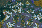
Seperated Worlds:
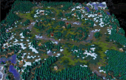
Really nice aesthetics and texturing, those mushrooms trees  . Nice use of the hight tool, heavily underused in my opinion.
On campaign maps its almost ludacris to what level those designers went back then.
Overall its not a competitiv map unfortunatly, the layout is just too crazy. But good effort  Corrupted Flow:
The map in general is a little bit too big, would scale it down to 88x100, put the startinglocations in the corners. Work on the area spacing, those open areas feel gigantic. Try to play a testgame with 100 sup armee and walk over the map, that helps.
Corrupted Flow:
The map in general is a little bit too big, would scale it down to 88x100, put the startinglocations in the corners. Work on the area spacing, those open areas feel gigantic. Try to play a testgame with 100 sup armee and walk over the map, that helps.
The natural expantion is close to the enemie so its hard to take, maybe its on purpose but alot of players wont like it.
The green water is mh difficult. Its the theme of the map but maybe scale it a little bit down. Im all for fresh aesthetics in melee maps but Felwood is problematic  . Try to find a nice balanced between green and the dark textures. I would suggest work on the spacing and see where it goes.
 ") Bay of Storms:
Looks like a solid map on first glance. Try to make those open water areas more interesting aestheticly speaking. I think its important for players and observers to immediately recognise where there are on the map based on aesthetics and texturing. Difficult on a Beach map i guess, maybe go for some different doodading.
Bay of Storms:
Looks like a solid map on first glance. Try to make those open water areas more interesting aestheticly speaking. I think its important for players and observers to immediately recognise where there are on the map based on aesthetics and texturing. Difficult on a Beach map i guess, maybe go for some different doodading.
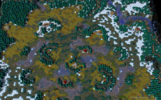
The natural expantion creeps are way too strong, try lvl 13-15. Not sure about those Dragonroosts Crystalline City:
Ok thats some acid trip texturing and doodad mashup for sure
Crystalline City:
Ok thats some acid trip texturing and doodad mashup for sure 
Layout is pretty solid i would say, it has a very easy circle design which works but isnt particular interesting.
nice gate usage .
Northwestern River:
Mapsize is good, the open areas are too big, try to optimize those.
The Creepspots should point towards the opponent not towards your own base. Keeping it like that creates potentially a boring creepgame without much action.
Turning them towards the opponent makes them more risky for creepjacks, thus more rewarding and tense.
The bottom right corner should have multiple ways to enter and exit. 1 big corridor leaves little room for movement.
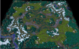
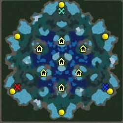
Throne of Tides:
solid map i guess. kinda wacky on the aesthetics but thats to be expected on a zucth map
Sludge Fen:
Again really big map, i wouldnt use more then 90x90 to 100x100. Maybe scale down the top half. it really feels like this will end up in a never ending creepfest without much going on. the natural is too far away. the bottom path should have openings towards the middle.
Besides that nice concept on the theme. im interested to see how you blend the green oasis parts with the red barren textures.
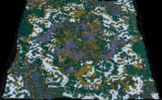
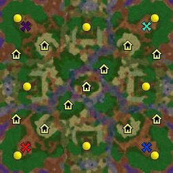
Déjà Vu:
uh didnt expect that one. sick layout, nice terrain texturing, nice area zoning with the little rivers, hight tool, creeps, neutral building placement.
very well done Ancient Blood:
puh, difficult to really go into detail here. maybe look at some ladder maps to get a general feeling of what works and what doesnt.
i like the theme and the doodad work is really good.