Ralle
Owner
- Joined
- Oct 6, 2004
- Messages
- 10,385

Warhammer 40,000 TD

The time has come... I would like for you to test something for me. I have refined the Hive 2 resource section system enough and would like some feedback. This does not mean that Hive 2 is finished, but a big part of it is (depending on the feedback I get). After finishing the resource system, I will still need to add all BB-Codes, the chat, award system, reputation system and import the site.
Resource System
Look in the forum category called "Repositories". I would like you to test the features: upload different types of resources, edit them, filter and search through them, rate and comment on them. Do this while ignoring the setup of repositories. Right now the repositories are set up in a way I thought was interesting. When doing the final import of the site each resource section will become a repository. Also, they are not necessarily going to appear as forums. The tags are also subject to change, just something I set up to to test with.
Something I would like you to comment on:
- The repository display page only has a few filter options and no keyword search. If you plan on searching, go to "Search" -> "More..." -> "Search Bundles and Resources". This is where the advanced search options go.
- When you first upload a resource, something else called a bundle is created. The bundle will contain your resource and you will have the ability to add more resources to the bundle.
Feel free to try out the pastebin and tell me what you think. I made it in a hurry but it covers all the same features as the old one. I am open for smoothing things out and adding more features.
Night Elf Theme
I have been working on the Night Elf theme with Archian and am pretty proud of it. If you ask Archian, it's not half done, but I think it's good enough to be plenty usable.
XenForo
I did not make the forum system. Anything that is not part of the resource system is a standard forum package known as XenForo. You can try this out here or at www.diplomunion.com and www.brigandshaven.net. It is everything I want. A modern forum system designed for developers to build on top of. vBulletin was always hard to work with in this regard and I have been so happy working with XenForo.
Reputation
XenForo does not come with a reputation system out of the box. However, there is a reputation addon which I am going to install and improve upon before showing it to you. Hive 2 WILL HAVE REPUTATION but this beta site does not have reputation yet. Calm down.
If you run into any problems, please post them in this thread as I won't be scavenging the test site for useful information.
I have spent a long time making this and it means a lot to me. Therefore, I hope that you will approach this thread with respect and constructive criticism.
Remember, the site rules still apply on the beta site. Also, all content will be deleted when the test is over.
Enter Beta Site


")


 ) to better illustrate my feedback lol
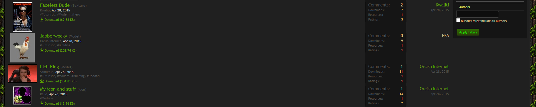


") It wont be like that in the final version.
It wont be like that in the final version.


